Green in this list runs from a few napkins or a ribbon on each menu to rented drapery by the panel and a dark forest green lace gown, so the cost depends on how much of the room you ask it to cover.
Pick by the surface you can afford to color: small, repeatable pieces like dusty blue linens and sage greenery spread the palette cheaply, while large surfaces like a dark green drapery backdrop are rented by the piece, so I’d count chairs and measure wall width before falling for one.
1. Forest Green Table Runners
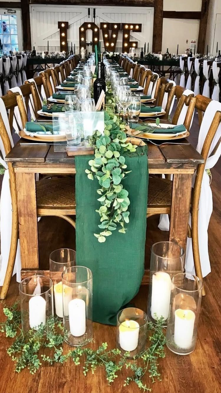
A single forest green runner down a long wooden table does the work of a whole color scheme. The dark green sits against the wood without fighting it, so greenery and white pillar candles can stay simple.
I would pick a runner with some weight to it over a thin strip, with greenery spilling over its edges so the fabric reads as a base, not a stripe.
Keep the candles in a staggered line. Nothing else on the table needs to be green.
2. Sage Green & Soft Ivory
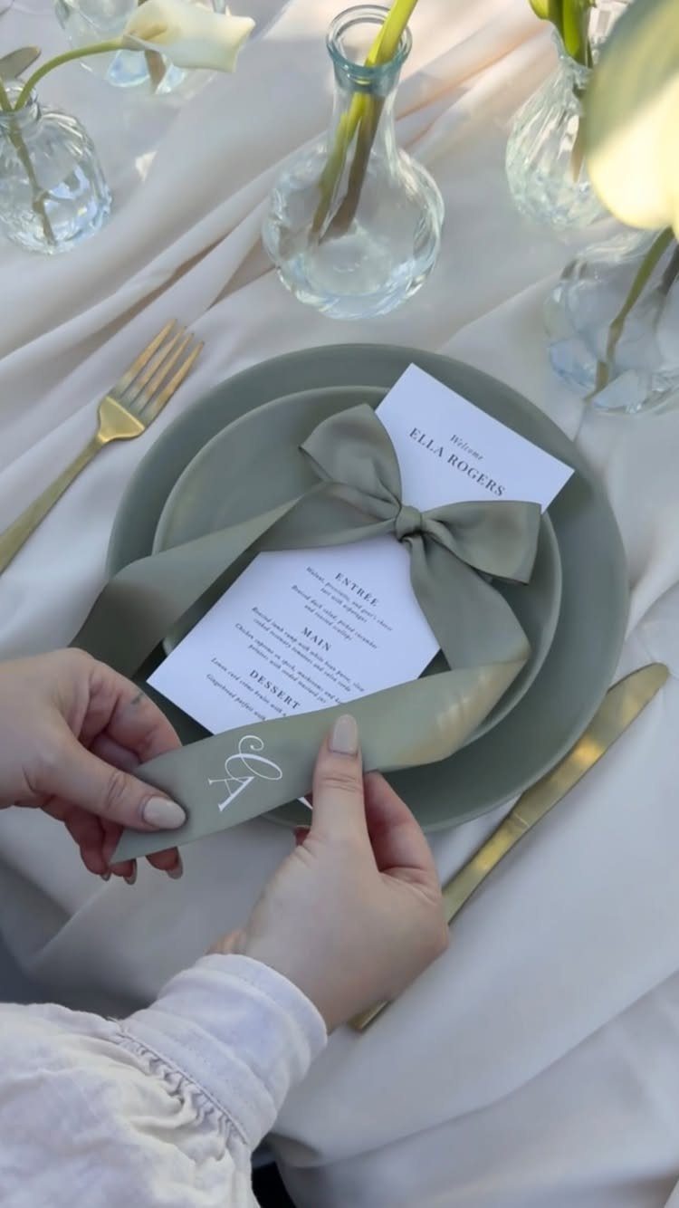
Sage and ivory suit a couple who want a quiet table that still looks planned.
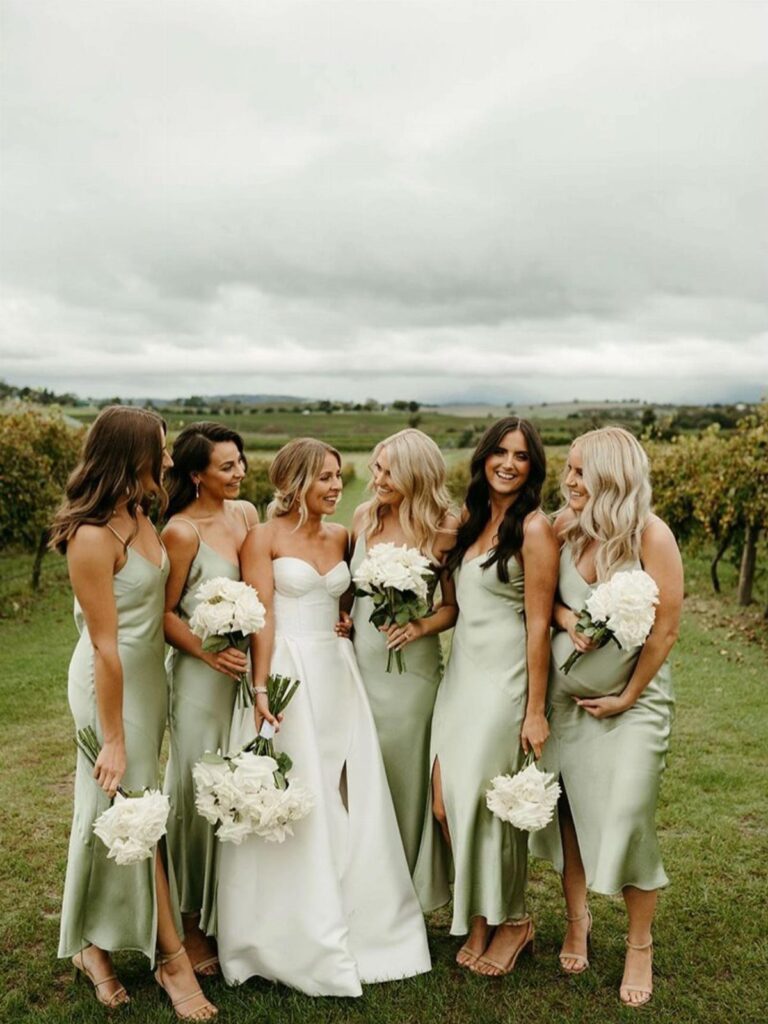
Ivory linens work as the base, and sage belongs in small, repeatable pieces: a ribbon tied around a menu, a plate, a sprig in a small glass vase.
Spread the sage thinly.
A ribbon costs little, and it brings the color to every place setting without renting sage linens. Gold cutlery warms the pairing; I prefer it to silver here, which turns the whole table cool.
3. Emerald Green & Gold
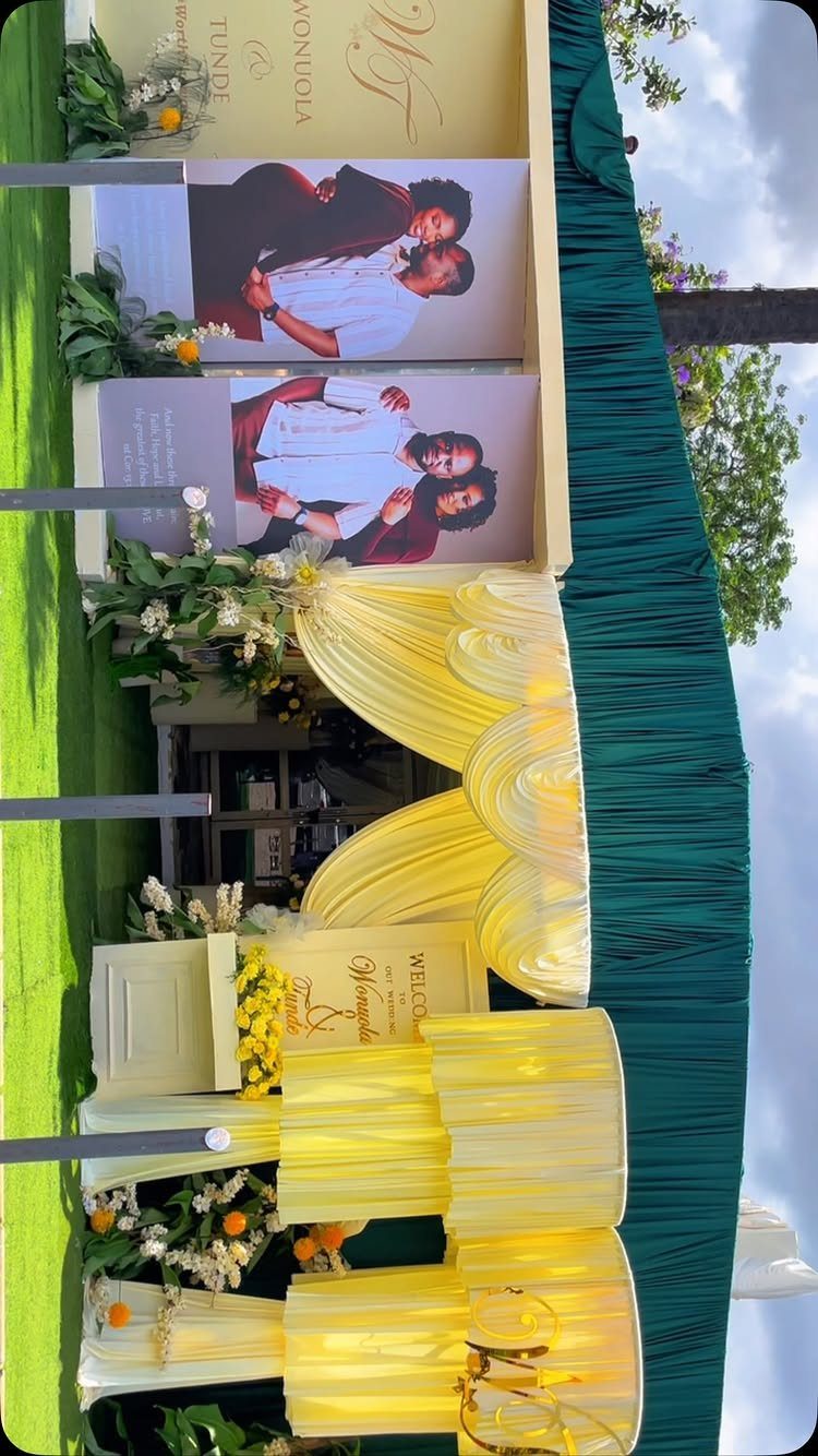
Emerald against gold is the loudest pairing for green, and it works best when one color leads.
Let emerald take the large surfaces, like a draped backdrop at the entrance, and use gold for the smaller layer: chair covers, signage details, accents.
Reverse that ratio and the look turns brassy.
Floral arrangements in warm tones tie the two together. Since drapery and covers are rented by the piece, count your chairs before you fall for the gold.
4. Rustic Green and Gray
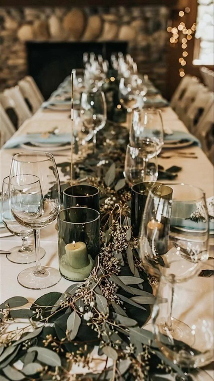
Green and gray sound plain on paper, and that is why the pairing holds up.
For a runner, I would lay the eucalyptus in a loose, continuous line down the table’s center instead of building separate bunches. A greenery runner is the cheapest way to make a banquet table look full.
5. Dusty Blue Linens with Sage Greenery
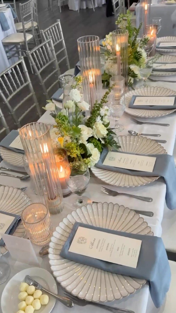
Dusty blue only needs to appear in the napkins. With white fluted plates and ribbed glass candle holders, a blue napkin on each setting brings in the second color at the lowest cost and effort.
Sage greenery and white flowers then sit between the 2 as the bridge.
Choose a blue with a gray cast, so it reads as a cousin of the sage and not a competitor. Napkins are also the easiest piece to swap if a sample looks off.
6. Farmhouse Green
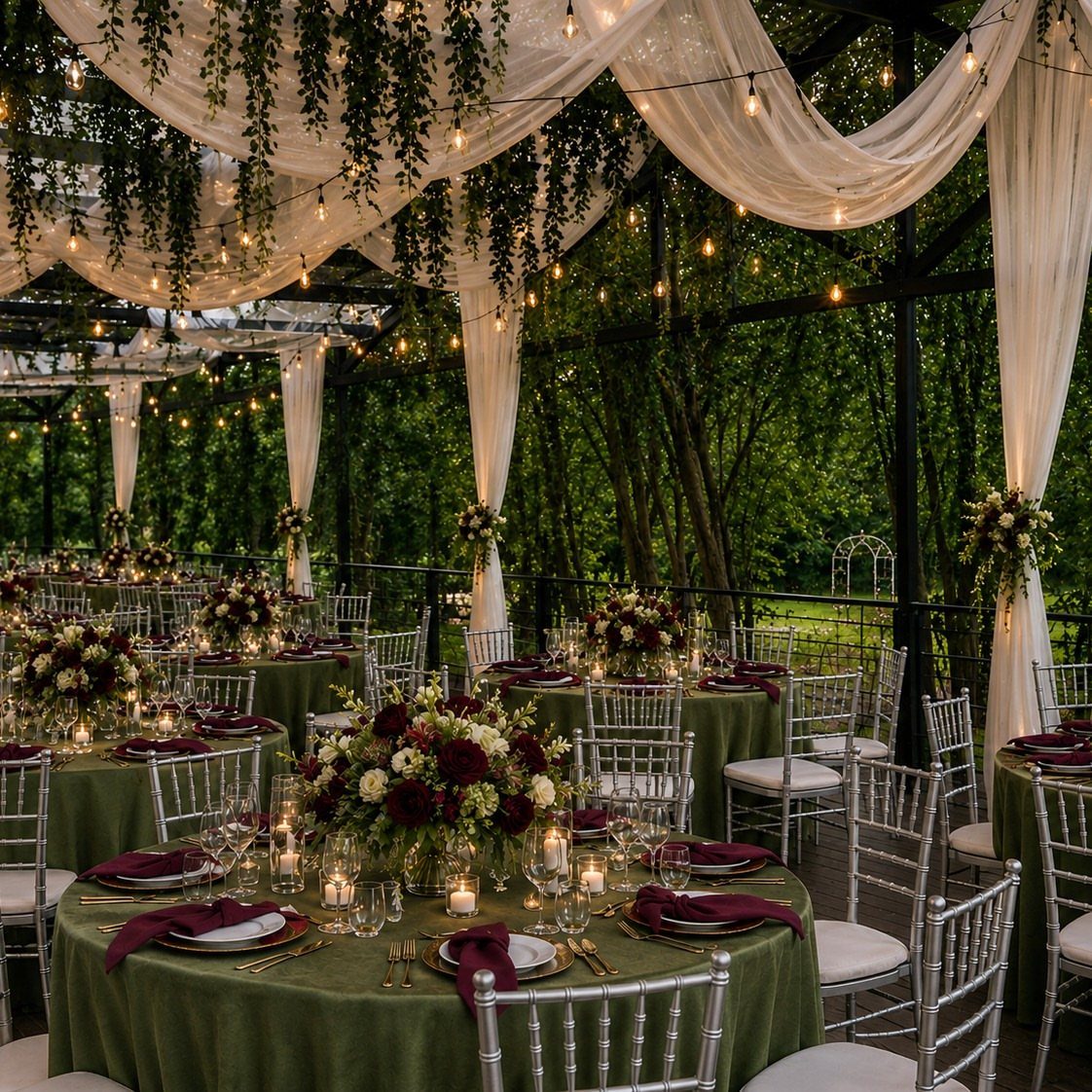
Olive green cloths set a casual tone, and burgundy adds depth against them. Burgundy centerpieces plus burgundy napkins on olive tables mean the second color repeats at 2 heights, which makes the palette look intentional.
String lights and a draped white canopy soften all that earthy color for evening.
I would keep the chairs neutral, as silver is, so the olive and burgundy stay the only decisions. Olive is a forgiving shade for outdoor photos, too.
7. Tropical Greens
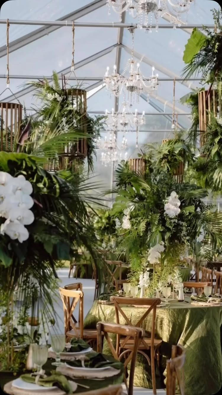
Tropical greens are the loosest, brightest way to use the color, and a clear tent is a good frame for them. Big leaves and white orchids look best when the greenery runs generous and a little wild.
Green cloths hold the look together, so I would let the leaves do the talking and keep everything else plain.
Wooden chairs suit it well. Crystal chandeliers add polish and stop a tropical palette from tipping into themed-party territory.
8. Green Wedding Invitations
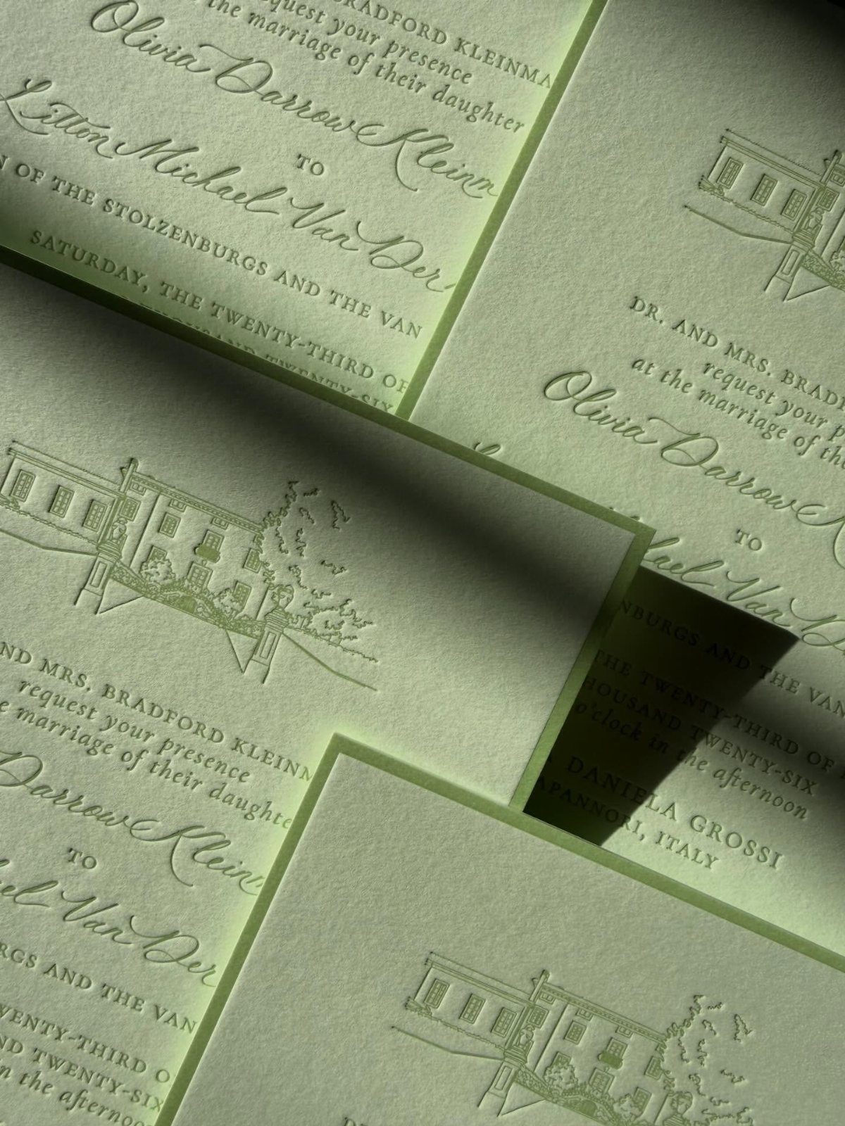
A pale green invitation tells guests the palette before they arrive.
Pick a soft tint for the paper, then keep the type simple: cursive names over a small line drawing, like a building, give the card a point of view without extra color.
Order a sample before the full run, since green shifts from screen to paper. Stick to one illustration, and make the names the largest thing on the card.
9. Dark Green Wedding Gown
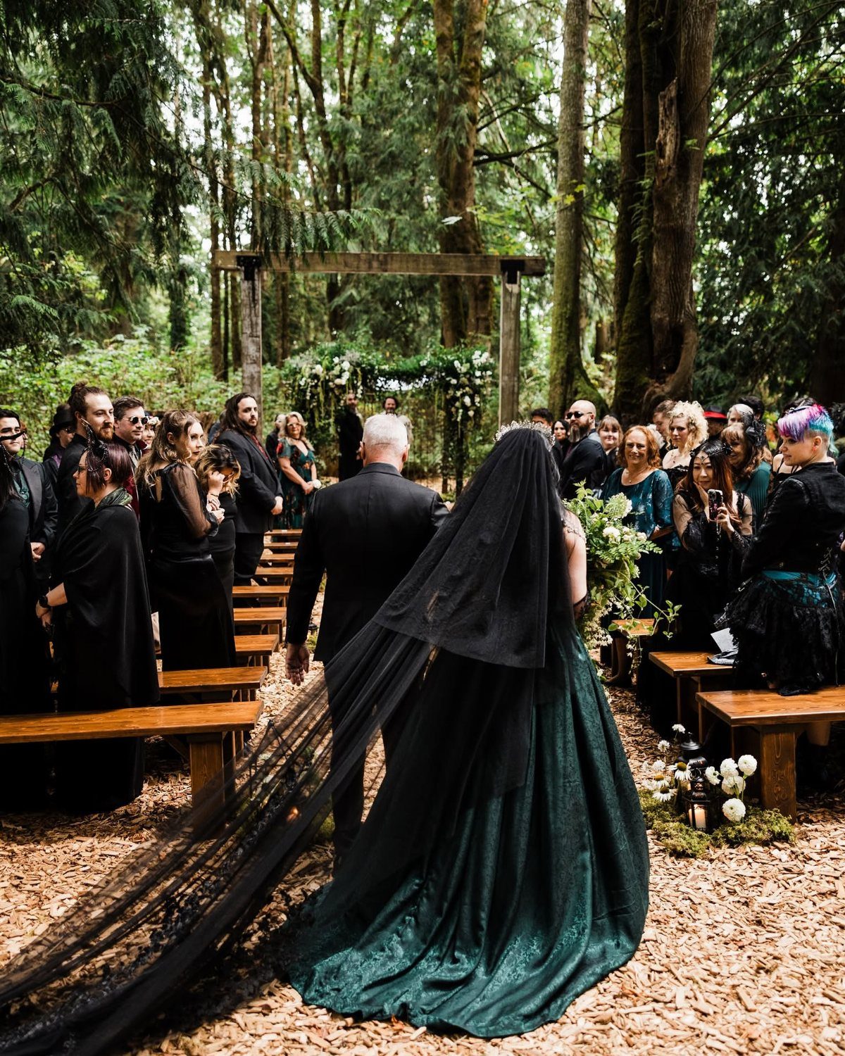
A dark forest green lace gown is the boldest way to wear the color, and I like it far more than a white dress with green trim. Lace gives the deep shade texture so it reads rich, not flat.
A black veil over a dark green gown gives a moody finish.
Choose a woodland or garden setting, where the dress looks at home. Try it on in daylight first, since dark green can read nearly black indoors.
10. Dark Green Bridesmaid Dresses
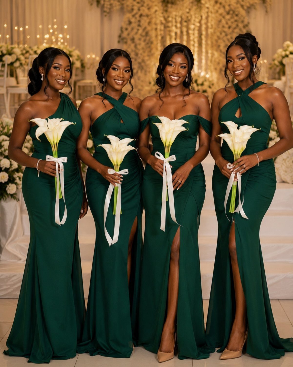
Mismatched floor-length gowns in dark green let each bridesmaid pick a cut that suits her, and the shared shade keeps the group looking planned. That is cheaper on nerves than arguing over one style.
Give everyone the same color name or swatch, because dark greens vary widely from one maker to the next.
White calla lily bouquets then do the contrast work. Keep the flowers identical, so the dresses are the only thing that varies.
11. Dark Green Drapery and Backdrop
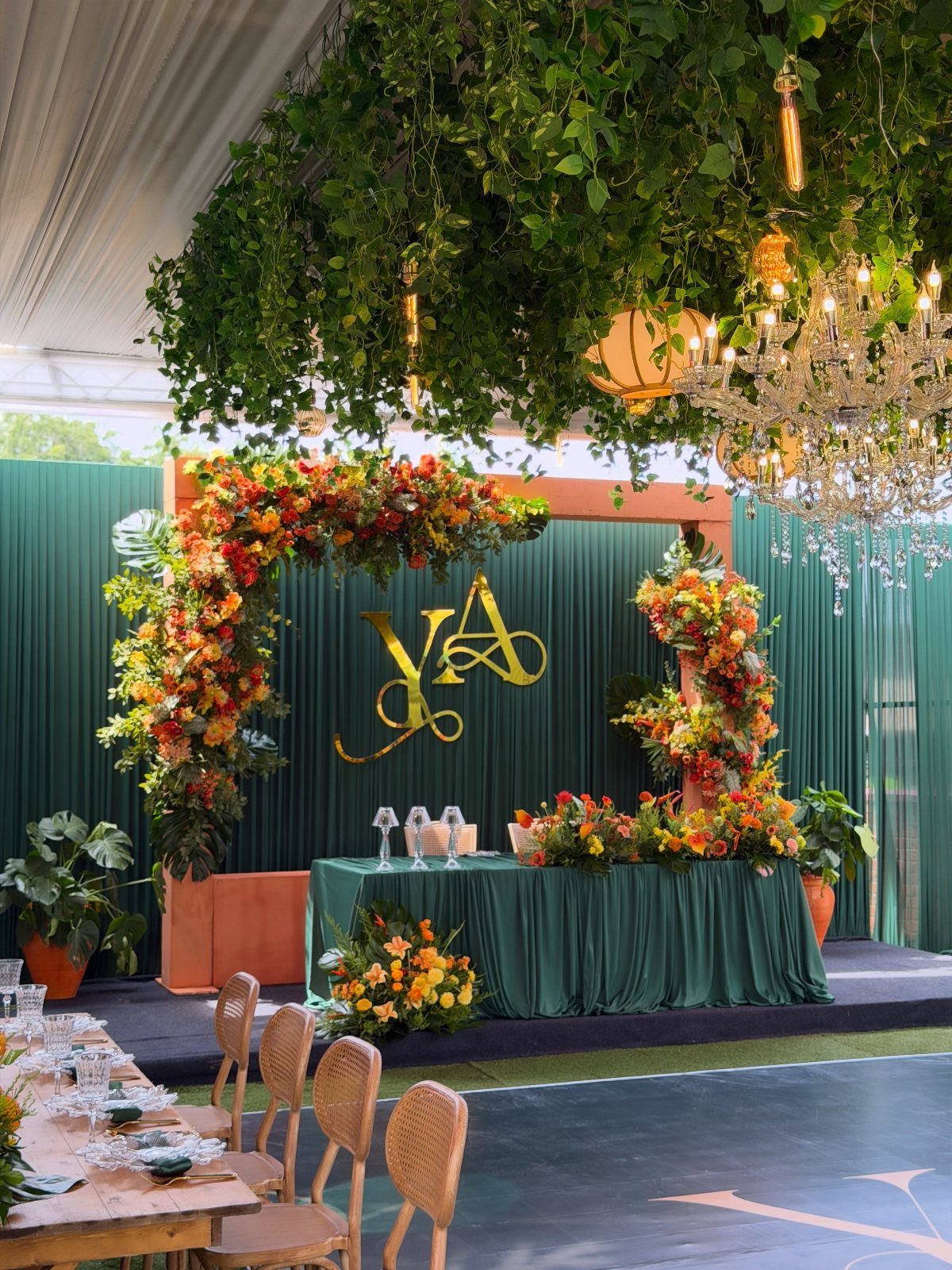
Deep green drapery turns a plain wall into a backdrop, and hanging greenery overhead carries the color up toward the ceiling. Together they make a room feel enclosed and rich.
I would add one bright accent, such as orange florals, because dark green on its own can go heavy.
A gold monogram on the fabric works as a focal point. Fabric is usually rented by the panel, so measure the wall width before you price it.
12. Green Glassware and Produce Tablescape
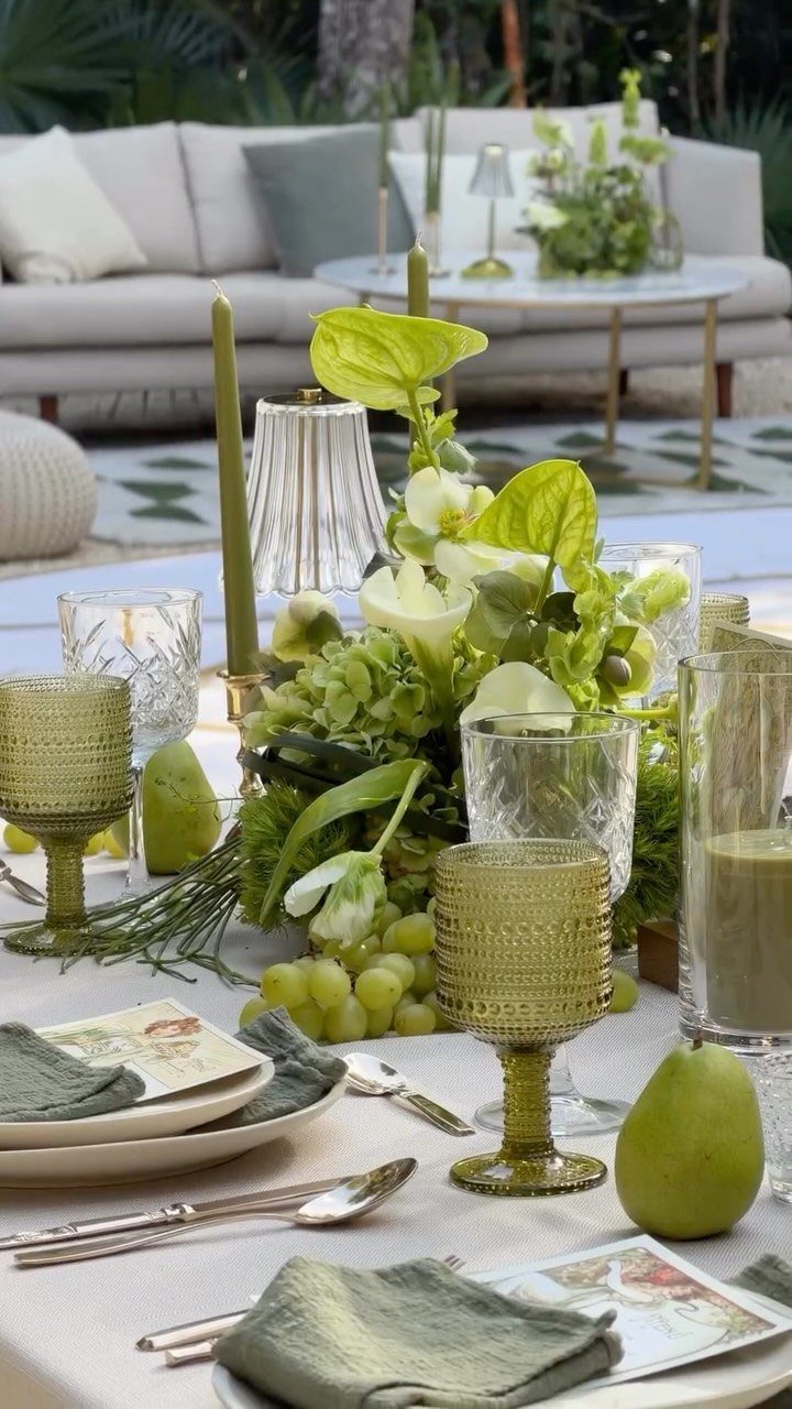
Green glassware does more for a table than another flower stem. Tinted goblets catch light and tie in with sage napkins, so the color shows up at eye level.
Add green pears and grapes between the florals as edible decor; they cost little and fill gaps. I would choose glassware in one consistent tint over a mixed set, so the table looks collected, not cluttered.
Choosing the Right Green Palette
Start with the season, because it sets which greens are even available. Fresh foliage and flowers vary by month, so a palette built around what is in bloom costs less and looks more at ease.
Next, match the green to the flowers you love. Soft blush roses suit a lighter green, while white lilies hold their own against a deeper one.
Then look at the room itself.
Walk the venue, or study photos of it, and note what is already there: wood, stone, painted walls, trees outside the windows. Your green should sit comfortably beside those, not fight them.
Finally, decide on the mood in one word, like calm, moody or playful.
If a choice doesn’t fit that word, skip it. A palette that feels cohesive beats one that looks like a theme.
Incorporating Green Into Decor
Foliage is the cheapest way to make green feel deliberate. Fill bouquets and centerpieces with lush leaves, then pair them with white lilies, blush roses or wildflowers, depending on the season.
Potted succulents or small herbs in pots make a centerpiece that guests can take home, and they usually cost less than a fresh arrangement. They bring an organic touch, and guests can take one home.
Attire can carry the color too. A green tie or pocket square on each groomsman costs very little, and it links the group to the green in the room.
Forest green and cream is a calm pairing for fall or an intimate guest list. Cream florals with dark greenery, plus a dark green ceremony backdrop, let a mountain or woodland setting do the rest.
Frequently Asked Questions
What is the most beautiful color for a wedding?
Green is a strong pick because it works as a main color and as a neutral base, so it pairs with nearly any palette.
Sage, emerald, olive, mint and forest each give a different mood, from calm to rich to earthy. Choose the shade by the season, the flowers you love and what the venue already has in it.
What color best compliments mint green?
Coral, peach and metallics like gold or rose gold all pair well with mint, and each one keeps the palette bright and festive.
Mint looks its best in spring and summer, when daylight and fresh blooms match its cool, airy tone. I would pick one of those partners and let it lead, rather than adding all three.
What are some creative ideas for a green wedding theme?
Start with one shade and give it a single job. A forest green runner with greenery and white pillar candles carries a long wooden table, and sage ribbons tied around menus bring color to every place setting cheaply.
Dark green bridesmaid dresses in mismatched cuts, tinted green glassware with pears and grapes, or a dark green drapery backdrop with one orange accent all work too.
What colors go well with green for a wedding?
Ivory, gold, gray, dusty blue and burgundy all work. Sage goes with ivory and gold cutlery, emerald with gold in smaller doses, and olive with burgundy repeated at 2 heights.