Blush can be as small as one swag of sage fabric behind a statement arrangement, or as full as an all-pink table with velvet chairs and matching lampshades, or a canopy of draped fabric over a lawn.
Season settles it: blush carries a spring or summer wedding alone, but a fall or winter date wants a deeper shade like burgundy or mauve to take most of the palette.
1. Blush and Sage Green
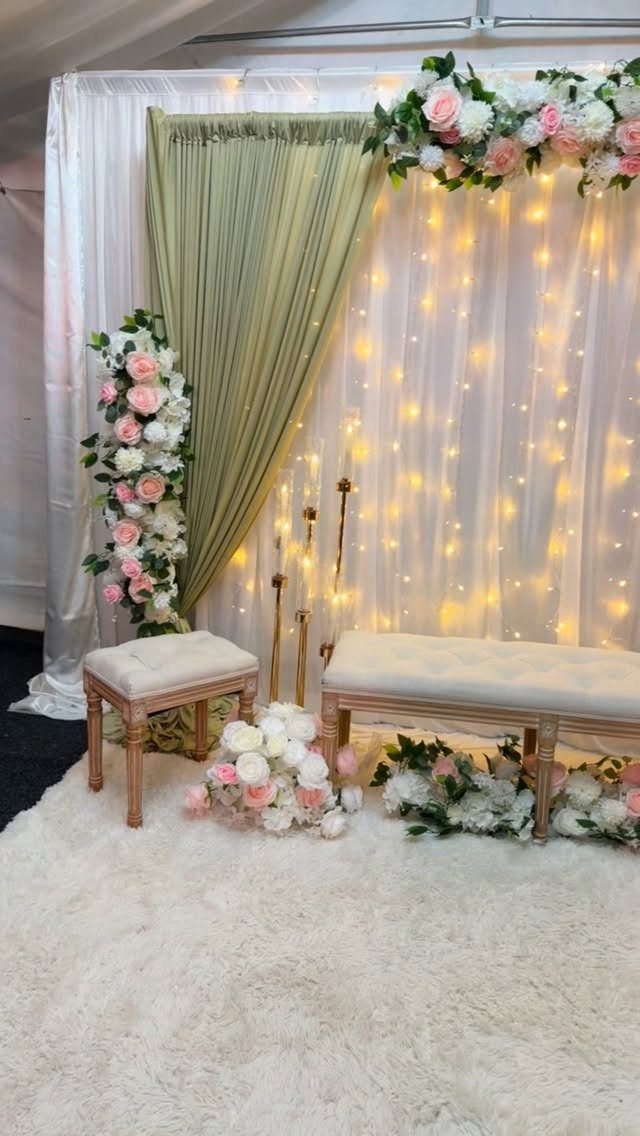
Sage draping against blush and ivory flowers reads as garden-fresh without a single leaf of real greenery on the walls. The fabric does the green work, so the flowers can stay soft.
I would put the strongest floral arrangement at one side of the backdrop, framing the curtains, with everything else kept quiet.
According to the maker, the florals here are blush and ivory with one statement arrangement, which is a smart limit on a budget: one big piece, fabric for everything else.
2. Dusty Rose and Mauve
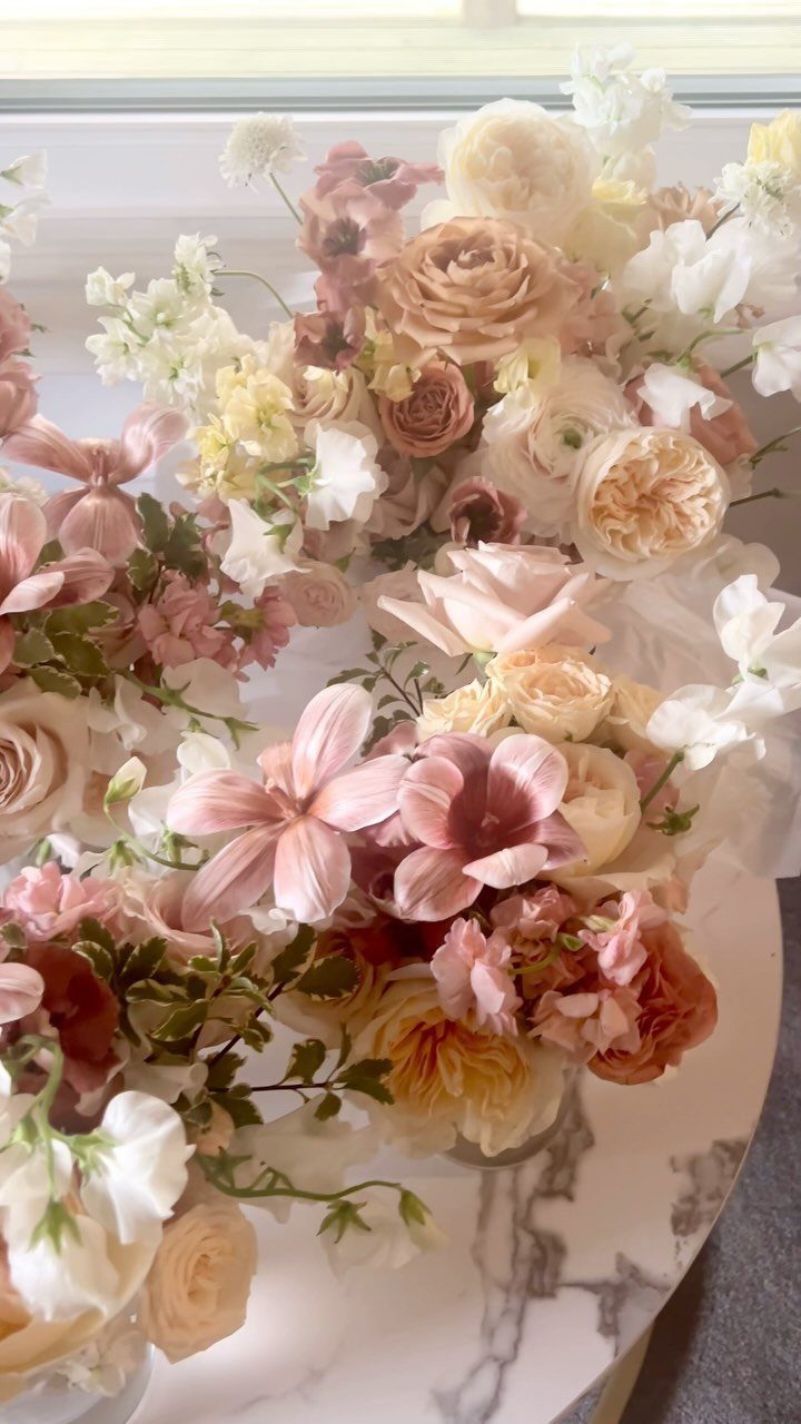
Dusty rose and mauve carry more age than pure blush, and that is why they feel vintage. Cream roses between them keep the arrangement from turning muddy.
For a bouquet or centerpiece, I would use cream as the third color, with the 2 deeper tones sitting in the middle. Marble, or any pale, cool surface under the vases, lets the muted shades stand out.
Skip bright white flowers here; they look stark next to such soft color.
3. Blush and Burgundy
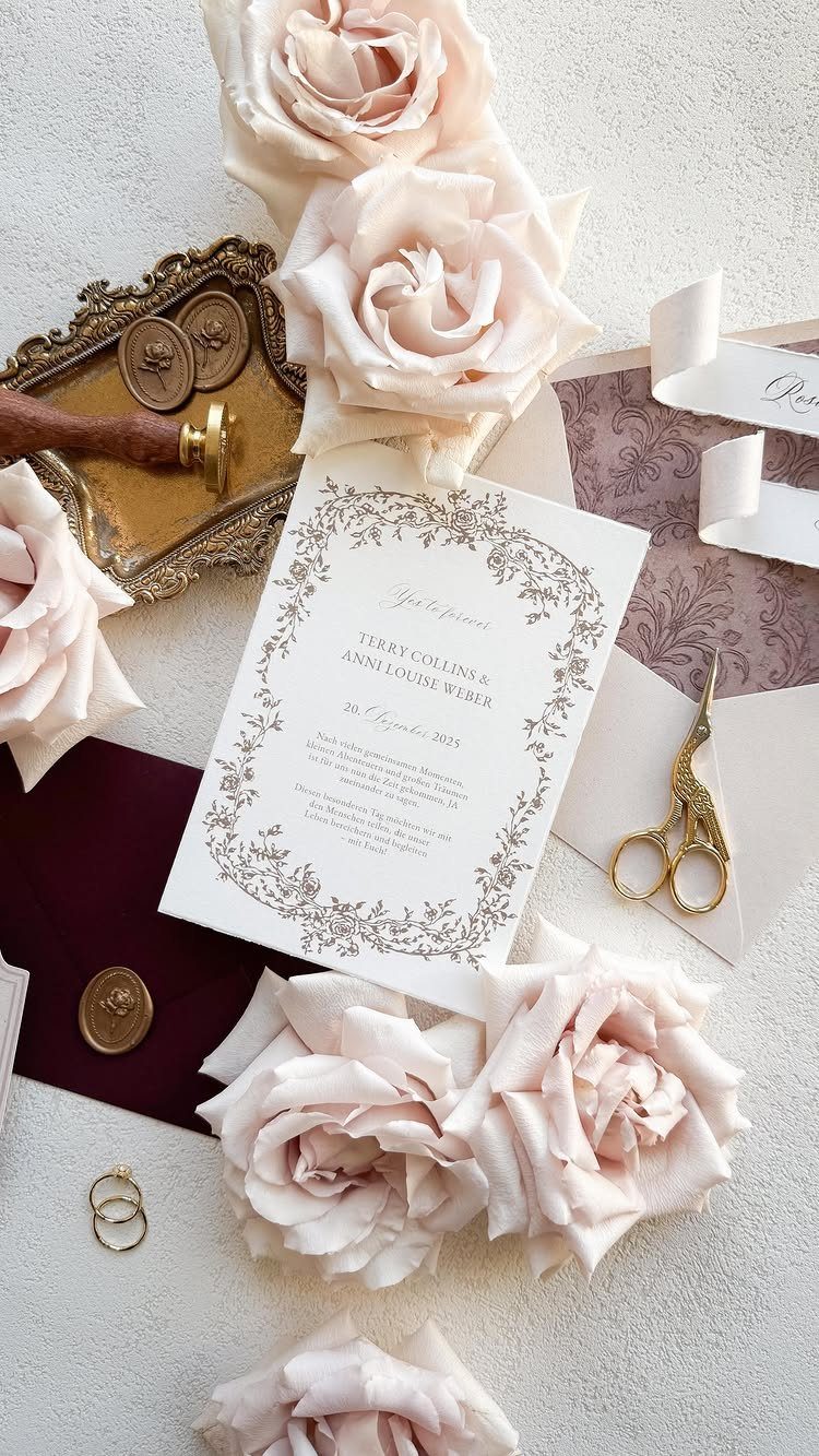
Invitations are an inexpensive place to try this pairing before committing to it in the florals.
Keep the paper mostly white, then add burgundy in one place: the envelope, a wax seal, or a ribbon. Gold accents tie both colors together.
If the full palette feels heavy, let the invitation carry the burgundy while the reception stays blush-led.
4. Blush Wedding Flowers
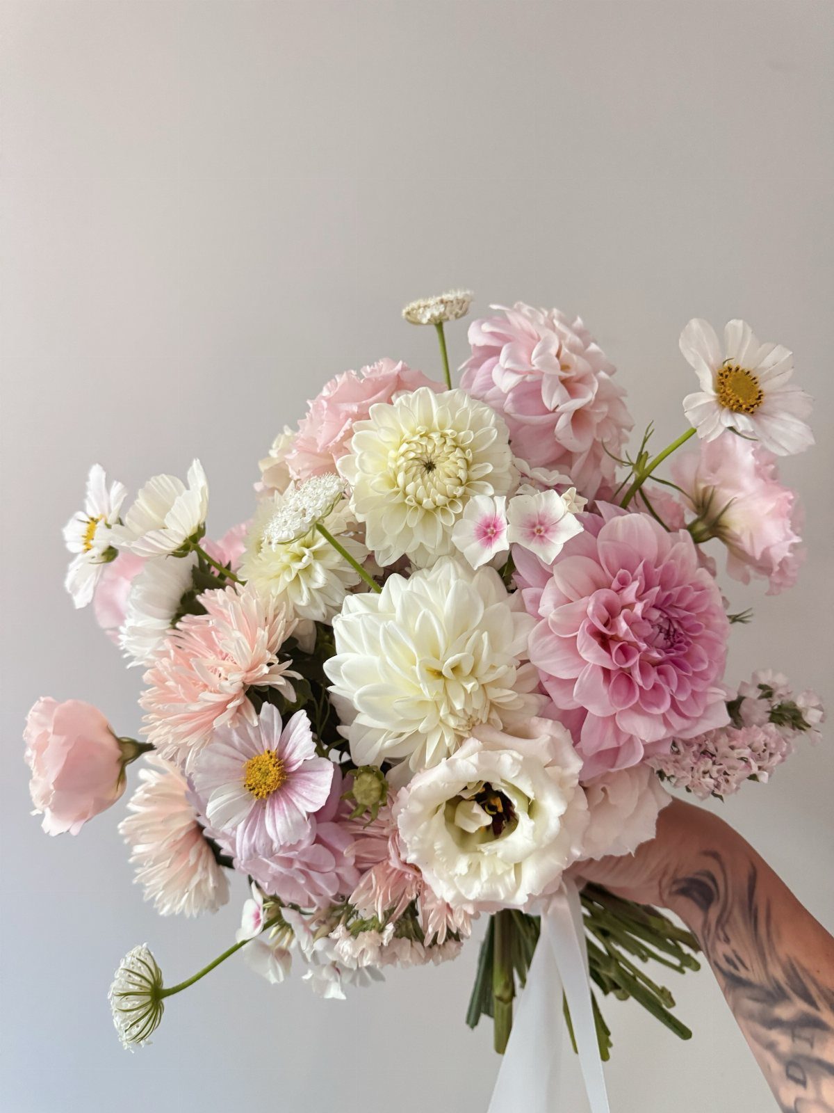
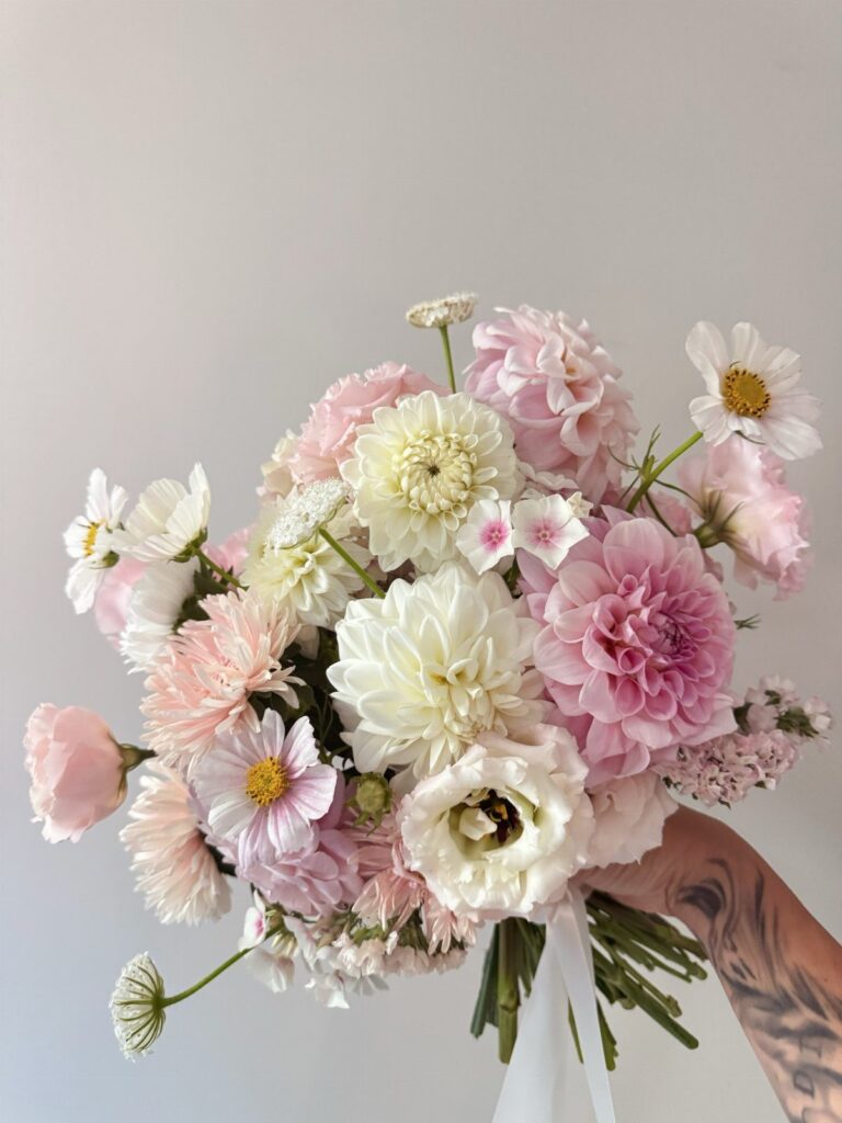
Dahlias, roses and daisies in blush and white make a bouquet with three different textures but one color story. Round dahlias give the volume, roses add a classic shape, and daisies keep it from looking formal.
I like asking a florist for a tight palette of 2 shades rather than a long flower list; it reads richer. Hold the stems loosely tied in a neutral wrap so the petals get all the attention.
5. Blush Wedding Attire
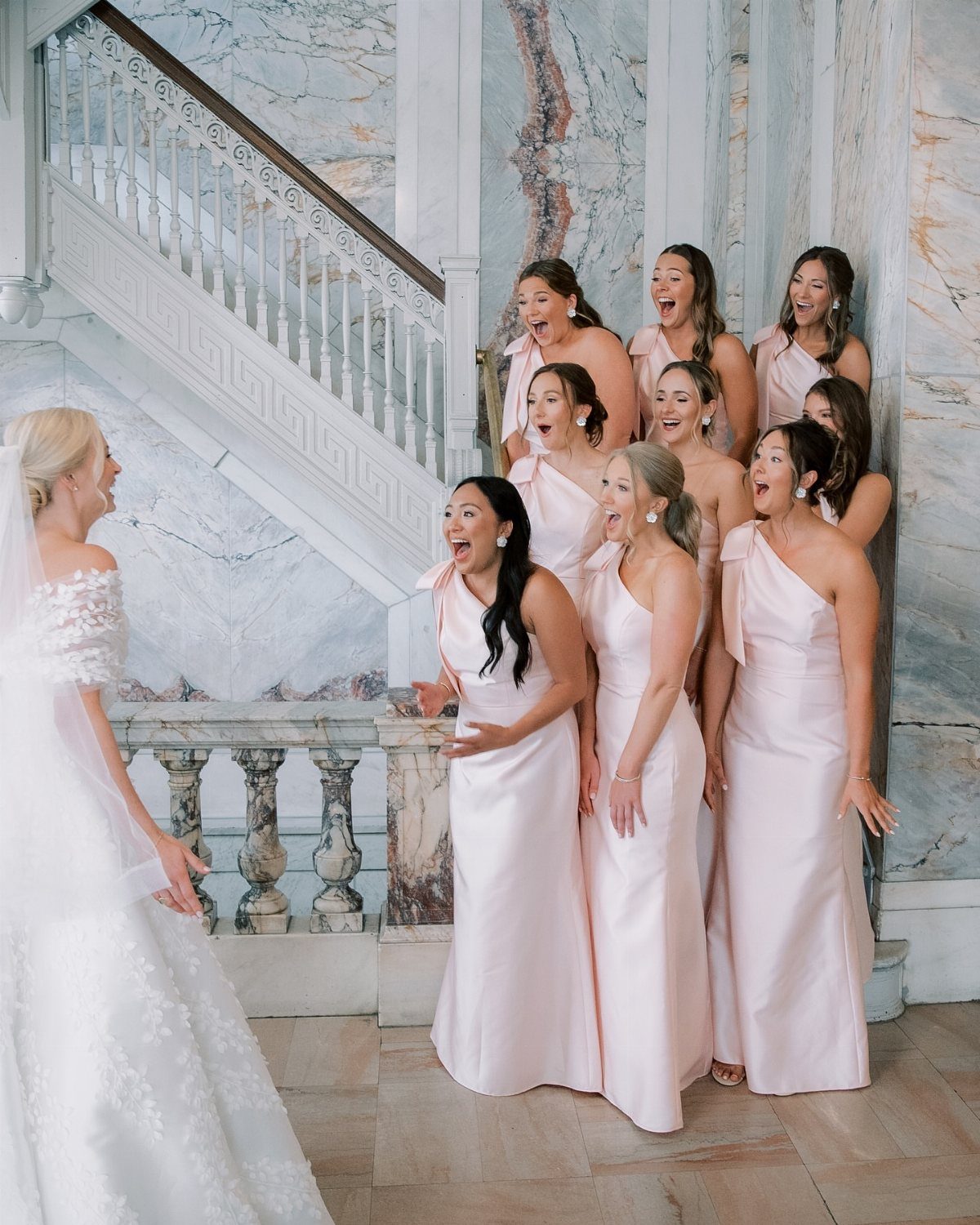
A group of bridesmaids in blush satin beside a bride in white lace photographs as one group, not as a clash. The satin sheen sets the dresses apart from the matte lace.
For a party this size, I would pick one shade and one fabric so the dresses match, then let each bridesmaid choose her neckline. That keeps everyone comfortable and the color consistent.
Hold swatches against the bride’s dress in daylight, since blush can lean peach or gray indoors.
6. Blush and Gold Table Settings
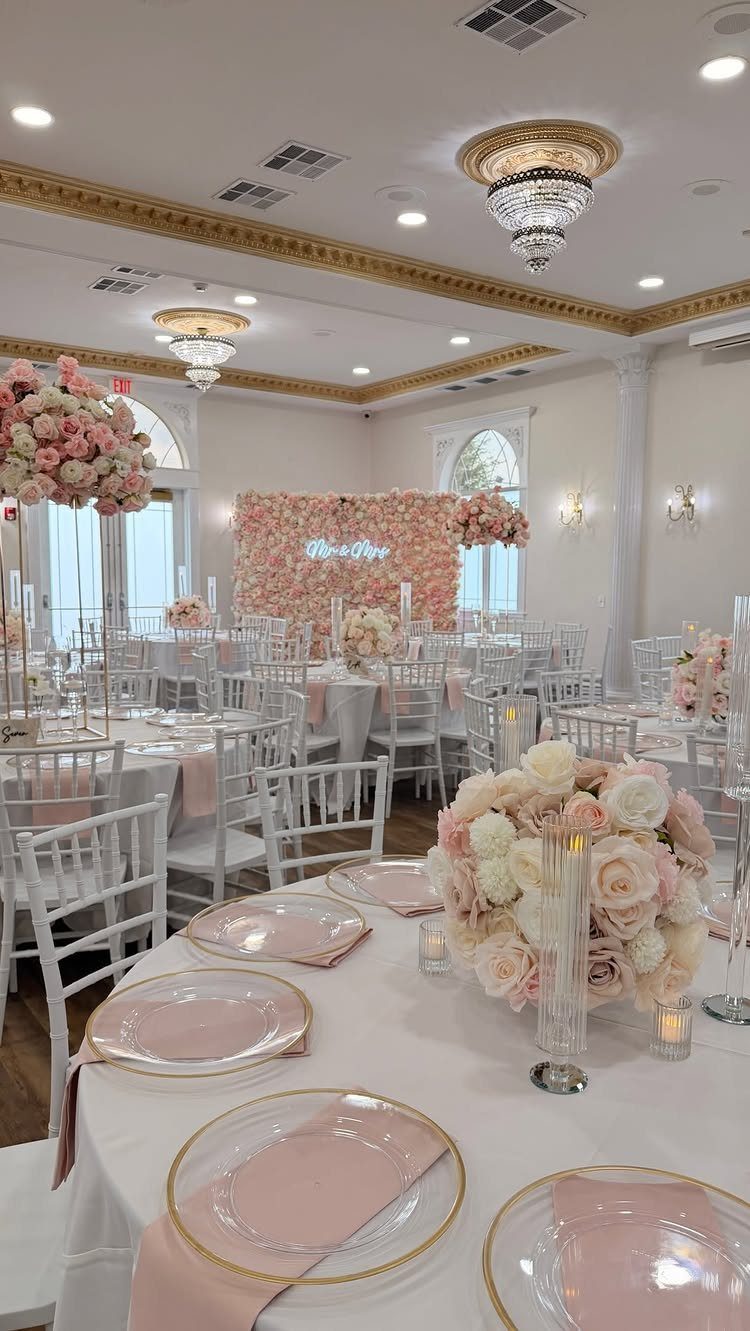
Gold-rimmed plates on white tables give blush napkins a clean frame, and the result looks formal without much effort. The gold stays in the details, so the pink remains the main color.
I would put blush in 2 places only, the napkins and the centerpiece flowers, and let white linen carry the rest. Add gold in the plate rim and nothing else, or the table gets busy.
Chandeliers overhead add sparkle at no cost to the table budget, if the venue already has them.
7. Blush Fabric Draping Reception
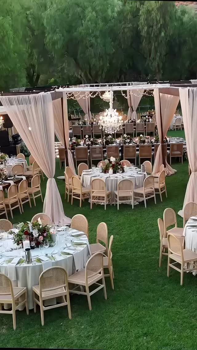
Fabric hung from an overhead frame gives an open lawn the one thing it lacks: a ceiling. A chandelier at the center turns that blush canopy into the focal point, so the tables below can stay plain white.
Overhead is where I would put the budget, with plain chairs and simple linens below it. Hang the fabric in loose swags rather than pulling it taut; the folds catch light and look fuller.
Ask the rental company about the frame before buying yards of fabric, since the frame sets how much cloth you need.
8. Monochromatic All-Pink Reception Decor
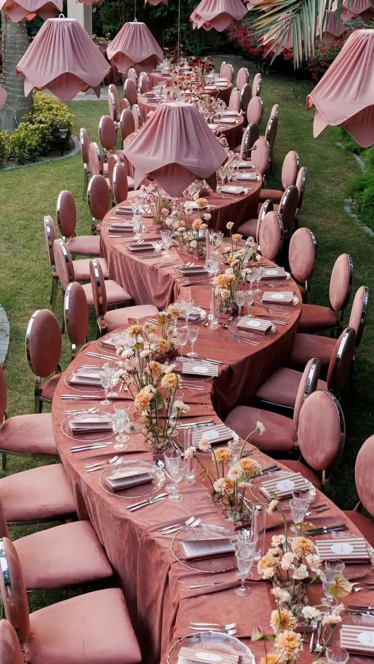
Pink linens, pink velvet chairs and fabric lampshades in the same blush turn one long table into a single piece of furniture. Green lawn around it keeps the color from overwhelming the view.
Matching is the hard part, because blush varies by fabric. Velvet reads deeper than a cotton or polyester cloth, so I would order swatches of the linen, chair and shade together and compare them outside.
A curving table takes more linen than a straight one, so price that early.
9. Blush and Red Decor
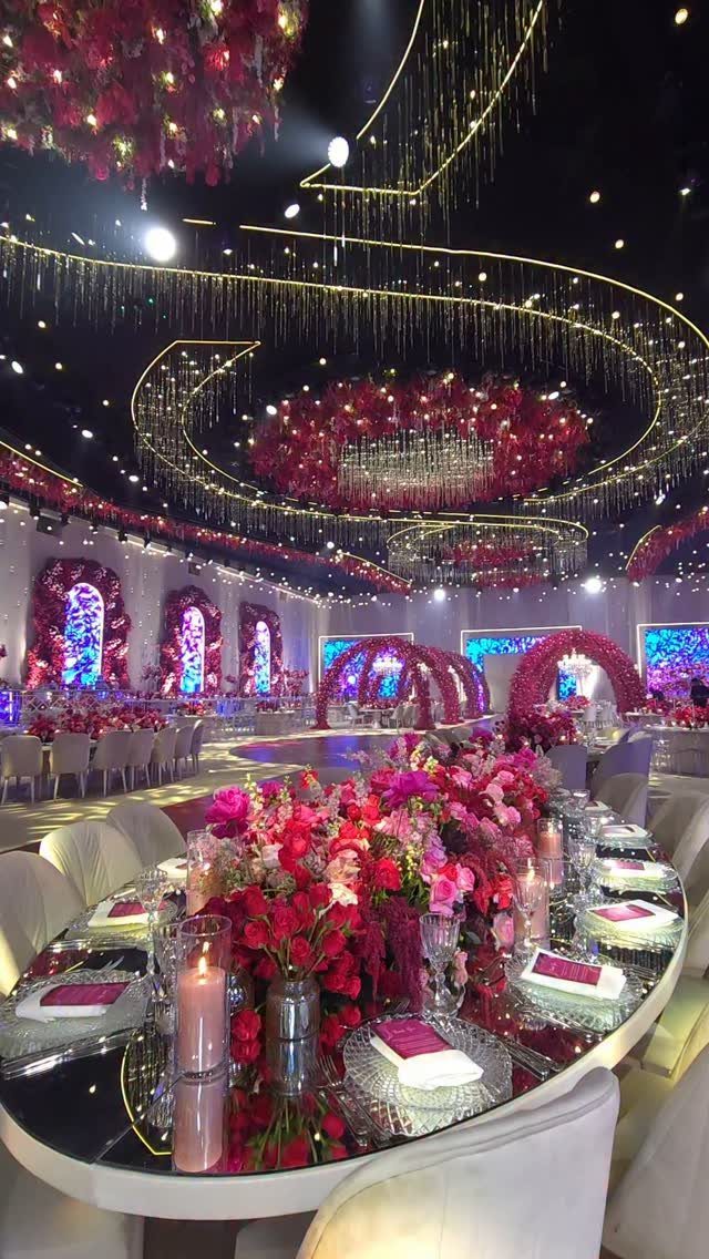
Red flowers among the pink give a blush room real drama, and gold string lights overhead warm both colors. Pink should be the larger share, with red as the accent, or the room tips toward Valentine’s Day.
I would ask the florist for a mix of both shades in each centerpiece, rather than alternating all-red and all-pink tables. It reads as one design.
Keep linens neutral. The flowers and the lights already carry the room, and extra color on the tables would compete with them.
Best Seasons for Blush Weddings
Blush belongs to spring and summer, when its softness matches the light and the flowers in season. Outdoors at those times of year it reads fresh and romantic with very little help.
For a fall or winter date, keep blush but add depth beside it: burgundy, mauve or pewter. Let the deeper tone take the larger share of the room, with blush as the lighter note.
Taupe and champagne also sit well next to blush, and both are easy to find in linens and ribbon.
Metallics That Pair with Blush
Blush looks best against rose gold and champagne gold, since both share its warm undertone and neither fights it. Both share its warmth, so flatware, candleholders and charger plates look like part of the palette instead of an add-on.
Silver works when the rest of the palette runs cool, such as blush with dusty blue. Pick one metal for the whole day, since mixing rose gold with silver makes both look like a mistake.
A quiet neutral scheme works with blush, greige and champagne, with the metal limited to small touches like flatware, candle holders or a thin frame.
Meaning of Pink at Weddings
Pink stands for femininity, love and romance, which is why couples keep choosing it. It also carries softness and playfulness, so a pink room tends to feel relaxed rather than stiff.
Blush is only one pink. Rose, coral, fuchsia and magenta all count as pink wedding colors, and each says something louder than blush does.
If you want the romance without the sweetness, stay with blush and rose. If you want energy, bring in coral or fuchsia in small doses.
Frequently Asked Questions
What colors go well with blush for a wedding?
Sage green, burgundy, dusty rose and mauve, dusty blue, taupe, champagne and greige all work with blush.
Sage drapery gives a blush room a garden look, and burgundy adds contrast and deeper depth. Taupe, champagne and greige keep things quiet and neutral.
What are the best color combinations for a wedding?
With a blush base, sage green, burgundy and gold, mauve with cream, or taupe with champagne all hold up well.
Each one has a clear lead color and one supporting shade, which keeps a room from looking busy. Choose one main color, then add a single accent in a smaller share.