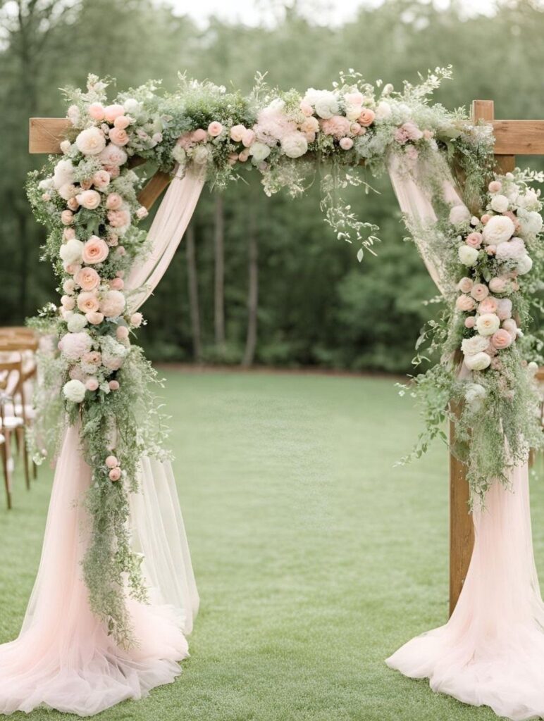
These palettes run from dusty rose and sage to jewel tones, coral, light blue, golden orchard shades and one color at three depths, and they differ more in how much matching they ask of you than in cost.
The deciding fact is your venue, which gets its own entry below: a lawn, a tent, a candlelit room and a wall of patterned wallpaper each push the same shade in a different direction, so the room should choose before Pinterest does.
The post’s 60-30-10 split, with the base color covering most of the space and the accent saved for napkins or ribbon, keeps any of them in check.
1. Dusty Rose and Sage
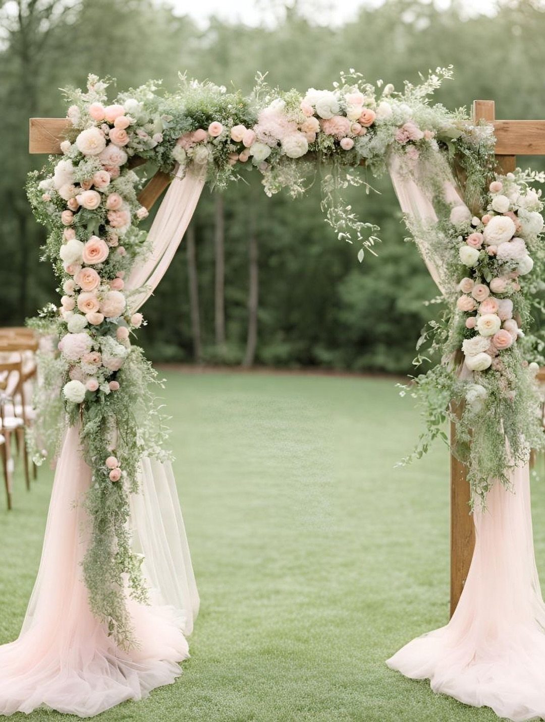
Pale pink and gray-green work together because neither one shouts. Dusty rose roses against sage foliage give an arch a soft, earthy look that suits a boho ceremony on a lawn.
Let the greenery do most of the volume and keep the roses as accents. Flowing light pink fabric draped through the frame adds movement for very little money compared with more blooms.
2. Burgundy Bridesmaid Dresses
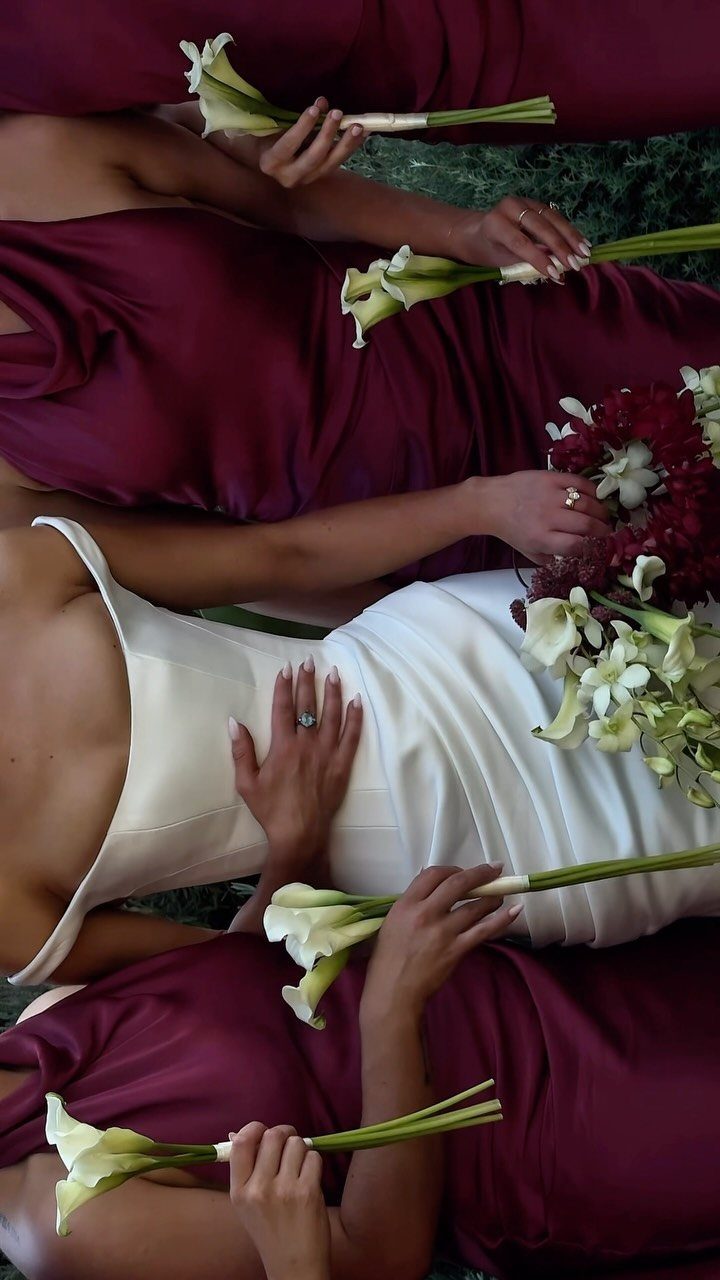
Burgundy on bridesmaids reads festive without feeling loud, and white keeps it from turning heavy. Hand them white calla lilies or a mixed bouquet, and the dark dresses stand out cleanly next to the bride’s gown.
Add plenty of greenery in the bouquets and around the ceremony space. White flowers plus green give you a clear three-color scheme, which is easier to shop for than a complicated one.
3. Sunwashed Coral
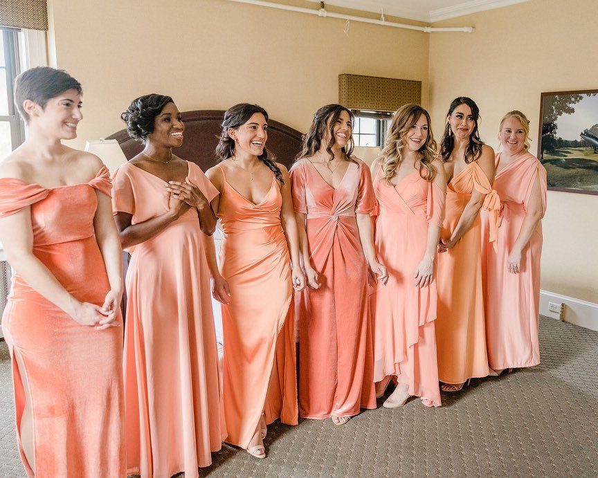
A coral gown holds up in a mix of cuts, which is how I would use this palette.
7 bridesmaids in different styles of the same warm shade still look like a set, and each person can pick the neckline she is comfortable in.
Ask everyone to order from one dye lot or swatch group so the shade stays consistent. Coral drifts toward orange or pink depending on the fabric, so compare swatches in daylight before you commit.
4. Emerald and Sapphire Jewel Tones
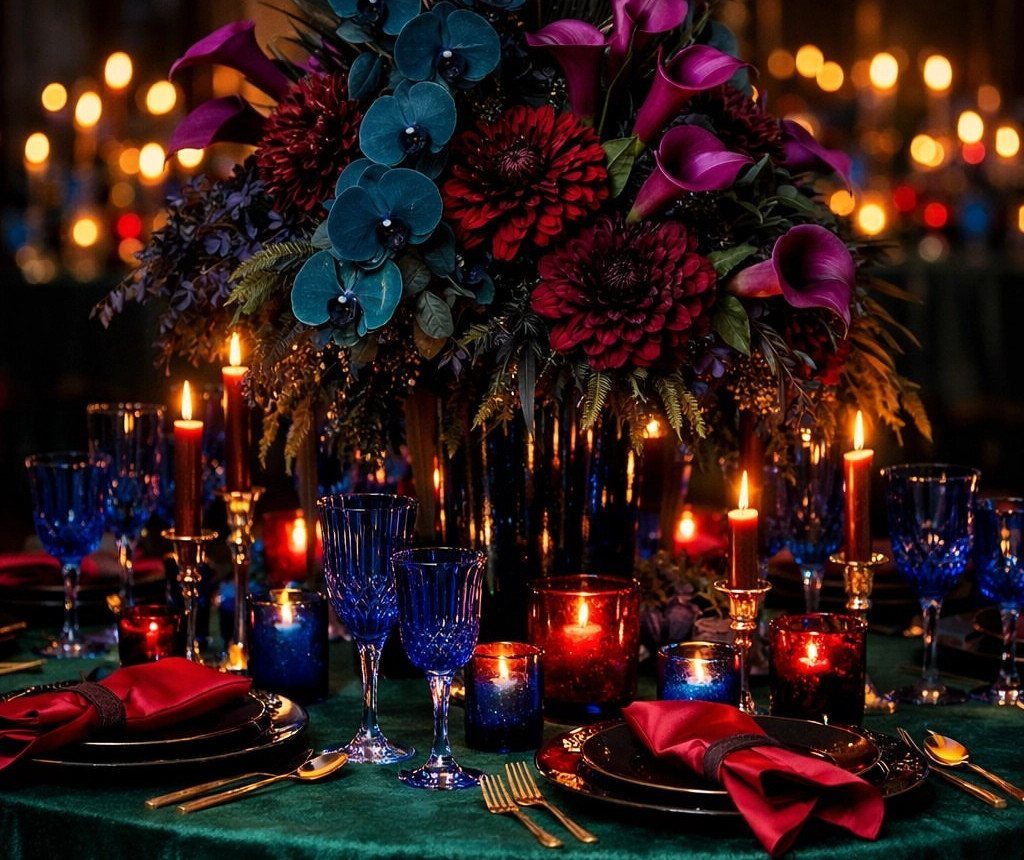
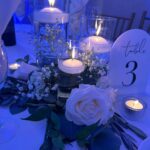
Jewel tones like emerald cloth, sapphire glassware and deep red blooms look best after dark, when candlelight makes the colors glow and the dark shades read as rich instead of heavy.
Many candles at different heights bounce light off the glass and make the colors glow.
Rent the linens and glassware rather than buying them, since jewel-toned pieces get pricey fast.
Keep one color per layer: green on the table, blue in the glass, red in the florals and napkins. That keeps rich shades from looking busy.
5. Light Blue Bridesmaid Dresses
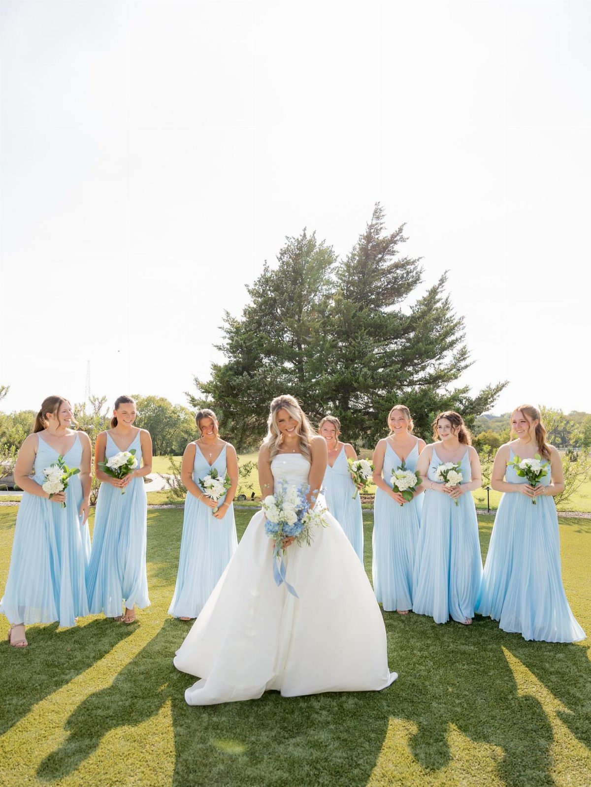
Light blue suits a summer lawn, and a group of bridesmaids in it looks calm next to a white gown. Against grass and a big shade tree, the pale shade reads soft and cool.
Pick one blue for everyone, since pale shades show mismatches more than dark ones do. I would keep the bouquets white or very pale green so the dresses stay the only blue.
6. Golden Orchard
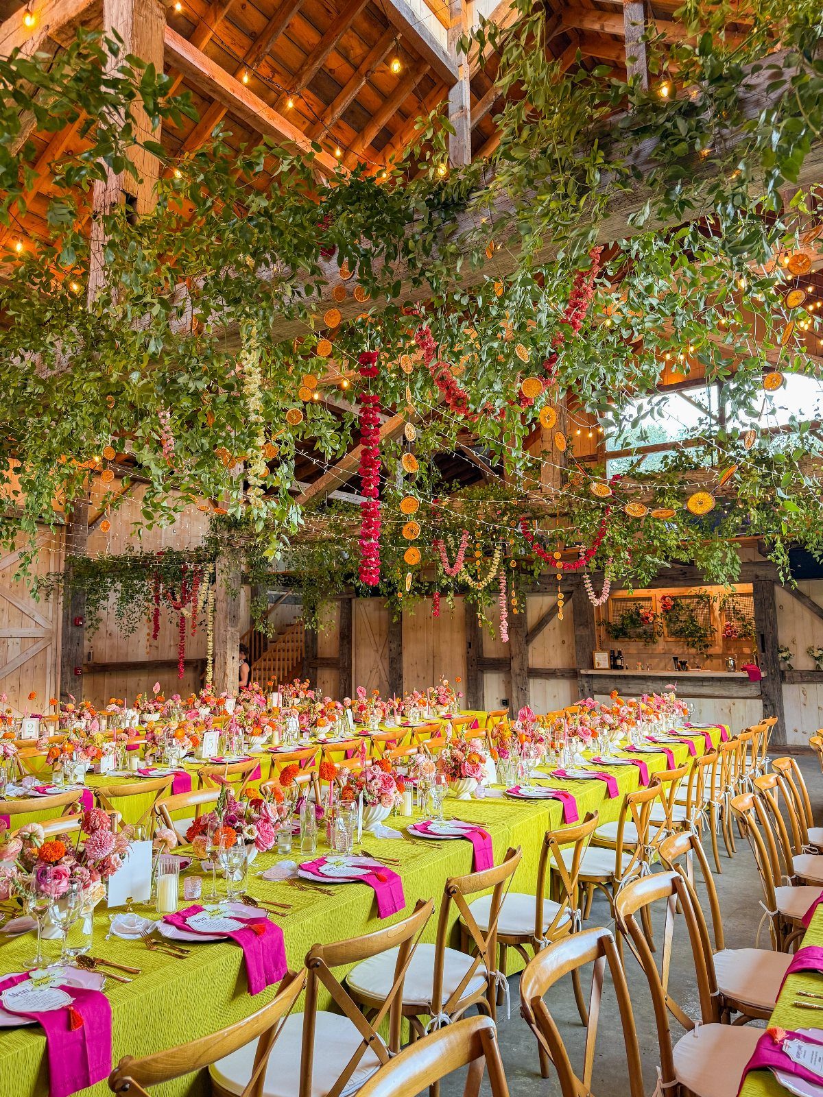
Warm peach, soft pink, honey gold and copper beech make up the Golden Orchard palette, and it belongs to autumn.
Golden Orchard suits a tent or a vineyard or estate venue, because the warm, earthy tones need open space and a lot of greenery around them to feel generous.
Copper beech works well as foliage, and honey gold can come in through candles or flatware.
7. Eucalyptus Stone
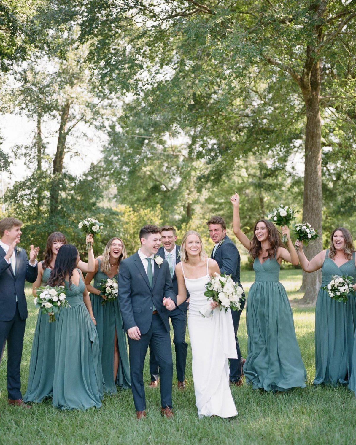
Eucalyptus green dresses against an ivory gown give you a palette with almost no contrast to manage. The green is soft and gray-leaning, so it sits quietly beside the bride instead of competing with her.
Dark suits on the groomsmen anchor the group, and I like that choice. Carry the green into the bouquets with real eucalyptus stems and keep everything else ivory, so the dresses are the only strong color.
8. Moss Green Flower Arrangements
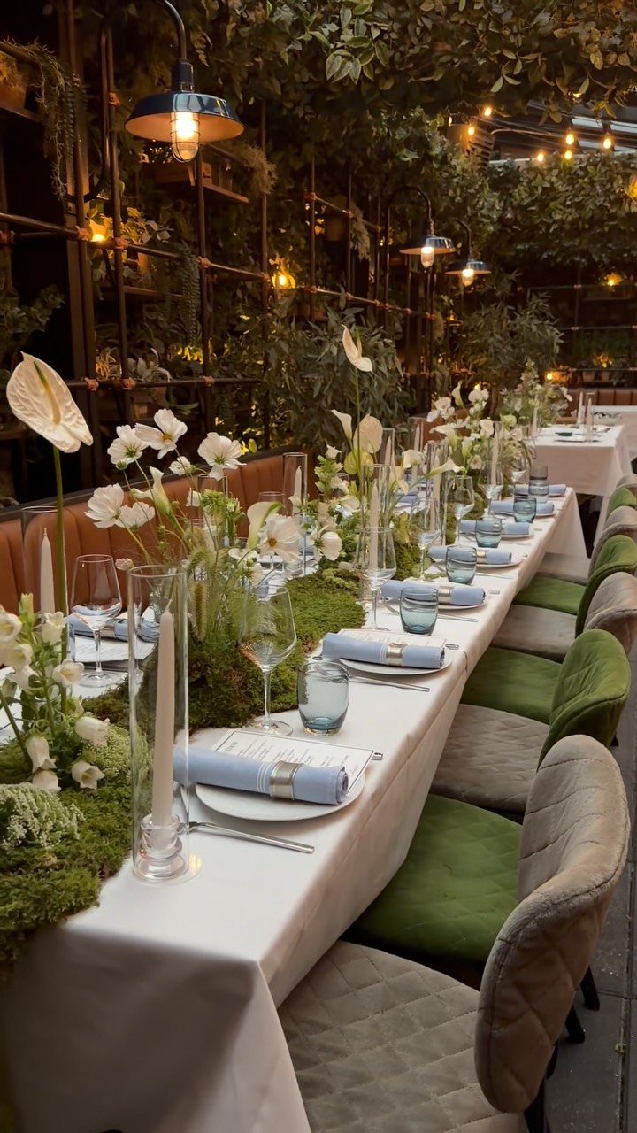
Moss green centerpieces ground a long table in a way brighter greens cannot. Set them among white flowers and the deep, muted green makes the white look cleaner.
Light blue napkins are a small, cheap addition that keeps the table from reading as only green and white.
I would keep the linens white and let the arrangements carry the color, since napkins are the easiest piece to swap if you change your mind.
9. Mismatched Bridesmaid Dresses in Complementary Colors
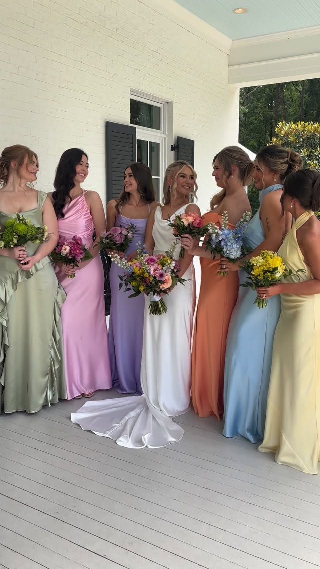
Pastel dresses in different colors work when the shades share the same softness. Pale pink, blush and soft lavender sit well together because none of them is louder than the others.
Choose the palette first, then let each bridesmaid pick her own dress within it.
Keep the bouquets in one consistent mix so the group still reads as a set. White flowers are the safest unifier.
10. Monochromatic Palettes
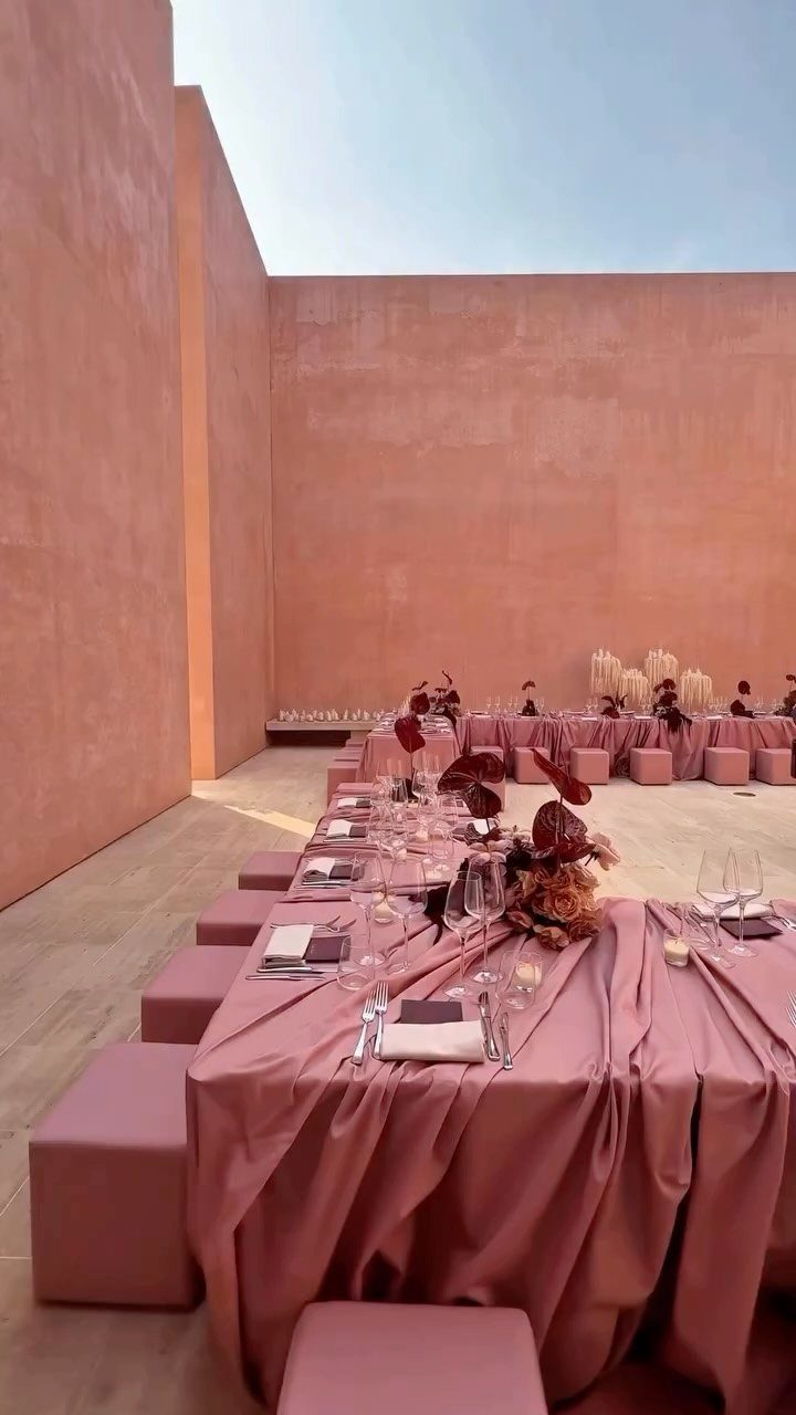
One color at several depths looks more polished than a mix of colors, and a dusty pink table shows it well. Pink linens, pink glassware and pink florals read as one idea because each layer sits at a different tone.
Vary the shade by material: deeper pink in the flowers, softer pink in the linens. Without that variation a single color goes flat, and I would rather see three tones than one.
Choosing Colors Based on Venue
A color reads differently in a room than on a swatch, so test your palette against the actual space before you commit.
Photograph the venue next to your flower and fabric samples, ideally at the hour of your ceremony, and look at the pictures side by side.
If the venue already has strong color, like patterned wallpaper, colored drapery, or bold carpet, your palette has 2 options: match it or contrast with it on purpose. A half-match is the one that looks like a mistake.
Season and setting count too. A garden with lush greenery and warm string lights suits deep greens and creams, and jewel tones like emerald and gold pop after sunset against those lights.
Stand in the actual room at the hour your ceremony will start, since a swatch that looked crisp on a screen can turn muddy under warm bulbs or wash out beside a wall of windows.
Mood Creation with Colors
Mood comes from how bold and how deep your colors are. Saturated, dark shades add drama, and soft, pale ones feel romantic.
Pick the feeling first, then choose colors to match it. A couple who wants an intimate dinner will be happier with deep tones than with pastels, even if pastels were the first thing they pinned.
Lighting changes the result. Candlelight warms everything, and daylight cools it, so a shade that feels cozy at night can feel flat at noon.
If you want both moods, split them by moment: soft colors for the ceremony, richer ones for the reception.
Limit Color Choices
Aim for three to five colors in total, counting neutrals and metallics.
A reliable structure is one main color, one or two supporting shades, one neutral base, and one metallic accent.
Use a 60-30-10 balance to keep one shade in charge.
A split of 60, 30, and 10 percent works well: let the base shade cover most of the room, give the second color a clear supporting role, and keep the accent for small touches like napkins or ribbon.
Before you order anything, write your colors down with their percentages. If a new idea doesn’t fit one of those slots, leave it out.
Frequently Asked Questions
How do I start choosing my wedding colors?
Pick the feeling you want first, then choose colors that match it.
Deep, saturated shades read as dramatic, while pale, soft ones lean romantic. Begin with one color you already love, because a single anchor narrows every choice after it, and hold it up in your actual venue before you commit.
Should my wedding colors match the season?
Not required, though the season deserves a look. If your venue stays green all year in a warm climate, you can ignore the calendar more freely.
How many colors should a wedding have?
Keep the whole palette to 3–5 colors, and count the neutrals and metallics in that total. Split the room 60-30-10 so one shade clearly leads, and drop any new idea that has no slot to fill.
How do I make sure my wedding colors look right at my venue?
Take photos of the space beside your flower and fabric samples at the time of day you’ll say your vows, then compare them next to each other.
Warm bulbs can turn a crisp screen swatch muddy, and big windows can wash it out. When the room already carries a strong color, either echo it exactly or contrast it on purpose; a near-match looks like an accident.
Can bridesmaid dresses be different styles or colors?
They can, as long as the shades share a level of softness or come from one color family.
Settle the palette first, repeat one steady mix in every bouquet, and use white flowers to tie it together, since they are the safest bridge.