The venue decides which of these 12 colors is yours, because you cannot repaint a wall, a lawn or a row of trees: forest green tablecloths disappear under big leafy trees, while fuchsia needs a plain building or white walls to carry an arch.
The list runs from quiet neutrals like beige and white to the loudest shade, fuchsia, and from paper goods in pale purple, which cost the least of anything here, to linens and flowers that cover a whole room.
Pick the one that matches what already surrounds you, then give it a single job.
1. Blush Pink Floral Arrangements
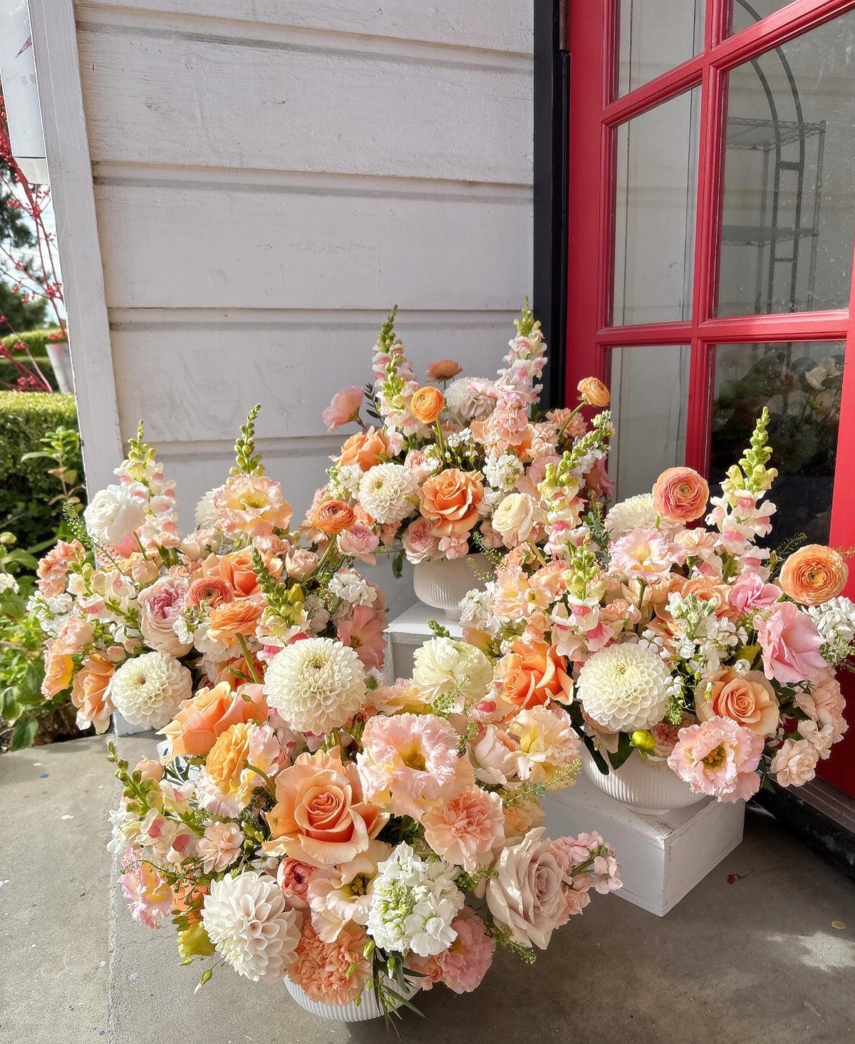
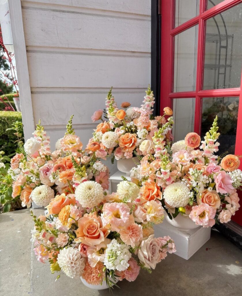
Blush pink does its best work in June when it is mixed with a warmer neighbor.
Peach and white keep pink from reading sugary and give a bouquet or centerpiece some depth, so tuck a few peach blooms into the blush rather than stacking pink on pink.
Buy 3 shades in the same family, not one, so the arrangements look grown instead of matched. White ties them together.
I would put these on the ceremony steps or the welcome table, where pots read better than tall vases.
2. Peach
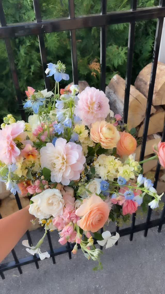
Peach is a cheerful summer shade, and a bouquet is the easiest place to use it. Peach flowers mixed with pink and a touch of blue give you a palette that feels like a garden instead of a theme.
Keep the blue small. A few stems are enough to cool the warmth, and more will pull the whole bouquet away from peach.
Repeat the peach in one other spot, like a boutonniere or a table arrangement, so the color follows through the day.
3. Purple
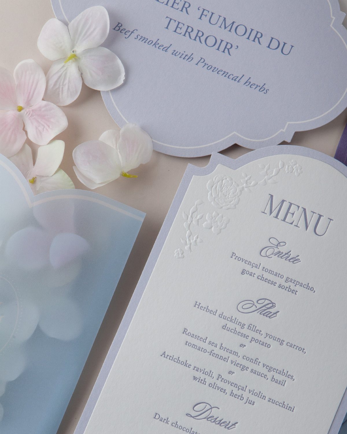
Purple stands for grace and elegance, and paper is a low-risk way to try it.
A menu card with purple accents, finished with pale purple hydrangea petals and tiny white and pink blooms, adds the color without covering a whole room.
Printed goods like menus, programs and signs cost far less than purple flowers or linens, so they stretch a small budget the furthest.
I like pale lavender tones over deep plum for June, since they stay soft in daylight.
4. Beige
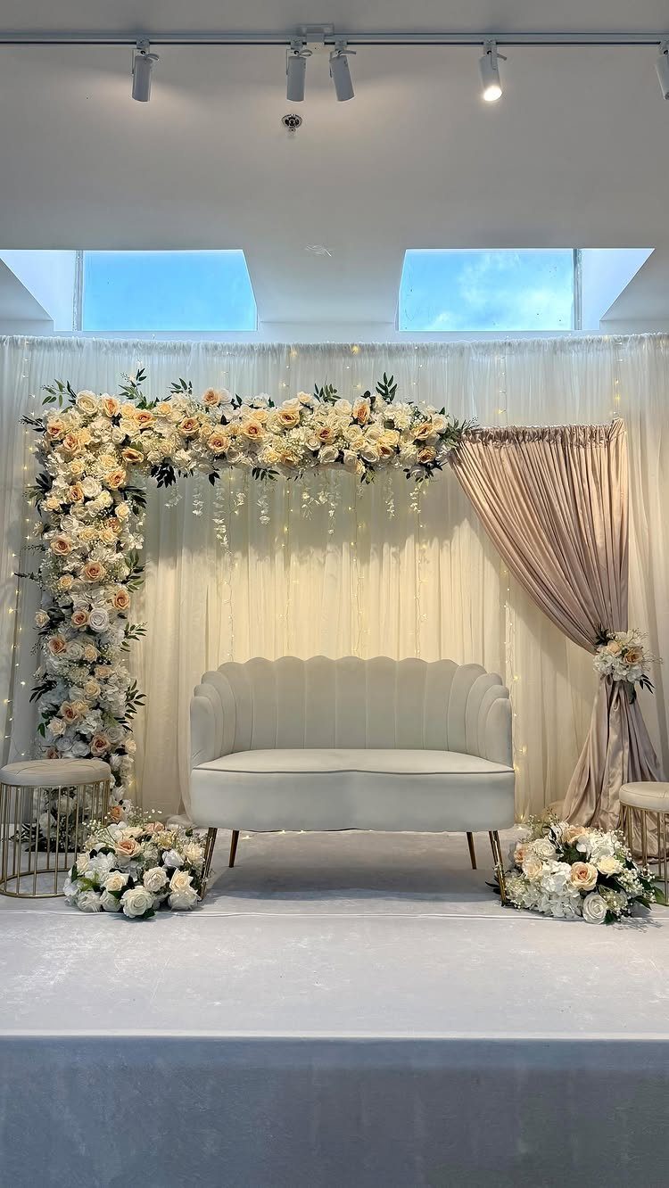
A beige backdrop is quiet on purpose. Cream florals, draped beige fabric and curtains in near-matching tones let a single piece of furniture, like a white scalloped sofa, carry the shape of the scene.
Neutrals can look flat, so vary the texture: fabric folds, full blooms and a hard-edged piece against soft drapery.
Choose this if you want the couple to stand out against the setting. It is understated by design, and I would not add more color to it.
5. Navy Blue Suits
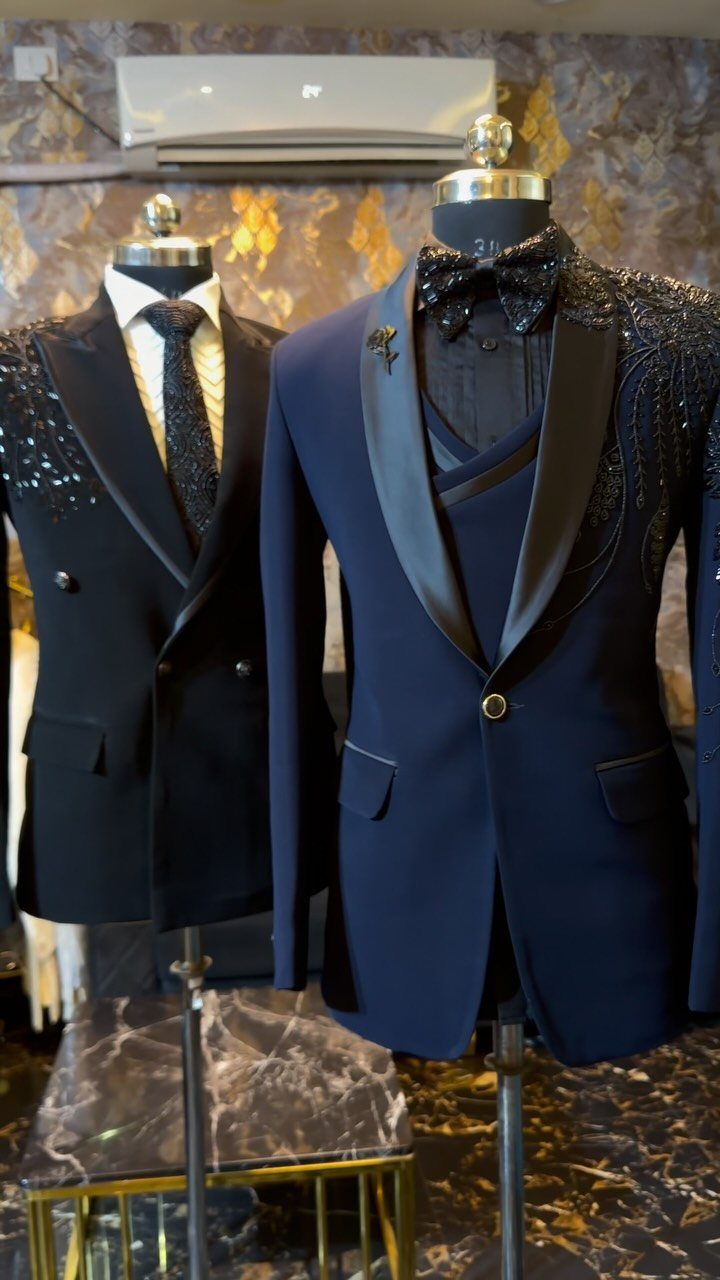
Navy suits give a June wedding a deep anchor against all the pastels. Satin lapels and a bow tie, as on this formal jacket, push navy toward black-tie without the starkness of a black tuxedo.
Pair it with blush, peach or sage accessories so the group sits inside the palette.
Ornate beadwork is lovely but a bigger commitment. A plain satin-lapel jacket is the safer choice if you want the groomsmen to match easily.
6. Sage Green
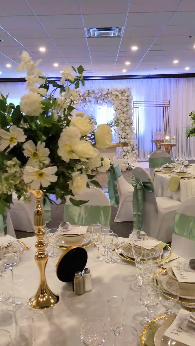
Sage is a soft, grayed green that echoes leaves and stems, so it sits easily in a hall without fighting the room.
Sashes cost little and come off without leaving a gap, so the room still looks finished once they are gone.
I would pick sage over a brighter green for a room with a floral arch, since it lets the flowers stay the focus.
7. Champagne Linens
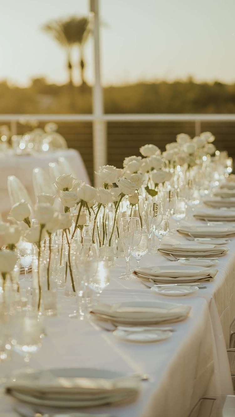
Champagne reads as a warm cream with a faint glow, which makes it kinder than stark white on banquet tables at sunset.
White roses and white plates stay crisp against it, so the linen carries the color while the flowers stay clean.
Order a swatch first and look at it outdoors in late light. Champagne can lean pink or gold depending on the fabric.
I would pick it over bright white if the dinner runs into evening.
8. Forest Green
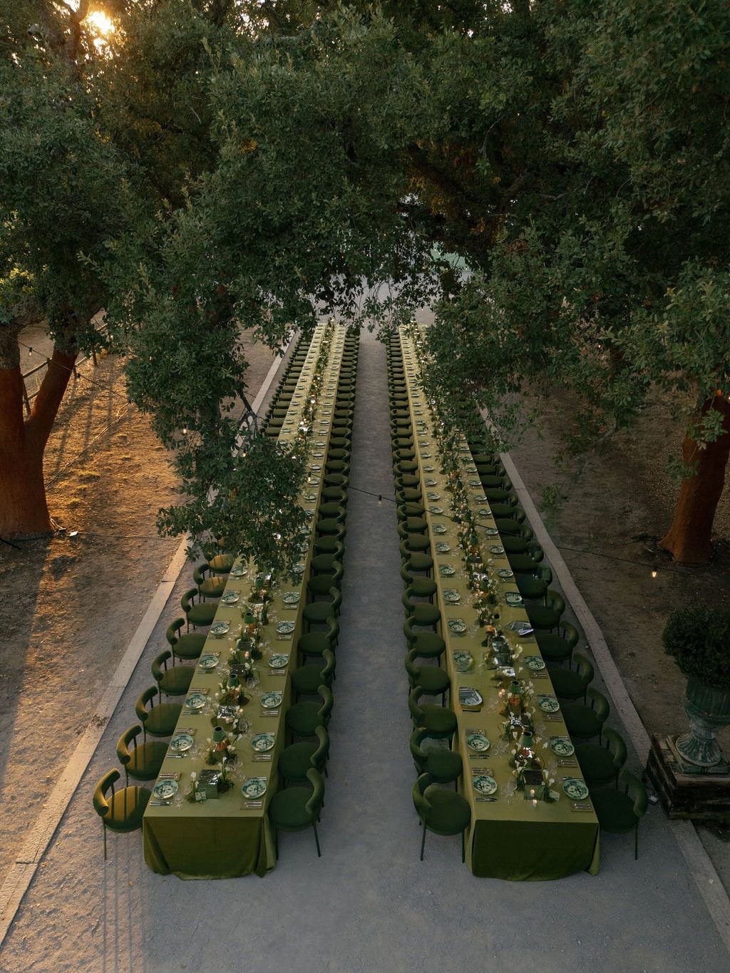
Forest green tablecloths disappear under big leafy trees, so the table seems to grow out of the setting. Matching green chairs push that further, so the whole setup looks grown from the site rather than placed on it.
Dark linens show every crease and speck of dust, so steam them close to setup time.
I like this best for a June dinner outdoors, where the trees supply half the decor.
9. Gold Decor
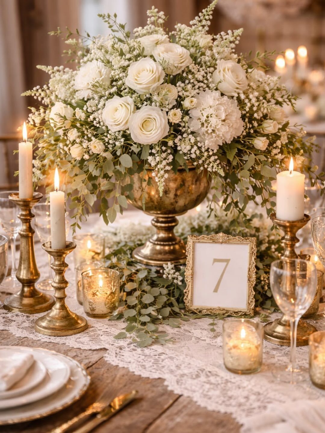
Gold works best in small, repeated pieces.
Buy the metal in one finish so the pieces match. Mixed golds, some brassy and some pale, look accidental side by side.
White flowers keep the gold from feeling heavy.
10. Fuchsia
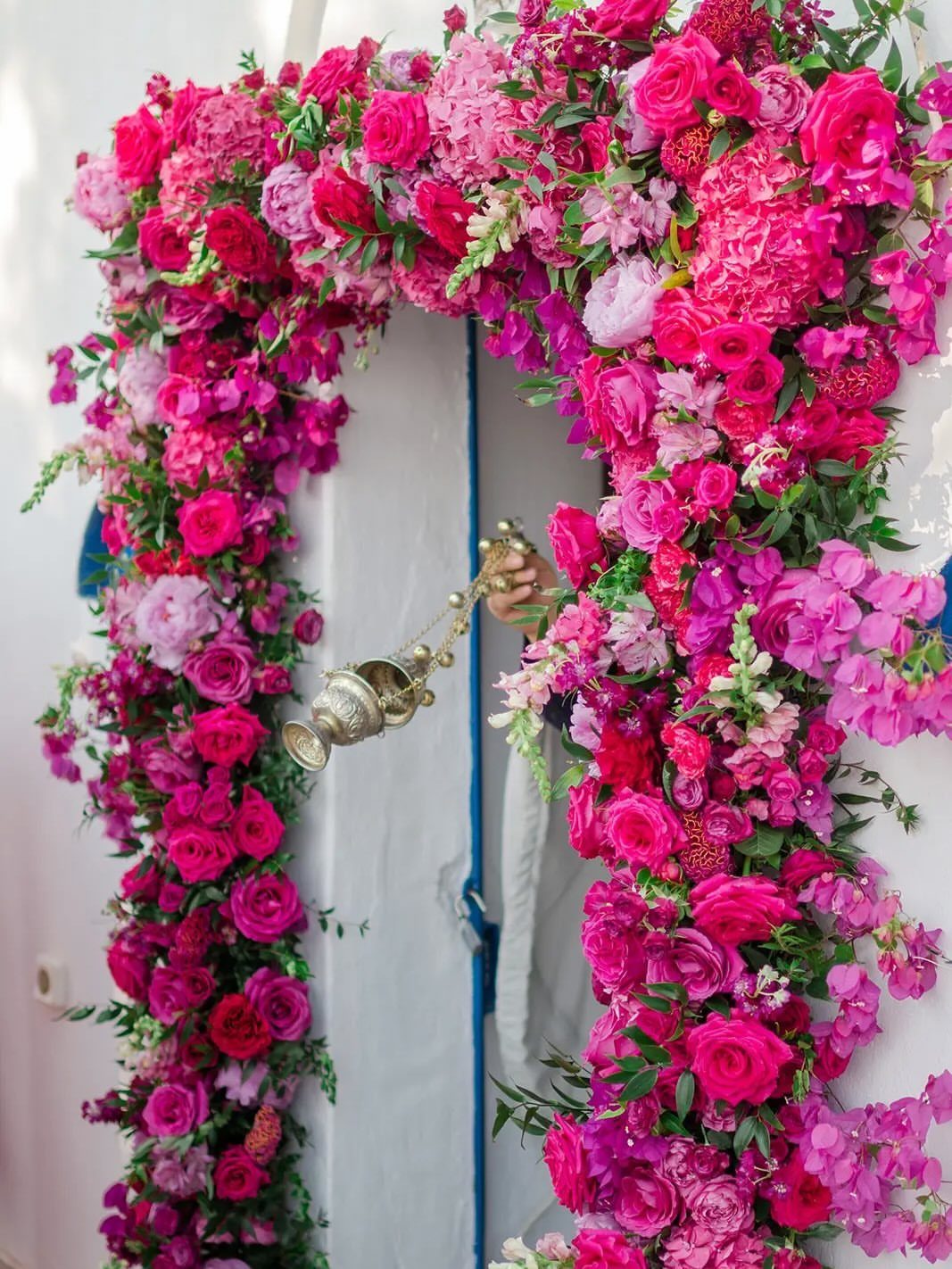
Fuchsia is the loudest shade on this list, and an arch is the right place to put it. Packed fuchsia and pink blooms with green foliage frame a doorway so the color is the first thing guests see.
Put it in one big spot and keep everything else quiet. White walls or a plain building let it carry the scene.
If a whole room of fuchsia feels like too much, I would use only the arch.
11. Terracotta
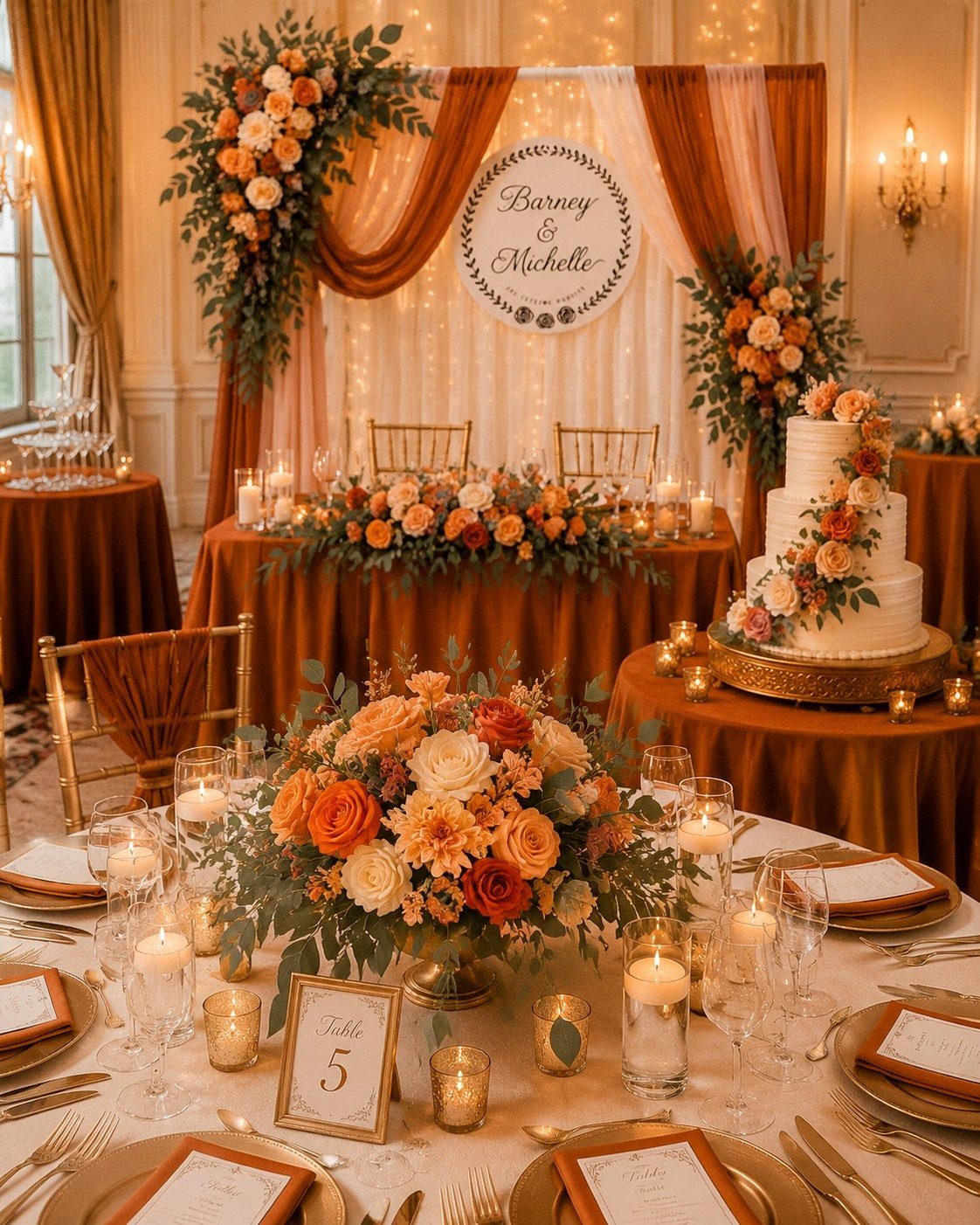
Terracotta brings an earthy warmth that suits an indoor room with soft lighting. Terracotta linens with orange florals and a little gold stay in one warm family, so nothing clashes.
Gold accents lift the clay tone and keep it from looking muddy. A white or cream cake gives the eye a place to rest.
Check linen samples under the venue’s own lights, because warm bulbs push terracotta redder.
12. White
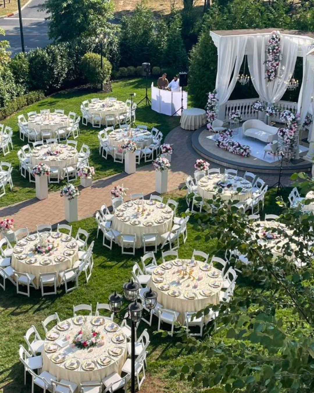
White is the classic June choice, and on a lawn it needs texture more than extra color. White chairs, cream tables and a draped gazebo layer slightly different whites, which keeps the scene from looking flat.
Mixing warm cream with bright white is fine if you keep the shades deliberate and repeat them. Grass and trees supply the green, so you do not have to add it.
I would choose white for a daytime lawn reception where the setting does the talking.
Choosing a Color Palette
Start with the venue, not a swatch. A palette should sit well against the walls, floors, lawn or water behind it, so the venue decides what disappears into the background and what needs to stand out.
A beachfront ceremony looks best in sea glass blues and sandy neutrals, a garden party in leafy greens and soft florals, and a farm wedding in deeper greens that echo the fields.
Match the setting’s own colors and the room does half the work for you.
Then check the palette against your theme. If the two pull in different directions, the venue wins, because you cannot repaint it.
Lock in your colors first, then place any orders for flowers, linens or stationery. It sets the linens, the bouquet and centerpiece flowers, and the paper goods, so changing it late means redoing all three.
Selecting the colors for your summer wedding palette is an incredibly important part of the wedding planning process. It can define the linens for the tablescape, the florals in your bouquet and centerpieces, and the details in your paper goods.
— Vogue
Incorporating Colors
Give each color one job: one gets the starring spot, like the bouquets or the tablecloths, while the others stay in the background.
A single color can show up in the flowers, the linens and the paper goods, and that repetition is what makes the day look planned.
Flowers in season are easier to source, and growers can mix tones within a color, like a soft blush beside a warm peach.
Layer shades inside one family rather than matching everything exactly. A palette that is rich and layered looks more personal than one flat color repeated.
Color also lingers in the photos, so choose with your keepsake pictures in mind.
Seasonal Inspiration
Let the flowers blooming near your date set the palette, then build the rest around them. Nature’s lush hues are the safest starting point because they already agree with each other.
Look at the surroundings too. Water, trees, fields and gardens each suggest their own tones, and a palette that echoes them feels at home there.
Your own taste still leads. Seasonal color is a guide, not a rule, but a palette that reflects the time of year is rarely a bad call.
Ask your florist what is at its best on your date before you fall for a specific bloom.
Frequently Asked Questions
What colors are off limits for wedding guests?
Guests should skip white and ivory, plus any shade that matches the bridal party. Those colors compete with the bride or blend guests into the wedding group, which is why most guests avoid them.
What are some June wedding colors?
Blush, peach, sage green, champagne, and navy are easy picks for June.
Blush works best when warmed with peach and white so it doesn’t read sugary. Sage and champagne stay soft in daylight and at sunset, and navy suits give all those pastels a deep anchor.