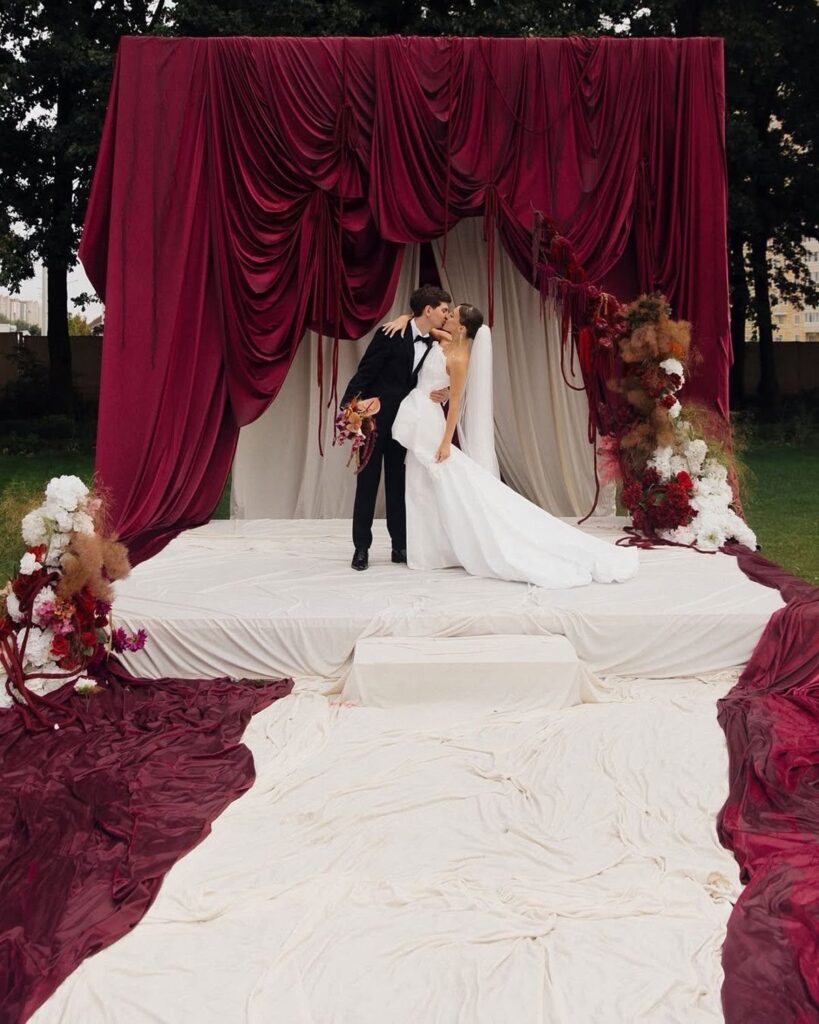
Maroon can mean a few flakes of gold leaf on one cake or floor-length velvet drapery behind the ceremony, so the cost spread is wide.
Your venue’s light decides this one: maroon with navy or black works only in a bright room or with plenty of candles, while blush, champagne, sage or ivory keep a darker room from feeling heavy.
On a small budget, put the burgundy in one place, like the dahlias in the bouquet, and let greenery and plain linens carry the rest.
1. Gold Accents in Burgundy Decor
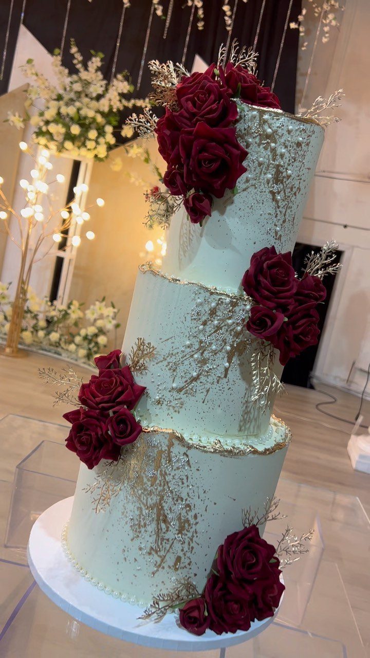
Gold leaf on a white cake lets burgundy roses carry the color while the metallic stays a whisper. Keep the gold to a few flakes near the roses so it catches light without competing with them.
For a modest budget, this is a smart place to spend. One cake takes the palette, and the rest of the room can stay simpler.
Matching a touch of gold elsewhere, such as candle holders or flatware, ties the cake back to the tables.
2. Burgundy and Blush Floral Arrangements
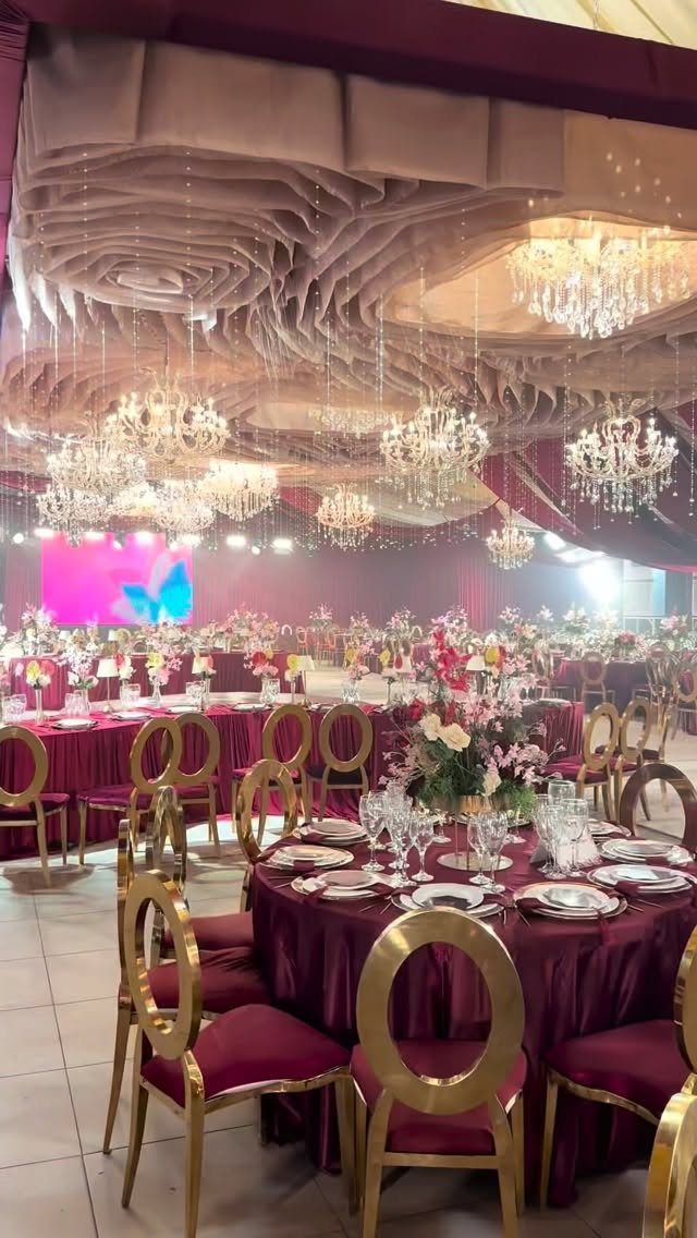
Blush softens burgundy, and I like it best in centerpieces where the dark blooms sit low and the pale ones rise around them. That keeps the arrangement from looking heavy.
Maroon tablecloths already supply a lot of color, so let the flowers do the lightening. Gold chairs and crystal chandeliers suit this pairing, though a simpler room works too.
To keep costs down, ask a florist to repeat one mixed shape across every table rather than vary each one.
3. Burgundy and Navy
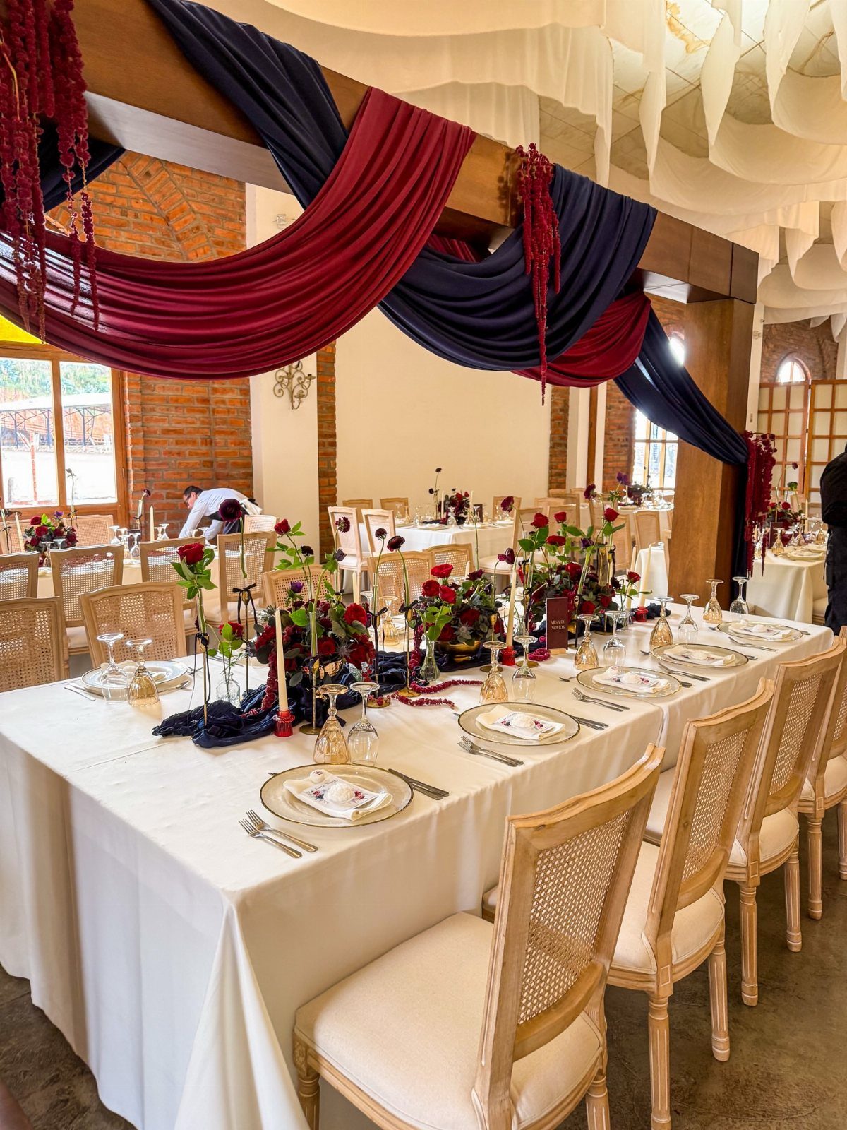
Navy darkens burgundy rather than competing with it, which is why this pair feels formal without much effort. Both are deep colors, so white linens are the relief that keeps a long table from going gloomy.
Choose daylight or plenty of candles; 2 dark colors need light to read as separate.
4. Maroon and Gold, Ivory, Dark Green
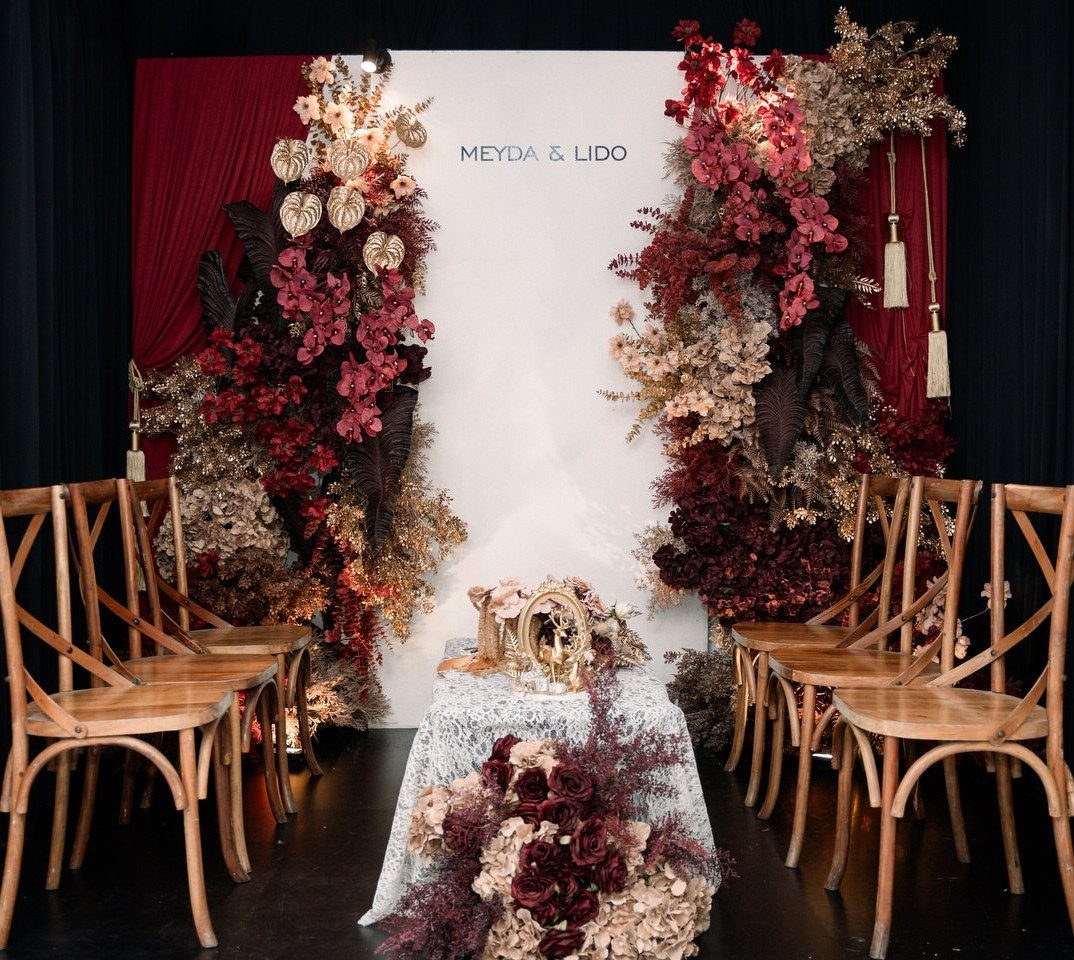
Maroon, gold, ivory and dark green is a traditional mix, and each color has a job. Ivory is the ground, maroon is the main flower color, gold adds warmth, and dark green supplies foliage that makes everything look fuller.
Plain wooden chairs keep a ceremony from feeling stiff, and they cost far less to rent than gilded or upholstered ones.
I would let the greenery do the heavy lifting, since it costs less than extra blooms and fills a backdrop well.
5. Burgundy and Champagne
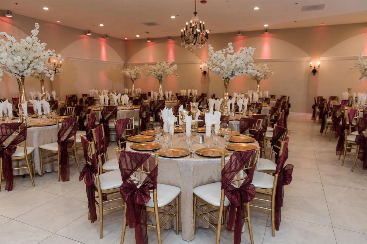
Champagne linens are the quiet partner here, warmer than white and gentler against burgundy. Chair sashes or bows in maroon bring the dark color up to eye level without paying for more flowers.
White centerpieces keep the tables light, so the burgundy shows only where you place it. Gold chairs suit the mix well; if you rent plain ones, the sashes still do most of the work.
6. Burgundy and Grey
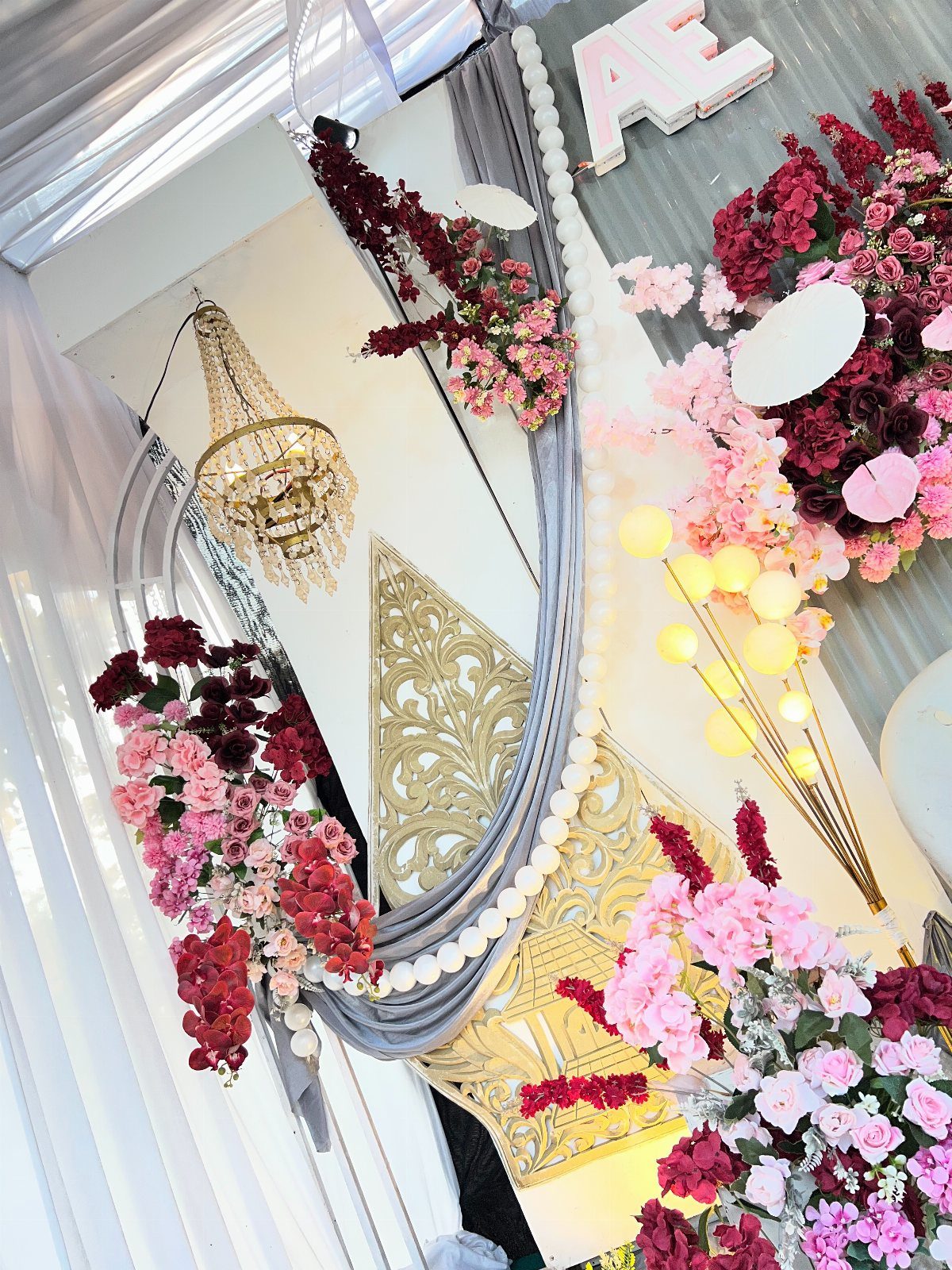
Grey fabric makes burgundy look cooler and more modern than the usual gold-and-cream pairing. Soft pink and white flowers between the maroon blooms keep the grey from going flat.
Grey draping sets the tone for this palette, and a chandelier or gold accent panel adds glamour on top of it.
If you want the look on a budget, start with the fabric and a handful of burgundy flowers, then add metallic touches only where they show.
7. Burgundy and Ivory Table Settings
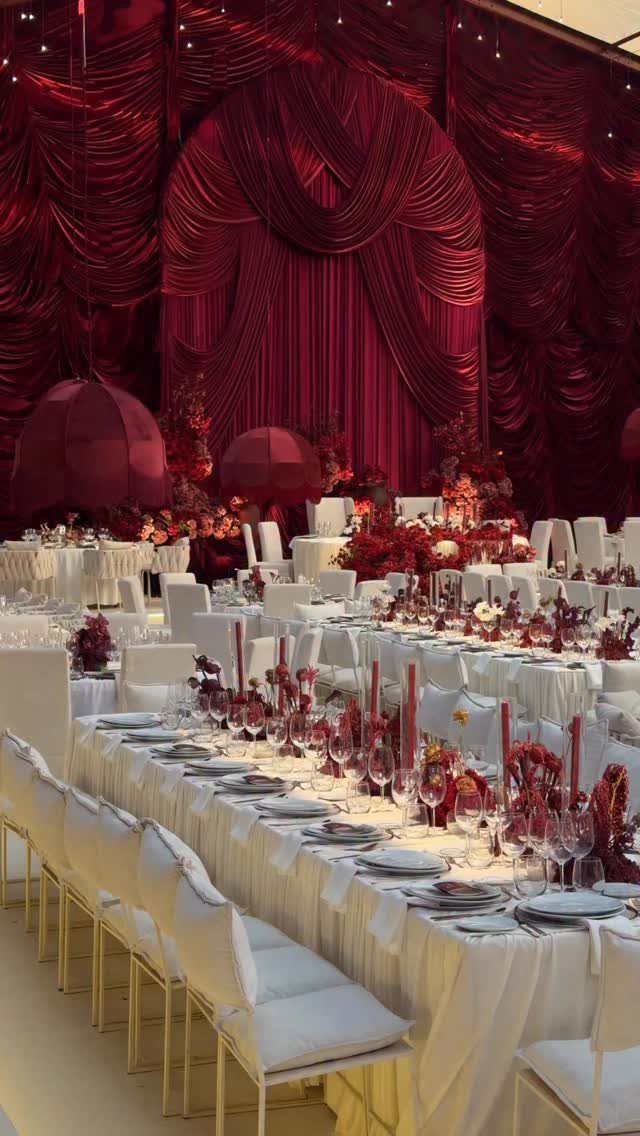
Ivory cloths do the heavy lifting on a burgundy table, because they let a small amount of dark color read clearly. Burgundy florals and draped fabric behind the tables carry the palette, so the place settings can stay plain.
Plain plates and clear glassware keep the table quiet, so the centerpieces are the only place deep burgundy shows up.
If money is short, spend it on either the drape or the flowers, since paying for both is where a small budget runs out.
8. Burgundy and Sage
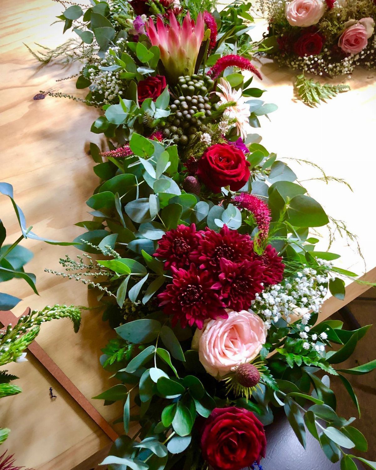
Sage-green eucalyptus gives burgundy roses and dahlias a loose, garden-picked look that formal pairings lack. A low, long arrangement down the middle of a wooden table suits it well.
Pink protea between the dark blooms keeps the mix from turning muddy. Greenery costs less than extra blooms, so I would let the eucalyptus fill most of the length and save the burgundy flowers for focal points.
9. Burgundy and Peach
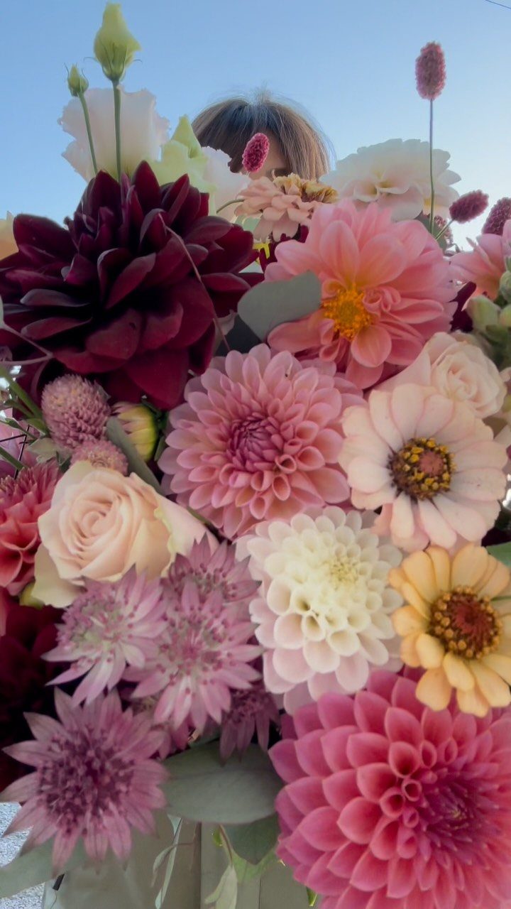
Peach warms burgundy in a way blush never quite does, and dahlias are the flower I would build it around. Cream roses between the dark and peach blooms give the eye a place to rest.
Burgundy, peach and cream work best as one mix, so request that blend from the florist and repeat it in the bouquets and the table pieces until the palette reads as a single idea.
Zinnias add a casual, sun-warmed note to the peach side.
10. Burgundy and Black
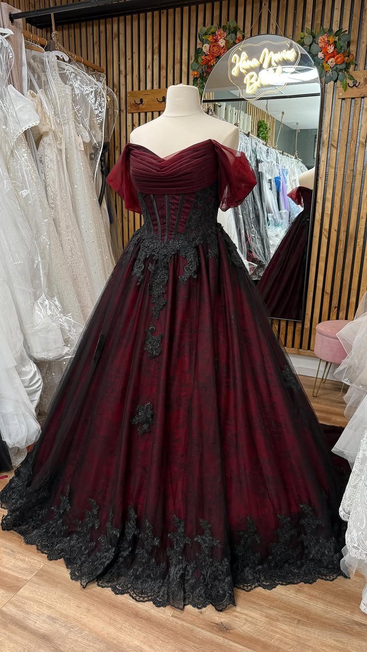
Black lace over a burgundy gown is the most dramatic way to use this pair, and it works as an outfit before it works as a color scheme. A ballgown skirt gives the dark color real presence.
Use the pairing in small doses elsewhere: black napkins, black menu cards, a few burgundy blooms. 2 dark colors need light, so choose a bright venue or plenty of candles.
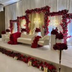
11. Maroon Velvet Drapery Backdrop
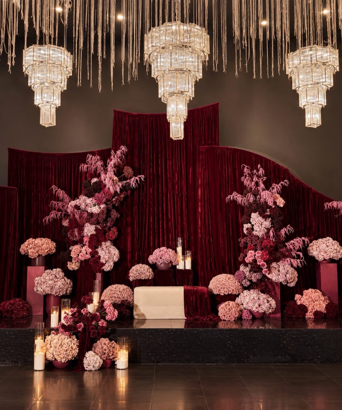
Maroon velvet drapery turns a plain wall into a stage, and it photographs with a richness that flowers alone rarely give. Hang it full and floor-length so the folds stay deep.
Pink and burgundy floral installations at the sides soften the heavy fabric, while crystal chandeliers overhead add sparkle against the dark color.
It is a splurge, so I would use it behind the ceremony or sweetheart table only, rather than around the whole room.
12. Maroon Bridesmaid Dresses
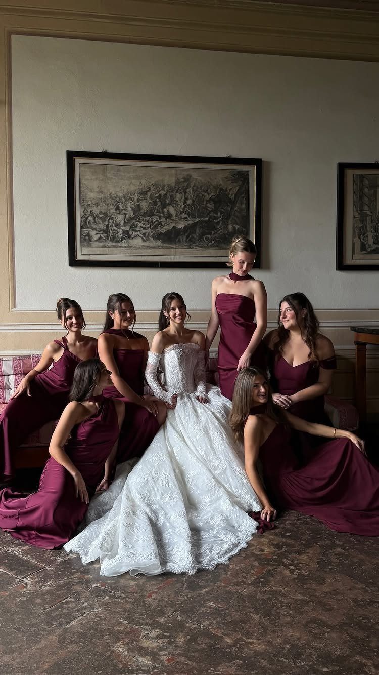
Floor-length maroon dresses make a bridal party look unified against a white lace gown, and the dark color keeps the bride as the lightest figure in every photo.
Ask everyone to match the shade and length, then let each bridesmaid pick her own neckline if she wants. That keeps the group cohesive and makes the dress something people may wear again.
13. Maroon Bridal Bouquets
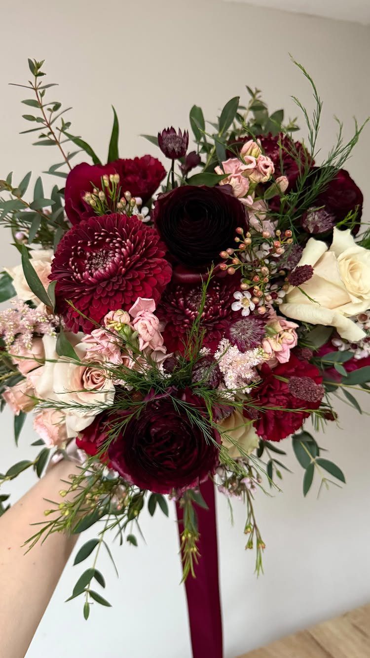
Dahlias do the work in a maroon bouquet: their full, layered heads give the dark color real weight, and white roses and pale pink blooms keep it from reading as one heavy mass.
Green eucalyptus leaves around the edge add the relief.
A long maroon ribbon in the same shade as the flowers finishes the stems cleanly. Ask the florist to match the ribbon to the dahlias, since a near miss shows up in close-up photos.
Keep the bouquet’s mix of dark, pale and green the same in the table flowers, and the palette will read as one idea.
14. Maroon and Blue Floral Arrangements
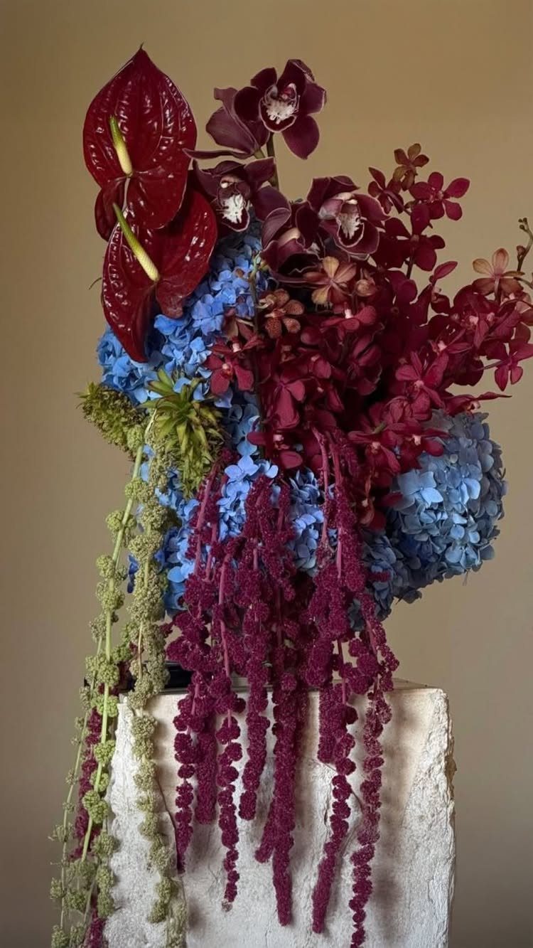
Blue hydrangeas against maroon anthuriums is a bolder pairing than most people expect, and it works because both colors are deep enough to hold their own.
Hanging amaranthus gives the arrangement a trailing line, so it spills down the sides instead of sitting in a tight dome.
A white stone pedestal gives the dark flowers a pale base to stand out against.
I would use one on a welcome table or beside the ceremony rather than on every guest table, since orchids and anthuriums are a costlier choice than greenery.
Choosing the Right Season
Burgundy reads coziest in fall and winter, when the deep red suits cooler weather and a festive mood. That is where it needs the least help.
Spring and summer weddings can still use it. Lighten the mix with blush or cream, and let it show up in smaller amounts so the room feels fresh rather than heavy.
For a summer date, add champagne and plenty of greenery to the palette. Lightweight fabric such as chiffon in burgundy also helps, since the airy drape keeps the color from feeling like a winter coat.
Accessorizing with Burgundy
Small accessories carry a palette across a wedding party without much cost. Gold or silver metallic jewelry works with burgundy; pick one metal and repeat it so the look stays tidy.
Groomsmen do not need full burgundy suits. A burgundy tie or pocket square on a navy suit ties them to bridesmaids in burgundy dresses, and the contrast gives an evening wedding some drama.
For a winter wedding, a burgundy velvet blazer on the groom is a modern choice that sets him apart from the rest of the party.
Matching across a large wedding party is what makes the day look planned rather than assembled, so settle the shade early and check that every tie and pocket square matches the dresses.
Frequently Asked Questions
What color goes with burgundy for a wedding?
Gold, blush, navy, ivory, champagne, sage green and dark green all work, and ivory is the easiest base.
Pale colors like ivory or blush give the deep red room to show, while gold and navy add formality. Grey, peach and black also pair with it, though black and navy both need daylight or plenty of candles.
What colors complement maroon well?
The classic pairing is ivory, gold and deep green: ivory covers the tables and linens, maroon takes the lead in the flowers, gold adds a warm glint, and leafy green makes the arrangements look bigger.
Pink and white blooms soften it, and blue hydrangeas against maroon anthuriums make a bolder pairing. Keep the maroon in the focal points and let paler colors carry the rest.
What is the most beautiful color for a wedding?
Beauty is subjective, but burgundy is a frequent favorite because it looks rich and elegant.
Warm-weather dates call for a lighter hand, so I’d stir in blush, cream or champagne and lean on extra greenery to keep maroon from feeling heavy.