These palettes run from icy blue to velvet red and black, and the cost depends mostly on one choice: whether the color lives in fabric, candles and runners or in a large floral installation.
1. Icy Blue Winter Wedding Theme
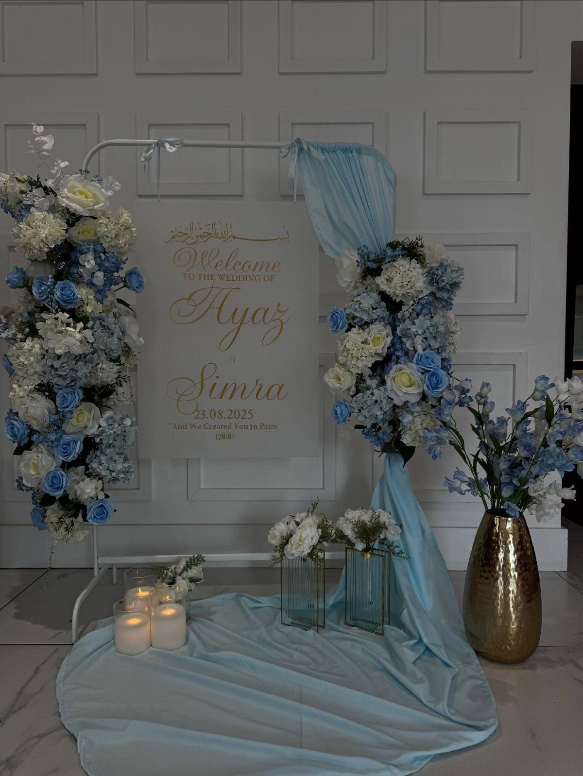
Light blue and white flowers, flowing blue fabric and candles against a white wall give February its own palette: frost, not snow.
Keep the blue pale and let white do most of the work, so the room reads as ice and not as a swimming pool.
Fabric is the cheap move here. Draping it around a welcome sign or an arch adds more color per dollar than extra stems, and candles supply the warmth the blue lacks.
2. Pink February Wedding Color
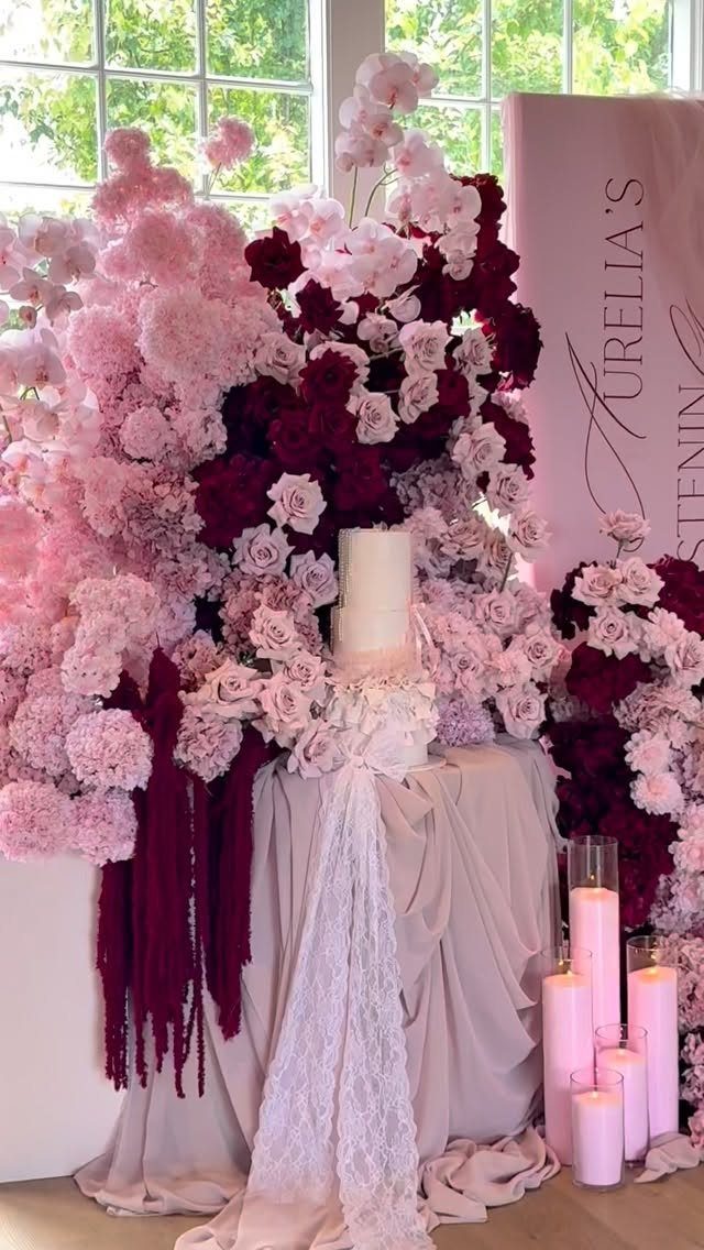
Pink and burgundy together keep a pink wedding from turning sugary. The deeper tone grounds the soft one, and a white cake sits between them without competing.
My preference is to put burgundy in the florals and keep pink for the candles and backdrop, so the darker shade reads as the accent.
Pillar candles in pink are an easy, low-cost way to carry the color down the table.
Pick one pink and stay with it; mixing several makes the room feel scattered.
3. Burgundy & Forest Green
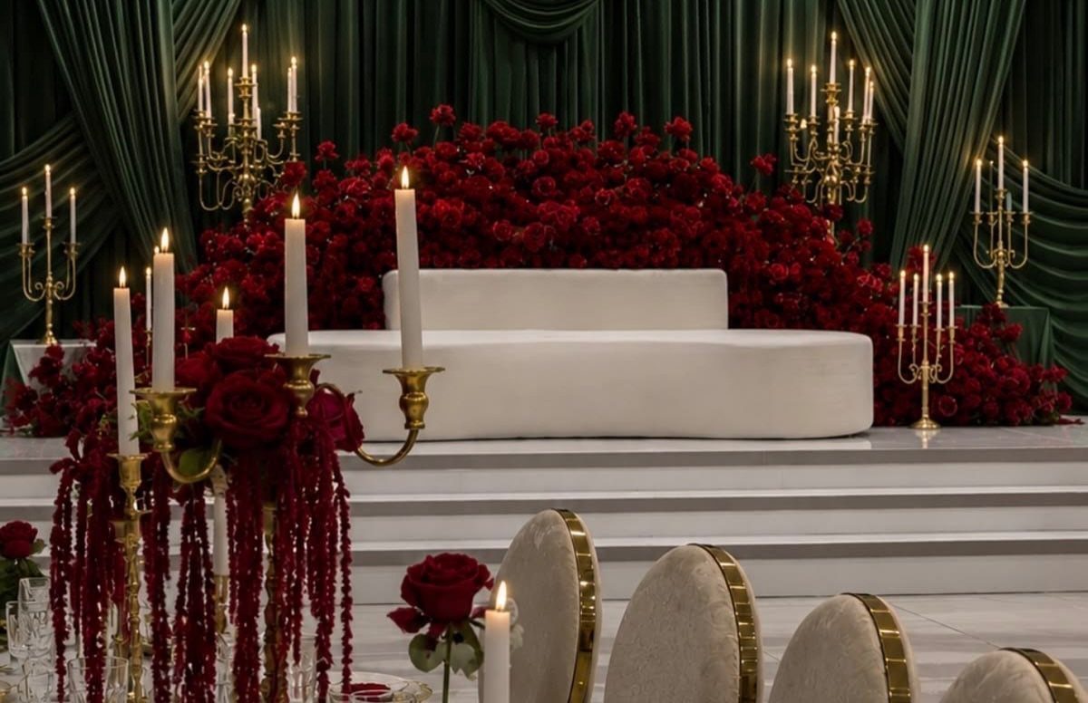
Red roses against dark green velvet read as Christmas only if you let them, so keep the reds deep and the greens close to black.
Add gold candelabras and white candles, and the same 2 colors read as formal and rich, which is why I like this pairing for an indoor February venue.
Use a deeper, wine-leaning red, not a bright one, and keep the green dark. White furniture gives the eye a place to rest between 2 heavy colors.
Skip red ribbon and green garland; that is where the holiday look creeps back in.
4. Champagne February Wedding Color
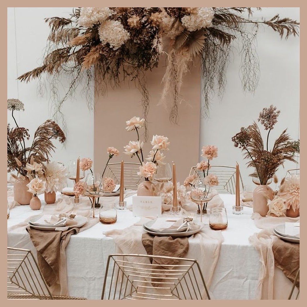
Champagne is the palette for a couple who wants warmth without a statement color. Linens in that shade, neutral florals and gold accents sit well together because everything shares the same soft undertone.
The risk is flatness. Vary texture instead of color: a large overhead floral installation gives height, and gold wire chairs add shine.
Check linen swatches in the room’s actual light before ordering, since champagne can drift toward gray or pink.
5. Purple February Wedding Color
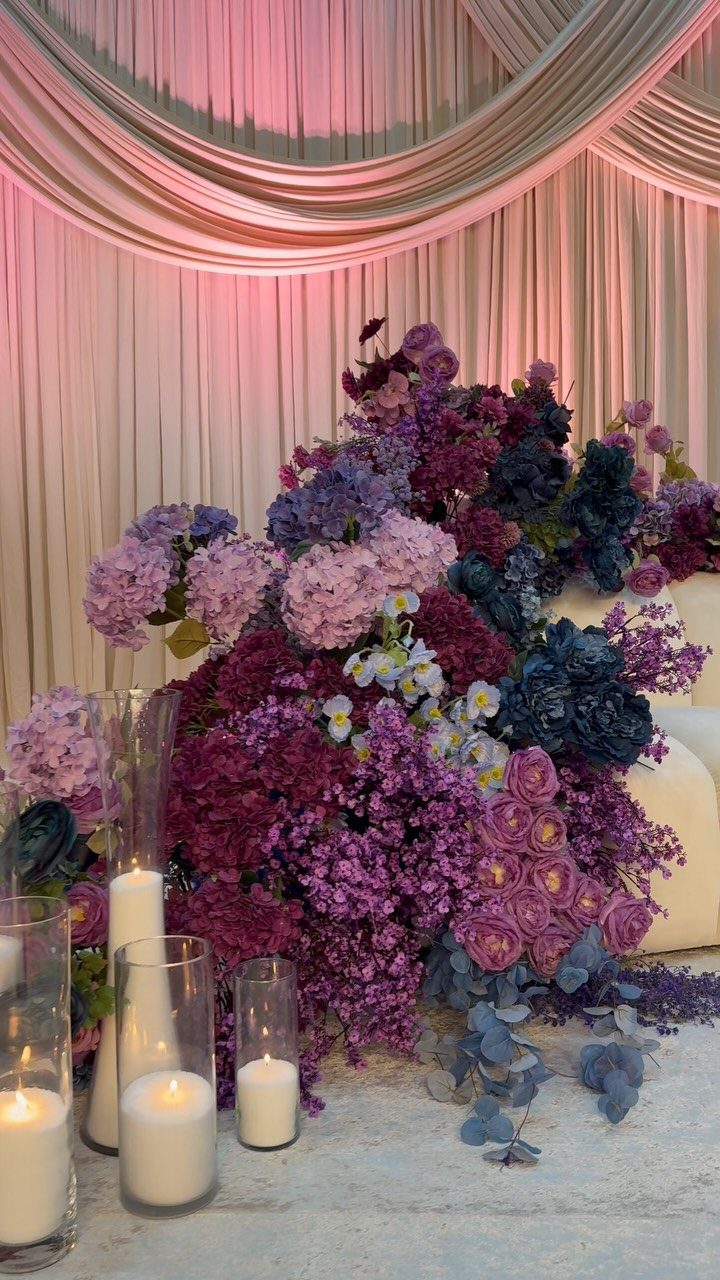
Purple mixed with blue gives a florist more range than purple alone: lilac, violet and deeper blue stems can share one arrangement and still look planned. Regal is the right word for it.
Pair the arrangement with plain white candles in glass cylinders and a draped cream backdrop, so the purple is the only loud color in the room. I would keep everything else quiet.
Choose one dominant purple, then use the blues in a supporting role.
6. Caramel, Rust, and Sepia
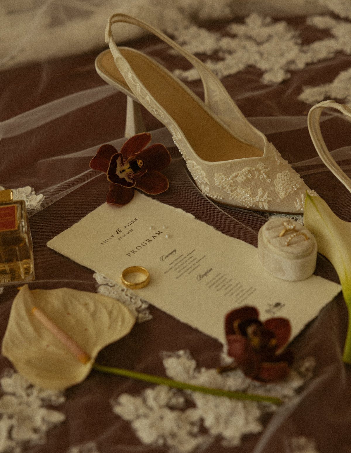
Caramel, rust and sepia suit a couple who wants February to feel warm, not wintry.
Rust, caramel, and sepia layer well because they sit close together on the color wheel, so a dark red-rust orchid on brown fabric looks rich instead of clashing.
Start with a brown base, then add rust through flowers and a gold accent through rings or hardware. Add white shoes, white paper, or printed programs for crisp contrast so the brown does not turn muddy.
Keep to 3 shades at most.
7. Emerald & Champagne
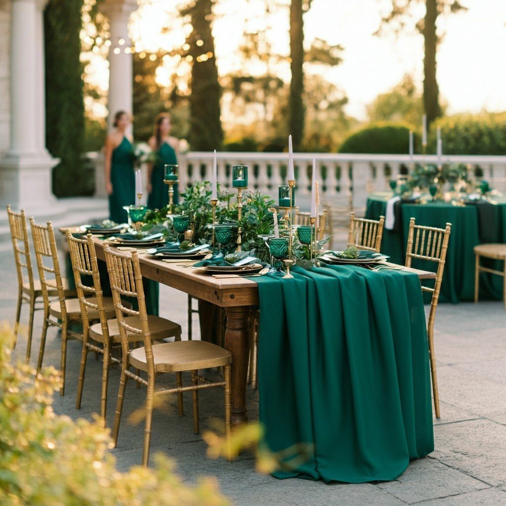
Emerald with champagne lands between winter depth and spring brightness, which suits a February date that can’t decide what season it is. The green carries the weight, and the champagne chairs and glassware keep it from going heavy.
Let emerald live on the linens and champagne on the seating, then add greenery so the table feels planted, not staged. Gold-toned chairs pick up the champagne without a second color.
Order a linen swatch first; emerald shifts a lot between daylight and sunset.
8. Grey & Greenery
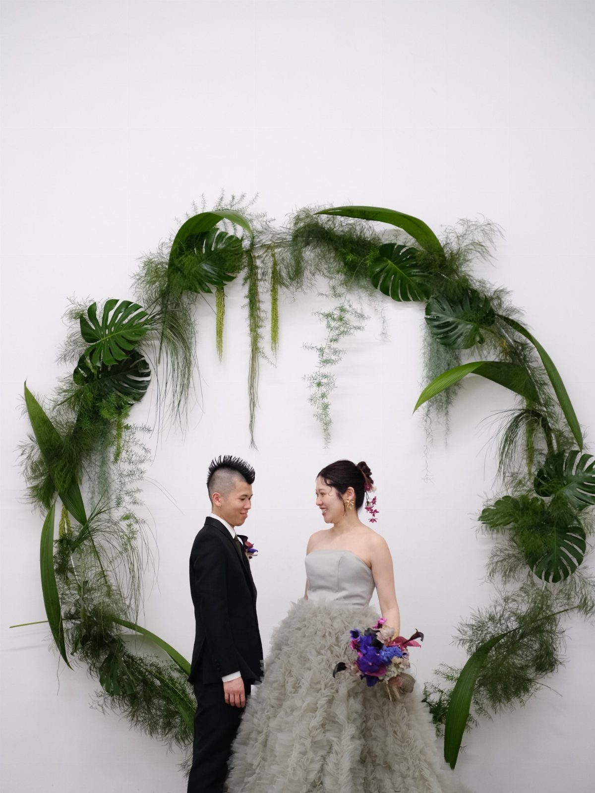
A large circular greenery installation against a white wall does the job of a flower arch for less drama and, usually, less money. Greenery fills space cheaply, and it gives a grey gown a color to sit against.
I would keep the dress grey and the backdrop green, nothing else competing. The white wall matters: it lets the circle read as a clean shape.
Choose one leaf type or two at most, so the ring looks designed and not overgrown.
9. Velvet Red & Black

A red velvet tuxedo jacket with a black bow tie and black trousers is the easiest way to put this palette on one person. Velvet has a soft sheen that catches candlelight, and it feels warm in a cold month.
Keep everything below the jacket black so the red is the only statement. I like it best when the florals stay small and quiet, since the jacket already shines.
If the groom wears it, let the wedding party wear plain black.
10. Jewel Tones
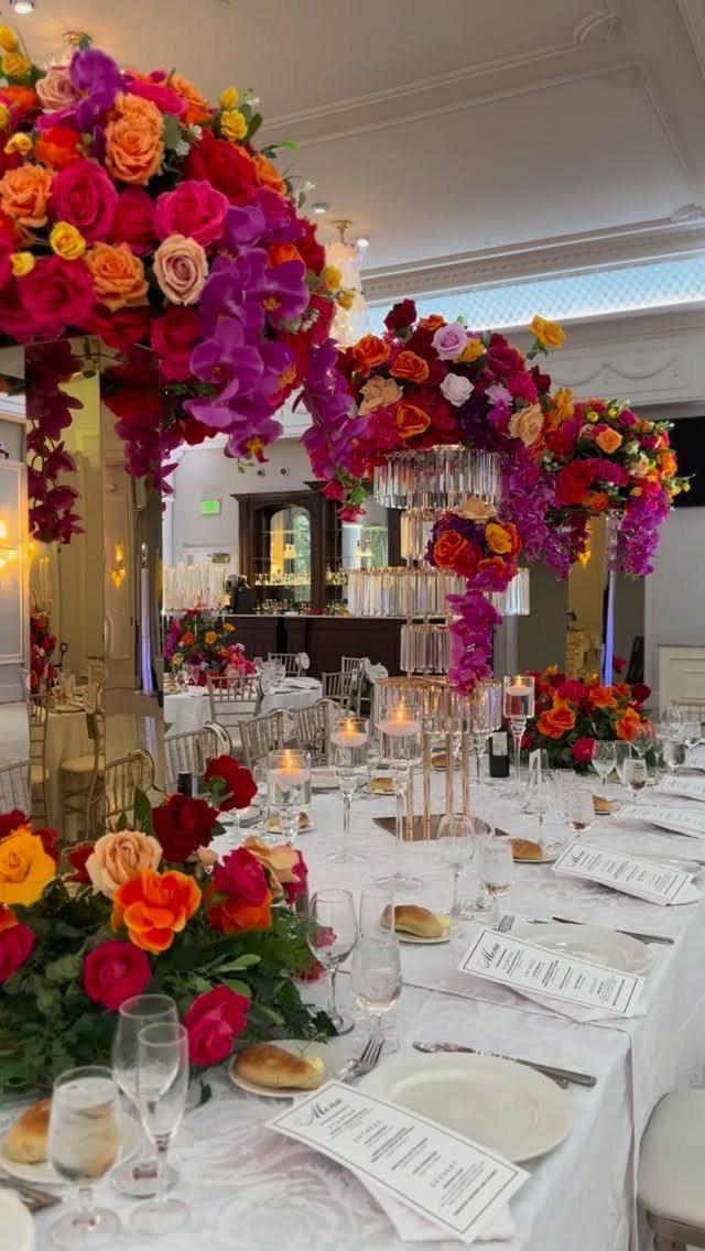
Magenta, orange and purple in tall centerpieces make a winter room feel lit from within. Jewel colors work best over white linens, which give the eye somewhere to rest between the saturated flowers, candles and glassware.
Put the color in the florals and keep plates and cloth plain. Tall arrangements carry that color down the length of a banquet setup without crowding the place settings.
Limit yourself to 3 shades, as in the arrangements here. A fourth color turns bold into busy, and bold is the point.
11. Red February Wedding Color
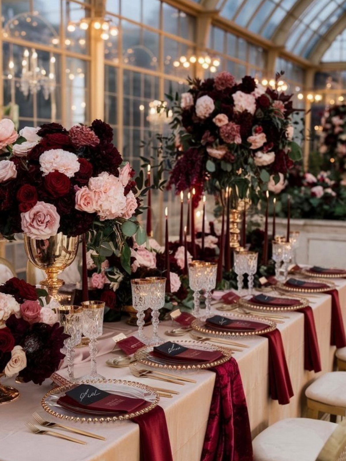
Deep red and pale pink flowers, red velvet runners and gold plates make red feel classic, not loud. The pale pink loosens the red, and the gold keeps it formal.
A runner is the budget move: one strip of velvet down the table brings in the color without red linens for every seat. Burgundy roses in large, full arrangements carry the red palette without needing much else.
Keep the reds deep and let gold stay in the tableware only.
Choosing a Color Palette
Start with the month, not the Pinterest board.
Then check the palette against 2 things: what you actually like, and the style of the day. A formal ballroom and a casual barn can carry the same colors very differently.
Pair rich winter tones like burgundy or emerald with crisp white, cream or gray, and the whole look lands as clean and modern. Lighter shades work well too if the setting is snowy and pale.
Settle on two colors and one neutral, then set real samples of them side by side in the room’s lighting before you place any orders.
Combining Colors
Bold color needs a quiet partner. Pair it with a neutral or a metallic, and the saturated shade looks intentional instead of loud.
Navy gets passed over for winter weddings more than it should, and it deserves a spot on the shortlist. Bronze beside it gives a softer glow than the usual gold and keeps the palette cozy and refined.
Rich jewel tones and velvety blooms, with pops of burgundy or ruby, also hold up well in a cold month. Let the bold shade take the flowers and keep the metallic in small doses, such as candleholders or flatware.
I would hold one metallic to a single finish so the table does not compete with itself.
Winter Wedding Themes
Winter does not have to mean cold and colorless. You can lean into the chill with frosty pastels, or push against it with deep, romantic shades.
Pure white is the classic route, especially with a snowy backdrop. Add ivory, alabaster or pale blush flowers, then bring in warm textures and fabrics so the room feels lush instead of sterile.
Holiday tones are optional. Skip them unless you want them.
If you go icy, add one warm material, such as wood or soft wool, so guests do not feel the cold indoors.
Frequently Asked Questions
What is a good color for February?
Deep red, burgundy, pink, purple and icy blue all suit February, and emerald with champagne works too.
I lean toward burgundy with forest green for an indoor venue: keep the reds wine-leaning and the greens near black, and the pair reads as formal instead of holiday.
For a lighter room, pale blue with lots of white gives a frosty look.
What is the in-color for weddings in 2026?
I can’t name a single color of the year, but the palettes that hold up best in a cold month are rich jewel tones, burgundy, emerald and navy.
Pair them with a neutral or one metallic, such as bronze, which gives a softer glow than gold. Pick two colors and one neutral, then hold off on ordering flowers, linens or candles until those three are locked.
Is a February wedding a good idea?
Yes, February works well, especially indoors. A winter date gives you 2 good directions: icy, washed-out pastels, or saturated shades like burgundy and emerald that suit the dark afternoon light.
Warmth comes from texture, so I would add candles, velvet runners, wood tables and a few wool throws on the chair backs to keep the room cozy.