Dusty blue runs from a single touch, like napkins on sage tablecloths or a white two-tier cake with blue and grey flowers, to a full palette carried through suits, capes, invitations and aisle.
Your second color decides most of the rest: sage, dusty rose and burgundy each pull the blue a different way, and the season you marry in tells you whether to lean on crisp white and silver-grey or on softer, warmer tones.
Because dusty blue holds a grey undertone, the partner you choose matters more than the blue itself.
1. Dusty Blue Wedding Cake
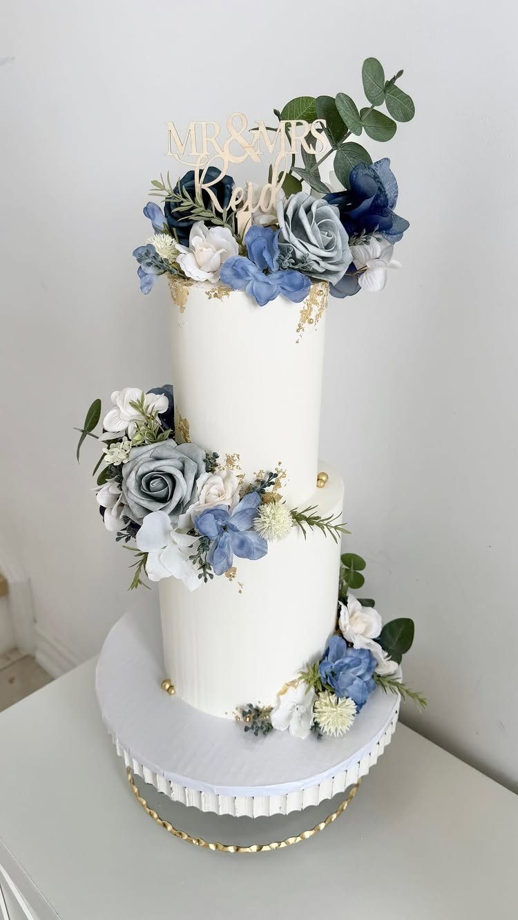
A white two-tier cake with dusty blue and grey flowers carries the palette with very little effort. The flowers do the color work, so the frosting stays plain white and the cake never competes with the rest of the room.
Gold leaf brushed along the tier edges and a simple gold topper tie a dusty blue cake to any gold in your decor, like flatware or candle holders, and 2–3 touches is plenty.
Ask your baker to match the flower tones to your bouquet so the cake looks like part of the same order.
2. Dusty Blue Floral Arrangements
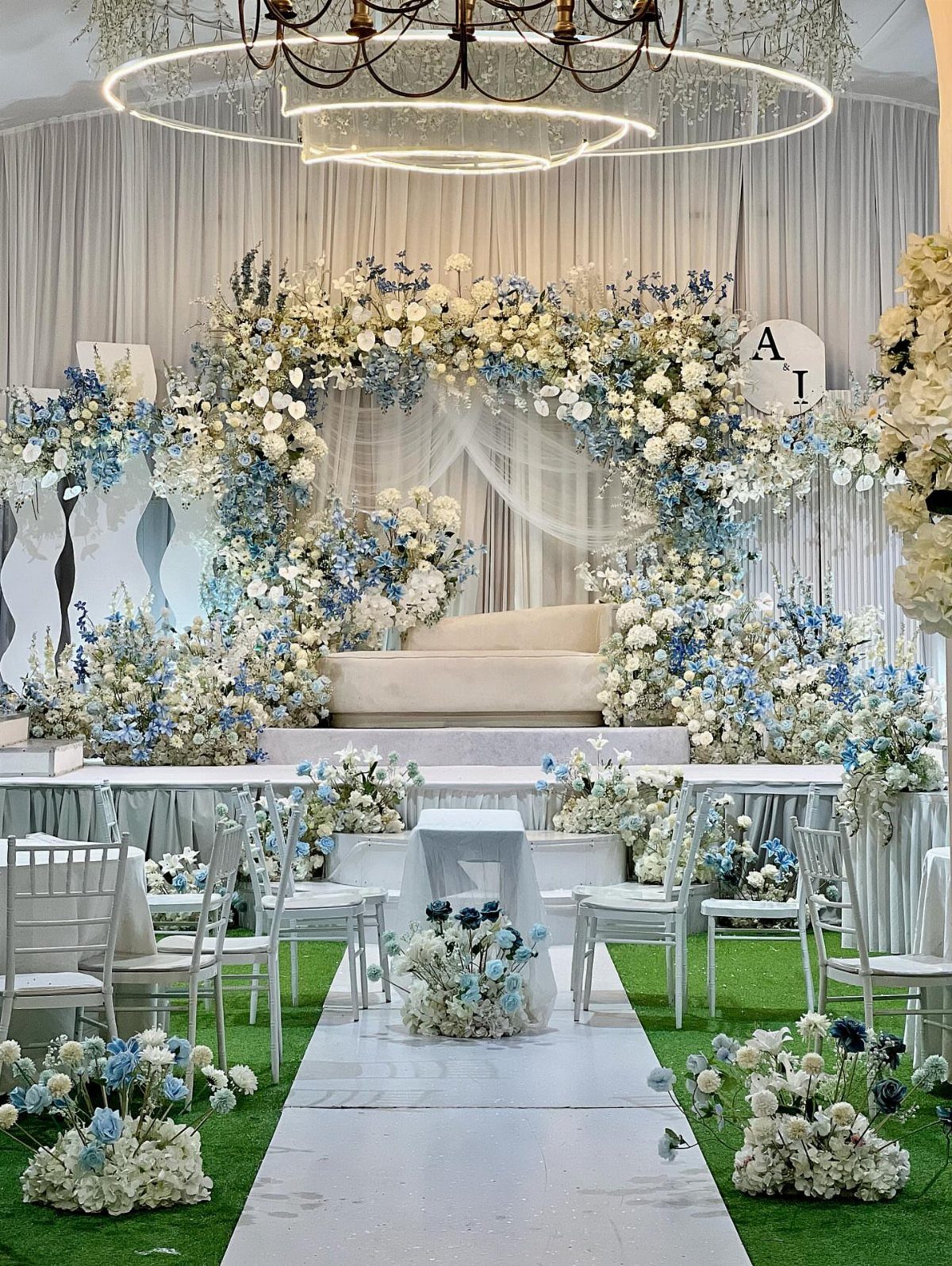
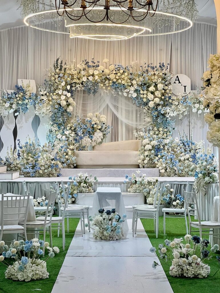
Dusty blue florals look best when they share space with white, and a ceremony arch is where that mix has the most room to work.
White chairs and a white aisle runner keep the eye on the flowers, so the blue reads soft instead of heavy.
Ask your florist about less common blooms in the blue range, since a few unusual stems keep a mostly white arch from looking generic. Choose one bold arch over several small arrangements.
3. Dusty Blue and Sage Green Wedding
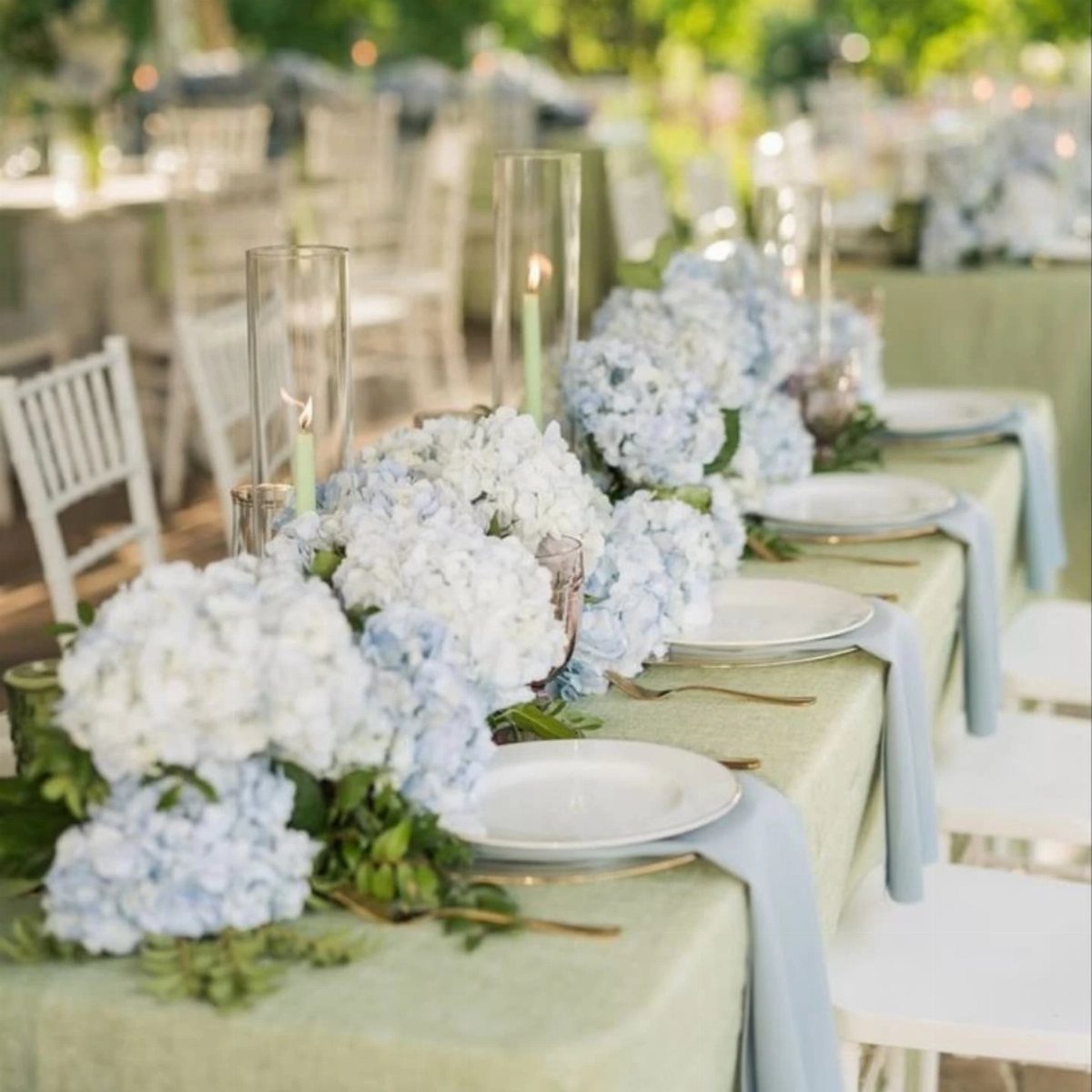
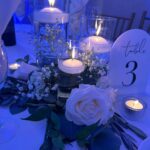
Sage tablecloths with dusty blue napkins is a pairing I’d pick over almost any other muted palette. Both colors sit low in saturation, so neither fights the other, and the napkins give you a cheap way to add the blue.
Put the stronger blue in the flowers: light blue and white hydrangeas down the center of the table work well.
Tall glass cylinder candles add height to a dusty blue and sage table without bringing in a third color, and clear glass keeps both shades in front.
4. Dusty Blue and Dusty Rose Wedding
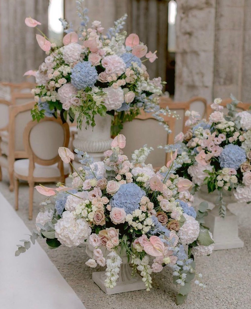
Blue and pink usually leans sweet, but when both colors are dusty, the pairing turns calm and a little formal. Hydrangeas for the blue and roses for the rose give you two full, soft shapes that blend easily.
White urns keep the arrangements clean and let the 2 colors share the stage. Keep the pink and blue about equal in quantity, because if one dominates, the pairing starts to look like a single color with an accent.
5. Dusty Blue and Burgundy Wedding
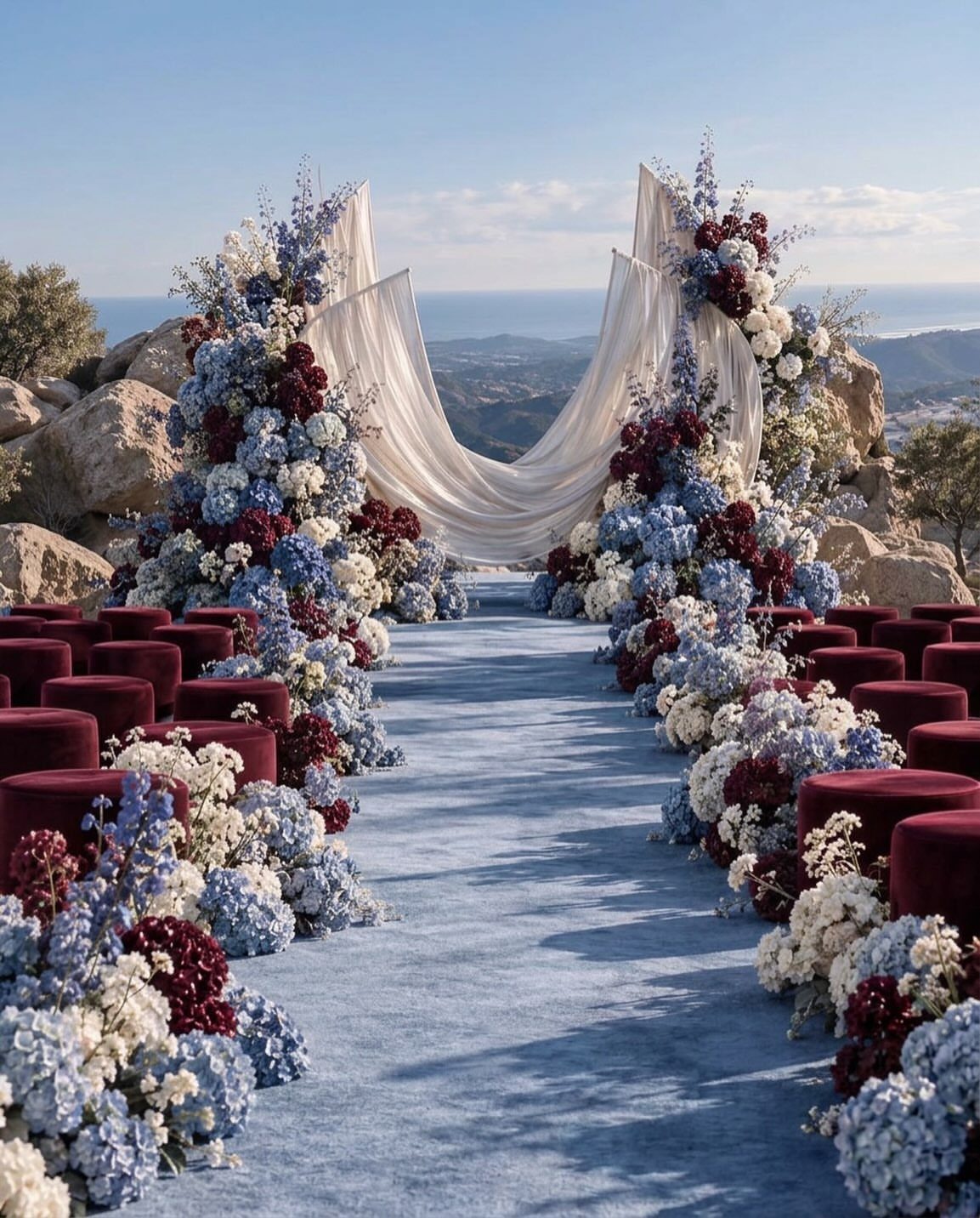
Burgundy and dusty blue work together because neither one gets lost next to the other. The blue stays quiet, the burgundy brings weight, and the contrast looks dramatic without any bright colors.
Spread the burgundy across seating, flowers and anything velvet, then let the blue run in one long band such as an aisle runner so neither color crowds the other.
Dividing the colors by surface makes the pairing look planned. A white canopy or white backdrop gives both shades a neutral place to land.
6. Dusty Blue Bridesmaid Dresses
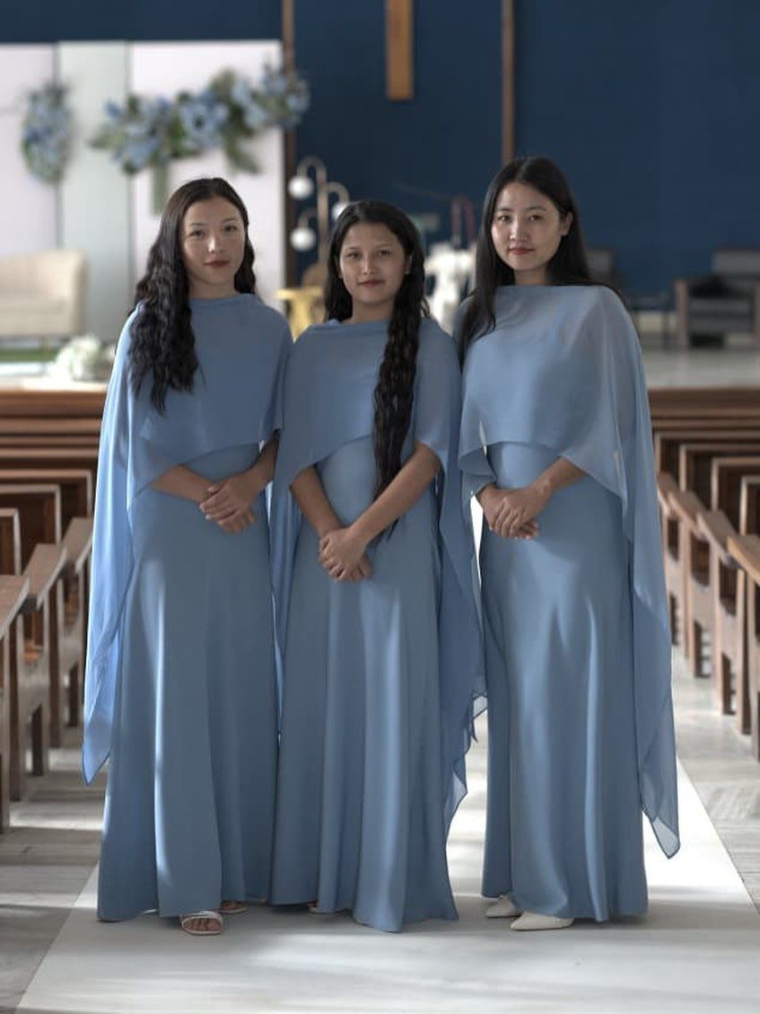
Dusty blue gowns with matching capes give a bridal party a polished, finished look from the back of the church to the front.
Capes add a second layer that you can drop or keep depending on the weather and the photos you want.
Dusty blue is flattering on many skin tones, which makes it an easy color to put on a group of different women. Have everyone order from the same dye lot so the blues match in the pews.
7. Dusty Blue Centerpieces
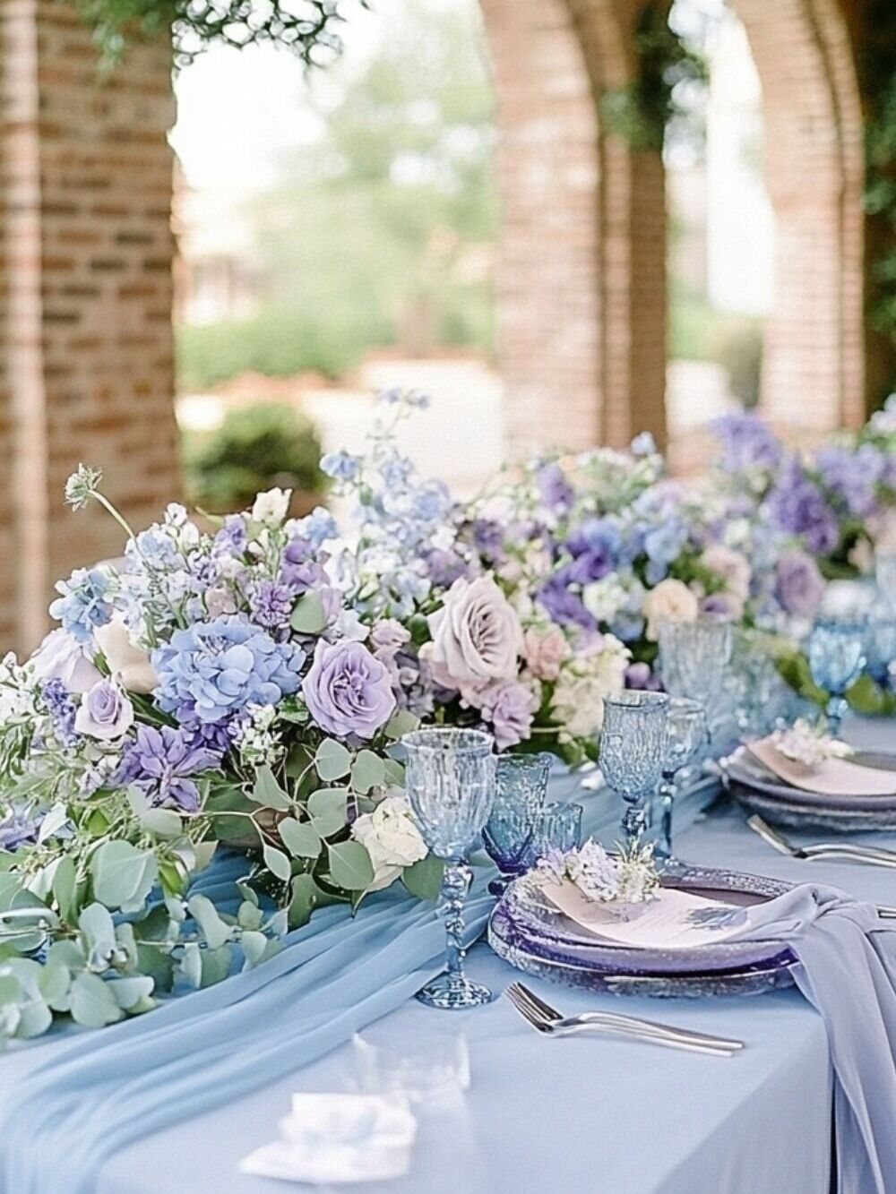
A long table can carry one large arrangement instead of many small ones, and a low-to-medium centerpiece in blue and purple flowers does that with quiet confidence.
Blue glassware and a light blue runner repeat the color without adding more flowers.
Keep the runner a shade lighter than the blooms so the arrangement stays the focus. Pick one tone of glass and stick with it, since mixed blues start to look like a collection instead of a plan.
8. Tailored Dusty Blue Suit
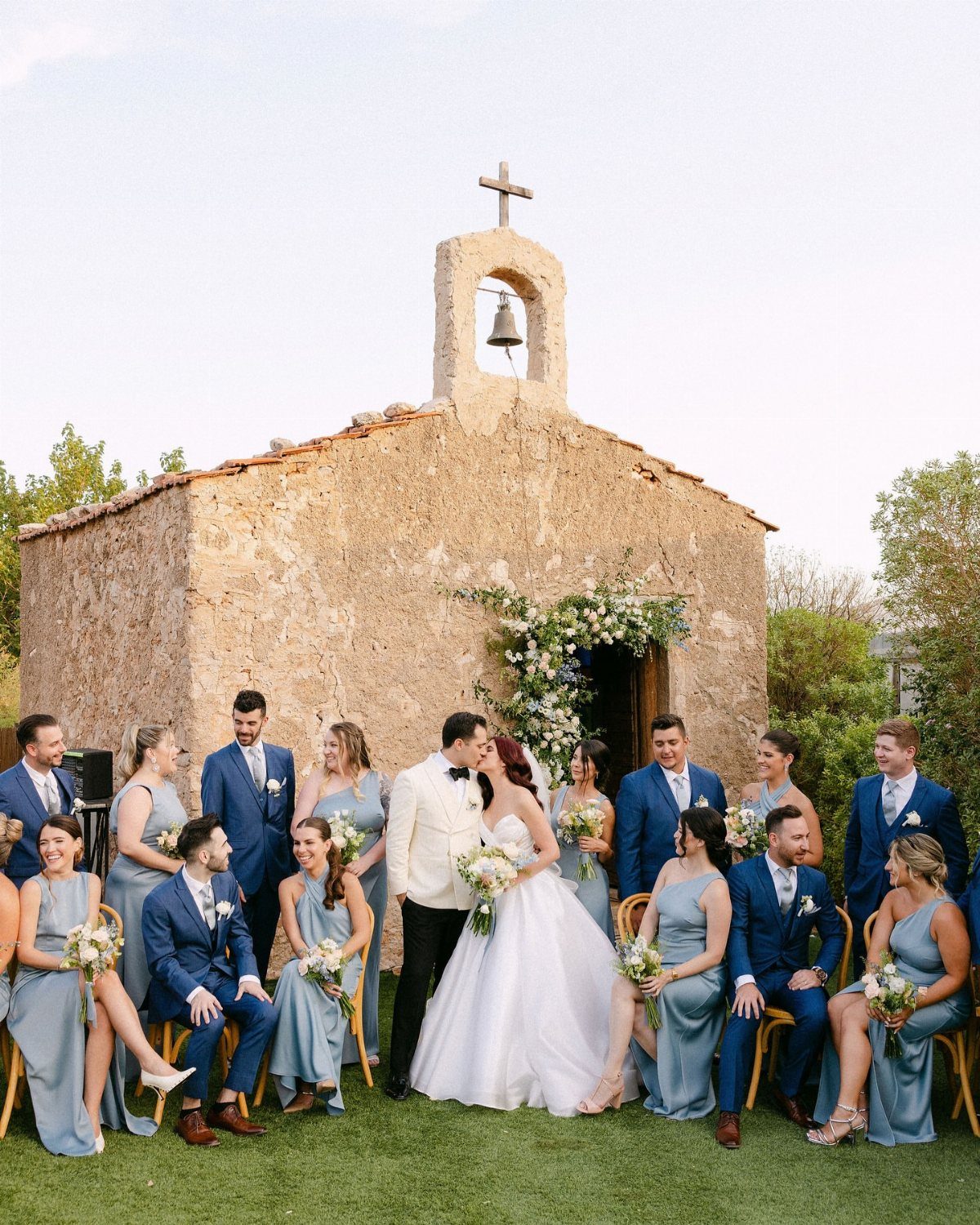
Groomsmen in dusty blue suits look relaxed and polished at once, and a groom in white stands out against them without any extra effort. That contrast does the work, so the suits can stay simple.
Order every suit from the same maker and the same fabric run so the blues match outdoors, where daylight shows every difference.
Ask for a tailored fit on each one, because a fitted dusty blue suit looks sharper than a pricier loose one.
Dusty blue sits well against raw, textured surfaces like fieldstone, old brick and weathered barn wood, since the gray in the color softens next to their warmth.
9. Dusty Blue Table Settings
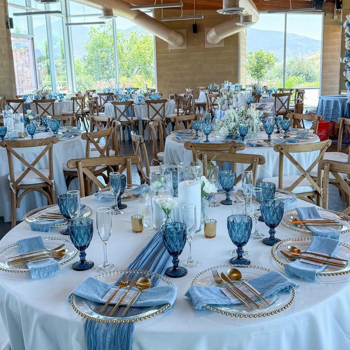
White cloths give dusty blue table settings a clean base, and every blue detail then reads clearly. A runner, glassware and a few napkins are enough to carry the color down a whole table.
Gold cutlery makes a warm partner for the blue, and it costs less than adding gold chargers or candle holders to every seat.
Keep the centerpieces white so the blue stays in the settings, and keep the runner a single, even shade from table to table.
10. Dusty Blue Invitations
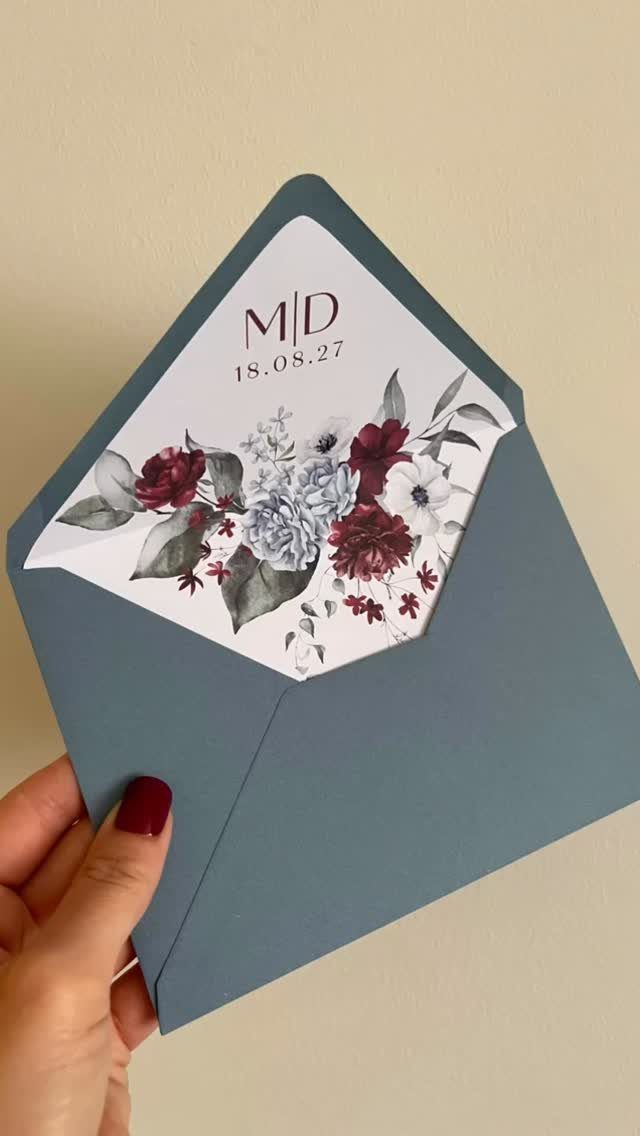
Printing the date and initials in a clean, simple layout, like "M|D" over a numeric date, lets a dusty blue envelope do the talking.
Guests see your palette before they read a word, which is the cheapest way to set the tone for the day.
Match the envelope to the card inside by pairing it with a white card and one accent color from your flowers.
Burgundy florals against dusty blue look rich without feeling heavy. Order a spare few envelopes, since addressing mistakes happen.
Color Pairings with Dusty Blue
Dusty blue holds its grey undertone, so the best partners leave that grey alone. Push dusty blue toward warm or heavily saturated partners and it goes murky fast, losing the soft, powdery quality that made you pick it.
Copper, blush and ivory are the safest additions, and you can spread them through the bouquet, centerpieces or bridesmaid dresses.
Blush runs a shade lighter and pinker than dusty rose, so it sets off the blue with warmth instead of echoing it; I’d tie the two together with white or ivory so neither one shouts.
Pick your neutral on purpose. Pure white gives a crisper, more modern edge next to the blue, and ivory gives a gentler, more romantic look.
Silver-grey greenery like eucalyptus works with either neutral. For metals, let the venue guide you: gold suits formal or garden settings, and silver looks crisper in modern spaces.
Look at the venue’s fixtures, railings and light bulbs first, then pick gold, brass or silver details to match what is already there.
Dusty blue is a muted, grey-toned blue that sits closer to slate than sky. It photographs well in nearly every lighting condition, works across seasons, and pairs with a wider range of secondary colors than most wedding palettes.
Dusty Blue’s Seasonal Versatility
Against white and silver it reads cool and modern. Next to ivory, blush and candlelight it turns warm and romantic.
So the season mostly decides the partners, not the blue. I’d steer a summer or spring palette toward white and silver-grey greenery, and a fall or winter one toward ivory, blush and warmer light.
Pair it with deep jewel tones or with bright citrus and it holds its own either way. That gives you room to change the mood without changing your main color.
Since it never chased a trend, a dusty blue palette still looks deliberate in an album a decade from now, and that counts for a lot when the photos are what you keep.
Photography Tips for Dusty Blue
Most lighting flatters this color, so I’d choose the venue and time of day that fit your budget and skip worrying about finding perfect light.
What changes is the mood. Add ivory, blush and candlelight and the same blue turns warm, so the reception photos will feel softer and more romantic than a sharp-looking ceremony.
Pay attention to the neutral you pair it with, since that is what the camera picks up first.
The shade also looks good on a wide range of skin tones, which is a real help when your bridesmaids are all different complexions.
Ask your photographer for a few group frames in both daylight and candlelight so you can see the blue shift between them.