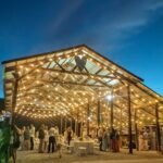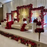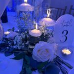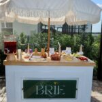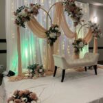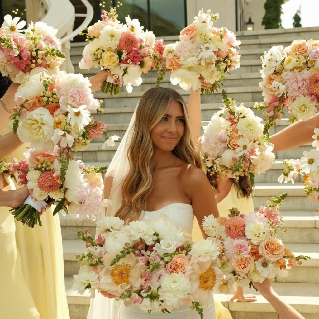
Venue and light should pick your July palette before Pinterest does: a barn or backyard suits earthy shades, a city ballroom wants fewer colors, and noon sun washes out pale tones while an evening reception under warm bulbs pulls everything toward amber.
The palettes here run from soft Butter Yellow, Cream and Sage to loud Marigold, Fuchsia and Cobalt, and the cheapest versions put the color in centerpieces and tablecloths while the rest stays neutral.
1. Butter Yellow, Cream, and Sage
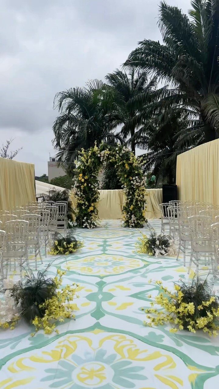
Butter yellow reads softer than lemon, and next to cream and sage it never shouts. That is why this palette works for a July ceremony under open sky.
I would keep sage as the anchor, with yellow and cream as the lighter layers.
2. Emerald Green and White
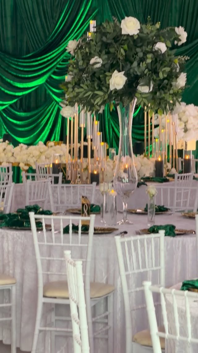
Deep emerald against crisp white gives a reception table real drama without a second accent color.
Draped emerald fabric behind white linens and white roses does the heavy lifting, so the florals can stay simple. I would spend on the backdrop fabric rather than extra décor, since it fills the whole sightline.
3. Peach and Coral
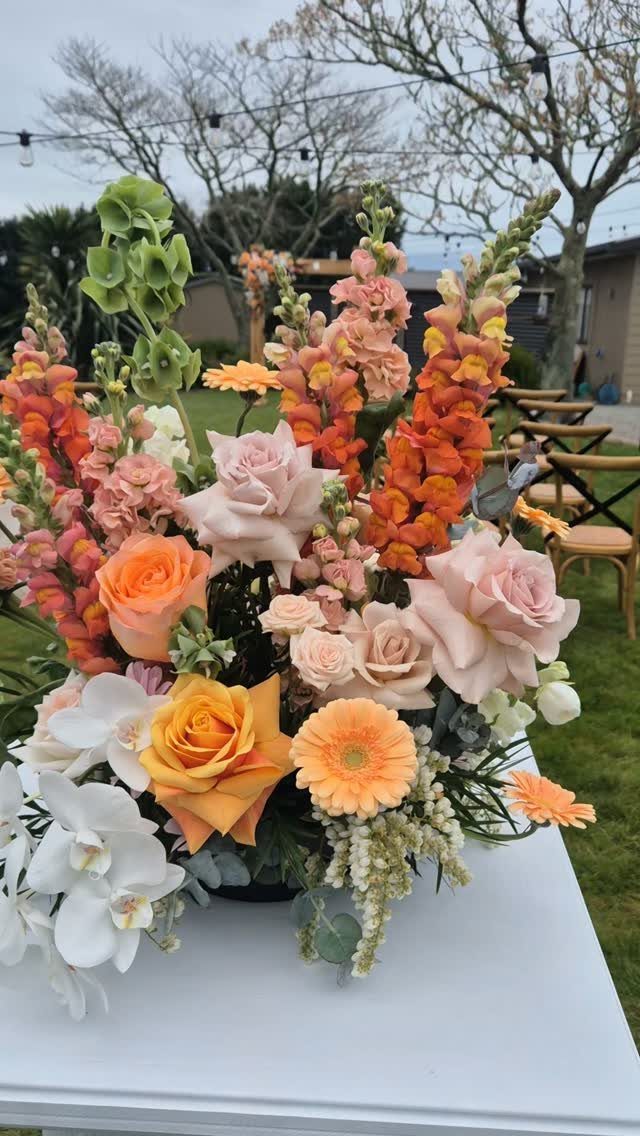
Peach and coral sit close enough on the color wheel to blend like a sunset, and white keeps them from going muddy.
Roses and orchids give the arrangement varied texture even when the colors stay in one family. On a tight budget, I would put the color into the centerpieces and keep linens and chairs white.
4. Lavender and Cream
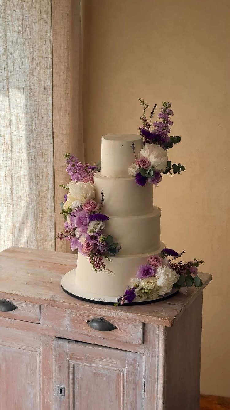
A cream cake with lavender and white flowers is one of the easiest ways to bring this palette in, since the cake itself stays neutral.
Matching the cake flowers to the bouquets ties the day together. A rustic wooden table suits it better than a stark white one, which I would skip.
5. Dusty Blue and Greenery
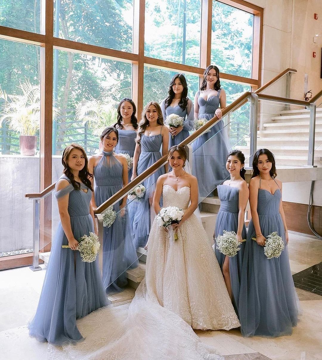
Dusty blue is forgiving on bridesmaids, and nine of them in one shade, as here, look unified even in a bright, modern room.
White bouquets keep the dresses as the color story. Add greenery in the bouquets and at the ceremony to pull in the garden half of the palette.
6. Fuchsia and Orange
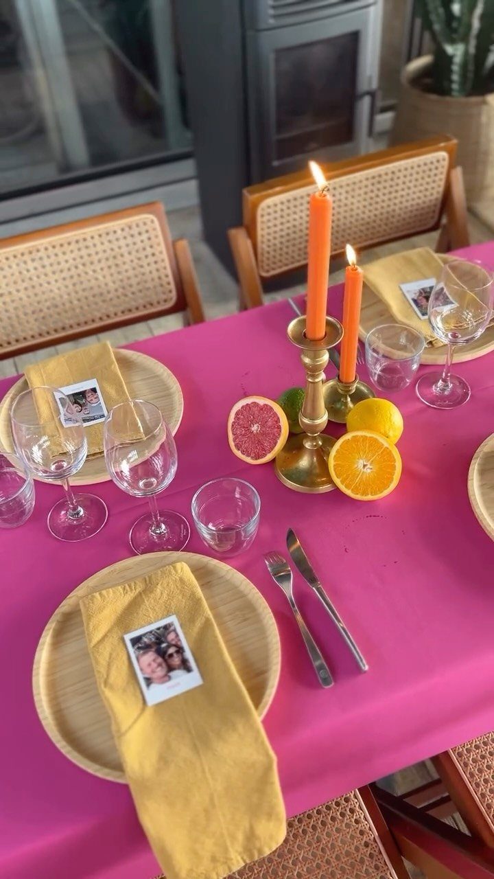
Fuchsia and orange together are loud, so I would pick one to dominate and give the other a supporting role.
A fuchsia tablecloth carries the bold side, while orange candles, citrus slices and yellow napkins add warmth cheaply. Fruit costs much less than extra flowers and fits the palette.
7. Dusty Lilac, Hydrangea Blue, Soft Peach, and Cream
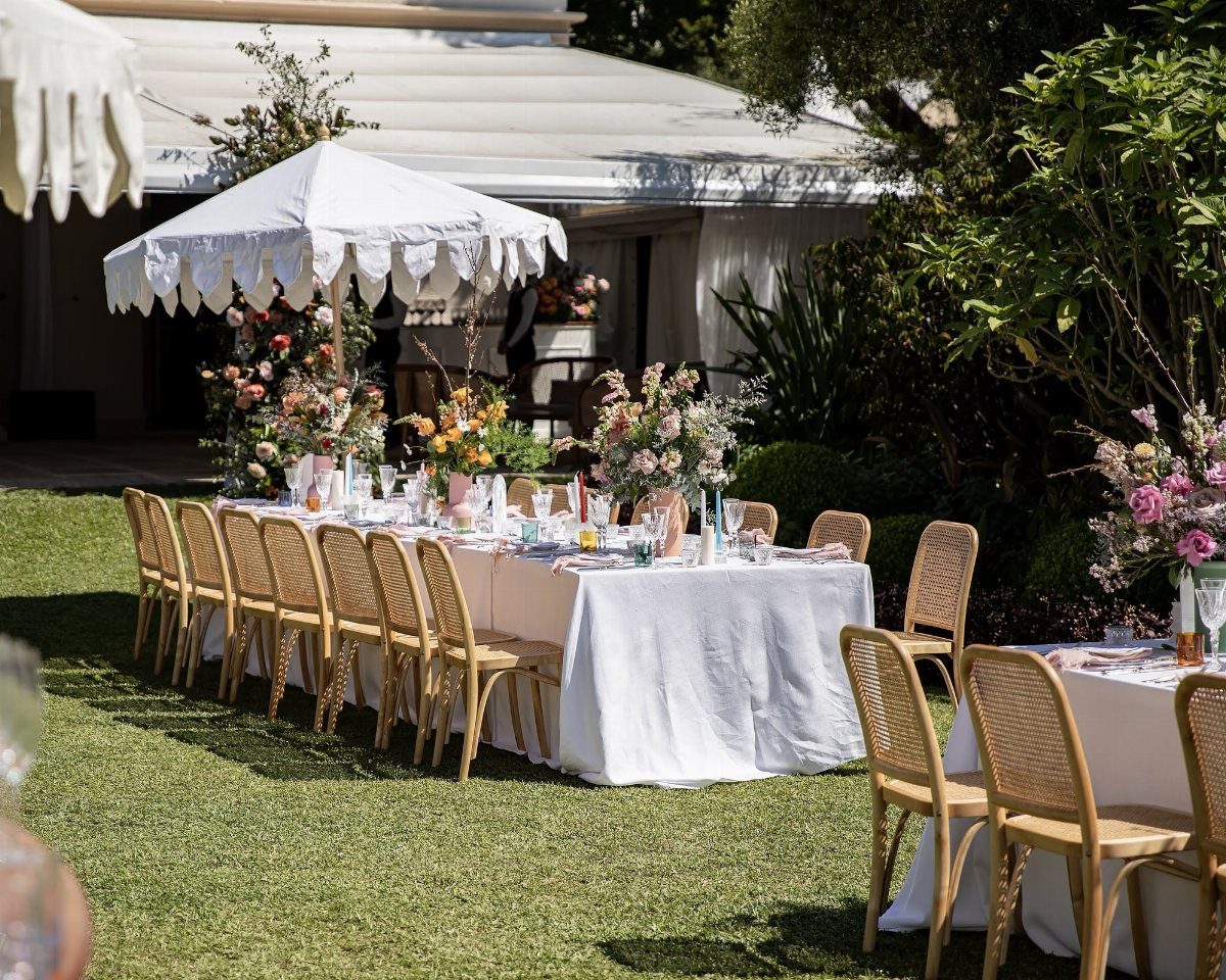
A palette this soft can read as a mess unless one color leads, and here white does that job: the tablecloth and chairs stay neutral while lilac, peach and blue live in the flowers.
I would repeat all three flower colors in every centerpiece instead of assigning one color per table.
The blend then looks like watercolor from any seat. A peach runner adds the warm note cheaply.
8. Terracotta and Ivory
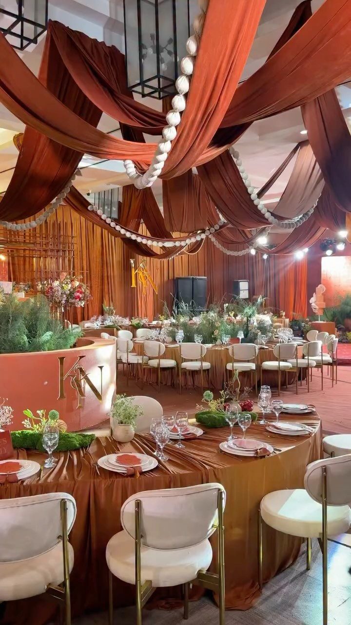
Terracotta fabric overhead and on the tables wraps a room in one warm color, and ivory chairs keep it from feeling heavy.
Ceiling drapes cost more in labor than linens, so on a smaller budget I would put terracotta on the tables and leave the ceiling bare.
Keep the chairs and florals light so the fabric stays the star. Skip dark chairs; they would swallow the earthy tone.
9. Marigold, Fuchsia, and Cobalt
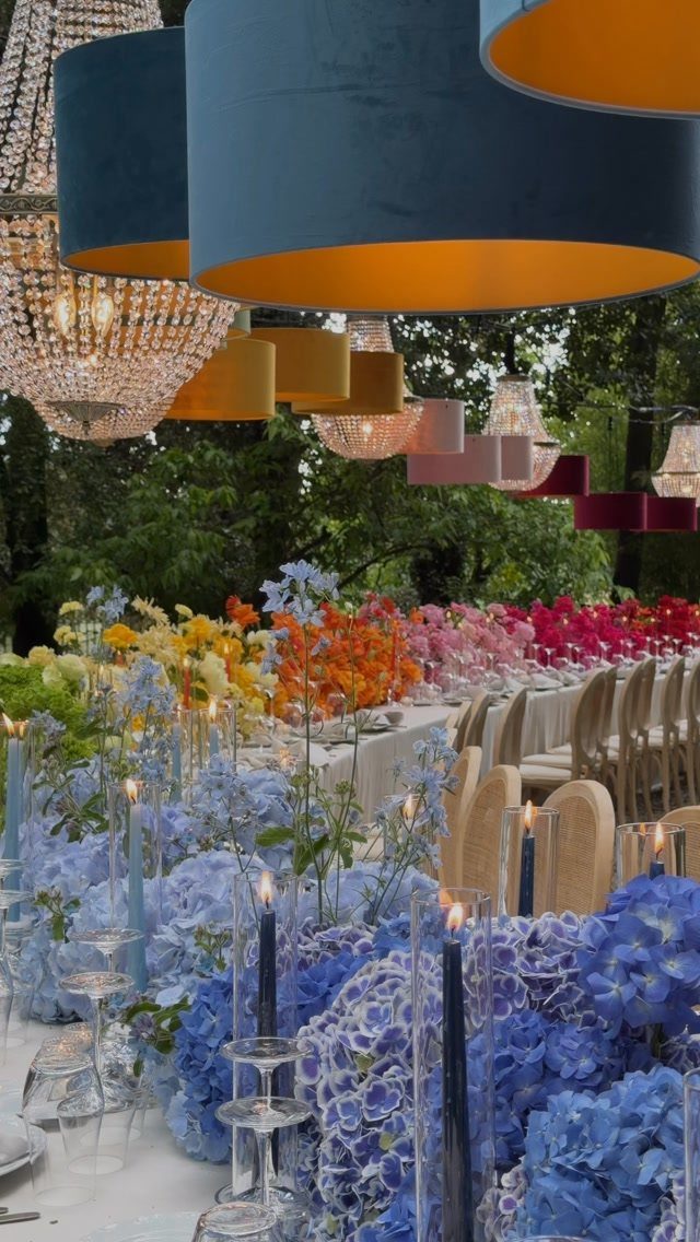
Cobalt is the anchor in this trio, so I would let blue hydrangeas and blue candles carry it while marigold and fuchsia stay in smaller blooms.
Oversized colorful lampshades hung above the table repeat the palette at eye level, and they do the decorating without extra flowers.
Three saturated colors need that kind of repetition to feel planned, so use each one at least twice on the table.
10. Turquoise and Sunny Yellow
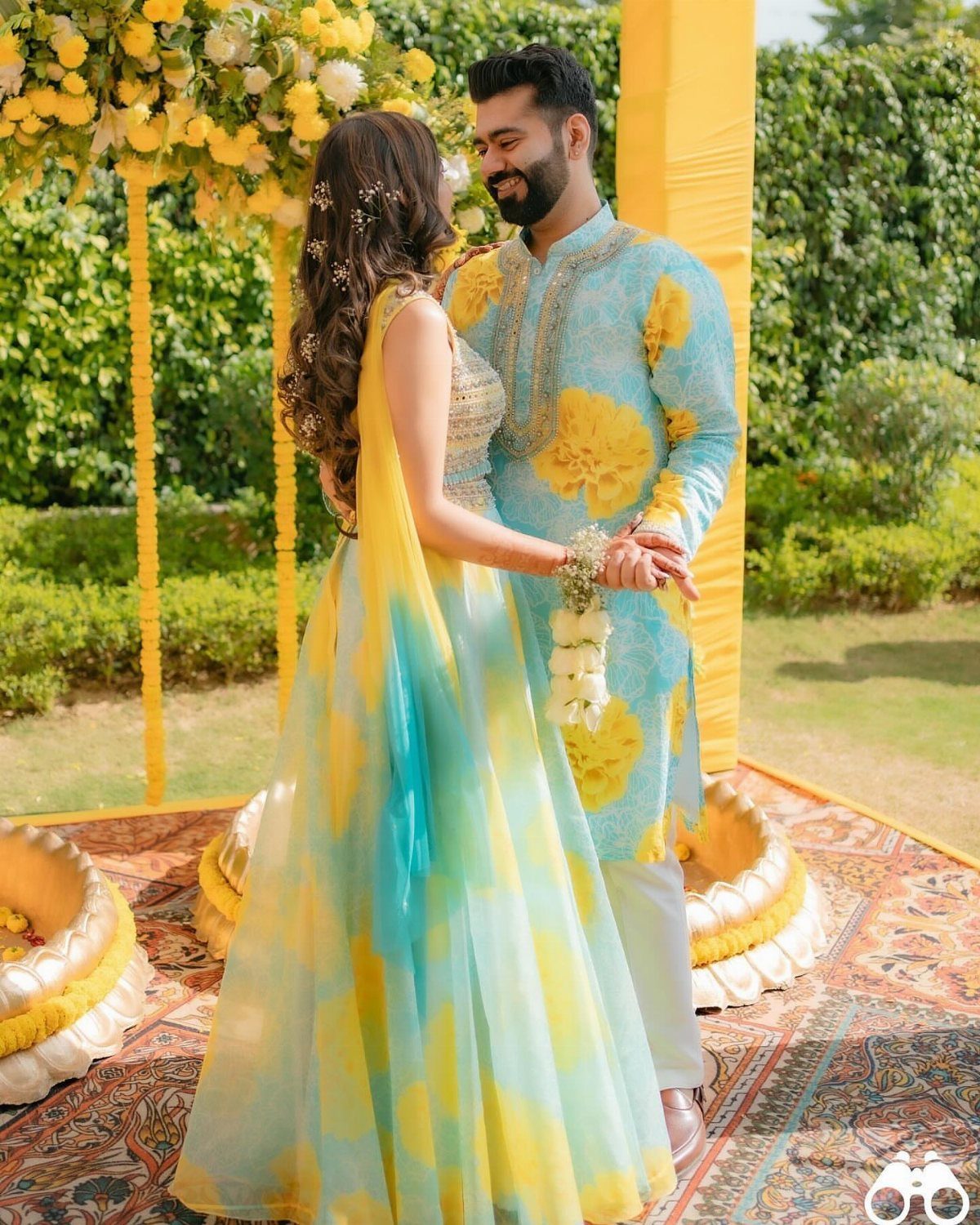
Turquoise and sunny yellow suit traditional Indian wedding attire well, since the clothing itself carries the whole palette.
Yellow flowers overhead and around the couple pick up the yellow, so the outfits are the only place turquoise needs to appear.
I would keep the rest of the décor in yellow so the 2 colors meet in the photos. Fresh blooms in one color are simpler to source than a mixed bouquet.
11. Vibrant Yellow and Gold
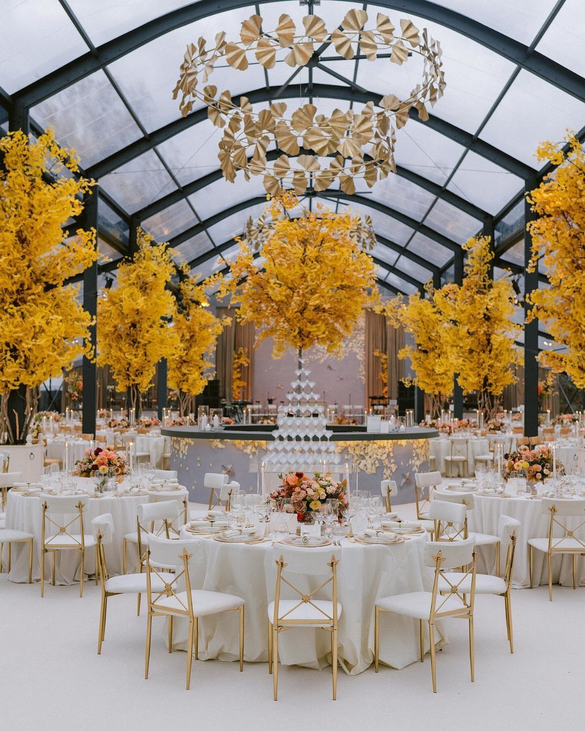
Gold chairs, a gold chandelier and yellow flowers are all warm metals and warm color, so crisp white linens are what keep the room from going yellow-on-yellow.
Tall centerpieces draw the eye up toward the chandelier and leave table space open.
I would spend on the centerpieces, since they are the largest yellow in the room, and rent the chairs. Keep every flower in one yellow family.
12. Magenta and Purple Floral Accents
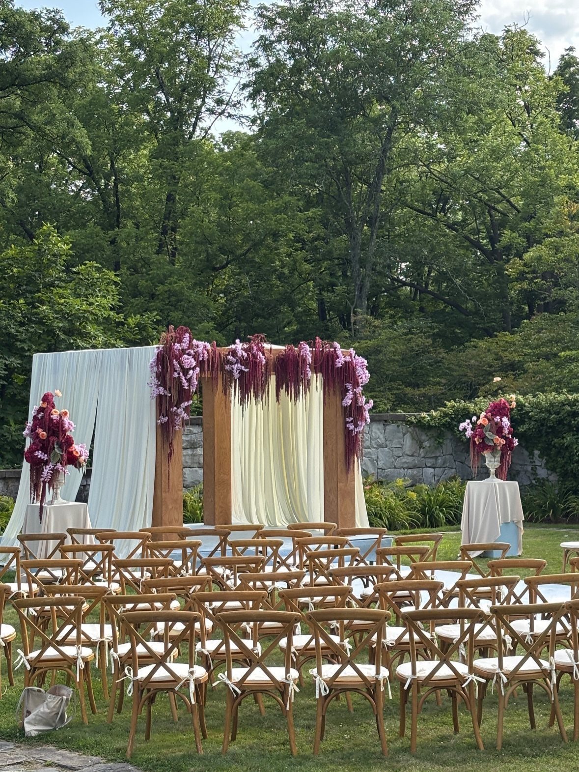
Cream fabric over a wooden arch gives magenta and purple flowers a soft ground, so the bold colors read as accents instead of a wall of color.
Let the blooms cascade down one side rather than cover the whole frame; it uses fewer stems and looks more natural.
Wooden cross-back chairs on a lawn fit the rustic frame. Cluster the deepest purple at the base of the cascade, where it anchors the arrangement.
Choosing the Right Colors
Venue and light should pick the palette before Pinterest does. Earthy, organic shades like sage, clay and sun-faded wheat sit comfortably in a barn or backyard, and a sleek city ballroom looks best with fewer colors and cleaner lines.
Check the time of day, too.
Noon sun washes out pale shades and flatters saturated ones, and an evening reception under warm bulbs shifts everything toward amber. If you can, look at fabric swatches in the room at the hour you plan to be there.
Keep the count low: 2 or 3 main colors with 1 accent. Bold colors hold together when neutrals sit beside them, so I would decide the neutral first and build the loud shades around it.
Selecting the colors for your summer wedding palette is an incredibly important part of the wedding planning process. It can define the linens for the tablescape, the florals in your bouquet and centerpieces, and the details in your paper goods.
— Vogue
Incorporating Seasonal Elements
Seasonal materials make a palette look intentional, and they usually cost less than out-of-season stems.
Hydrangeas, roses and sunflowers add texture. Eucalyptus and ferns make lush garlands and backdrops, so a plain wall or arch needs little else.
Fruit works as décor. Berries, lemons or peaches in a centerpiece add freshness and a bit of real color, and I like them tucked between flowers or set in a bowl at the table’s center.
Warm yellows, oranges and pinks pop most against white backdrops.
Not every venue can carry them, but they warm up a plain room in a hurry, so hold a few stems or swatches up in the actual space and see how they look first.
Frequently Asked Questions
What are the most popular wedding colors for summer?
Coral, sage green, dusty blue, lavender and soft neutrals come up most, along with pastels like blush and mint and bright hues like turquoise.
Bright, saturated tones like coral, cobalt and marigold keep their color under strong sun, and they still look right once the party moves into a tent or ballroom.
For July, I would anchor on one of them and keep cream or white beside it.
Is a July wedding a good idea?
Yes, July has warm weather and plenty of sunlight, and its bright, festive feel suits colors like yellow, green, blue, orange and pink.
July is one of the busiest wedding months in the US, so book early and pick a palette that feels like midsummer instead of a generic spring mix.
How do I choose wedding colors that complement my venue?
Start with the room and the light it gets; save the inspiration board for later.