The palettes here run from two-color tables like Ivory and Gold or Pink and White to a Mismatched Pastel Palette for the bridal party, and the cost depends on where the color lands: gold accents on chairs and candle holders are a small rental, while draping a ceiling in teal is a big expense.
Your season and the flowers your florist can source in those shades narrow the choice further, which is worth checking before you fall for Blush Pink and Sage Green in a month when peonies are gone.
1. Ivory and Gold
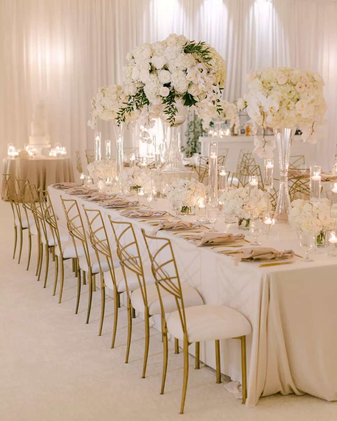
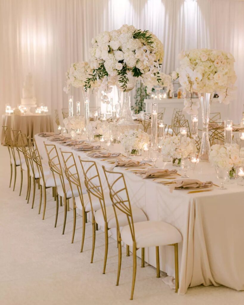
Ivory reads softer than stark white, and gold gives it a little shine, so the pairing works best when you keep the two in a clear ratio: ivory for the big surfaces like linens and drapery, gold for the hardware.
If the rental cost stings, I would keep gold on the chairs and candle holders and let the florals stay white.
2. Coral and Teal
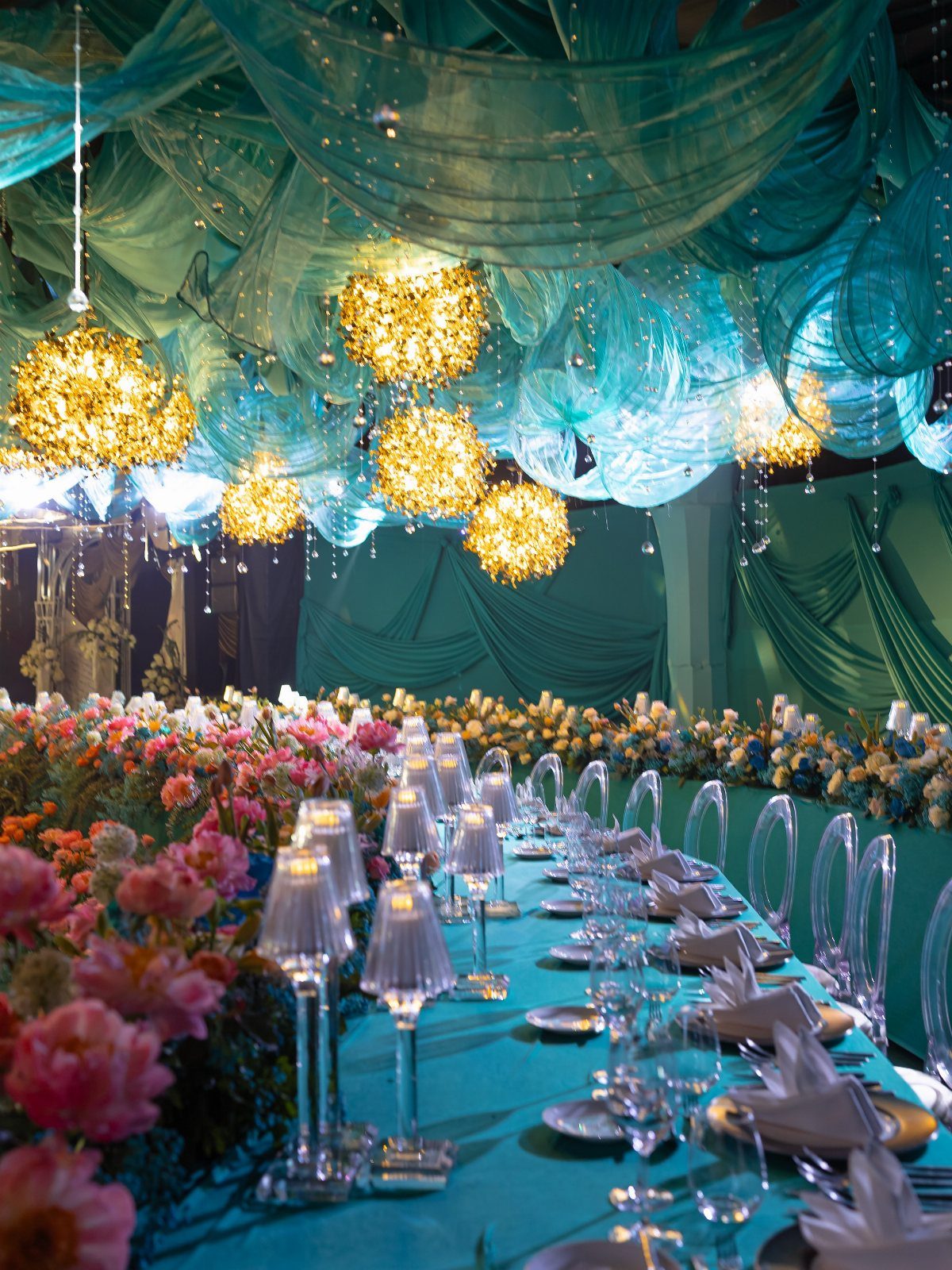
Coral and teal are close to opposites on the color wheel, which is why they feel so lively together. Teal does the heavy lifting in the room; coral stays in the flowers, where it can pop.
I would keep the ratio around three parts teal to one part coral, and let gold fixtures like chandeliers bridge the two.
Draping a ceiling is a big expense, so if budget is tight, teal linens alone will deliver most of the effect.
3. Navy and Sunflower Yellow
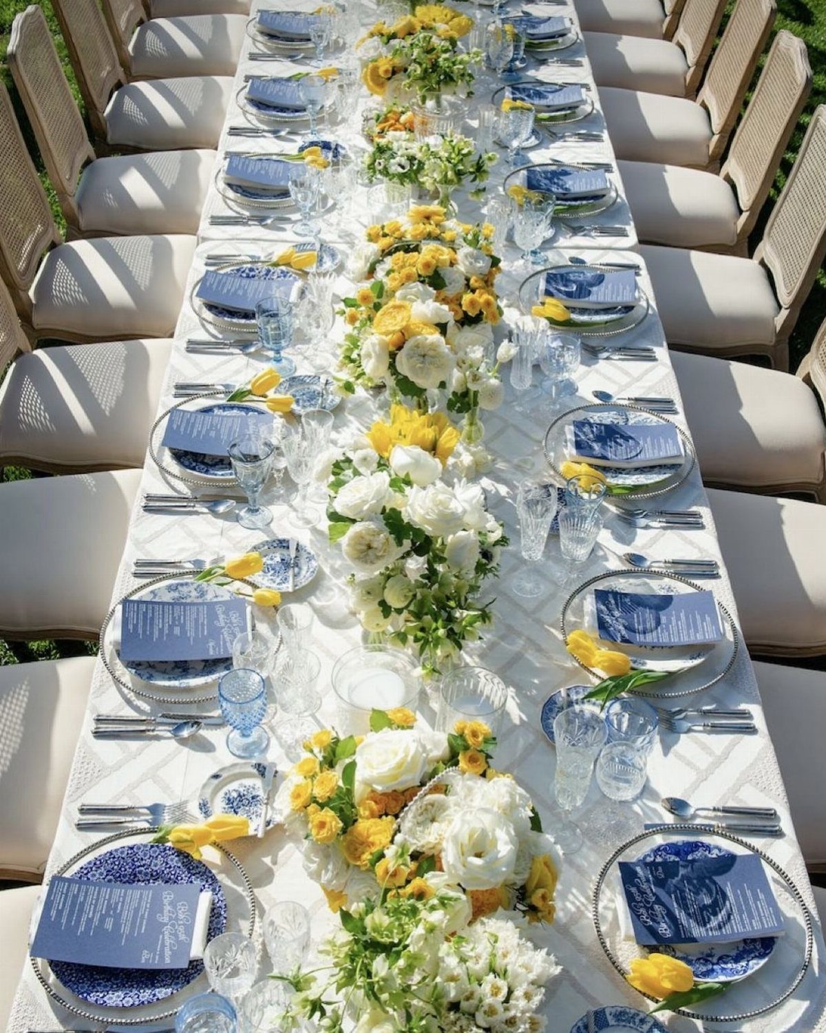
Yellow flowers against navy napkins are enough to carry this palette, and white linens keep it from feeling heavy. Sunflower yellow is bold, so I like it mixed with white blooms in the centerpieces instead of used alone.
Patterned blue and white plates add a third layer without adding a new color. That is the move I would copy for a long outdoor table: navy at each place setting, yellow down the center.
4. Blush Pink and Sage Green
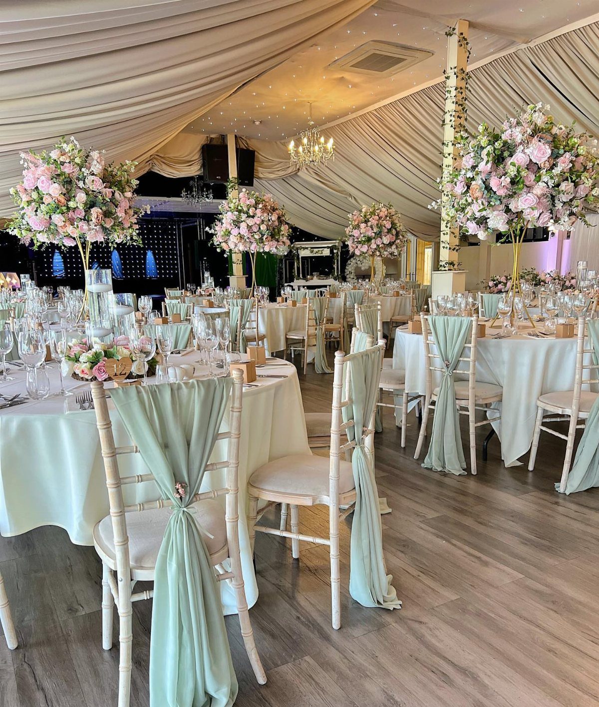
Blush and sage sit at the same soft, dusty level of color, so neither one competes.
White linens keep the whole room from going muddy. I would choose blush flowers in a few shades instead of one flat tone; the variation looks more like a garden and less like a matched set.
5. Deep Blue
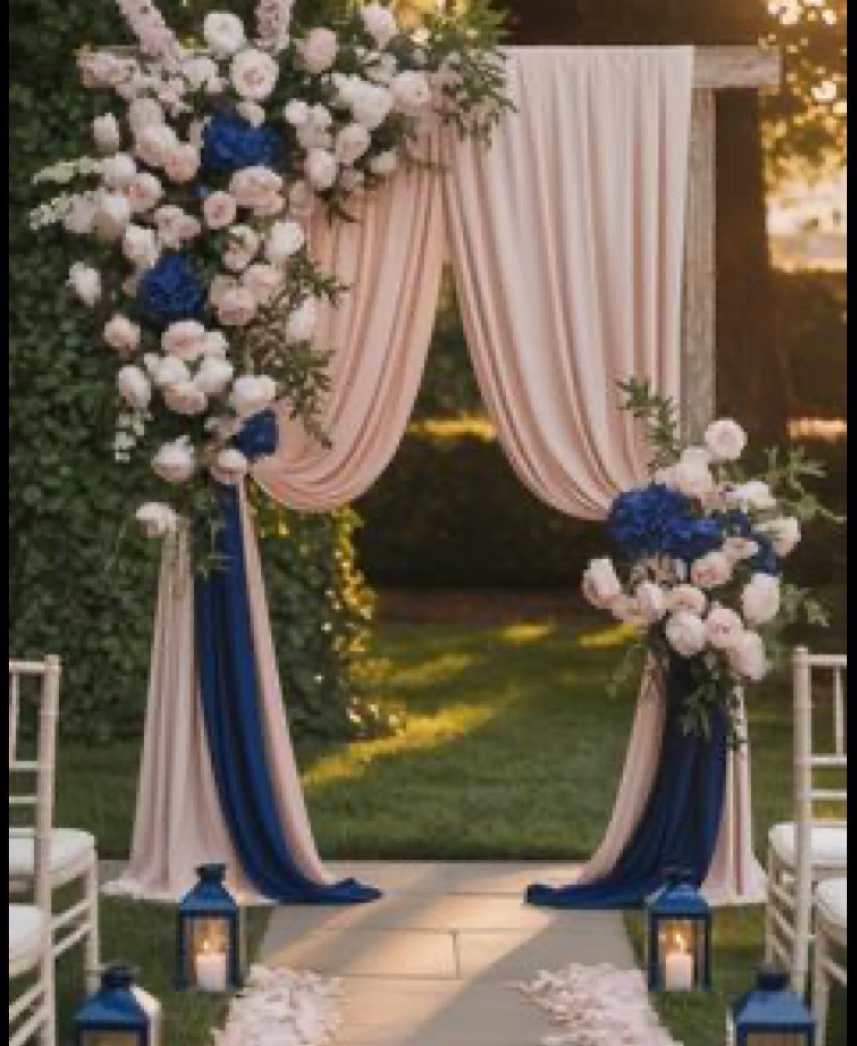
Deep blue gets its drama from contrast, so pair it with cream or blush and let the flowers repeat both. An arch is a good place to try it because drapes add color without much cost.
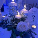
Blue lanterns along the path carry the palette beyond the altar. I would stop at one or two deep blue elements per area; navy everywhere can feel heavy, especially outdoors in fading light.
6. Pink and White
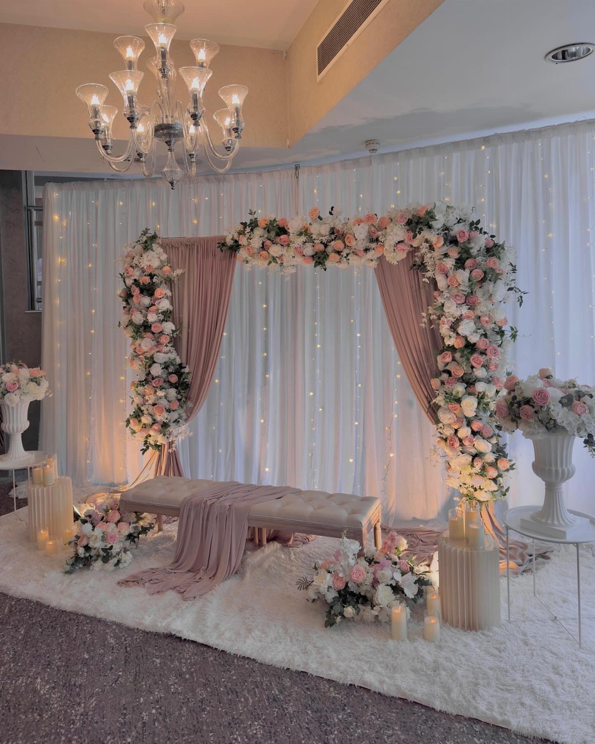
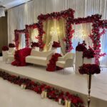
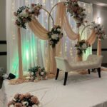
Pink and white feels romantic without needing a third color, which keeps the planning simple. Use white roses and pink roses together in one arch, then repeat the pink in the draped fabric behind it.
A plush white rug and a tufted bench give the couple somewhere to stand that looks finished.
Candles in several heights fill the gaps, and a chandelier overhead adds sparkle. Skip the chandelier first if you need to cut costs.
7. Mismatched Pastel Palette
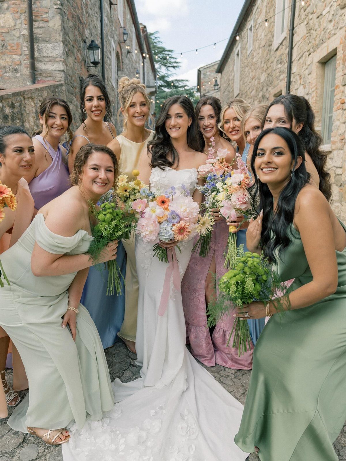
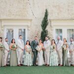
One pastel per bridesmaid works because they all share the same softness. Blue, yellow, lavender, pink and green all sit at the same light level, so the group reads as a set even with no 2 dresses alike.
I would keep the bride in white and let the bouquets stay neutral, so the dresses carry all the color. Spread the shades around so no 2 similar ones stand side by side.
Mismatched dresses also save bridesmaids from hunting for one exact shade.
8. Light Blue and Lemon Yellow
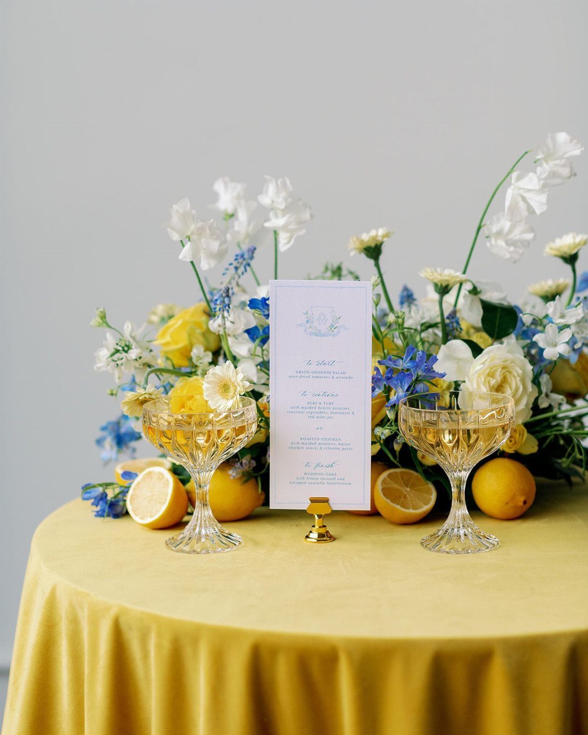
Lemon slices on the table do the work of a centerpiece accent for almost nothing. Yellow linen sets the mood, and white flowers with a few light blue blooms keep it from turning too sunny.
I would let yellow cover the big surface and keep blue small: flowers, glassware, a menu card detail. Reverse that ratio and the table gets cold.
Whole lemons are the budget move, since you can scatter them between arrangements instead of ordering extra flowers.
9. Teal and Gold
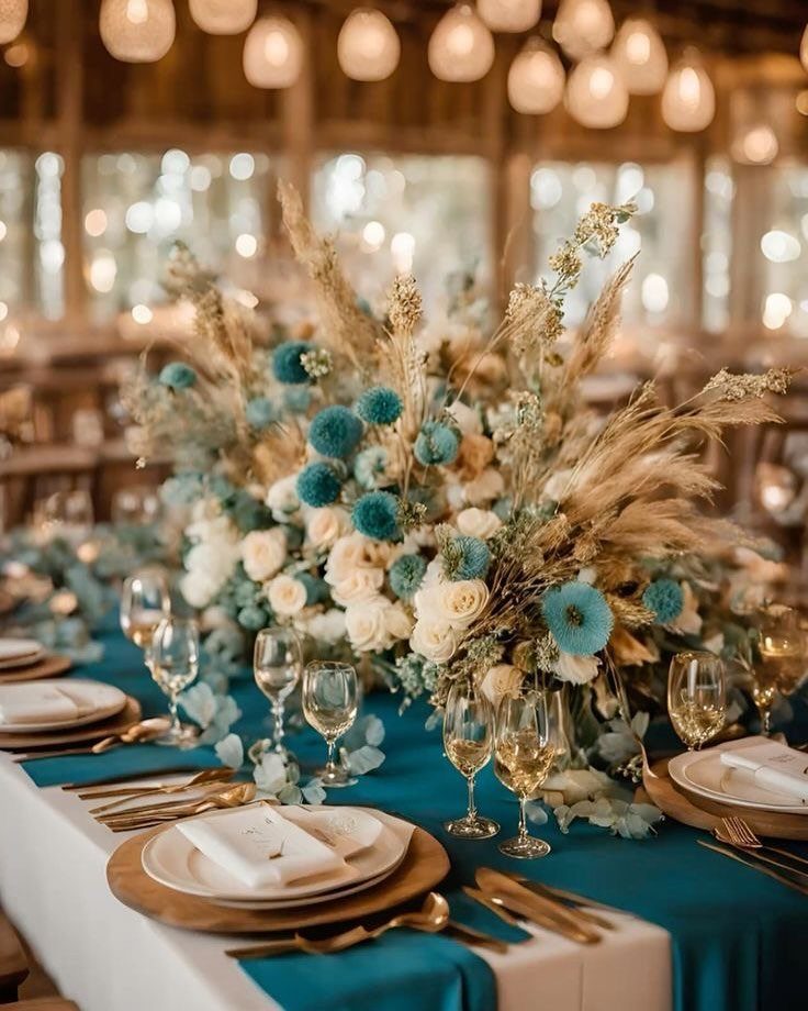
Gold chargers set beside a teal runner give a plain table 2 clear bands of color without a single extra decoration. Dried pampas grass in the centerpiece adds height and a warm, neutral texture that sits between the two.
Pair it with white roses, as the photo does, so the teal blooms stay an accent. I would spend on the chargers and runner, since they cover every table, and limit the centerpieces to one big arrangement each.
Pampas grass is dried, so it can be bought ahead and needs no last-minute timing.
10. Champagne and Cream
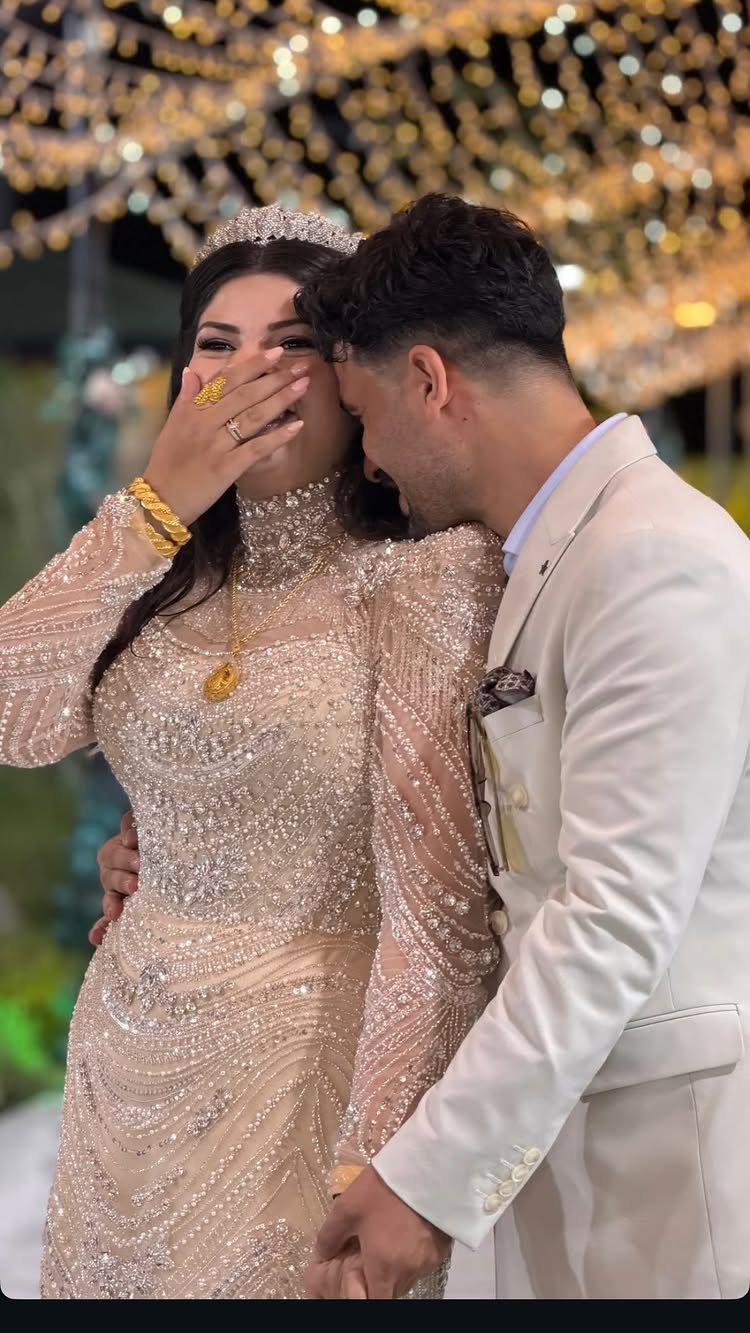
Dressing the couple in matching champagne and cream is a quieter way to carry a palette: the color lives on the people instead of the tables.
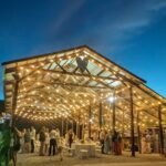
Add gold jewelry and the outfits tie in with warm lighting, such as fairy lights, without any extra effort.
I would pick one fabric tone for her and a slightly deeper champagne for him, so they read as a pair and not as twins. Keep the gold to a few pieces; too much starts to look heavy.
Understanding Color Psychology
Red reads as passion and energy, and blue reads as calm, so decide what you want guests to feel before you pick a palette.
A ceremony meant to feel hushed and tender suits cooler tones; a party meant to feel loud and warm suits reds and warm hues.
Light changes color, so it can push the mood further. Colored uplights or warm string lights set to your palette will tint the walls and tablecloths, so the mood you picked carries through the whole evening.
I would test any strong color under the lights you plan to use, because a shade that looks calm in daylight can turn heavy at night.
Cultural Significance of Colors
If your family traditions carry color meanings, build the palette around them.
Color meanings shift by culture: red is tied to luck and prosperity at many Asian weddings, white to purity and peace in much of the West, and gold to wealth and continuity in a number of African traditions.
You can use one of these as the anchor color and let the rest of the palette follow. A red sash, a gold accent or a white gown each puts the meaning where guests will see it.
I would ask relatives what a color means to them before committing, since the meaning can differ from family to family.
Incorporating Colors Into Wedding Details
Carry the palette past the decor and into every piece guests touch: invitations, table settings, floral arrangements, attire and even desserts. Repeating the same colors in each place is what makes the day look planned instead of assembled.
Before you lock the colors, check them against the venue. Walls, carpets and curtains are fixed, so the palette has to sit well with them.
Season and photography also matter. Spring and summer lean lighter, fall and winter lean deeper, and some flowers are not available in your colors year-round, so ask your florist early.
I would also look at how a color photographs, since you will keep the photos longer than the flowers.
Frequently Asked Questions
What are the best color combinations for a wedding?
Ivory and gold, navy and sunflower yellow, and blush pink and sage green are three that hold up well.
Each pairs a calm base with one accent that carries the look: gold hardware on ivory linens, yellow flowers against navy napkins, or blush blooms in a few shades beside soft sage.
Pick the one that fits your venue and season, then keep one color dominant.
What are the wedding color themes for 2026?
I can’t point to a verified 2026 list, but the trends that keep coming up are nature-inspired neutrals like sandy beige, soft gray and ivory, and bold single-hue looks in deep blue or emerald.
Sunset shades of warm pink, purple and orange are also popular, along with pastels paired with a surprise pop of color and metallics such as gold, silver and rose gold.
Look at any trend color under the actual lighting of your venue, whether that is a dim barn or a sunny garden, since it can shift a lot between the two.
What colors are frowned upon at weddings?
No color is banned outright, but meanings vary by culture, so a quick conversation with family can save you an awkward moment later.
A color that is a blessing in one family can mean something different in another, so a quick conversation with relatives settles it.