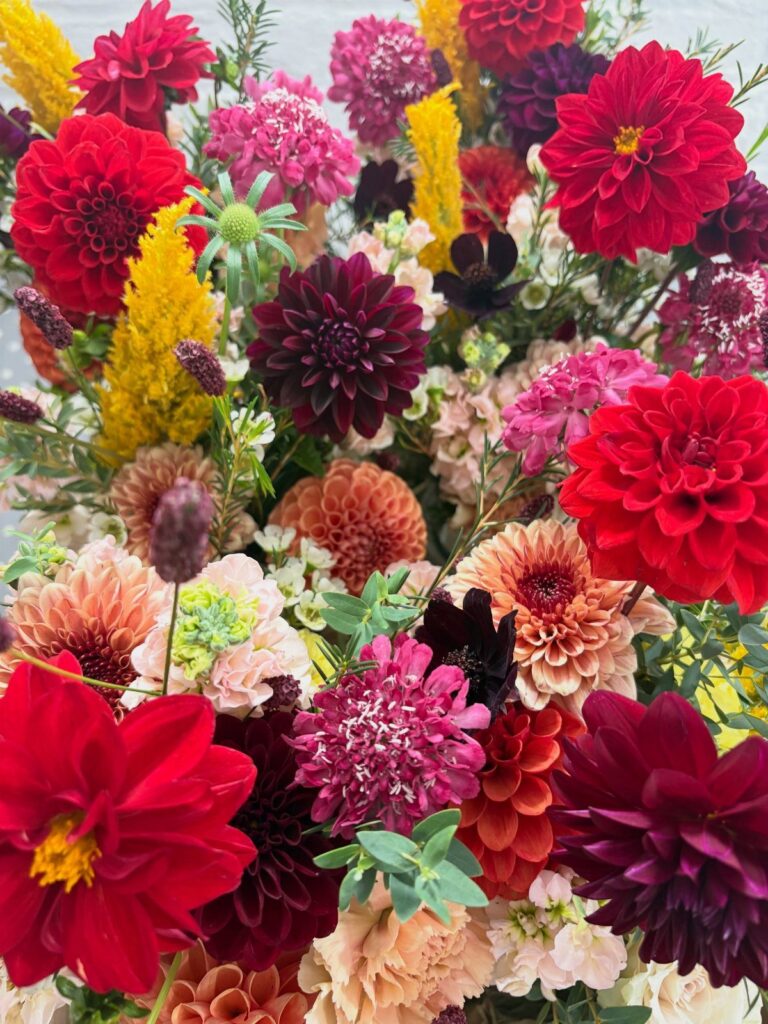
Light decides the palette before taste does, so start with when and where your reception will sit, then pick from burgundy and gold, navy and copper, or champagne and salmon.
A November evening with candles carries Burgundy and Gold, Emerald Green and Gold, or Black, Burgundy, and Purple, while an early fall afternoon runs warm and lets Muted Pumpkin Orange Accents or Champagne and Salmon hold up.
Budgets stretch in both directions here: Emerald Green and Gold can live on a few high-contact pieces like invitations and table numbers, while Terracotta and Greenery can lean on small pots in place of a florist’s arrangement.
Whichever palette you land on, Choosing a Cohesive Palette comes down to keeping it under 5 colors so one of them still leads in photos.
1. Burgundy and Gold
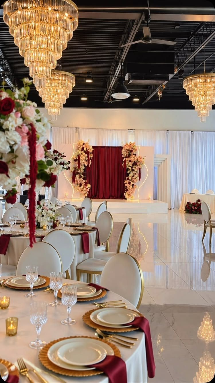
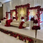
Gold chargers do the heavy lifting here. Set against white tablecloths, they frame each place setting, and burgundy napkins pick up the same color as the curtain behind the room.
White linen keeps the deep red from feeling heavy, and the gold adds warmth without a lot of fuss. I like this pairing for a ballroom with chandeliers, where the metal catches the light.
Chargers are the easy place to save: rent them rather than buying, and spend on napkins and florals instead.
2. Emerald Green and Gold
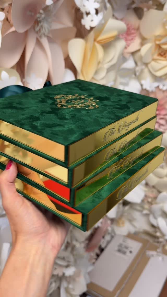
Emerald only needs a little gold to look expensive. Velvet or suede in deep emerald, finished with gold foil lettering and a crest, reads as formal before anyone opens the box.
For a budget wedding, I would put the emerald on a few high-contact pieces: invitations, a welcome sign, table numbers. Then let cream flowers fill the rest, since they soften the green.
Boxes cost more than flat cards, so order a small batch.
3. Black, Burgundy, and Purple
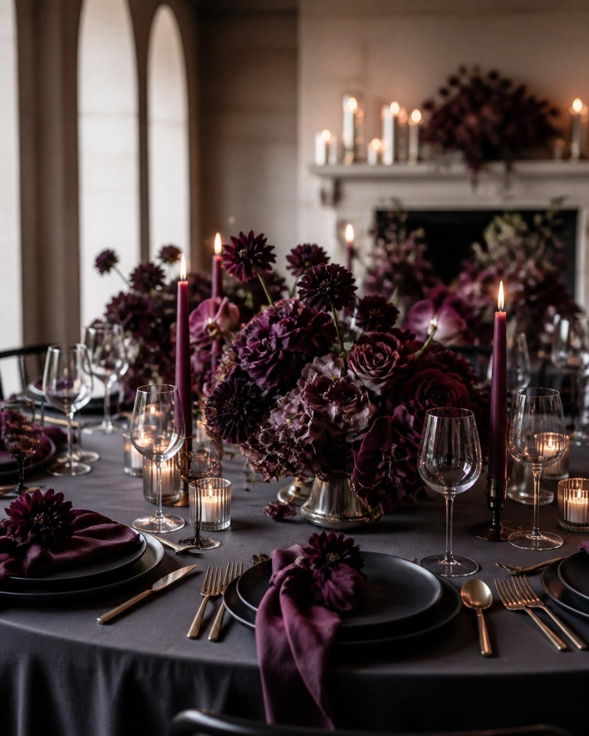
Black plates on a dark grey cloth set the mood before a single flower arrives. Purple napkins and tapers then add a second color, and burgundy blooms tie the whole table together.
This is the palette for an evening reception, ideally indoors with a fireplace or candlelight. In daylight, it can look flat.
Keep the florals full and low so guests can still talk across the table. Taper candles in purple carry the drama up to eye level without blocking anyone’s view.
4. Terracotta and Greenery
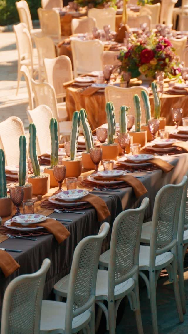
Cacti in small terracotta pots make a centerpiece guests can take home. That alone sets this table apart from the usual cut-flower arrangement.
Brown and terracotta napkins on a long outdoor table, with white chairs to keep things bright, give you a warm desert palette. Pots also cost less than a florist’s arrangement, which matters at a modest budget.
For softness, add one fuller floral piece at the head of the table, as in the background here, or fill gaps with greenery.
5. Navy and Copper
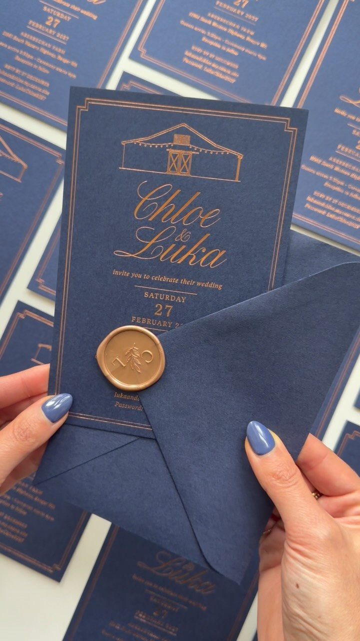
Copper foil on navy cardstock is a stationery decision first. Cool blue-black paper makes warm metallic text glow, and a copper wax seal adds a tactile finish.
Ivory envelope liners soften navy invitations, and a copper foil or ink detail on the card warms the whole suite without adding a third color.
If you like it, carry the copper into place cards and signage so the invitation sets the tone for the day.
Foil and wax both add cost per piece, so check your guest count before you commit.
6. Cranberry with Mustard Yellow Floral Arrangements
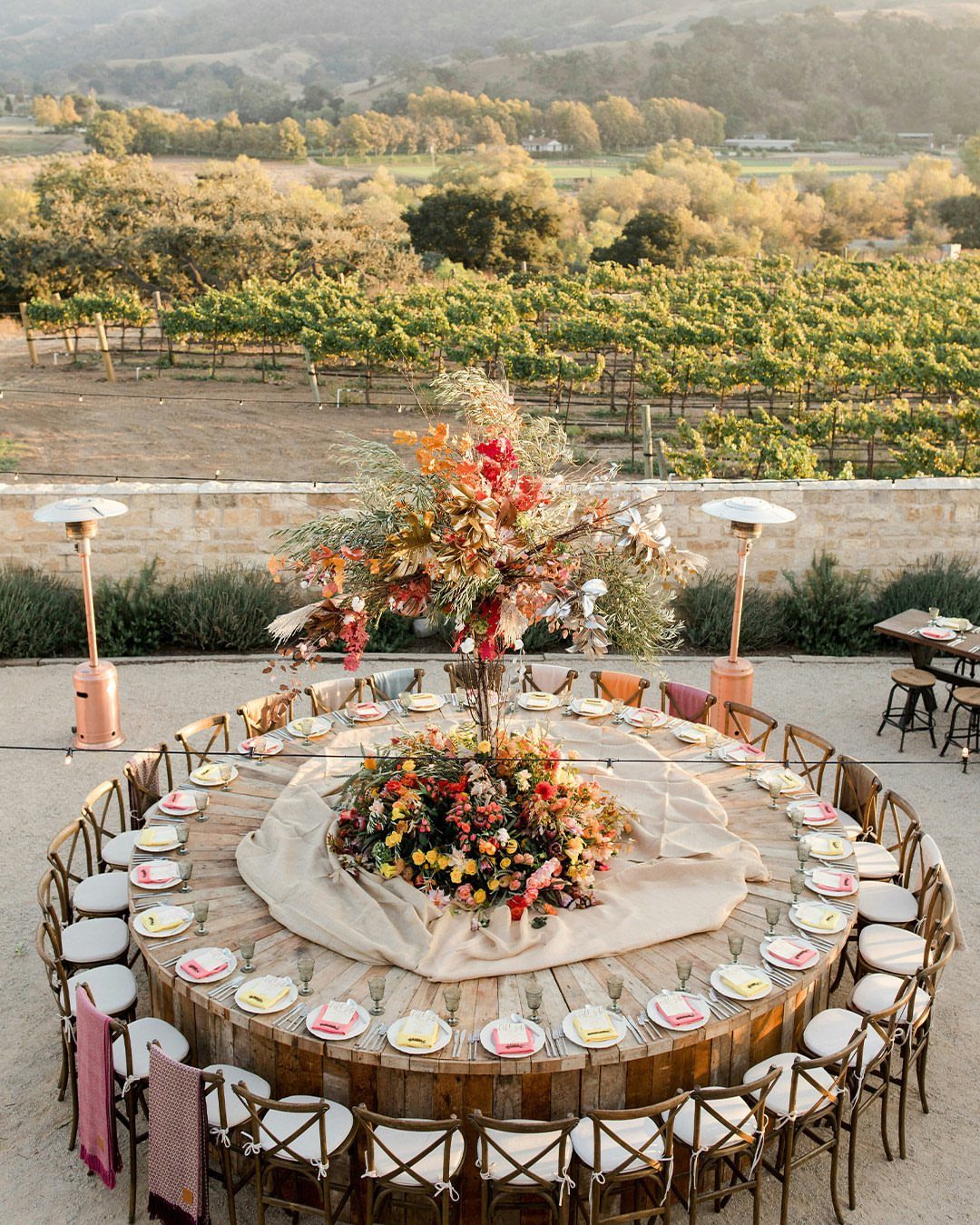
Mustard yellow keeps cranberry from going too dark. Together, in a low centerpiece on a round wooden table, they feel like harvest rather than formal dinner.
Plain white plates are the right call here, because the flowers already carry 2 strong colors. I would also leave the wood bare, or use a simple runner, rather than cover it with linen.
A vineyard view makes this easy, since the backdrop supplies the greens. Choose a florist who can match both shades.
7. Copper and Merlot
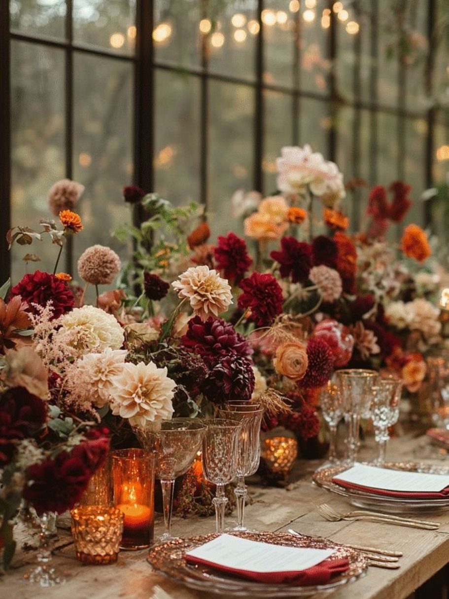
Copper glassware against merlot flowers is a small detail with a big return. The metallic tone picks up the red in the blooms, and the cream flowers in the centerpiece keep the table from reading too dark.
Candles add to the effect. Warm string lights behind the table do the rest, so the copper glows after sunset.
I would buy or rent the copper pieces in a small set, such as goblets, and let simple glass and cream blooms fill out the rest of the table.
8. Muted Pumpkin Orange Accents
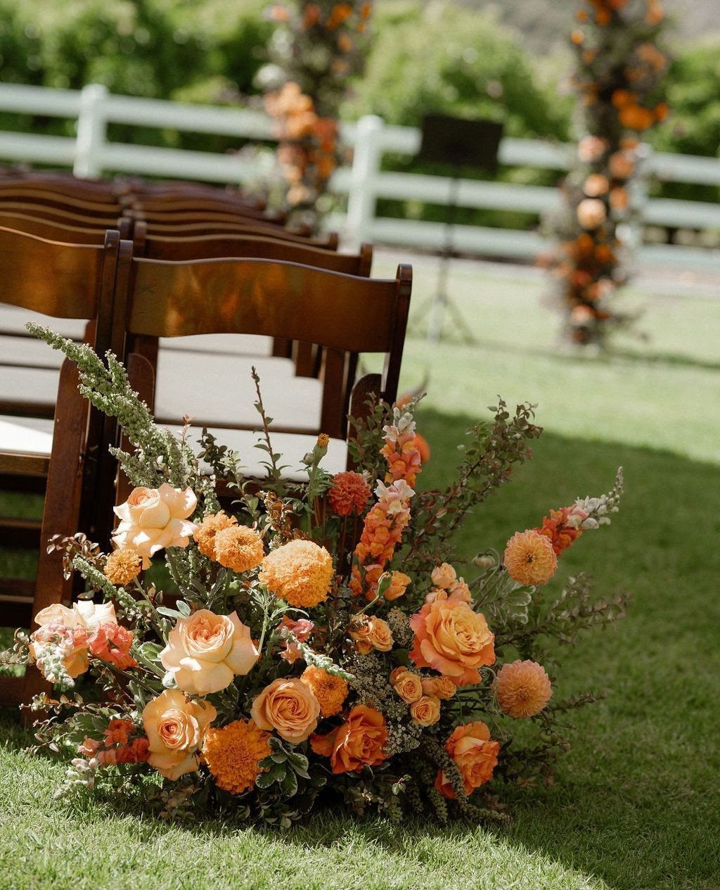
Orange works best in autumn when it is muted. Roses and marigolds in a softened pumpkin shade look like turning leaves rather than a Halloween display.
Greenery next to the orange keeps it grounded. Wooden chairs and a white fence let the flowers stand out, so keep the rest of the setup plain.
For a modest budget, put the orange on the ceremony aisle and a few floral pieces, and leave everything else neutral. I prefer this over orange linens, which can overwhelm an outdoor space.
9. Champagne and Salmon
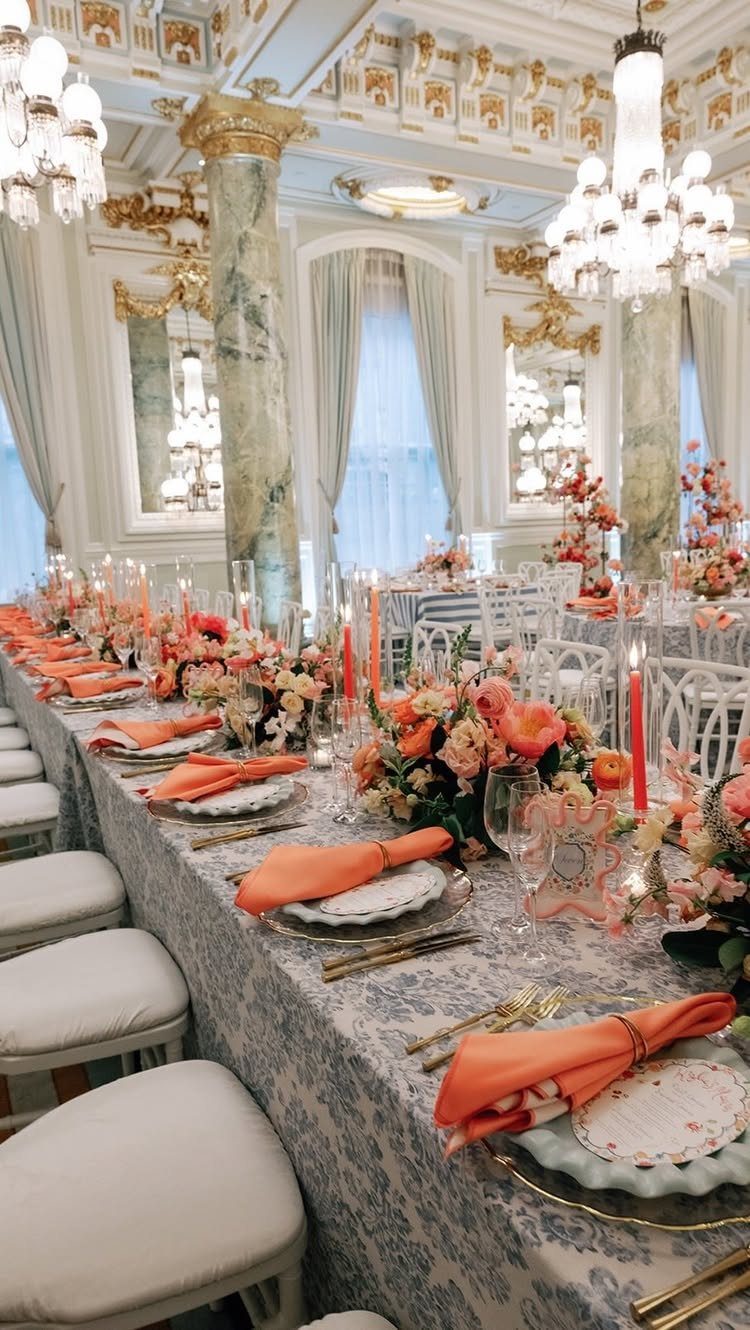
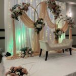
Salmon napkins and peach flowers set against champagne tones make a palette that feels soft without turning sugary. Neutrals do most of the work, and salmon adds just enough warmth to read as October.
Champagne with salmon looks best in a formal space, such as a ballroom with marble floors and crystal chandeliers, where the soft tones sit easily against the grand architecture.
A long table gives the napkins a repeating rhythm down its length.
Keep the flowers in one peachy family. Adding a third bright color would take away the calm that makes this palette work.
Choosing a Cohesive Palette
Once a palette reaches 5 colors, they start competing in photos and nothing reads as the lead.
Pick your starting point from whatever is already fixed: the wood tone in the venue, the shade of your dress, or a bloom you won’t trade away.
A color wheel helps with the mid-tone, since it shows which shades balance the anchor.
Then check the light. Light changes the math by month: early fall afternoons run warm and golden, but a November reception sits in the dark with candles, so rich colors carry and pastels wash out.
Keep a light neutral in the mix. 4 dark swatches side by side can look striking on a phone, then turn flat and muddy once they’re in a ballroom.
Lean all the way into autumn with a color palette that matches those insanely gorgeous color-changing trees. Perfect for an outdoor wedding, this scheme brings foliage vibes into your wedding party’s day-of looks.
Incorporating Textures
A palette gets depth from finish as much as from hue. Mix glossy and matte, metallic and plain, and use more than one shade of each color.
A matte burgundy runner next to glossy mahogany chiavari chairs gives the eye 2 surfaces to read. Gold chargers paired with hammered copper flatware do the same with metal.
I would pick one place for the shine and let everything around it stay quiet. Carry the colors through the decor and the attire alike, so the day reads as one scheme and not a set of matching parts.
Seasonal Flower Choices
Chrysanthemums, roses, and dahlias are the dependable October trio. Chrysanthemums bring warm fall tones, roses now come in rust, burgundy, and blush, and dahlias give you bold autumn color in one big bloom.
For texture, add amaranthus for trailing lines, eucalyptus for fresh green, and hypericum berries as filler.
On a tight budget, zinnias are the pick. They come in fall hues and cost less than most of the others.
For bouquets and centerpieces I’d reach for ranunculus, and sunflowers are the pick if you want a rustic feel. Ask your florist what is in season for your date before you commit to a color.
Frequently Asked Questions
What are winter colors for a wedding?
For a late-fall or early-winter date, deep jewel tones such as plum, wine, and hunter green work well, along with earthy shades like rust, ochre, and olive.
Candlelight is the main source of light at a late-fall reception, and it flatters deep, saturated shades while pale ones fade to nothing.
Pair the dark swatches with one soft neutral, like ivory or oatmeal, so a ballroom doesn’t swallow them into a single muddy mass.
What is the best color for October?
Burgundy (or wine) is the safest pick, and it pairs well with gold, copper, or cream.
Other strong October choices are hunter green, navy, deep orange, and marsala, since the month leans toward intense fall tones. Muted pumpkin looks better than bright orange, which can read as a Halloween display.
What are the best color combinations for a wedding?
For October, burgundy and gold, emerald and gold, navy and copper, and cranberry with mustard yellow are the strongest.
Each pairs a deep anchor with a metal or a warm accent, so the scheme looks rich without needing a third bright color. For a softer look, sage, champagne, and dusty rose also work.
What are the best fall wedding colors for a September wedding?
Lean transitional: sage and terracotta, dusty blue and rust, or honey and ivory.
Light in early September still has a golden cast, so warm mid-tones like terracotta, dusty rose and olive feel right, and heavy jewel colors can look out of season. Save the heavy burgundies and purples for later in the fall.
Is burgundy a good fall wedding color?
Yes, burgundy works well, and it looks best in October and November when the light is lower and the days are darker.
Gold chargers and white linen keep it from feeling heavy. If the date falls in early fall, I’d keep burgundy to small touches, like a ribbon or a few blooms, set against champagne or sage.
How many colors should a fall wedding palette have?
Three or four, with one anchor, one or two mid-tones, and one neutral or metal. At 5 colors or more, the palette starts fighting itself in photos, and no single shade stands out as the one people remember.
Begin with whatever can’t change, such as the wood tone of the venue or the shade of your dress, and build the rest of the palette around it.