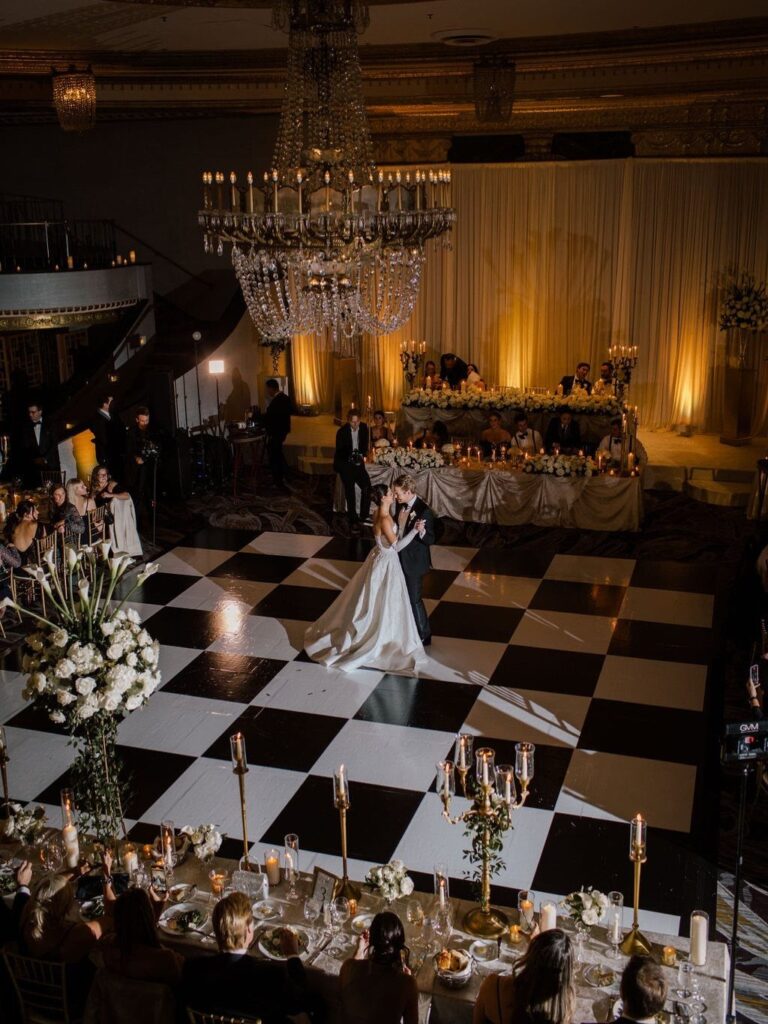
The ideas here run from nearly free choices like black and white linens and personalized favors to bigger commitments like black bridesmaid gowns or a black and white cake.
What decides which ones are yours is the room: a dark venue needs white linens, florals and lit candles to carry the palette, while a light one lets black and white backdrops and contrast stand out on their own.
Even the smallest choices count, since black napkins on white cloths set the whole color scheme before a single flower arrives.
1. Black and White Linens
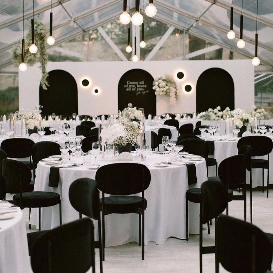
White tablecloths with black napkins give a reception its whole palette before a single flower arrives. The napkins do the contrast work, so that is where I would spend the effort.
Keep the cloths plain and let black chairs and white centerpieces repeat the same 2 colors around the room. Fold the napkins the same way at every seat; the consistency reads as intention.
If the budget is tight, rent the cloths and skip anything patterned. Plain linens look better in this scheme than busy ones.
2. Black Gowns for Bridesmaids
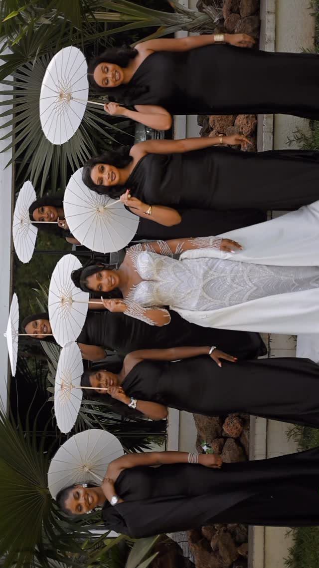
Black gowns on bridesmaids turn the bridal party into a frame for the bride. Against a white dress, a row of matching black gowns makes her the only light spot in the group.
Floor-length is the cut I would choose, since the length keeps the black looking formal rather than cocktail. Pick one fabric and one shade for everyone so the black doesn’t read as mismatched in daylight.
Black also lets each woman wear a neckline that suits her, and she can likely rewear it afterward.
3. Miniature Dishes
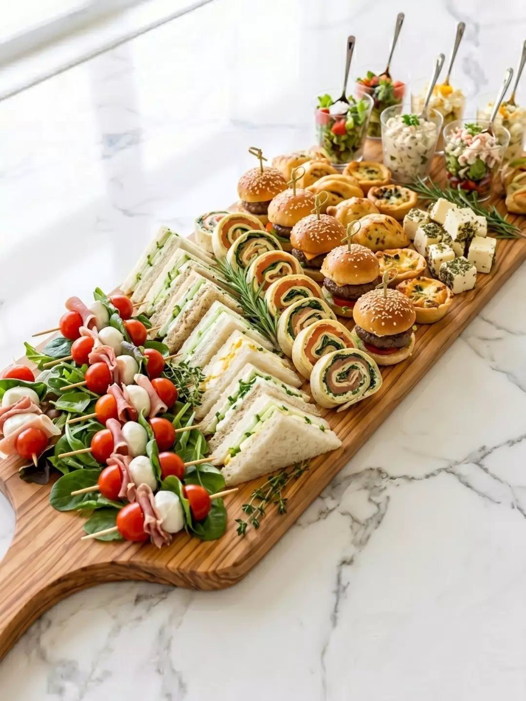
Mini dishes let a black and white wedding serve real food without a plated dinner.
I like them for cocktail hour, when guests are standing and holding a drink. One hand stays free, and nobody needs a fork.
Mix a few heartier bites with lighter ones so the board feeds people rather than just decorates.
4. Personalized Favors
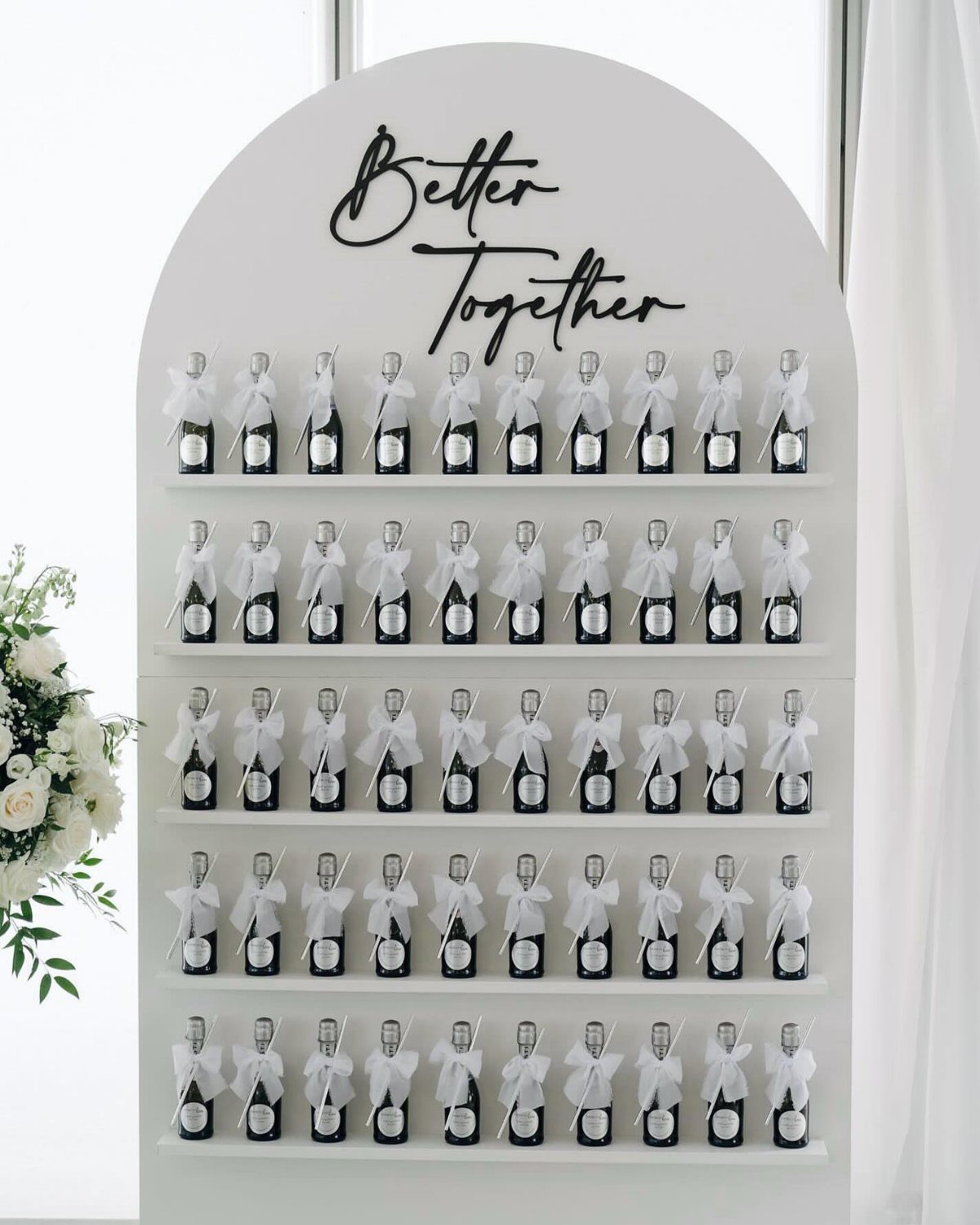
Mini champagne bottles tied with white bows are a favor guests actually use. Stacked on an arched wall with a sign, they also work as a display before anyone takes one home.
A short phrase like "Better Together" on a black sign keeps the palette tight and personal. Pick words that sound like the two of you, not a stock slogan.
Set out a bottle for every guest, and count the shelves before you order. White flowers at the side soften the hard geometry.
5. Black and White Backdrops
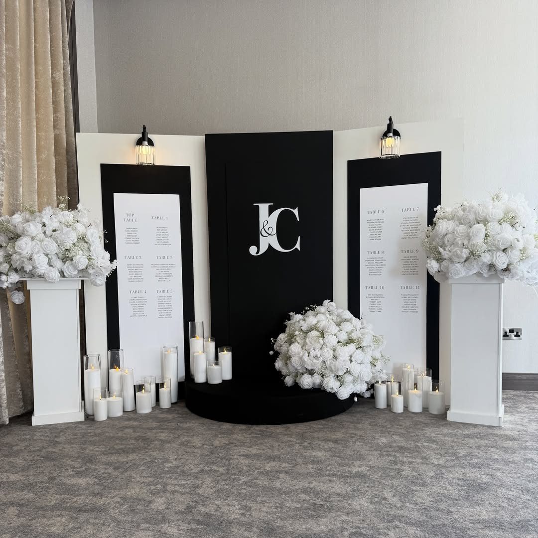
A seating chart can double as the room’s best backdrop. Black and white lettering for "Top Table" and the table numbers reads from across the room, which helps guests find their seats.
Add white flowers and candles at the base to keep it from looking like a sign. Initials give it a wedding feel instead of an office one.
Against grey carpeting, the black and white stands out. In a darker room, I would lean on the white elements and light the candles.
6. Black and White Cake
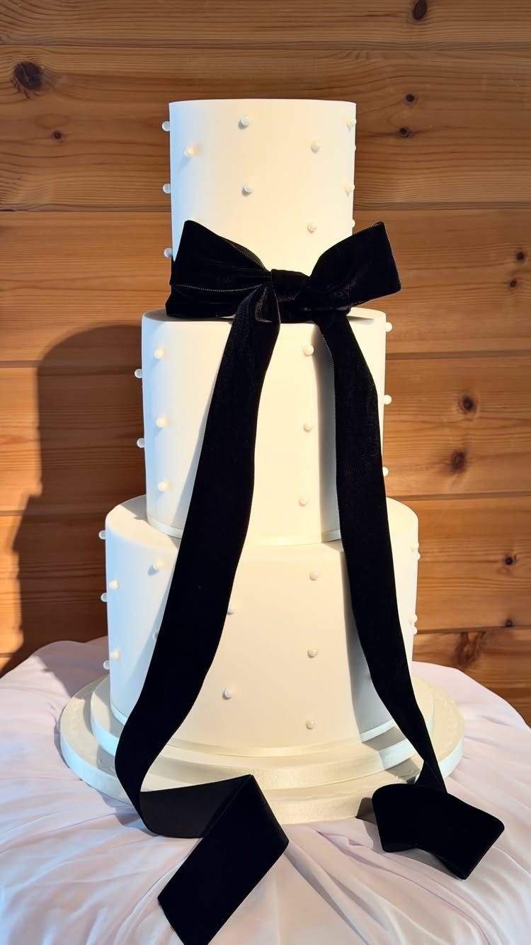
A three-tier white cake with a large black velvet bow is the simplest way to make dessert match the palette. Small white dots add texture without adding a second color.
The bow is the decision. Velvet gives a matte black that frosting can’t, and the ribbon is easy to swap or remove after the cutting.
I would choose this over a heavy black-frosted cake. White tiers slice cleanly, and the ribbon carries the contrast.
7. Black and White Invitations
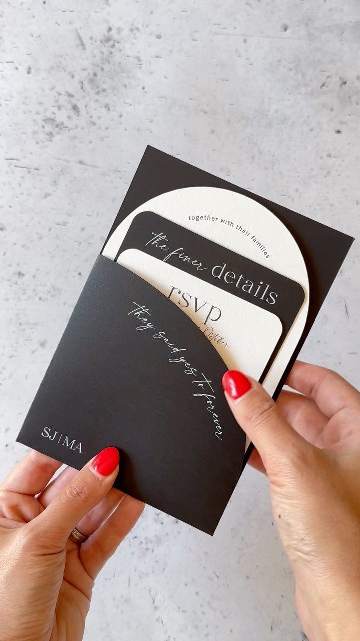
A black envelope holding white arched cards sets the palette before anyone opens it. The arch shape echoes ceremony arches, so the stationery already hints at the day.
Keep the suite to 2 colors and let the type do the work. White ink on black reads best when the lettering is clean and not too small, so check the RSVP card in particular.
Add your initials in one spot, like the "SJ | MA" monogram, and nowhere else.
Order a printed sample first. Black stock can look different from what a screen shows.
8. Candlelight and Florals
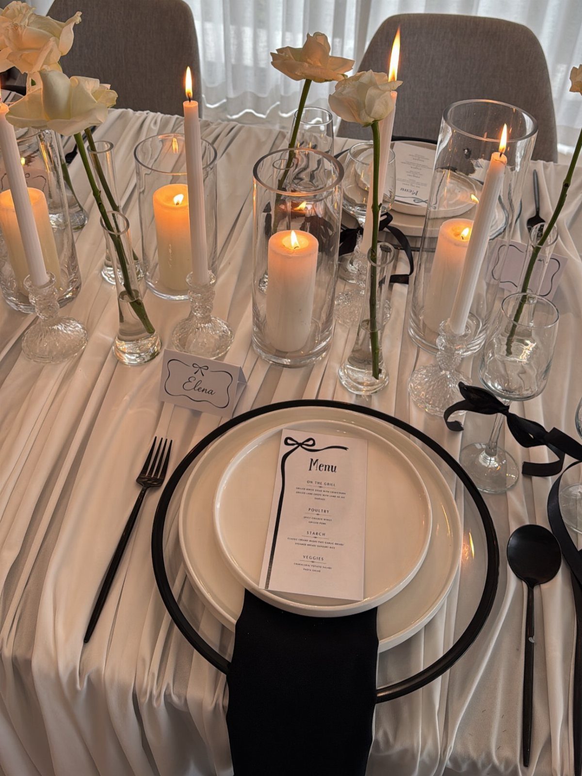
Candles on a white-linen table do the work that a lighting budget usually does. A cluster of lit white tapers and votives next to white flowers gives faces a warm glow and keeps the palette intact.
I would vary the heights so the flowers and flames sit at different levels, and keep everything low enough that guests can see across the table.
Black napkins and white plates already supply the contrast, so the candles can stay quiet.
Light them shortly before guests sit down. Add a few extra candles at the edges of the room if the venue is dim.
Timeless Color Palette
Black and white reads as classic because it has history behind it: checkered marble floors in old mansions, monochrome photography, famous fashion moments. That history is why the palette never feels dated, and why it bends to almost any style.
If you worry it will feel flat, decide on a direction early. A minimalist day keeps the lines clean and the decor sparse, while a soft, vintage day leans on gentler finishes and older details.
Either way, the attire and finishes carry the personality, so pick those with your own taste in mind.
Modern, industrial and simple all work here, which makes the palette a safe base if you haven’t settled on a style yet.
Contrast and Visual Interest
Contrast is what keeps 2 colors from looking flat, and texture is the cheapest way to add more of it. Pair a matte surface with a shiny one: matte black against glossy white, or the reverse.
Put the darkest items where you want eyes to land, and let white fill the space around them. If everything is equally dark or equally light, the room loses its focal points.
Repeat each texture at least 3 times around the room so it looks planned. One lone shiny object looks like an accident.
Look at your photos in grayscale on your phone before you commit. If you can still tell the pieces apart, the contrast is working.
Incorporating Personal Touches
Personal details work best when they come from your actual story, not from a list of trends. Start with something only the two of you would know: a place, a phrase, an inside joke, a song title.
Then choose one or two spots for it and stop. A detail repeated everywhere stops feeling personal and starts feeling like branding.
Keep each touch in the black and white palette so it blends in rather than competing. If a detail needs a third color to make sense, it probably belongs somewhere else.
Write down three things you want guests to remember about you, and cut any idea that doesn’t point back to one of them.
Frequently Asked Questions
Is it okay to wear black and white to a wedding?
Yes, at a black and white themed wedding it is expected. Black gowns on bridesmaids are a good example: a row of matching floor-length black dresses in one fabric and one shade frames a bride in white.
Outside a themed day, I would still avoid a full white dress, since that color belongs to the bride.
What are the 2026 wedding color trends?
Black and white is a safe pick because it reads as classic and never feels dated.
Black and white adapts to minimalist, vintage, modern or industrial looks alike, so it makes a safe starting point while your style is still undecided.
Mixing finishes keeps the palette feeling current, for instance matte black plates set against glossy white candlesticks.
How do you make a black and white wedding not look flat?
Add texture and repeat it. A quick test: snap the table in grayscale on your phone, and if each piece still reads as its own shape, the contrast is doing its job.
How do you decorate tables for a black and white wedding?
Start with plain white tablecloths and black napkins folded the same way at every seat. Setting black chairs at tables with white centerpieces echoes both colors across the whole room.
Add white tapers and votives at varied heights, kept low enough for guests to see across the table. Renting plain cloths is the budget move, and patterns are best skipped.