Navy can be as small as a boutonnière or an invitation, or as big as a room of navy tablecloths and bridesmaid dresses, and the cost climbs with how much of the room the color covers.
How much of the dark you want guests to see at once decides your version: tablecloths cover more than anything else on the list, while navy invitations or a navy and silver palette only hint at it.
On a tight budget, keep the navy to small pieces like the invitations and boutonnières, and let white or one metal, silver or gold, fill the middle.
1. Navy Wedding Cake
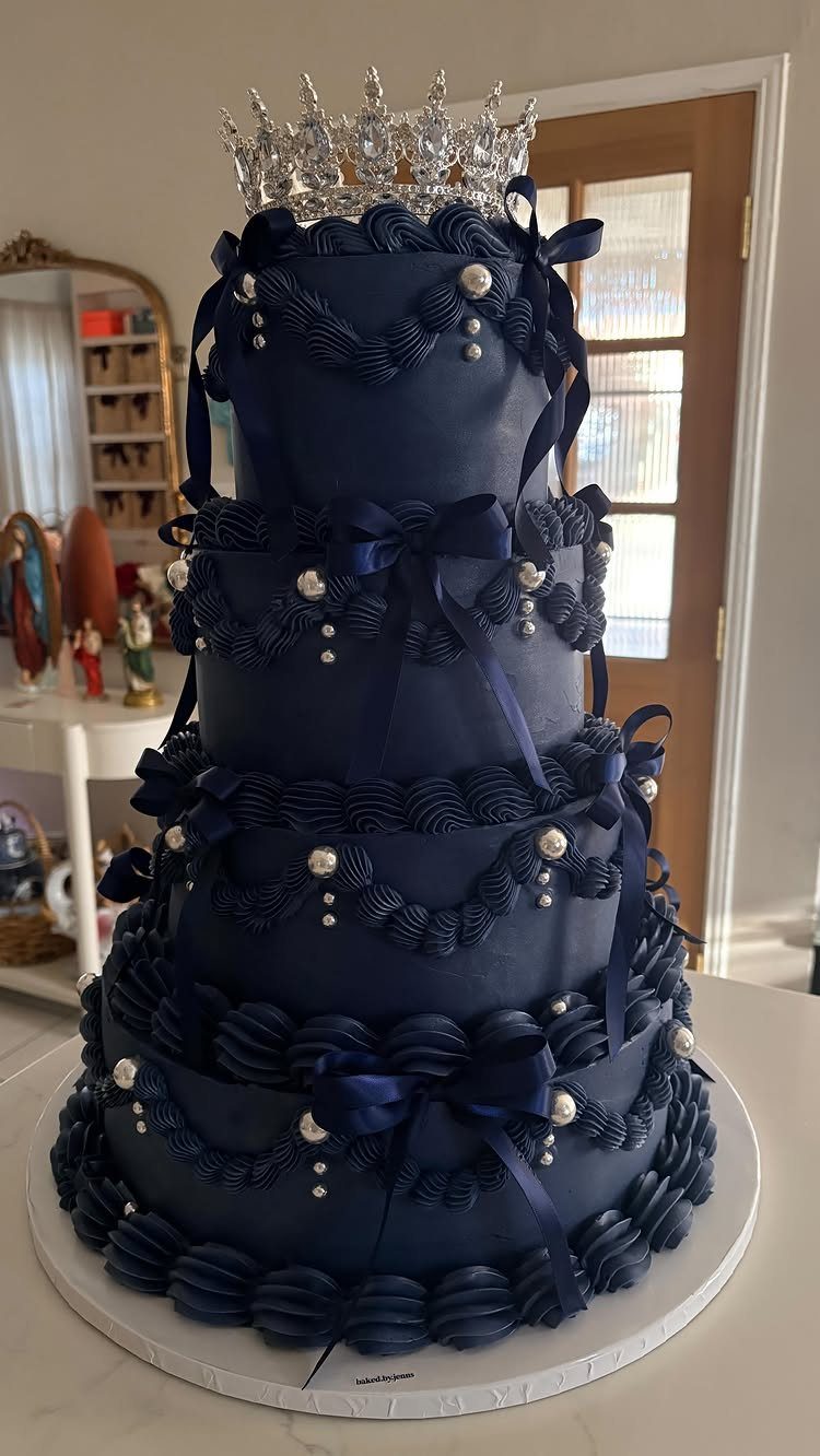
4 tiers in deep navy read as formal without any flowers at all, and the silver crown, ribbons and pearls here do the decorating for you.
One tier of the cake will always be the darkest thing on the dessert table, so keep the board white and the toppers light.
Ask your baker to show you how dark navy frosting looks in daylight and under reception lighting.
Deep colors take heavy dye, so a tasting is smart before you commit. Silver accents are the cheaper way to add polish than sugar flowers.
2. Navy Bridesmaid Dresses
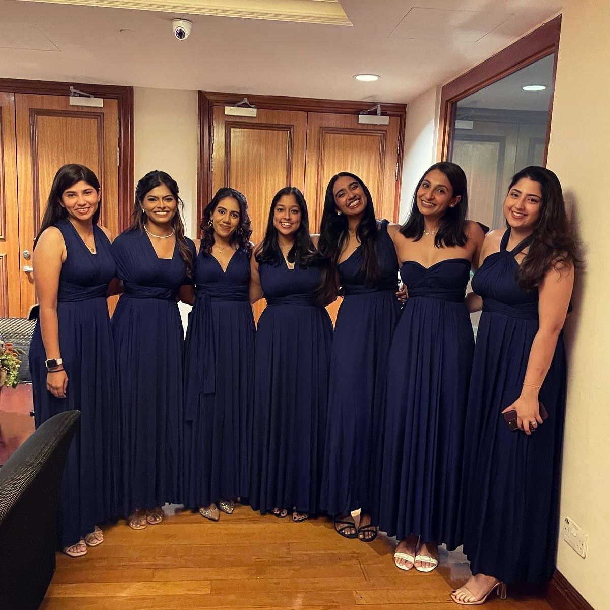
Floor-length navy is forgiving on a group, because mismatched necklines and silhouettes still look like a set when the color holds steady.
Letting each bridesmaid choose her own style costs you nothing and usually means everyone is comfortable enough to stay in the dress all night.
Give them one shade name or fabric swatch so the navy doesn’t drift from dress to dress. Order everything from the same dye lot if you can.
3. Navy and White
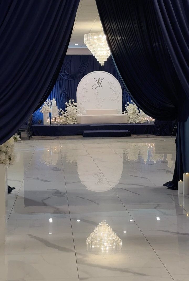
White does the heavy lifting in this pairing, and navy frames it. Think of navy as the edge: curtains, linens or a ribbon, with white flowers and a pale floor in the middle.
Navy lives in the linens, napkins, and ribbon, and white flowers are easy to find at every price, so this is one of the easier palettes to keep under budget.
Keep the white consistent, since cream next to crisp white looks like a mistake. A monogram on a plain backdrop adds a personal touch without extra blooms.
4. Navy and Blush Pink
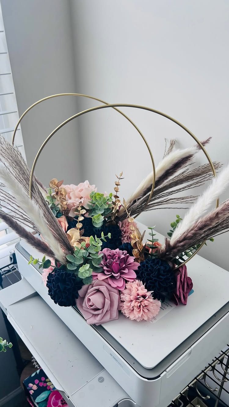
Navy keeps blush from turning sugary.
Use blush for the bulk of the flowers, then add a few navy blooms and green for contrast, and the arrangement stays soft without looking sweet. Pampas grass adds height and texture for little money.
Gold hardware, such as hoops, cake stands or flatware, warms a navy and blush palette and keeps the navy from reading cold. I would pick one metal and stay with it.
Blush fades to nothing in photos if the light is dim, so let navy do the defining work.
5. Navy and Silver
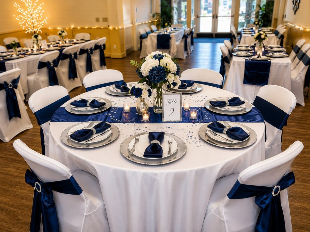
Silver chargers under white plates are the quickest way to make a navy table look modern. Add a navy runner down the center, white and blue flowers, and the linens can stay plain white.
Chargers are usually rented by the piece, so count your guests before you price them. Table numbers like the "Table 2" card here keep the look tidy.
I prefer silver here over gold, since it sits cooler beside navy and keeps the palette crisp.
6. Navy Invitations
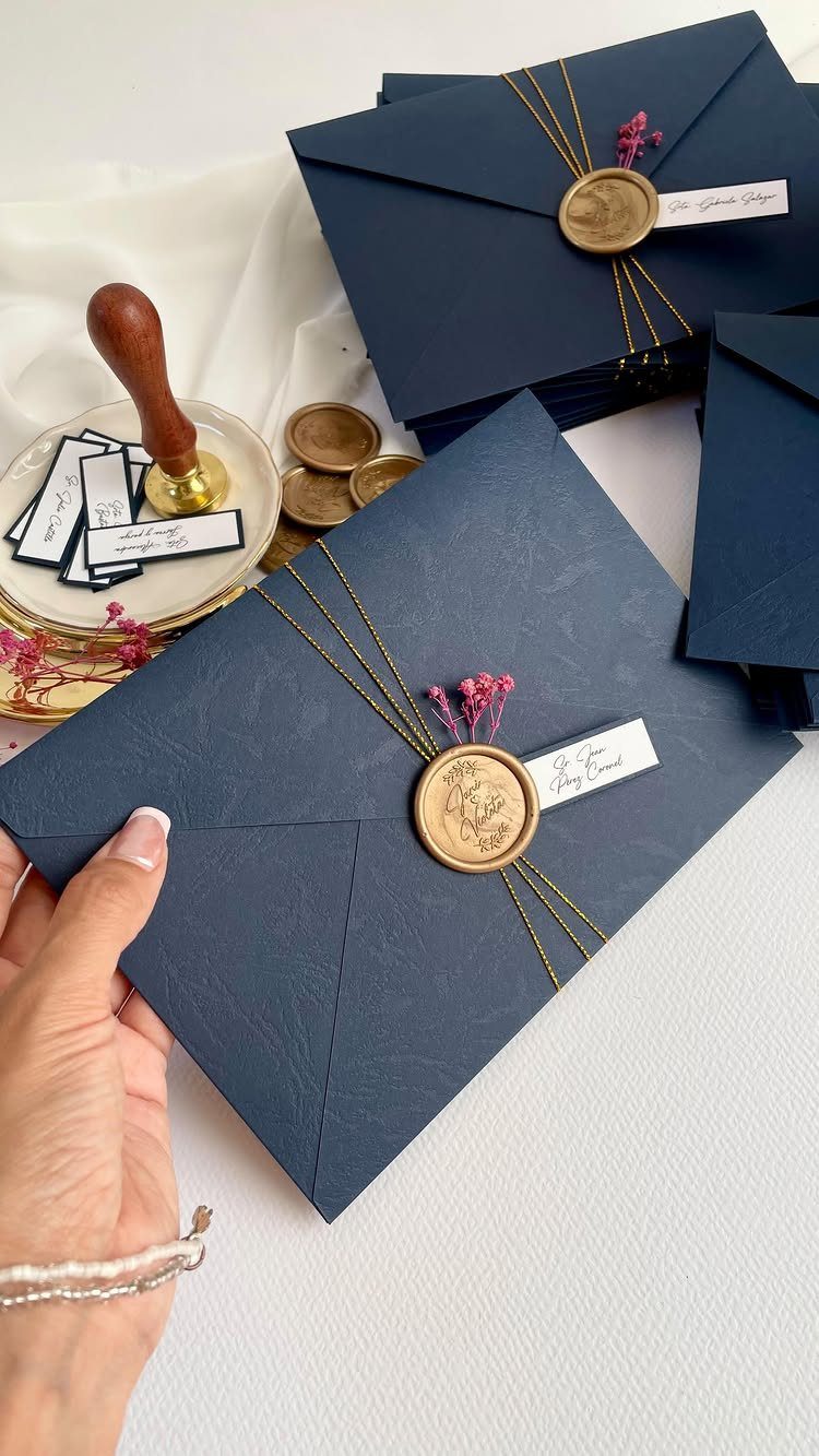
An invitation is the first color guests see, so navy envelopes tell them the palette before they open anything. A gold wax seal makes a plain envelope feel finished, and twine with a small flower adds a soft, handmade note.
Dark envelopes need light ink or a liner, because standard black pens vanish on navy. A white or gold pen works, or you can print addresses on labels.
Order a sample first to check the shade against your wedding palette.
7. Navy and Gold
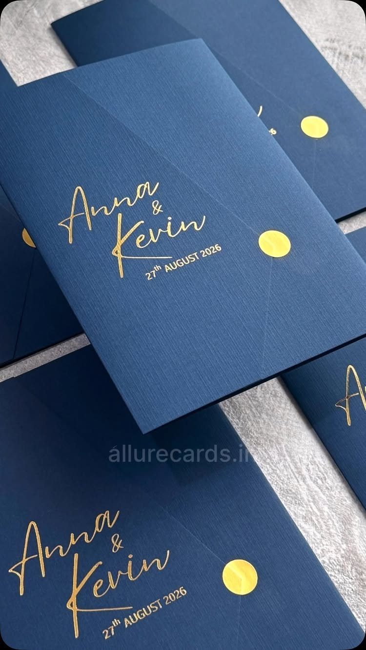
Gold foil on navy paper looks regal because the contrast is so high: metallic type catches light while the ground stays deep and quiet. Calligraphy suits it well, since thin strokes read clearly against dark stock.
Keep the wording short, with names and the date as the stars. A gold circular seal closes the set and costs little compared with printing a second color.
Carry the gold forward in small doses, such as flatware or a table number, and let navy stay the main color.
8. Navy and Coral
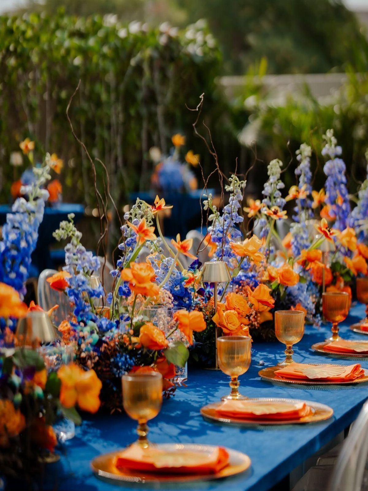
Coral against navy is the loudest pairing for a navy wedding, and it works because the two sit nearly opposite each other on the color wheel. Navy linen grounds the table so bright flowers can run wild without looking messy.
Pick one warm shade for napkins and blooms so the orange doesn’t split into three competing tones. Gold plates and amber glassware push the warmth further, and they keep the coral from fighting the navy.
I would choose this for an outdoor daytime wedding, where the color has room to breathe.
9. Navy Tablecloths
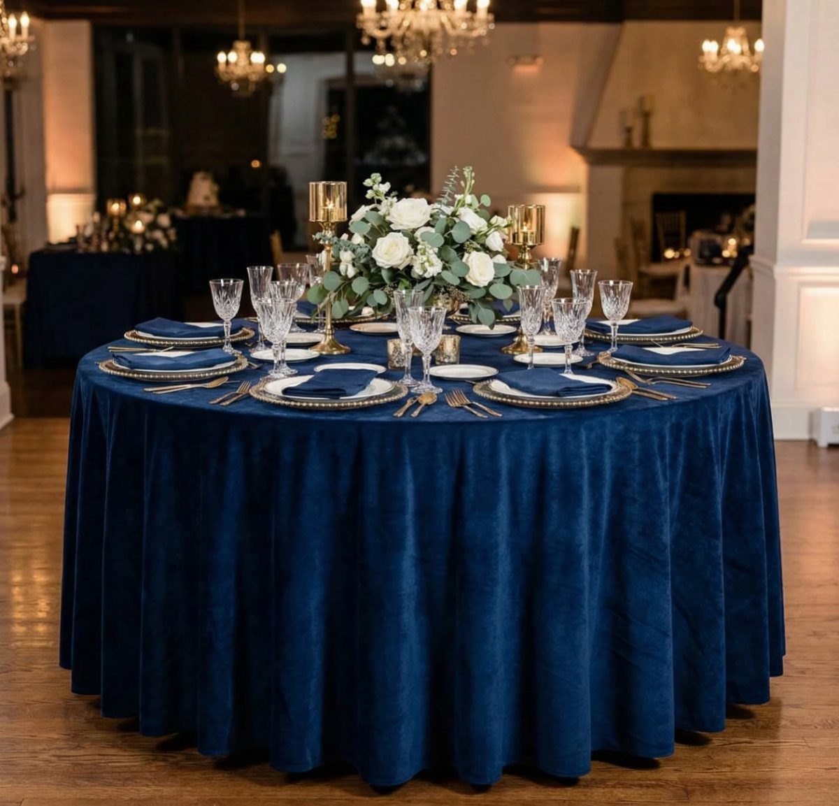
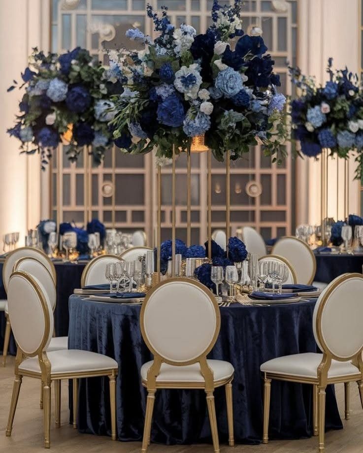
A tablecloth covers more of the room than any other single item, so a navy one sets the mood before a single flower arrives.
Velvet adds depth and looks rich under chandeliers, though it usually costs more to rent than plain polyester.
Keep everything on top light: white napkins, white flowers and gold chargers stand out against the dark cloth.
Count your tables and check the drop length with the rental company, since a cloth that stops short of the floor spoils the formal look.
10. Navy Boutonnière
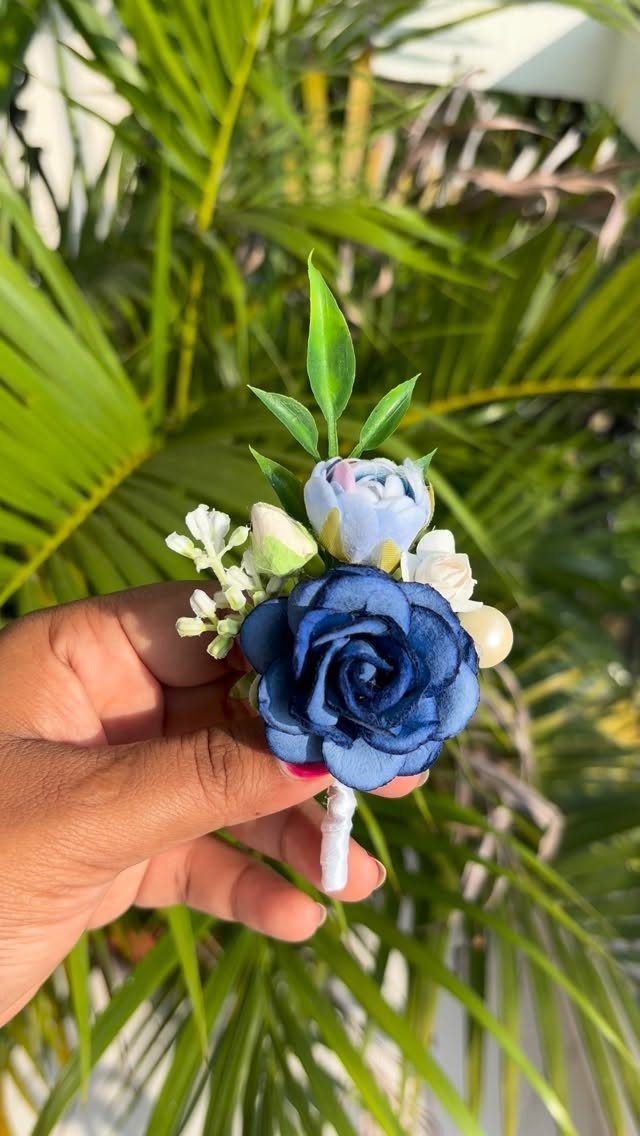
A navy boutonnière lets the color show up on the groom and groomsmen without a full palette change.
Navy roses with light blue and white accents and some green leaves look tailored, and the pale flowers keep the dark ones from vanishing against a dark suit.
Artificial flowers, as in this one, can be made weeks ahead and don’t wilt, which takes one task off a deadline-heavy list.
Pin it on the left lapel and test the placement before the day.
Symbolism of Navy Blue
Navy reads as trust, loyalty and stability, which is why it suits a day built around a promise.
It also carries a sense of depth and wisdom, so it fits couples who want a refined, lasting feel rather than a trend.
Because the color isn’t tied to a season, it works in any month.
If you want the meaning to show, use it where guests see it first and longest, and keep the rest of the palette light so it has room to stand out.
Navy Blue Wedding Attire
A navy gown is the boldest move for the bride, and a traditional white gown with navy accents is the gentler one.
A sash or navy shoes carry the color without changing the dress, and statement earrings do the same job in a smaller way.
A navy suit or a navy tuxedo on the groom picks up the palette on its own, with no extra styling needed.
Gold or silver jewelry on navy bridesmaid dresses finishes the look and keeps it polished. I would match the metal to the rest of your table so the whole look agrees.
Navy Blue Wedding Themes
Navy suits a black-tie ballroom and a barn or backyard equally well, so the color rarely dictates the venue. It pairs with many other colors, which lets you shift the mood by changing the partner shade rather than the base.
It also flatters a wide range of skin tones and makes a deep, quiet backdrop for photos. That matters when you are picturing how a whole guest list will look together in one group photo.
Navy is a good alternative to black if you want formality with a little more warmth. For a rustic feel, keep textures natural; for black tie, keep surfaces sleek.
Wedding trends come and go, while others remain perennial favorites for both decor and wedding attire alike. A navy blue color palette, for example — despite the fact that it’s having a moment according to Pinterest — is as timeless as they come.