The 12 palettes below run from a single accent like burnt orange napkins on white linens to a full-room commitment like forest green linens under a draped fabric ceiling, and the cost follows how much of the room the color has to cover.
The rule that picks yours is the venue: a shade has to suit your taste, the space and the month, so one that fights the carpet or brick drops out early.
Napkins and sashes are the cheapest place to test any of them, and November’s early dark gives candles and warm lighting most of the work.
1. Burnt Orange
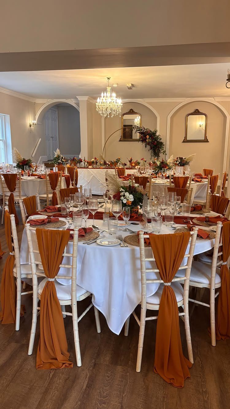
Burnt orange works best as an accent against white linens, where a few napkins, candles or stems carry the color without crowding the room.
Sashes and napkins carry the color while the tablecloths stay neutral, so the orange reads as deliberate rather than loud.
Napkins and chair sashes are the cheapest places to spend it, since you rent or buy them once and the florals can stay mixed.
I would pair it with autumn blooms in similar warm tones and let a chandelier or warm lighting do the rest.
2. Dusty Blue
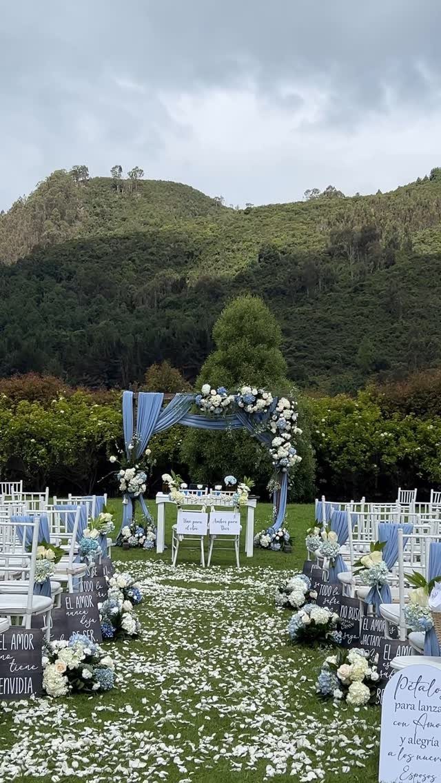
Dusty blue is a gray-leaning blue, and it softens a November ceremony more than any warm autumn shade can. Draped fabric across an arch gives you a lot of color for little money compared with a full floral build.
White blooms leave the dusty blue fabric as the focus, so spend the color on napkins, runners or bridesmaid dresses and let the florals stay quiet.
If your ceremony is outdoors with trees behind you, the muted blue sits quietly against green and gray without competing.
I would pick this palette for a calm, romantic look rather than a bold one.
3. Burgundy
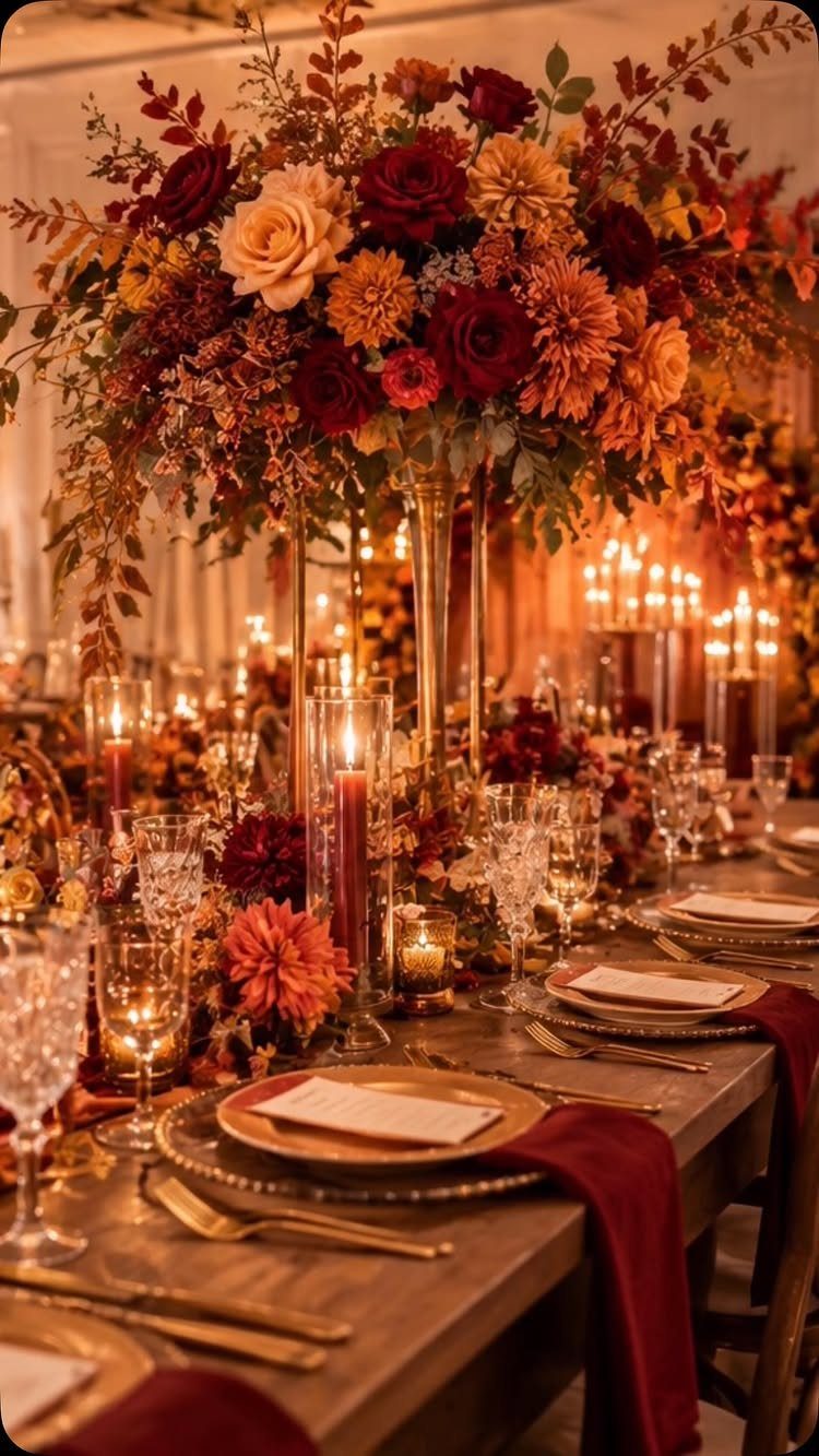
Burgundy gets richer with company.
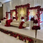
Gold is the accent I would choose, because it lifts the dark red without adding another hue to manage.
Lots of candles do much of the decorating here, so budget for them before you add extra pieces.
4. Champagne
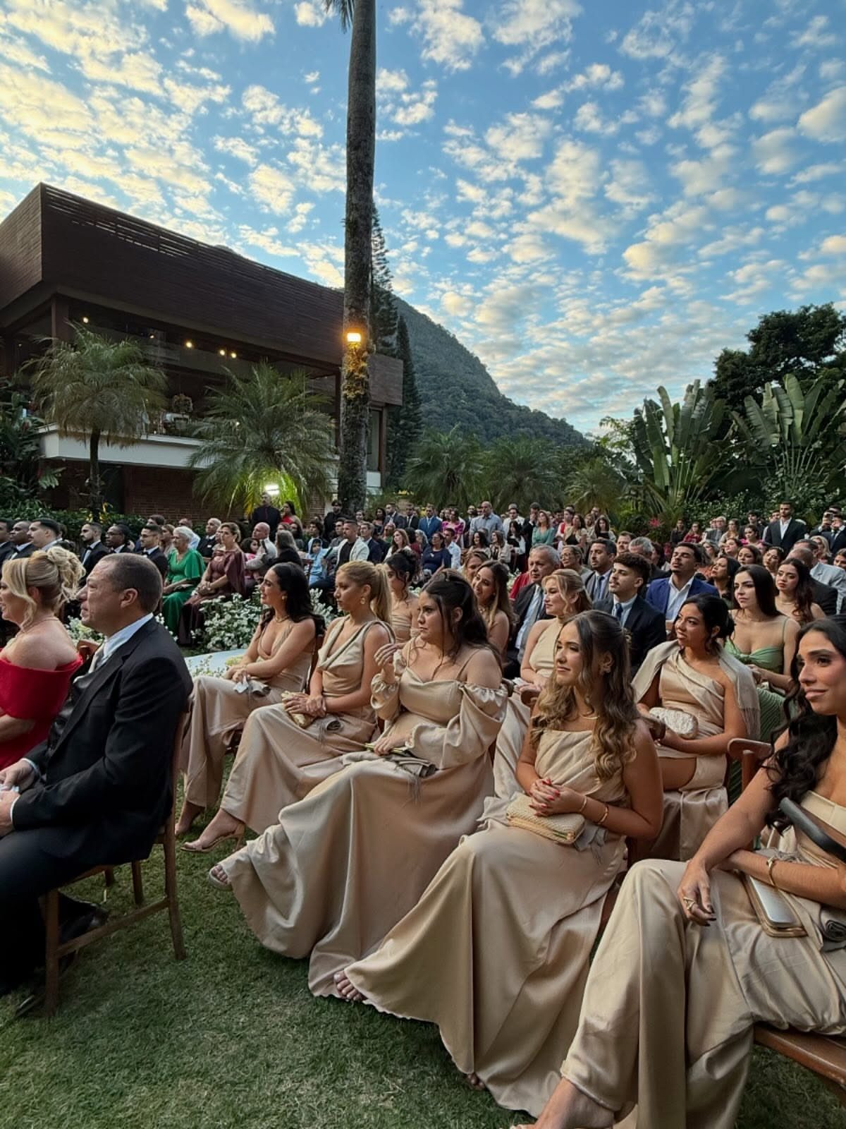
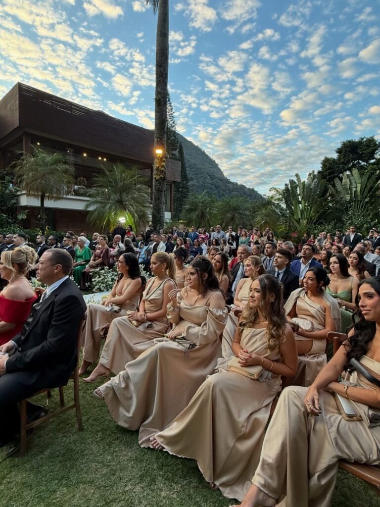
Champagne satin on bridesmaids is a quiet way to bring a palette into the ceremony. The shade is a soft beige with a little warmth, so it sits comfortably against mountains, brown buildings and cloudy November skies.
Because it is so neutral, it pairs with nearly any other color on this list. I would use it for dresses and let flowers or linens carry something stronger, or the whole party can fade into the background.
5. Forest Green
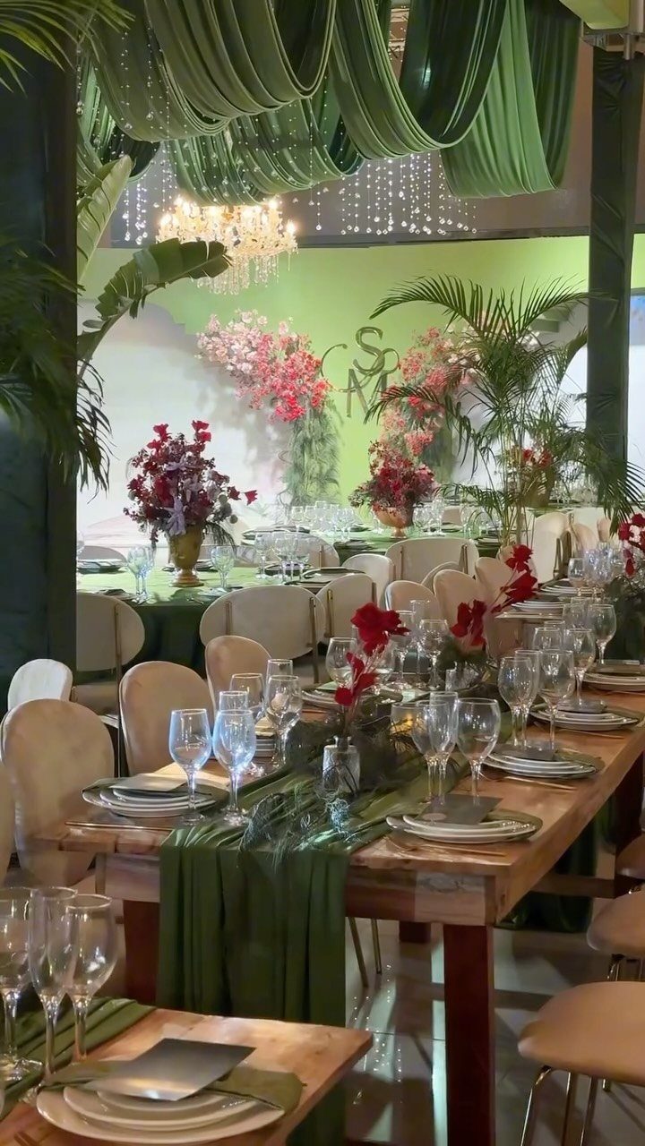
Forest green linens and a draped fabric ceiling change a room’s mood from the top down. Add green runners on long wooden tables and the wood, the green and the crystal light all start to work together.
Red and pink florals give the green something to push against, so choose blooms with real contrast rather than more green.
One maker said the day joined two cultures, so every detail was chosen to reflect that unity, and a palette like this can carry meaning too.
6. Terracotta
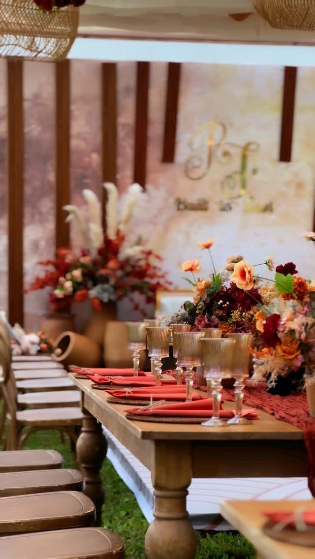
Terracotta napkins on a wooden table need very little else. Amber glassware picks up the same baked-clay warmth, and autumn florals fill in the rest.
I like this palette outdoors, where a backdrop with gold calligraphy adds a finish without more color. Start with napkins, since they are the least expensive piece, then add glassware if the budget allows.
7. Soft Blush
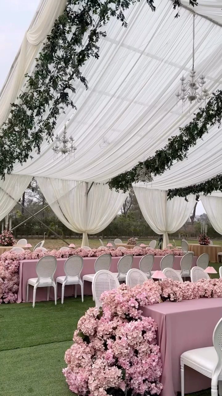
Pink tablecloths under a white draped tent keep blush from reading as sweet.
Soft blush works best when something else carries the contrast, so pair it with white chairs, a white canopy or plain greenery, and then the pink can cover the tables completely without turning sugary.
I would rent the tablecloths and keep everything else white, since linens are where blush has the most impact.
8. Gold and Glitter
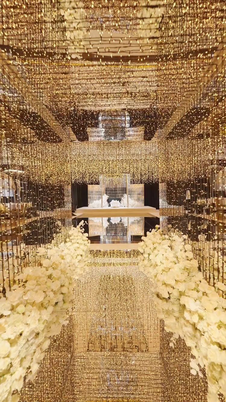
Gold beaded curtains turn a walkway into a glittering entrance, and white florals keep the shine from tipping into costume. A mirrored ceiling doubles whatever light is already in the room.
Winter gets the credit for this palette, but nothing about it belongs to one season, and November’s early dark helps it.
I would put the gold in one place, like a curtain or a cake backdrop, and let white flowers fill the rest.
9. Navy and Copper
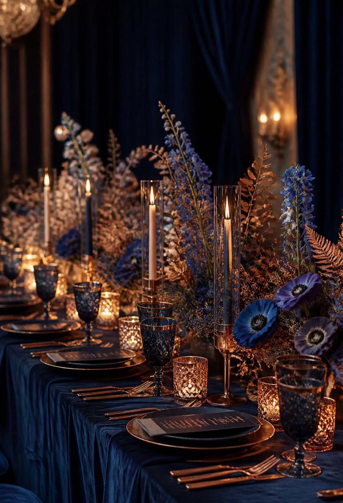
Navy linens with copper cutlery and copper candle holders give a table a warm glow against a deep, cool base.
Navy glassware and blue florals keep the table in one color family, and copper then reads as the accent in candleholders, flatware or small details.
Candles do the most work here, because flame light brings out the copper. I would spend on the flatware and holders first, then add blue flowers in a few shades so the table has depth instead of one flat tone.
10. Purple and Gold
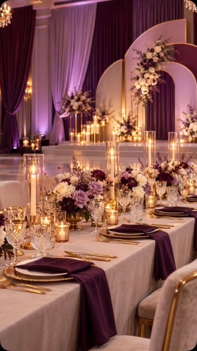
Beige linens are what make purple napkins and gold cutlery look rich instead of heavy. A neutral base gives the two strong colors room, so each one reads clearly.
Purple floral centerpieces repeat the napkin color, and gold arched backdrops or purple curtains can carry it across the room. I would keep gold to flatware and one backdrop, and set the purple in napkins and flowers.
11. Modern Black and White
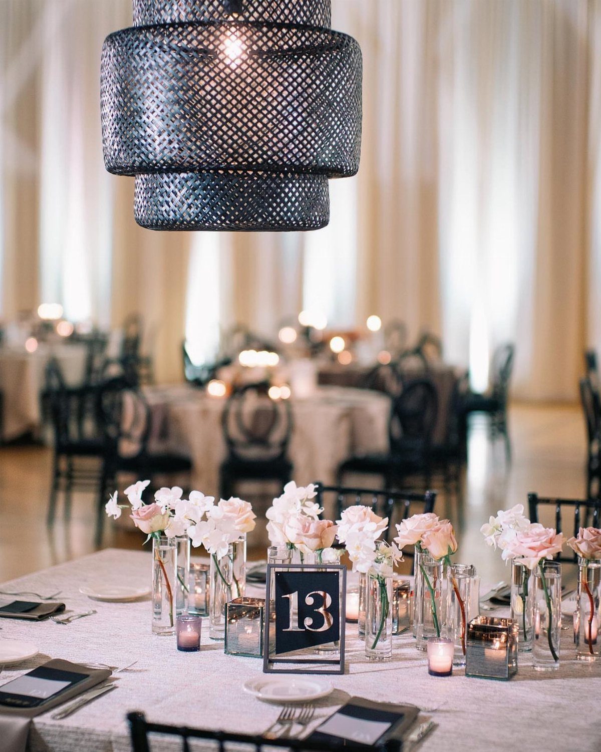
Black chairs against white linens make a table look graphic before a single flower goes down. Pale flowers soften the contrast, and a black table number adds a small mark of the same color.
A large black pendant fixture overhead can anchor a whole table. I would keep the florals light and airy, since the black already supplies the drama.
12. Jewel-Toned Autumn Florals
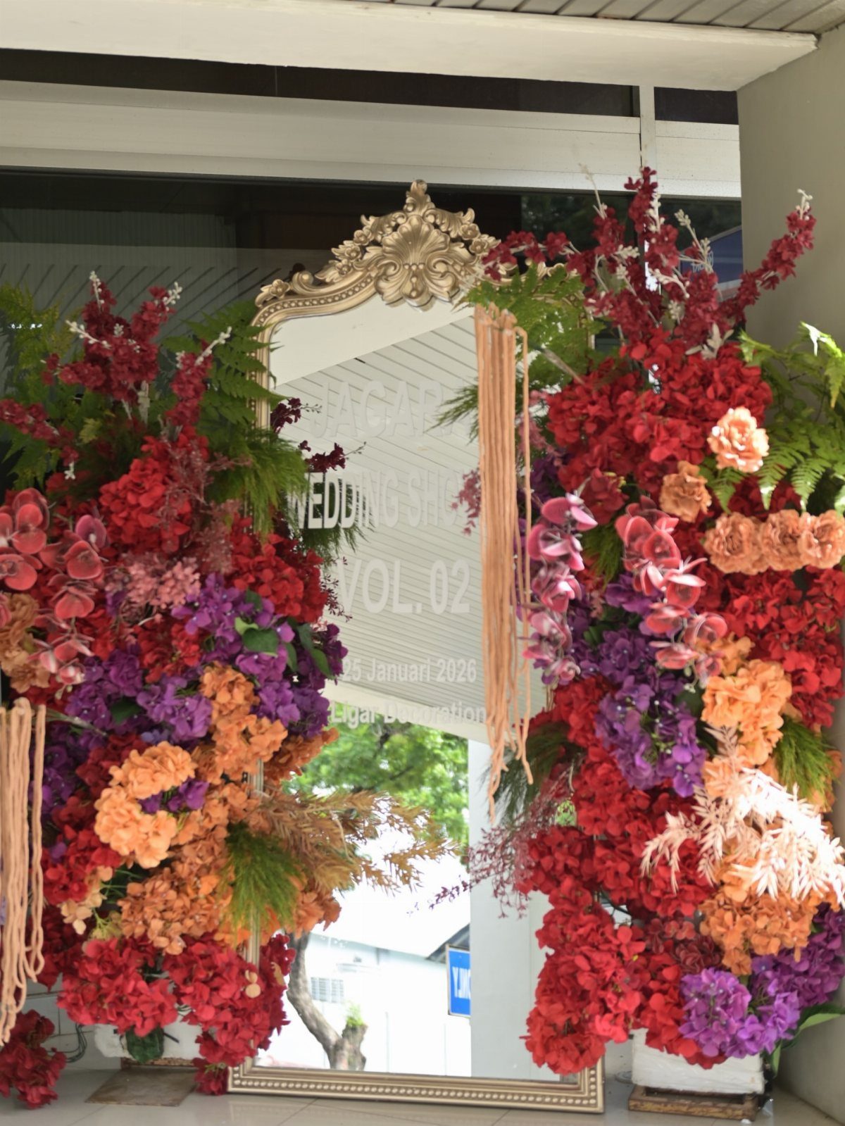
An ornate gold mirror makes a welcome sign that holds its own, and red, orange and purple flowers around the frame give it a rich autumn look. Gold and jewel tones share the same depth, so neither fights the other.
Mix all 3 colors in each cluster instead of grouping by shade. For a November wedding I would put this at the entrance, where guests see it first.
Choosing Your Color Palette
Before anything else, run every idea through 3 questions: does it fit your taste, the venue and the month?
A palette has to pass all three, so a color you love that clashes with the venue’s carpet or brick is worth dropping early.
Spend an evening scrolling Pinterest, Instagram and a few wedding blogs, then check which shades keep ending up in your saved folder. Those repeats are your real preferences, and they narrow the field faster than any rule.
For a fall palette, rich oranges, deep reds and warm yellows work in the bouquet, the table settings and the attire.
Slate gray taper candles add a cool-weather note to a fall table, and crimson, green and cream make a classic combination around them.
Incorporating Your Color Palette
Give each color a job before you buy anything. One shade leads, and the others support it in specific places.
Picture a black-tie ballroom: ivory linens, black napkins and one deep red bloom show how little it takes.
Notice that each color lands on a different category of item. That keeps the palette balanced, so no single color has to carry the whole room.
November Wedding Themes
Pick a theme as a filter for decisions, not a shopping list. Autumn Harvest is a timeless choice because it celebrates the bounty of the season and leaves room for many warm, inviting elements.
Hold the theme loosely and let the palette do the work.
Plum with slate gray holds its depth in that muted light, and neither shade washes out. If you are ordering printed pieces, ask your stationer and florist to match the same hex codes so everything lines up.
Frequently Asked Questions
What colors are appropriate for a November wedding?
Burgundy, burnt orange, deep plum, forest green and terracotta all suit the month, and dusty blue or champagne work when you want something calmer.
Warm, deep pigments hold up under amber reception lighting, which matters because the sun is down before 5 p.m. Burnt orange does best as an accent on white linens, with napkins, candles or sashes carrying the color.
Is November a popular wedding month?
Yes, it draws couples who want a cozy mood and the deep colors of fall.
The palettes are rich and warm, and early darkness makes candlelight and gold accents look their best. That setting makes many of the strongest November palettes easy to pull off on a modest budget.
What are the wedding color trends for autumn 2026?
Rich, warm colors lead, with rust, deep plum and burgundy showing up most often, and autumn harvest is a classic theme. Softer pastels, especially cool whites and blues, tend to flatten under the warm lighting most November venues use.