Venue and season settle your colors more than taste does, so start with Choosing Colors Based on Venue and Seasonal Color Inspiration, then pick the palette that suits both.
Some of these ideas cost almost nothing, like swapping napkins on white linens, while others build a whole palette from draped fabric, candles and florals; for a modest budget, one burgundy runner does more than a room of red blooms.
Before you commit to any palette here, hold your swatches up in the venue itself, since a clash with the carpet or drapes is the one you cannot fix.
1. Burgundy and Gold
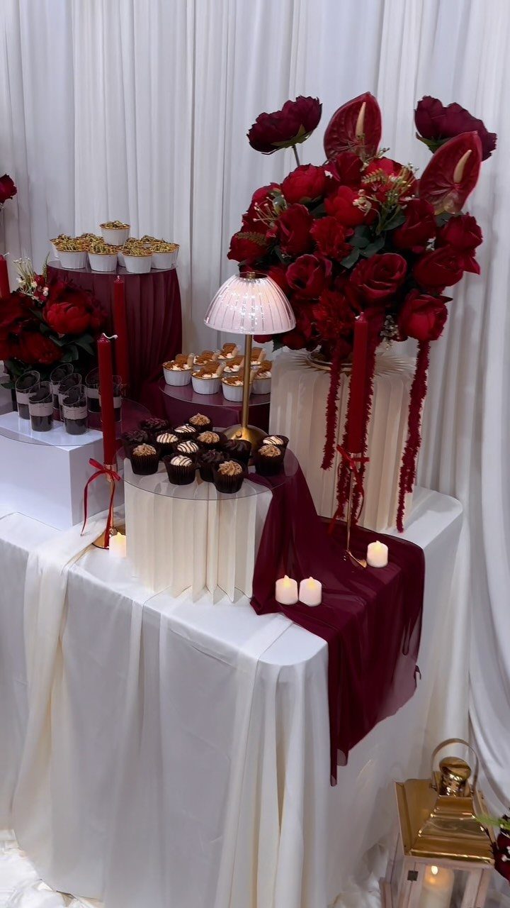
Burgundy works best when gold does the lighting. Metallic accents catch candle flame, so the deep red reads warm instead of heavy.
Keep white linens as the base and let burgundy arrive in runners and flowers, as it does on this dessert table.
Fabric is the cheapest place to spend the color, since a runner costs a fraction of what a room full of red blooms does.
Add more candles than you think you need, and repeat the gold in just a few pieces.
2. Mismatched Bridesmaid Dresses in Theme Colors
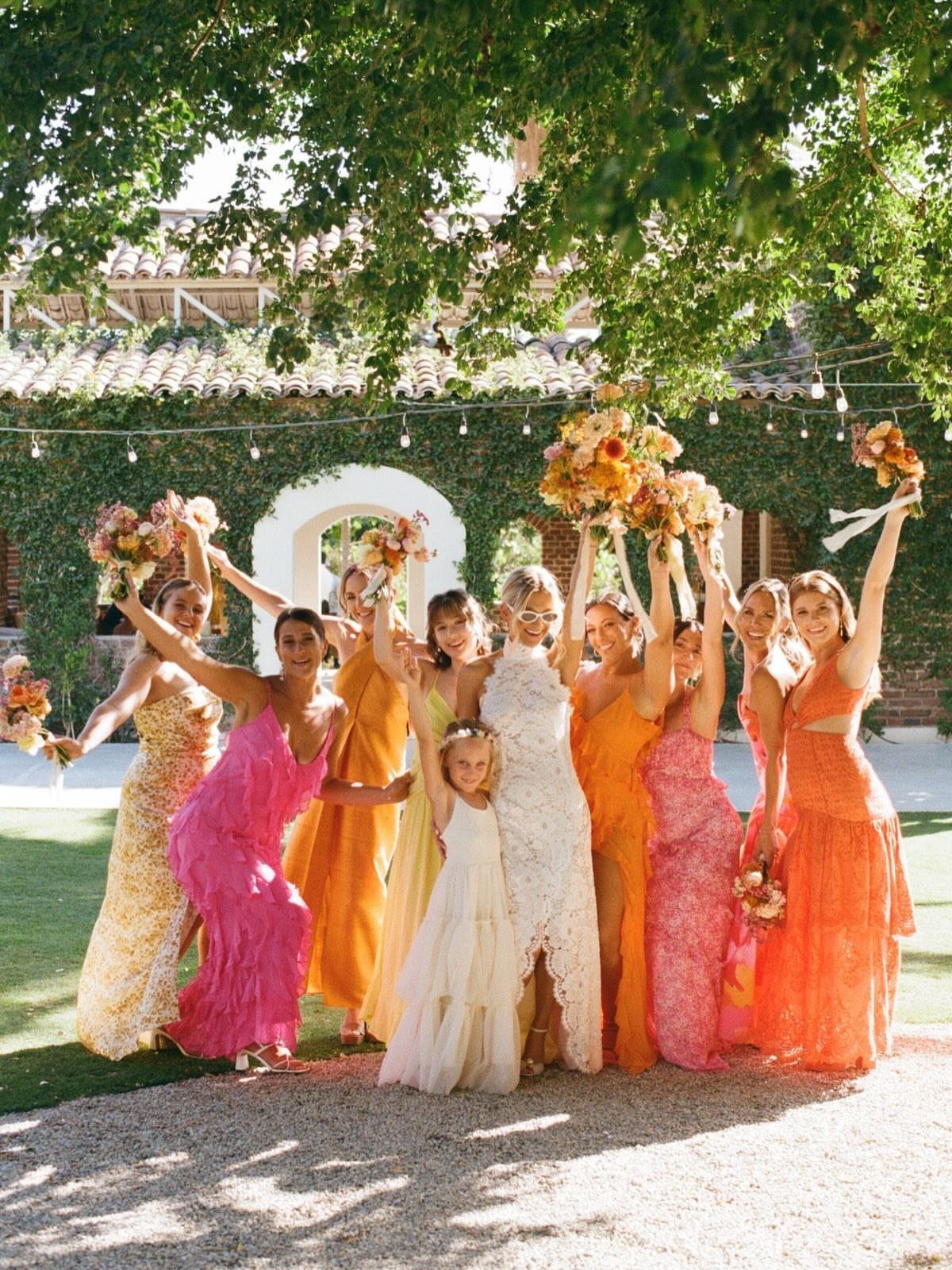
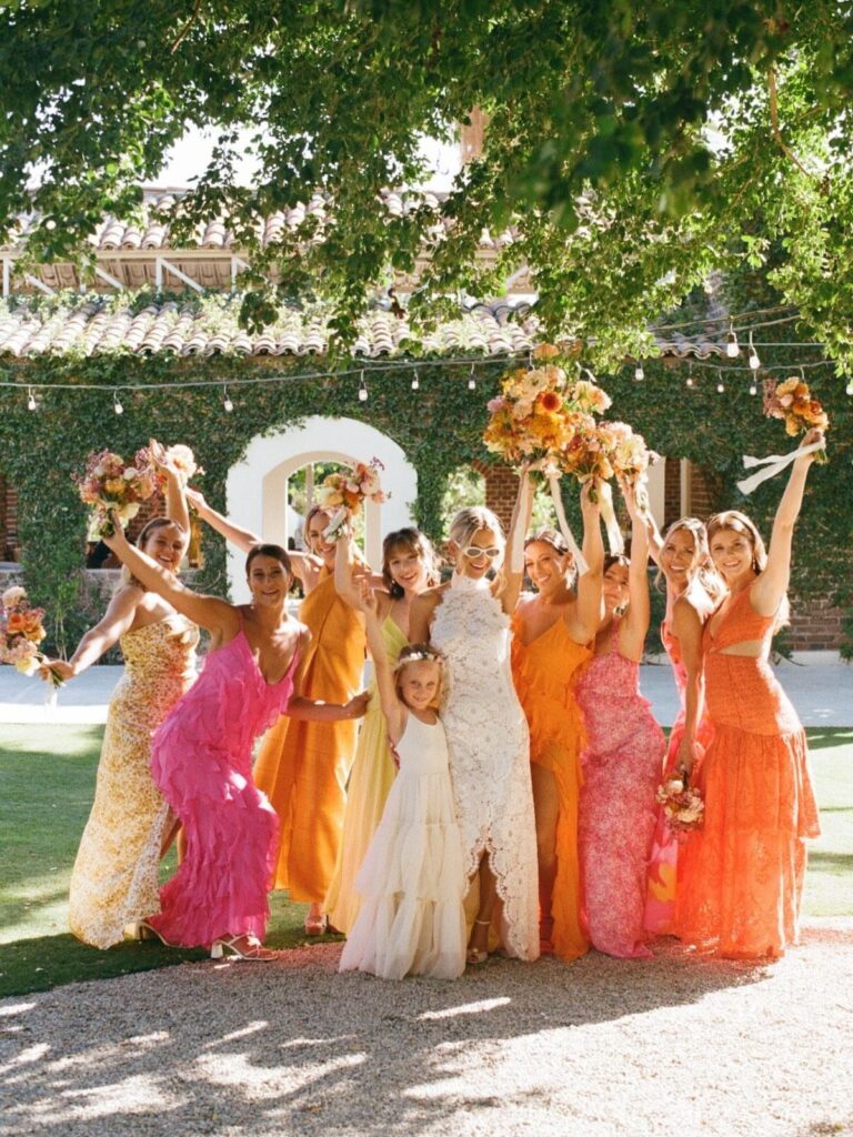
Bridesmaid dresses in slightly different shades of pink, orange and yellow look planned because the colors sit next to each other on the wheel. Pick that one family and let each bridesmaid choose her own cut and tone.
For a couple on a budget, this saves money: people can shop what they like, or wear something they already own.
I would hand everyone a swatch or a color range before they shop, then match the bouquets so the group still reads as one party.
3. Blush and Champagne
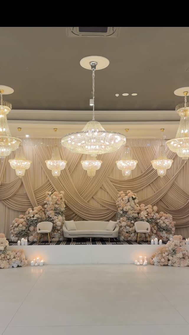
Soft color needs good light, and blush with champagne asks for it more than most palettes. Both shades sit close in tone, so they can wash out in a flat room.
Draped champagne fabric behind blush roses gives you the depth, and crystal chandeliers add the sparkle. If chandeliers are out of reach, warm lighting on the drapery does a lot of the same work.
I would add one deeper element, like greenery, so the blush has something to stand against.
4. Emerald and Gold
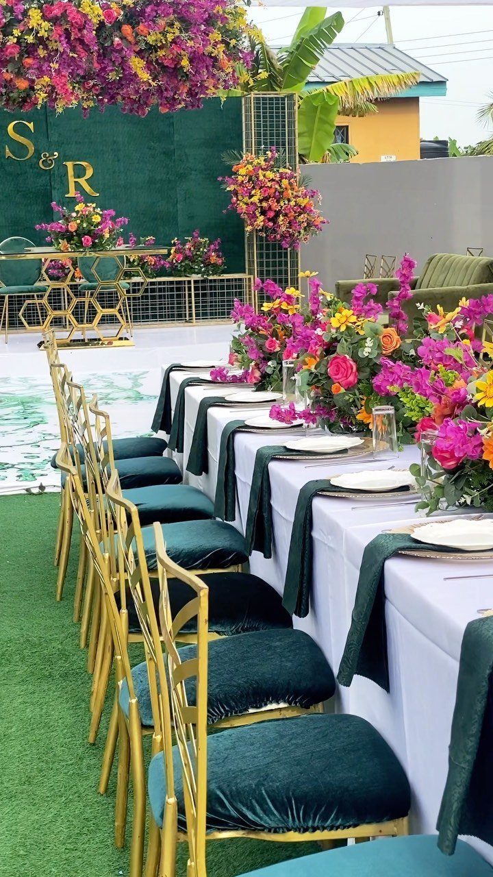
Emerald napkins on white linens are the quickest way to bring this palette to a long table. Napkins are cheap to swap, and they put the green right at each place setting.
Gold chairs carry the metallic side without adding anything to the tabletop. I like the pink and purple florals here because they push the emerald toward jewel tones instead of a plain green-and-gold look.
5. Sea Glass
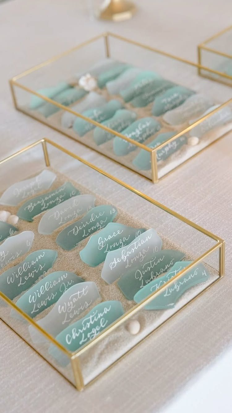
Sea glass is a color as much as a material: a frosted, pale blue-green that reads as calm. It suits couples who want a quiet palette.
Place cards are an easy way to use it. Frosted shards on white sand in gold-rimmed glass boxes hold a handwritten name, and the guest can take the glass home.
Write the names in a dark ink so they stay legible on the pale glass. Test one first, then decide on a full set.
6. Purples and Burgundies Wedding Colors
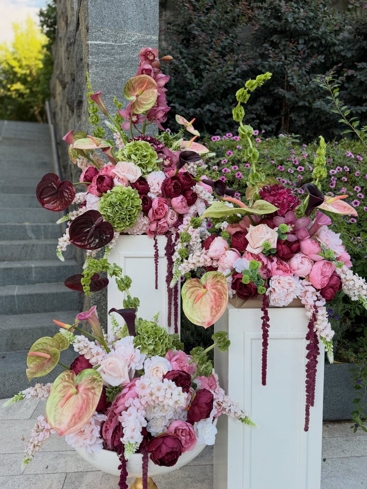
Purple and burgundy share a red undertone, which is why they blend instead of clash. Burgundy adds weight, purple adds lift, and pink bridges the two.
Flowers do this job better than linens. Arrange three shades in one display, as on white pedestals, and the palette appears without a single printed accent.
Keep the linens and furniture neutral so the blooms carry the color.
7. Sage and White
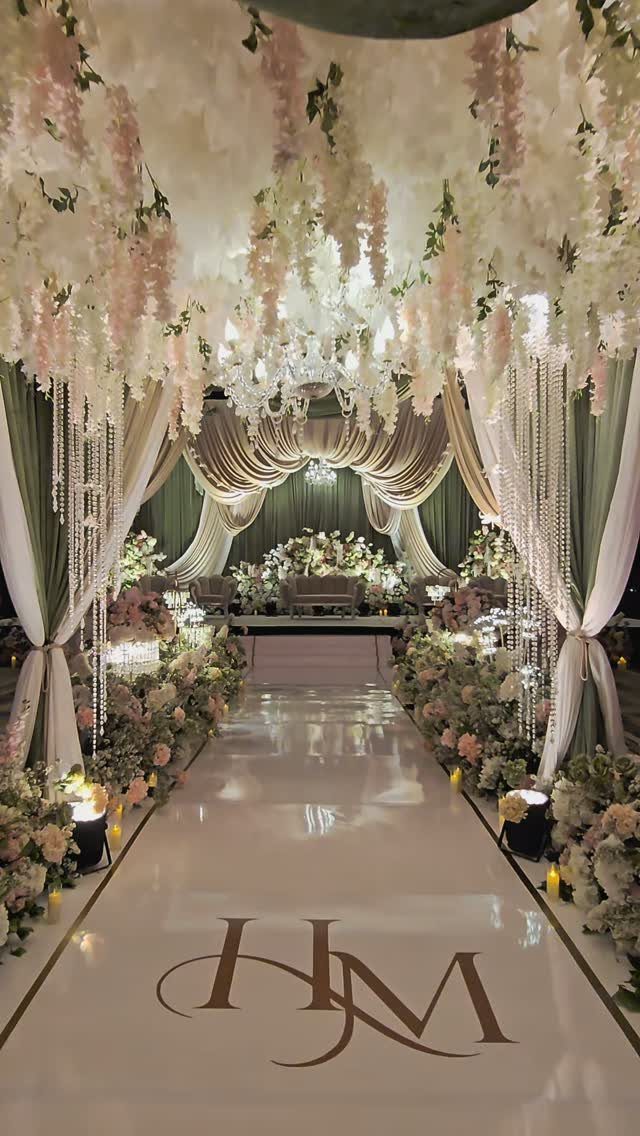
Sage reads as a neutral once white and cream sit beside it. Curtains in sage give a room its color in one move, and that is cheaper than filling every surface with greenery.
White florals overhead and along the aisle keep the green from looking flat. I would add warm cream somewhere, in candles or linens, so the white doesn’t turn cold against the muted green.
Pick your sage from fabric swatches in daylight, since greens shift under indoor bulbs.
8. Glamorous & Elegant Boho
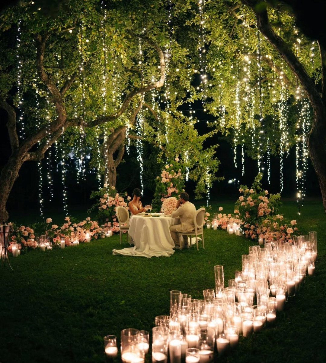
Boho turns glamorous when the candles outnumber the decor.
Keep the table simple: white linen, pink blooms, nothing fussy. The light does the glamour, and the flowers supply the color.
Candles on the ground need steady footing, so I would test them on your actual lawn before the day. Tall glass holders cost more but are worth it near guests.
9. Black Tie and Ivory
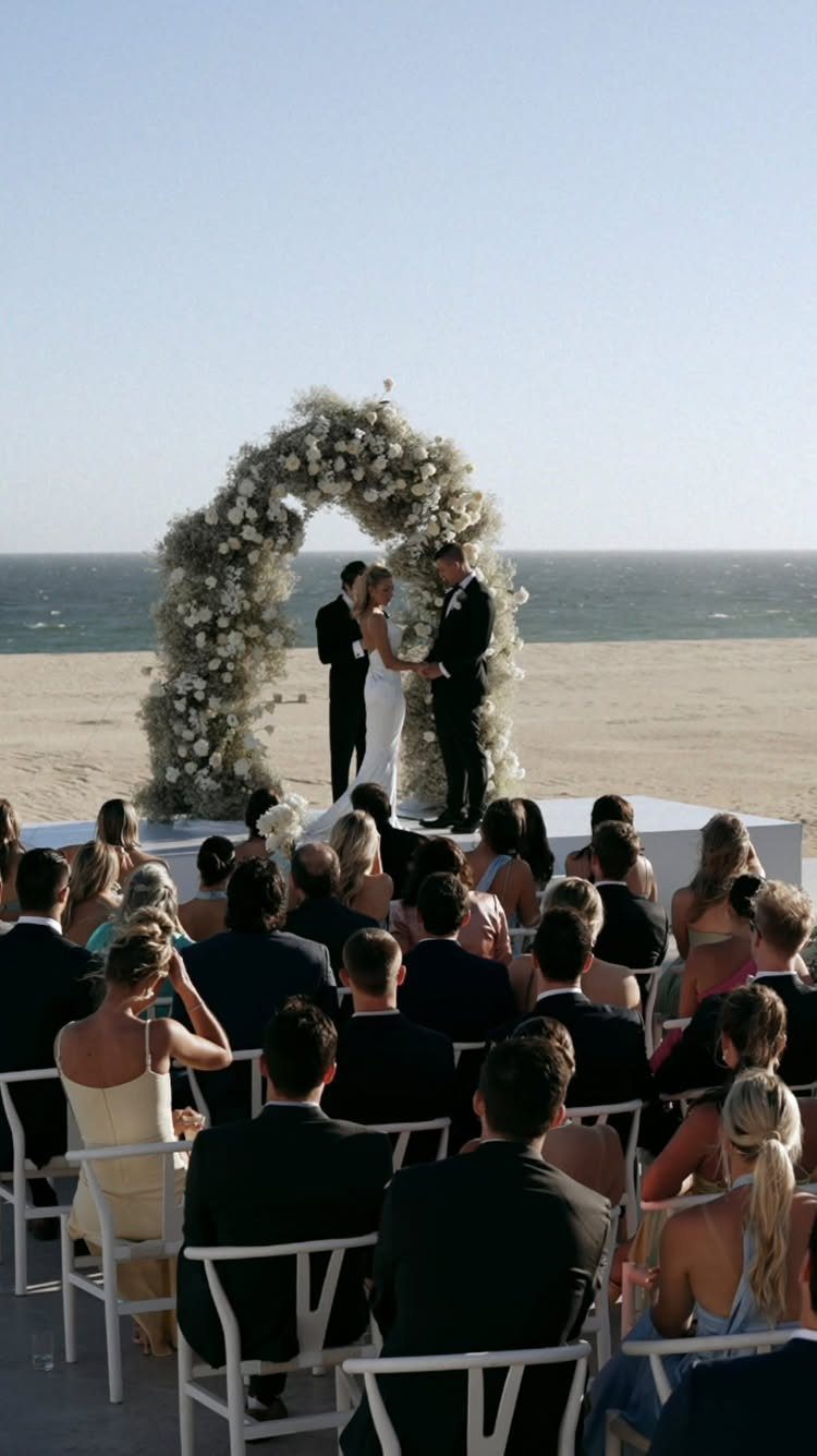
Black and ivory is the easiest formal palette to dress a guest list for, because a dress code of black tie does half the work. Ask for it on the invitation and the crowd matches the couple.
Let ivory carry the flowers, as in a large floral arch, so the black stays in the clothing. On a beach, I like how that contrast stands out against sand and sky without adding a third color.
Choose one ivory shade for the gown, flowers and linens, since small mismatches show in photos.
10. Nature-Inspired Colors
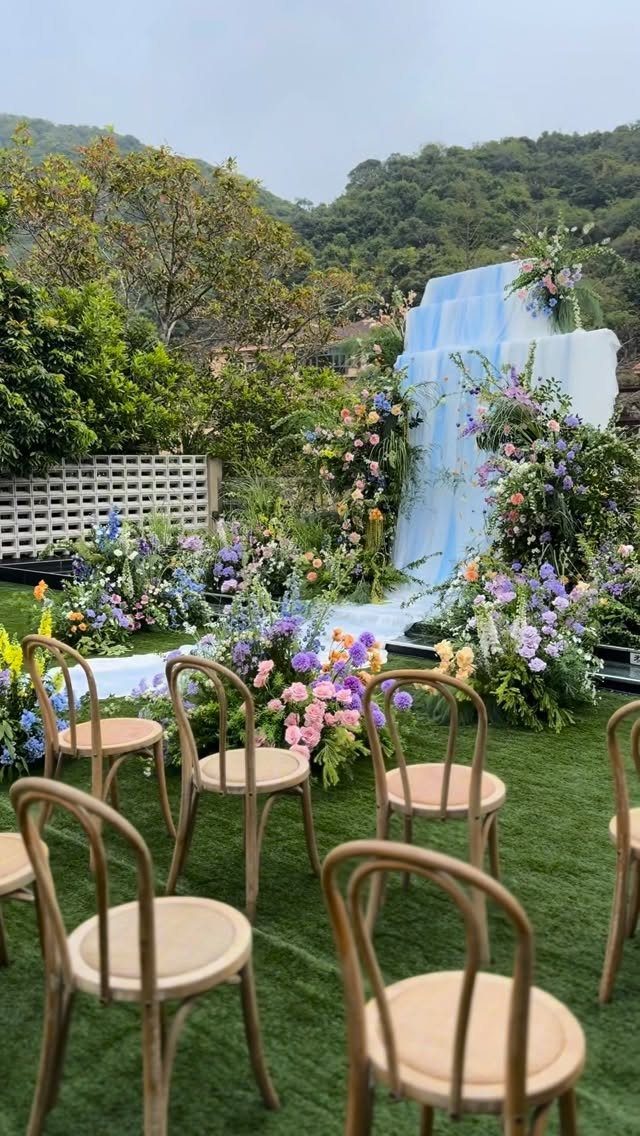
Take your palette from the view. Green hills behind the ceremony already supply the base, so blue, purple and pink flowers can sit in front without competing.
Light wood chairs keep the setup quiet, so the blooms get all the attention. I would put the strongest color in the arrangements at the front, with plain rows behind it.
Visit the site first, at the hour of your ceremony, and pick flowers against what you actually see there.
11. Vibrant Pink and Orange Palette
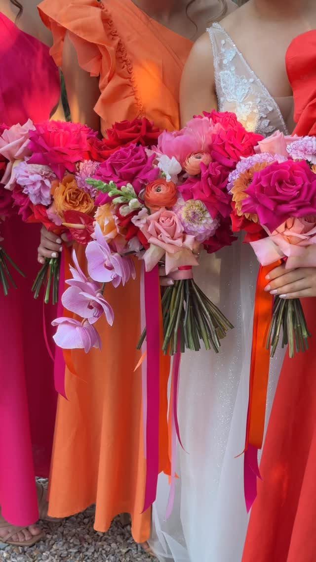
Bright pink and orange work because both sit warm on the color wheel, and white dresses give the eye a place to rest between them. 3 bridesmaids in different shades of the pair look lively, not loud.
Tie the group together with matching ribbons on the bouquets. It is a cheap detail, and it makes mixed dresses read as one set.
Keep the groom’s side calm, in navy or gray, so the color stays with the bridesmaids.
12. Romantic Rose and Mauve Setup
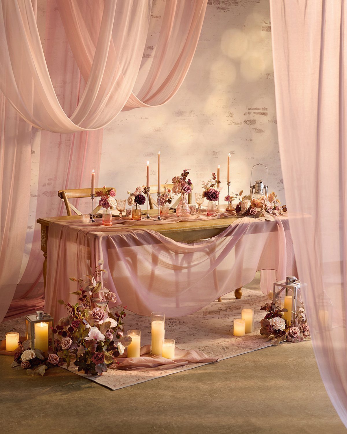
Layers of light pink fabric do for a table what a centerpiece can’t: they add height and softness without a vase. Drape them loosely, with the mauve florals tucked into the folds.
Candles on the floor as well as the table make the setup feel like a room, not a place setting. I would pick one white or textured backdrop so the pink and mauve stay the only colors.
Fabric by the yard is the budget lever here, and it covers far more space than flowers do.
13. Classic Pink and White Reception
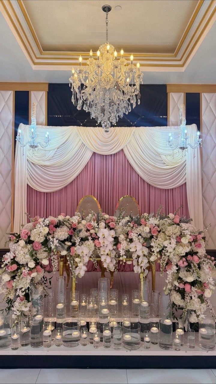
Pink and white stays classic when white does the structure and pink stays in the flowers. Here the sheer draping behind the head table gives the backdrop, so the arrangements don’t have to fill the wall.
Floating candles in glass cylinders add glow at table level for little money, and a chandelier overhead handles the rest of the light.
If your venue has no chandelier, extra candles along the table will cover much of the same ground.
I would keep the pink to one or two shades so the white fabric still looks like the main event.
14. Jewel-Toned Glassware Accents
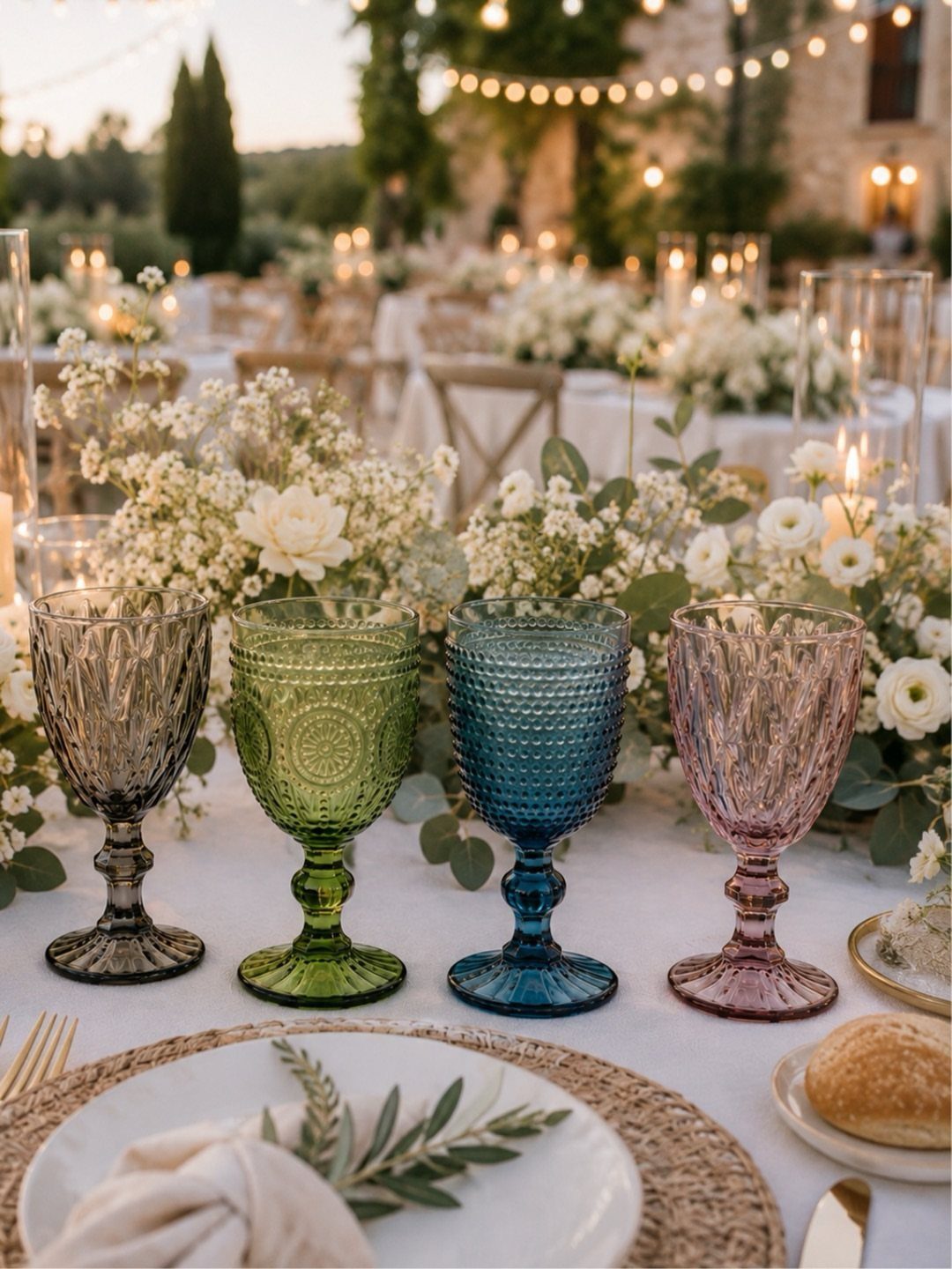
Four goblets in four colors do the work of a whole palette. Grey, green, blue and purple glass set against a white tablecloth puts the color at eye level, right where guests reach for a drink.
Glassware suits couples who would rather keep linens and flowers plain. Texture matters: the ridged surface catches light, so even the grey reads as something.
I would set one of each color at every place, and keep the plates and flowers white so the glass stays the only color on the table.
Order a sample set first, and check the shades side by side in daylight before you commit.
Choosing Colors Based on Venue
Venue colors are fixed, so treat them as part of your palette before you pick a single swatch. Floors, walls, chairs, wood tones, greenery and lighting all change how a color looks once it is in the room.
Photograph the space on your site visit, then hold your swatches up against those photos.
Look at what the room already has in its carpet, drapes and house linens, then hold swatches of your favorite colors against those fixed pieces before you commit, because a clash there is the one you cannot change.
Architecture can also hand you a palette. Terracotta tiles suggest burnt orange and cranberry, and a white interior suits a monochromatic scheme.
If you haven’t booked yet, bring your colors along on every tour and cross off any room that fights them.
Seasonal Color Inspiration
Your wedding date narrows the field fast.
Spring leans toward pastels and fresh greens, while fall favors deep reds, oranges and browns. Navy velvet bridesmaid dresses suit a winter wedding well, since the deep pile catches candlelight and reads rich without adding a single extra decoration.
Season also helps when you’re stuck between two palettes: pick the one that looks natural outside your window on the wedding date.
Two other starting points can override it. In many Asian traditions red stands for luck, prosperity and good fortune, which is why it turns up in so many wedding palettes, from the dress to the invitations.
A color tied to a memory you share can anchor the palette too.
Whatever you choose will reach the invitations, save-the-dates and signage, so settle it before you order any printing.
Mixing and Matching Colors
Mixing colors gives wedding party photos more depth than a solid block of one shade.
A palette can go one of two ways: stay within one color family and layer 3 or 4 shades of it, or pair different colors that flatter each other.
Choose the approach based on how bold you want the group to look. Shades of one color are the safer route, and complementary colors take more nerve.
Don’t feel bound to a shade you have already seen at other weddings. In-between colors, the ones with no common name, can make the palette feel like yours.
Once the dresses are set, match your bouquets to them. Flowers chosen to echo each dress color keep the mix looking deliberate.
Frequently Asked Questions
What is the best color theme for a wedding?
The best one is the palette that suits your venue, your season and a mood you like, not a single universal winner.
Pick the colors that look natural outside on your wedding date, then check them against the room’s fixed carpet, drapes and wood.
A shared memory or a color with cultural meaning, such as red for luck in many Asian traditions, can also anchor the choice.
What are the trendy colors for weddings in 2026?
Tone-on-tone is the 2026 move I’d bet on: pick one color family, then layer 3 or 4 shades of it across velvet, linen, paper and petals so the texture does the contrast.
Greens, blues and warm terra cotta tones are the 3 favorites among couples right now. Blush, champagne, sage and burgundy keep appearing in planning boards too, but choose only what you would still like in the photos.
How do I choose wedding colors that work with my venue?
Walk the room before you choose anything, because carpet, wall paint, chair finish, wood stain and window light will all push a color warmer, cooler or flatter than it looks online.
Your palette can either complement the room or contrast with it on purpose, but a clash with a fixed piece cannot be fixed later.
How many colors should a wedding color palette have?
I land on 4 or 5 colors most often: one lead, a couple of supporting shades, a neutral to rest the eye and a small accent, though 3 works fine on a tight budget.
Make at least one of them a timeless neutral like white or ivory. Fewer colors also make every later decision easier.
What can you do with your wedding color palette?
Use it as the reference for flowers, bridesmaid dresses, linens, napkins, candles, invitations and signage.
Settle it before ordering any printing, since it will run through every printed piece. Compare real fabric and paper samples, because screens and materials show color differently, and daylight and candlelight change it again.