Jewel tones on a budget come down to where you spend the saturation: plum linen on the tables only, or a few warm amber uplights behind the head table, can carry the whole palette, while jewel tone bridal gowns and invitations with gold printing sit at the expensive end.
Count what you can afford to repeat, since saturated color reads as planned only when it shows up in two or three shades across bouquets, linens and stationery.
Choose the one element your guests will look at longest, and spend your budget there first; in this list, that usually means the table decor or the plum linen.
1. Ruby Red Summer Wedding
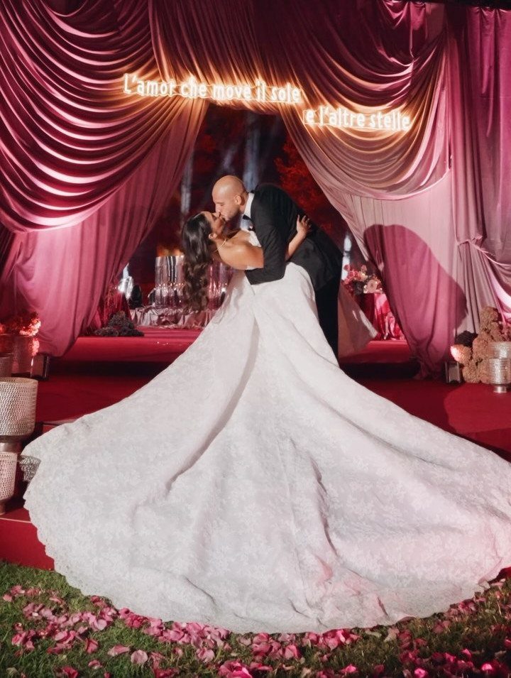
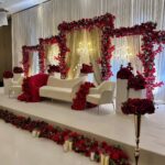
Ruby red draped behind a couple makes the backdrop the whole palette. Deep curtains over a red carpet say summer evening, and they do the work flowers usually would.
On a tight budget, pick one place for the red and let everything else stay quiet.
Fabric panels behind the ceremony spot give you the most color per dollar. Keep the gown white and the suit black so the red reads as a choice, not a clash.
2. Floral Arrangements
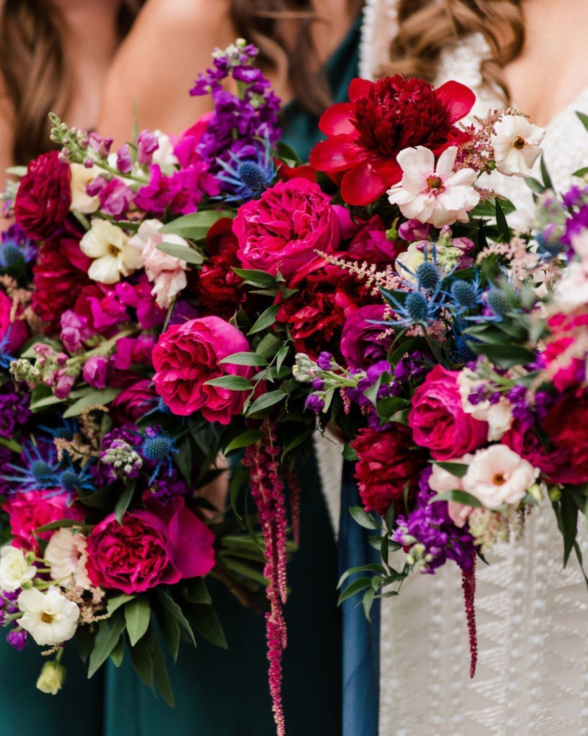
Deep red, magenta and purple blooms with blue thistles pull a bouquet into jewel territory fast. The thistles matter: their spiky blue gives the soft petals an edge.
Request flowers in two or three saturated shades rather than five, and repeat them in the bridesmaid bouquets so the group looks planned.
A dark teal dress beside a white lace one lets the bouquet carry the color. Hold the bouquet up against your own dress before you order it.
3. Table Decor
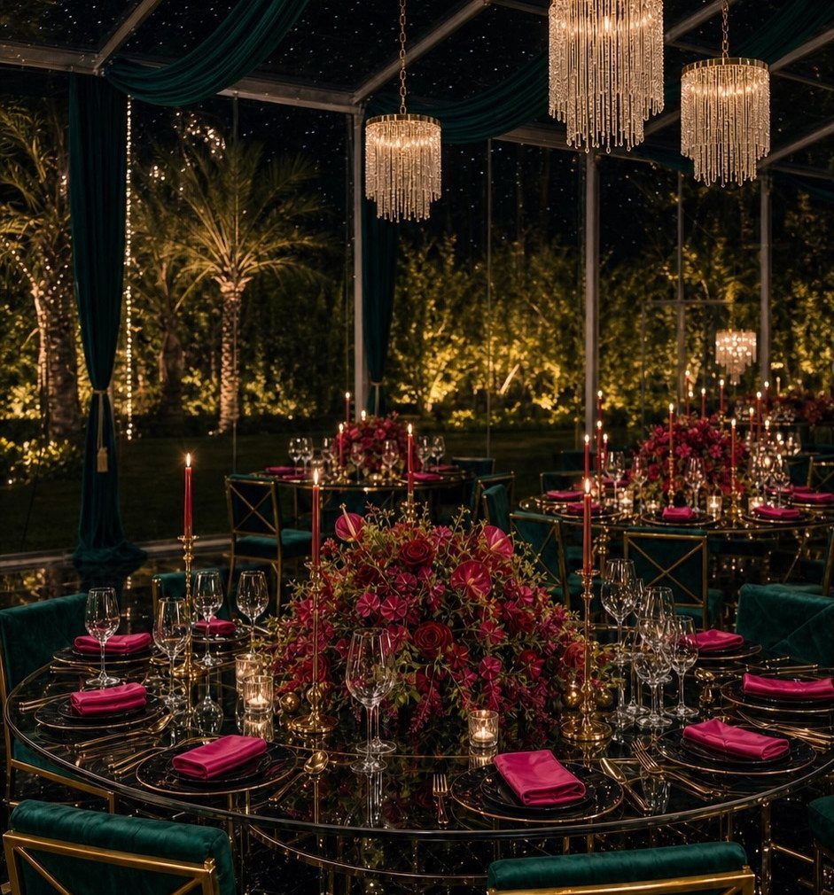
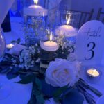
Jewel tones get richer against a deep backdrop, so the tables can stay simple.
Choose one flower color and one napkin color, then repeat them down every table.
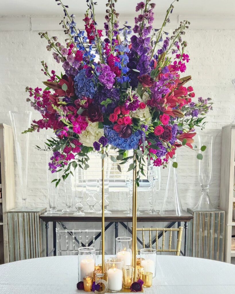
Gold chairs add glow without extra décor, though rentals add up, so price them before you fall for them. If you can afford only one upgrade, I would put it into the centerpieces.
4. Jewel Tone Bridal Gowns
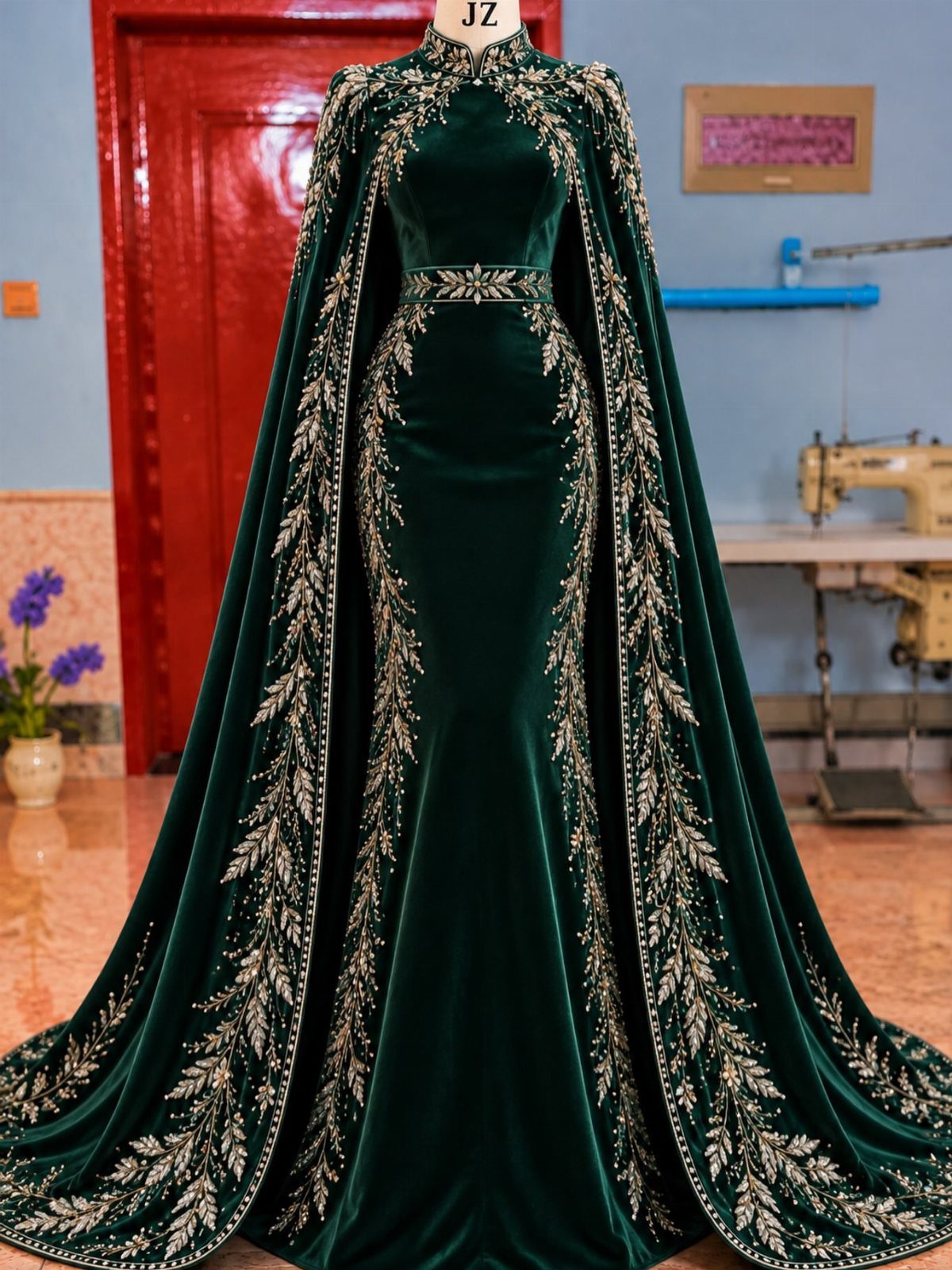
Emerald velvet with gold embroidery and a long matching cape is a gown that needs no veil and no jewelry to finish it. Velvet holds deep color better than most fabrics, and the gold thread gives it a formal edge.
A cape is a smart way to get the drama without a full train.
It also makes a good piece to take off once the dancing starts. A custom piece costs more than off-the-rack, so get a quote before you fall for the idea.
5. Plum Linen
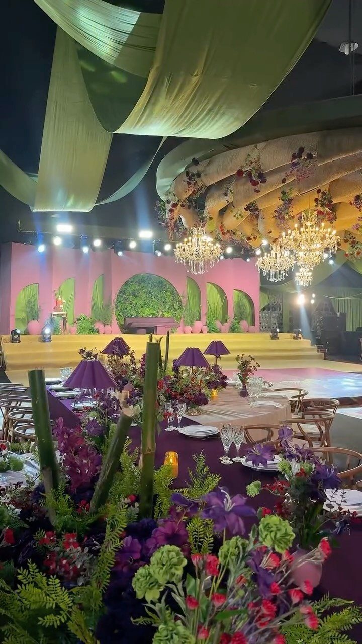
Plum sits between purple and burgundy, which is why it works from a barn table to a chandelier-lit ballroom. Linen in that shade grounds a room that has a lot going on above it.
Keep the flowers in the same purple family, and gold chairs and glassware will supply the sparkle.
Order a swatch before you book the linens, because plum can read brown or bright purple under different lighting. If money is tight, rent plum on the tables only and leave the rest neutral.
6. Jewel Tone Wedding Stationery
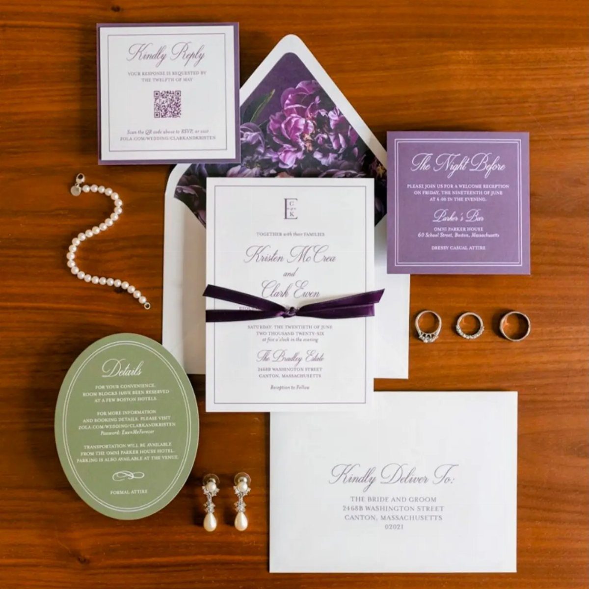
Cards in purple and green that share one palette make a stationery suite that feels like a single set. Invitation, RSVP and details card all share the same 2 colors, which is what ties them together.
Pick 2 jewel tones and stick to them across every piece.
Print one color as the main ink and the other as an accent. Request a printed proof before ordering the full run, since screens often show jewel tones brighter than paper does.
7. Jewel Tone Color Palette with Gold
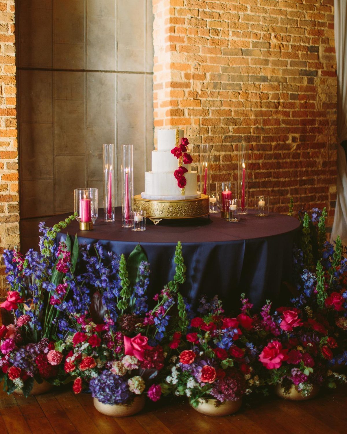
Gold gives a crowded jewel palette somewhere to rest. A gold cake stand on a dark blue cloth does 2 jobs: it lifts a white cake clear of saturated flowers and gives the eye a metallic edge to rest on.
Pick gold for the hardware, not the color: stands, frames and candle holders.
Then limit the flowers to 3 jewel shades so the gold stays the accent. Pink candles are a soft break from all that depth, though a plain white taper would also work.
8. Mismatched Bridesmaid Dresses
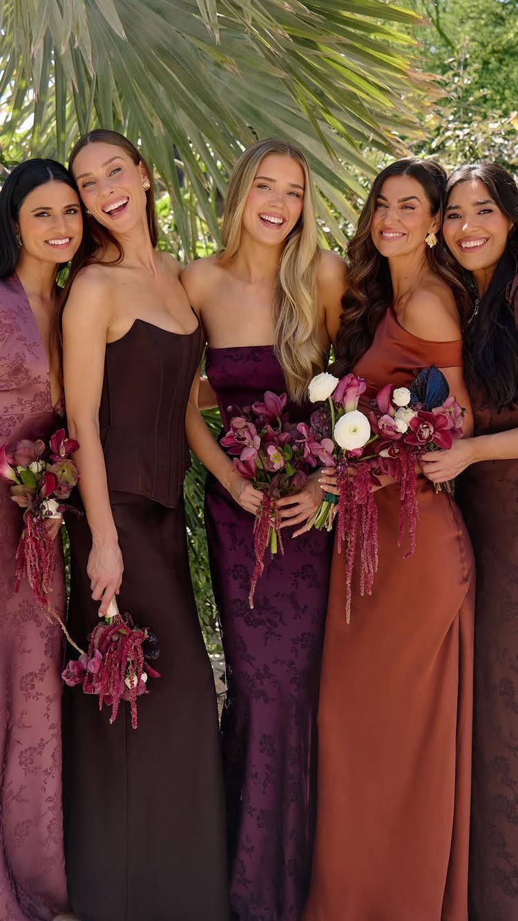
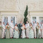
Mismatched jewel-tone dresses look planned only when the bouquets match, so tie the group together with one repeated flower or ribbon. Dark florals tie the group together, so let the flowers do the unifying and the gowns do the varying.
Choose a shared fabric weight and length, then let each bridesmaid pick her own shade from your palette.
Set the list of colors before anyone shops. Mismatched dresses also spare friends from paying for a style that flatters one body type only.
9. Jewel Tone Wedding Invitations with Gold
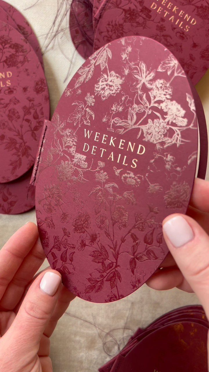
Burgundy card stock with gold floral printing feels like a keepsake before anyone reads it. An oval shape, as here, breaks from the usual rectangle and makes the set memorable.
Check how gold ink prints on a dark card, because foil stamping and flat metallic ink can look very different on dark stock.
Ask your printer for a proof, since foil and flat ink look different on burgundy. Cut shapes can cost more than standard cards, so get a quote first and compare it with a plain rectangle.
A "weekend details" card is a smart place to use the odd shape, with a plain rectangle for the invitation itself.
10. Warm Amber Uplighting
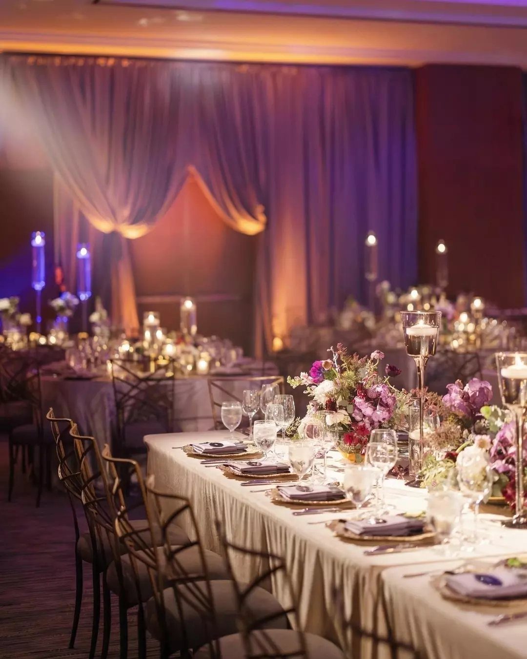
Warm amber light turns purple drapery from flat to glowing. Washing the walls from floor level also lets the tables hold simple flowers and candles without competing.
Amber and purple pair well because the light warms the fabric instead of fighting it. Test the color at night, not in daytime, since amber can shift purple toward brown.
Ask the venue whether uplights are included, because rental of a full set can add up fast. Even a handful placed behind the head table gives you the mood.
Jewel Tone Wedding Trends
Jewel tones are no longer a winter-only choice. Heading into 2025 and 2026, they are turning into a year-round palette, and they are expected to dominate weddings in those years.
Emerald is the most popular hue right now, so if you want something less expected, sapphire, amethyst or teal give you the same depth with less overlap.
Texture matters as much as color. Velvet and satin keep deep shades from looking flat in photos, so add at least one of them, even if it is only napkins or a ribbon.
For a summer date, choose lighter fabrics like chiffon and silk. Citrus pops such as peach, lemon or tangerine keep the palette from feeling heavy in warm weather.
Photography Considerations
The opposite is true. Saturated color holds up in bright light, where pastels often wash out.
They also pop against white attire and natural backgrounds like grass, stone or wood, so outdoor portraits get strong contrast without any editing tricks.
Sapphire and emerald flatter cool skin tones, while ruby, amber and citrine bring out the warmth in warm ones.
If you hire a photographer, show them your palette ahead of time so they can plan around it.
Color Balance Advice
Emerald as the primary, sapphire as the secondary and teal as the accent, with gold as the metal, is a combination that works.
Put 3 or 4 saturated colors on a table at the same strength and they fight each other. Pick one dominant color and repeat it on the largest elements, then give the other two smaller roles.
A deep anchor like charcoal or black, or a light neutral like ivory or champagne, gives the eye a place to rest.
For the metal, gold and copper give a warm, old-money feel, while silver and chrome read sleeker and more modern. Choose whichever suits your venue, and stick with one.
Frequently Asked Questions
What skin tone goes best with jewel tones?
Jewel tones suit a wide range of skin tones, and the match comes down to temperature. Cool skin tones pair well with sapphire and emerald; warm skin tones glow next to ruby, amber and citrine.
Can jewel tones work for spring or summer weddings?
Jewel tones work in spring and summer too. In summer, I would switch to chiffon or silk and add a little peach, lemon or tangerine, which keeps the deep shades from feeling heavy in the heat.
Rich color also holds its own in strong sun, where pastels tend to fade to nothing.
What are the 2026 wedding color trends?
Jewel tones are moving into every season, and emerald is the shade couples choose most right now.
For a less common pick, sapphire, amethyst or teal carry the same depth without the crowd. Velvet and satin add sheen and pile that deep colors need, or they can look flat on camera.
How many jewel tones should I use at once?
Use one dominant color and give two others smaller roles, so three or four total at most.
Set that many saturated colors side by side at the same strength and they compete. Give the eye a place to land with one deep anchor such as charcoal, or a soft neutral like ivory or champagne.
Should I use gold or silver with jewel tones?
Pick the metal that fits your venue, then stay with it. Gold is a strong match for emerald and sapphire, and as hardware it works well on stands, frames and candle holders.