Winter palettes in this list run from a pared-back silver and gray room to deeper pairings like burgundy and gold, emerald and champagne, and dusty plum with white florals, and the choice depends on the room more than on taste: walls, windows and ceiling decide which colors hold up.
Even the budget-minded options, like burgundy napkins on gold chargers with a neutral tablecloth, only work once you have checked them against the space at your reception hour.
1. Silver and Gray
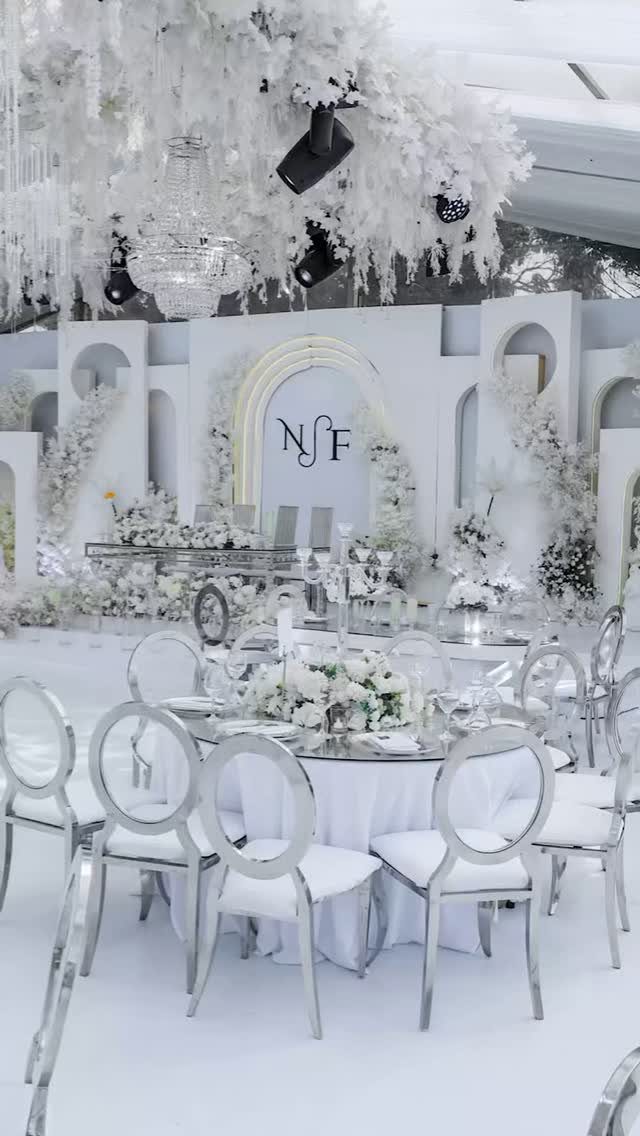
Silver chairs against white tables do most of the work in a silver and gray room, and white florals keep it from turning cold.
Pick one metallic finish for the seating and let linens and flowers stay soft, because silver on every surface starts to read as a showroom.
Gray gives the palette its depth, so bring it in through linens, a napkin, or a stationery suite rather than stacking more silver.
Keep the arrangements all white and let the metal supply the shine. A palette this pared back depends on clean lines, and I would spend the savings on good lighting.
2. Burgundy and Gold
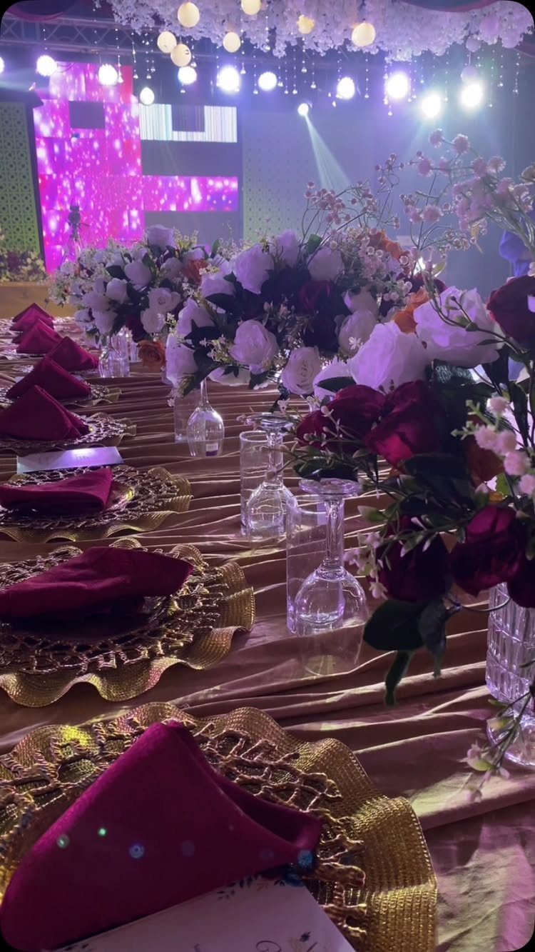
Burgundy napkins on gold chargers give a table a dark, warm base, and white and red roses keep it from feeling heavy. Cost control is simple: napkins and chargers carry the color, so the tablecloth can stay neutral.
I like the red and white mix in the centerpieces because it bridges the napkin shade and the white linens. Hanging lights add the glow that gold needs to read as rich rather than flat.
3. Navy and Rose Gold
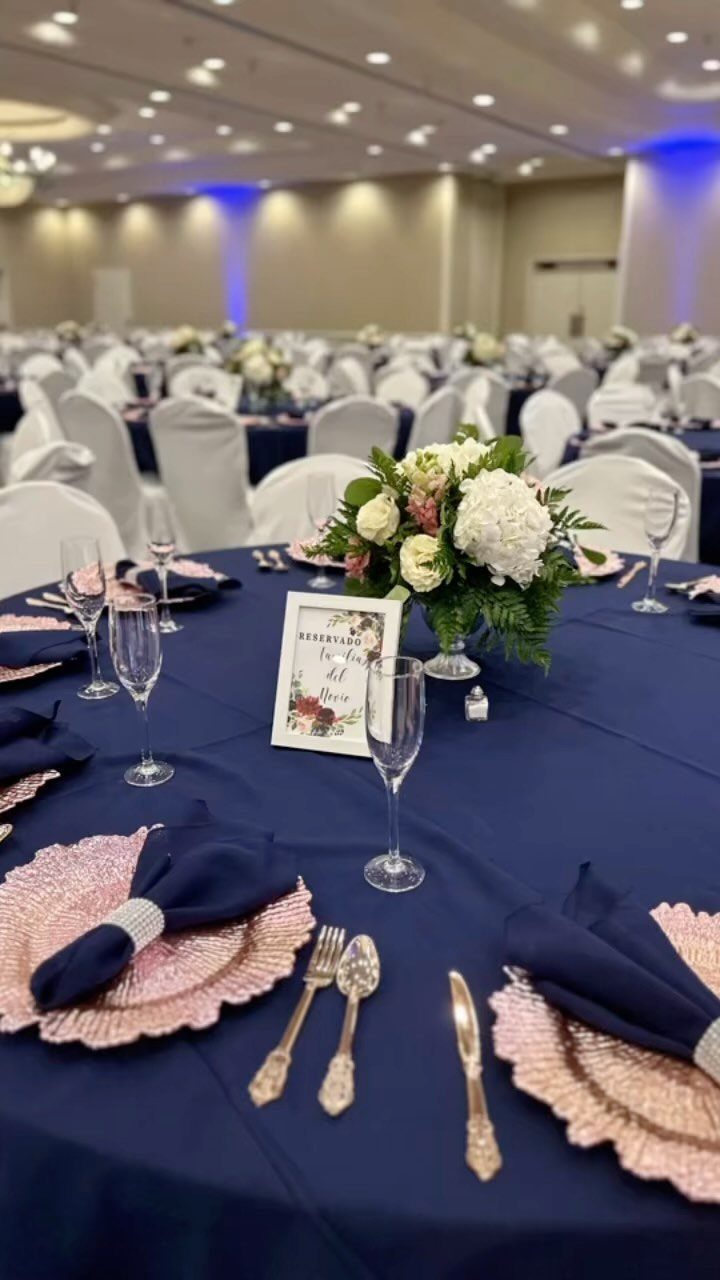
Navy gives winter a crisp, grown-up base, and rose gold chargers warm it without the flash of yellow gold. Use navy on the tablecloth and napkins, then keep the centerpiece white so the metal stands out.
White chairs help in a banquet hall, since they lighten a dark table. For a modern look, I would stay with one metal and skip mixing in silver or gold.
4. Gold, Teal and Ivory
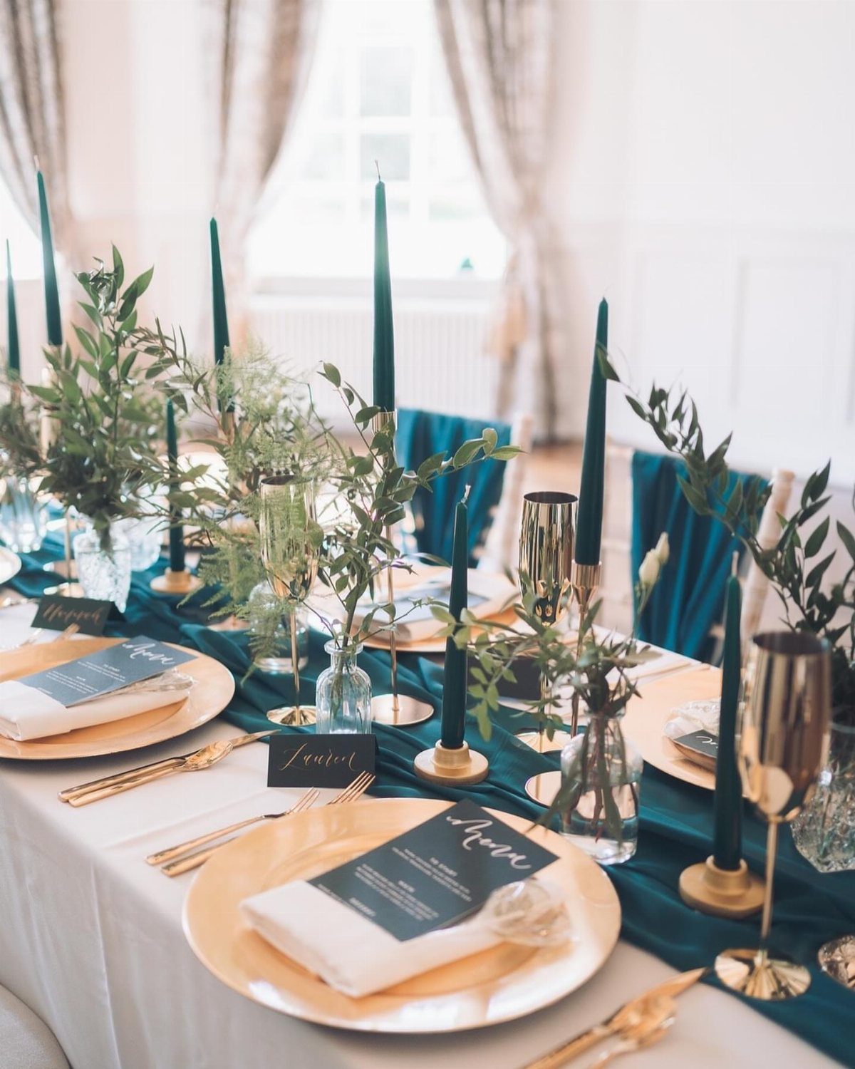
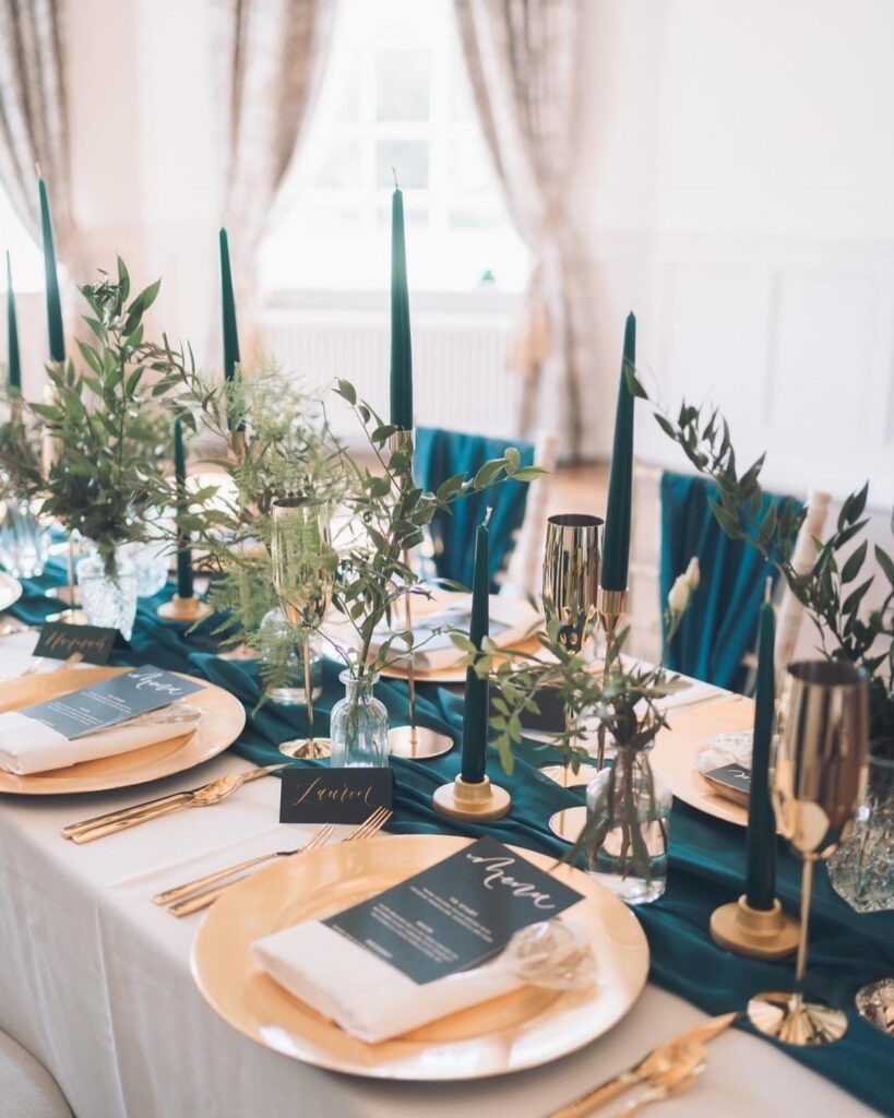
Teal, gold and ivory sit closer to an antique dining room than a ballroom. Dark teal tapers in tall holders, a teal runner, and ivory napkins keep the palette muted instead of loud.
Gold plates and cutlery add the shine, so greenery in glass vases is plenty for the flowers. Menu cards on the plates save you a separate stationery piece, which helps on a tight budget.
5. Emerald and Champagne
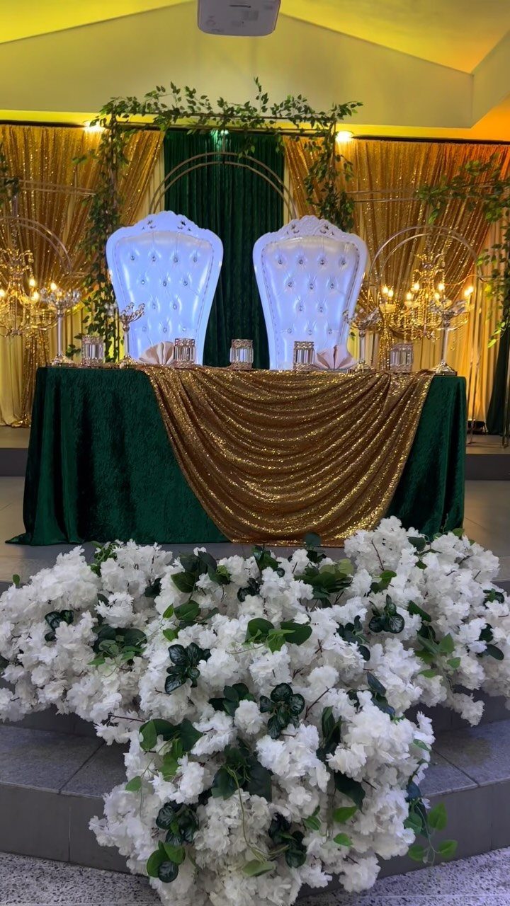
Sequin linens in emerald and gold are the bold move in this palette; they catch candlelight and do the work of a backdrop. Use them on the head table alone if the budget is tight, and keep guest tables plain.
Gold candelabras add height without extra flowers, and a big white arrangement gives the green room to stand out. Champagne tones keep the glow soft, which I prefer over bright gold here.
6. Cranberry and Taupe
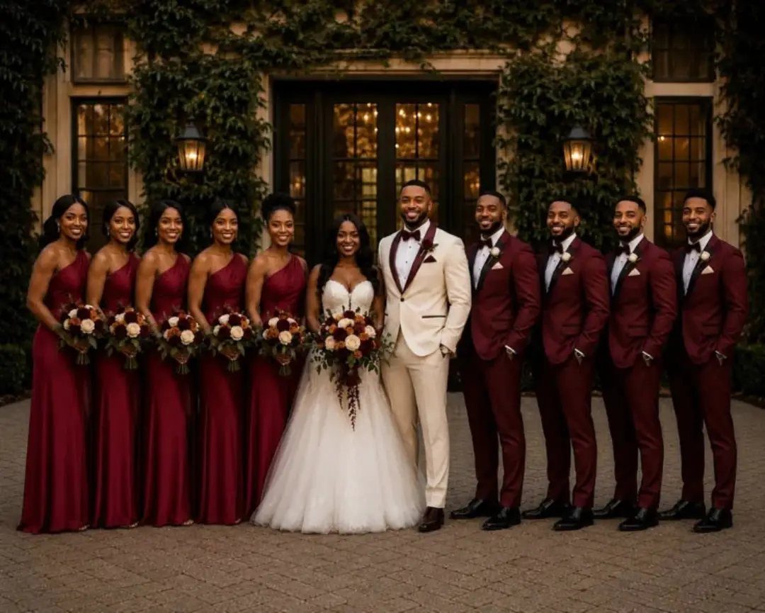
Cranberry reads festive without tipping into Christmas, and taupe calms it down. Dress the party in cranberry and put one person, such as the groom, in taupe, so the group looks planned but not matched.
Taupe also works as a neutral for linens and stationery. I would let the bride’s white stand out and keep the rest of the palette in those 2 shades.
7. Dusty Plum and White Florals
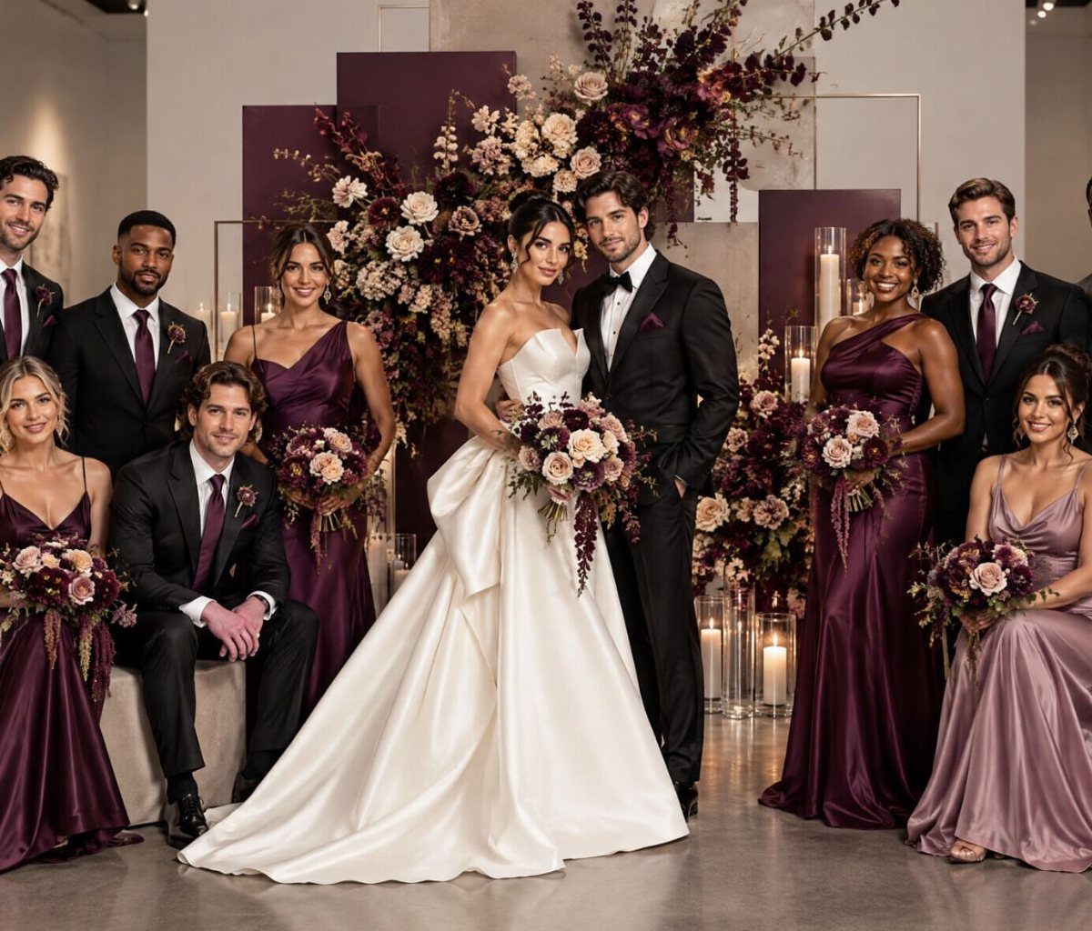
Plum bridesmaid dresses against a plum backdrop make the white florals do the contrasting.
Keep the bride’s white as the brightest thing in the room and let the arrangements echo it: white blooms with a few plum ones tie the party to the setting.
Dusty plum is softer than a true purple, so it suits winter without feeling heavy. I would let the dresses carry the color and keep everything else white.
8. Black and Gold
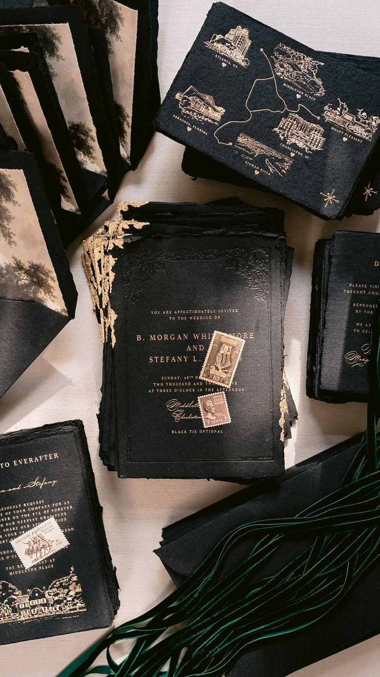
Black and gold starts on paper. Deep black stock with gold foil text reads as formal before a guest has seen the room, so the invitation sets the tone for a New Year’s Eve party.
The maker of this suite used gold foil press printing plus tone-on-tone letterpress, which adds depth without another color. Foil costs more than flat ink, so I would spend on the invitation and keep the other stationery simple.
Dark green ribbon ties the suite together without competing with the gold.
9. Moody Jewel Tones
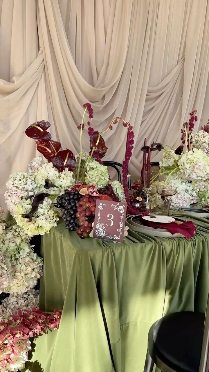
Green linen under burgundy flowers is the kind of pairing jewel tones do well: 2 deep shades that sit side by side without fighting.
Pick two jewel tones, such as emerald and burgundy, and split the work: one as the tablecloth, the other in the florals. Add a neutral like cream drape or ivory napkins so the eye has somewhere to rest.
Add a few white blooms to lift the burgundy, and fruit such as grapes works as a low-cost accent. I would stop at 2 jewel shades per table, since a third makes the room feel crowded.
Choosing Your Colors
A room’s walls, windows and ceiling will shape your palette long before a Pinterest board does, so I start with the venue.
Visit the room at the hour your reception starts, and hold fabric swatches against the walls and floor before you order anything.
Season matters too. With snow outside the windows, soft pastels look chosen on purpose; in a windowless ballroom downtown, those same shades fade into the walls unless something anchors them.
Ice blue and white pull the winter outside into the room, and burgundy with forest green close the door on the cold.
Then ask what mood you want: playful, or elegant and formal. Pick the palette that fits that answer and your venue, not just the one you like on a screen.
Incorporating Colors
Start with the paper. Save-the-dates and invitations give guests their first look at your colors, so settle the palette before you order them.
From there, follow the day in order: ceremony arrangements, aisle runners, and wedding party attire, then the reception tables, centerpieces, and lighting.
The small pieces carry more than you would expect. Programs, place cards, menu cards, and favor packaging repeat the palette at almost no cost, and they photograph well together.
Food and drinks can join in as well. A signature cocktail or cake finish in one of your shades keeps the look consistent without adding decor.
Seasonal Elements
Pine and cedar branches are cheap and local from December through February. I like them best at the entrance or down the aisle runner, where they add structure and a little scent.
At a higher price, eucalyptus gives a softer look, which pairs better with dusty plum or lavender than with a rustic palette.
Snowflakes tire fast as a motif. Keep them to a single spot, like the lining of an invitation envelope or one hanging installation.
Lighting works harder. For burgundy or dusty plum, candlelight finishes the effect you want.
Check the color temperature of your bulbs and candles against your palette, because the room itself is only half of what the light changes.
Frequently Asked Questions
What are good wedding colors for February?
Deep reds and burgundies are the safest picks, with icy blues as a cooler option.
For a February table, I like burgundy napkins folded on gold chargers with white and red roses nearby; the red reads warm without weighing the room down.
A plain ivory or white cloth lets the napkins and chargers do the color work, and it keeps the rental bill lower than patterned linens would.
What colors look best on dark winter?
Rich jewel tones and deep neutrals suit a dark winter backdrop. Choose 2 jewel tones, say emerald and burgundy, then put one on the linens and let the other show up in the bouquets and centerpieces.
A third shade in cream or ivory gives the eye somewhere to land, but I would hold each table to those limits, because a fourth color starts to crowd the room.
What is the best color for a winter wedding?
It depends on your venue and your start time, so look at the room first. Walls, windows and ceiling shape a palette more than an inspiration board does.