The palettes here run from quiet two-tone pairs like Lavender and Ivory or Classic Blue and White to high-contrast combinations like Yellow & Navy, and even a Mismatched Pastel Palette where each bridesmaid wears her own shade.
Your venue decides which one is yours, since it already has a floor, walls, wood and a view that your colors have to live with, and the Choosing a Color Palette section below shows how to test that.
1. Pink and Orange
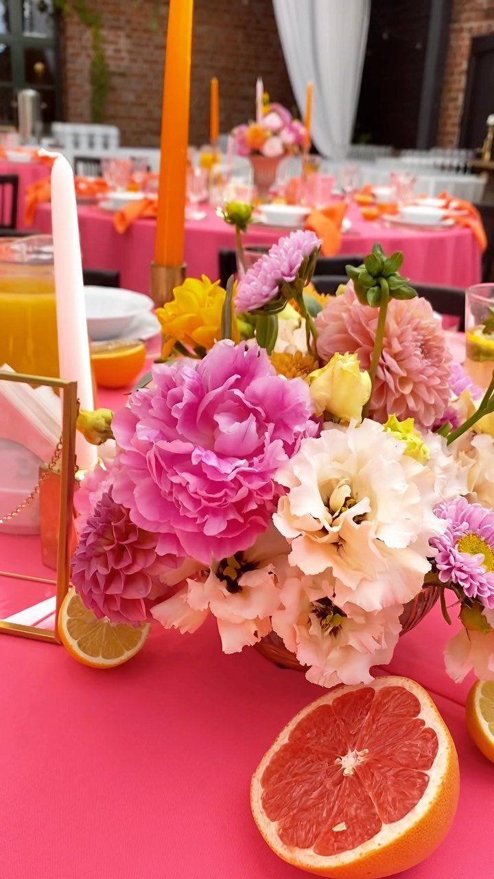
Hot pink and orange work best when one of them takes the lead. Pink linens carrying orange candles, as here, let the pink read as the base and the orange as the accent.
Sliced citrus on the table is a cheap way to repeat the orange without buying more flowers. Keep the florals pink and white so the table has somewhere calm to rest.
I would skip orange napkins on top of an orange candle. 2 oranges at the same height start to compete.
2. Sage Green
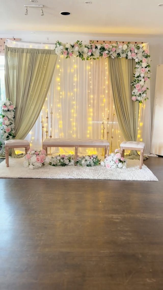
Sage green does its best work as a soft backdrop, and curtains are the easiest way to get it.
The maker of this setup pairs sage draping with blush and ivory florals, which is a combination I would copy as is.
Fairy lights behind the fabric give the folds a warm glow after sunset. Keep the ground light with a white rug and cream benches, and the green becomes the only real color in the room.
Sage is quiet, so it suits couples who want calm over drama.
3. Dusty Blue and Burgundy
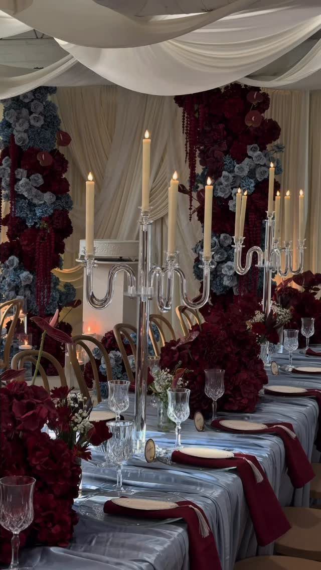
Burgundy gives dusty blue the weight it needs to hold up through a long dinner. On its own, dusty blue can look washed out under bright summer light; a deep red napkin or arrangement anchors it.
Keep the blue on the larger surfaces like linens and backdrop flowers, and let burgundy appear in smaller hits: napkins, centerpieces, candle accents.
Clear acrylic candelabras add height without adding another color, which makes them an easy fit for a palette that is already busy. I like that restraint.
4. Butter Yellow and Pale Lilac
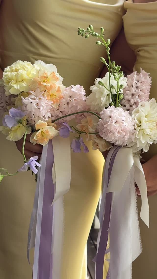
Butter yellow with pale lilac is a pairing I would pick for bridesmaids before I would pick it for tablecloths.
Dresses in a soft yellow, with bouquets of lilac and yellow blooms, put the whole palette into the photos without any extra decor.
Tie the stems with lilac and cream ribbon so the bouquets echo the dresses. Butter yellow is gentler than lemon, which keeps the look pastel instead of sharp.
If you want a third color, make it cream.
5. Gold and Pink
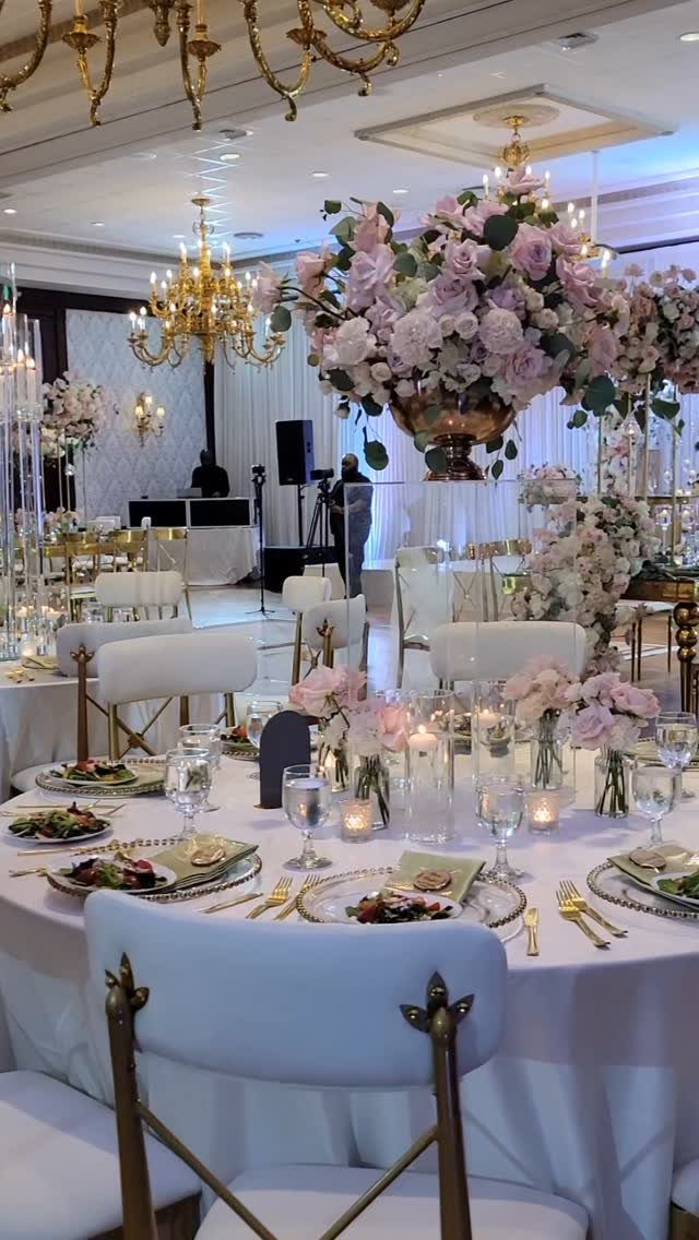
Gold chairs and chandeliers carry most of the luxury, so the pink can stay simple.
For a budget, spend on one gold element people will notice, such as chairs or lighting, and keep linens plain white. Gold everywhere starts to feel heavy in a banquet hall.
Blush pink reads more romantic than hot pink next to gold, and that is the version I would choose.
6. Peach and Mint
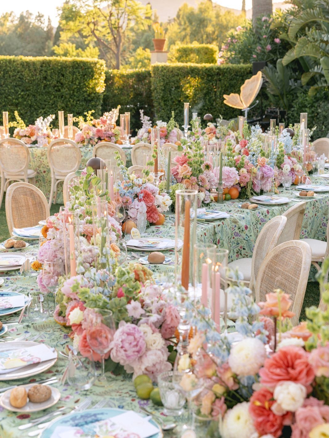
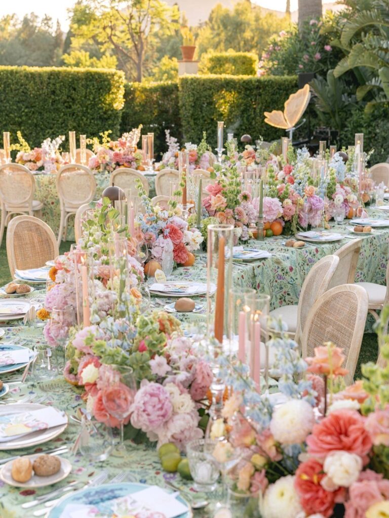
A mint tablecloth under peach and pink flowers feels like a garden even before the plants arrive. Mint is cool and peach is warm, so each one keeps the other from going sugary.
Tall candles add height next to low arrangements, and cane-back chairs bring in a natural texture that suits an outdoor table.
My advice is to let mint cover the large surfaces, then save the peach for the flowers. Reverse it and the table looks pale and flat.
7. Terracotta and White
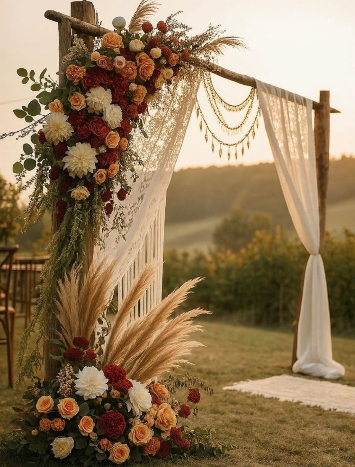
Spice is the right word for this orange-red: earthy, warm, and closer to baked clay than to a bright summer orange. Against white fabric and pampas grass, it reads as grounded instead of loud.
Terracotta belongs in the flowers, while white takes the large surfaces like draping and linens. A few true reds mixed in deepen the palette without adding a new hue.
For a sunset ceremony, I would choose this over anything pastel.
Not only is it unexpected, but a stark color contrast really pops in summer months. Try incorporating a typical "autumnal" color like this deep hunter green that essentially acts like a neutral.
8. Yellow & Navy
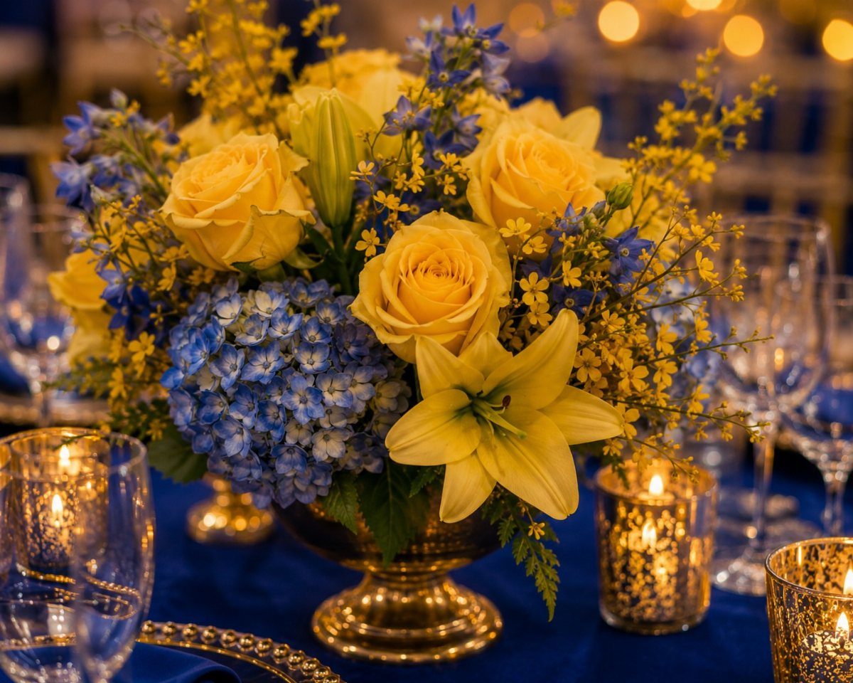
Navy linens under yellow roses and blue hydrangeas give the boldest contrast of any palette here, and late summer is when it feels right.
A gold vase ties the 2 colors together, so a third color has no work left to do.
Navy can cover the table while the yellow stays in the flowers. Lilies add a second shape beside the round roses, which keeps the arrangement from looking flat against such a dark base.
Candles and glassware catch the light on navy, so skip extra metallic accents.
9. Lavender and Ivory
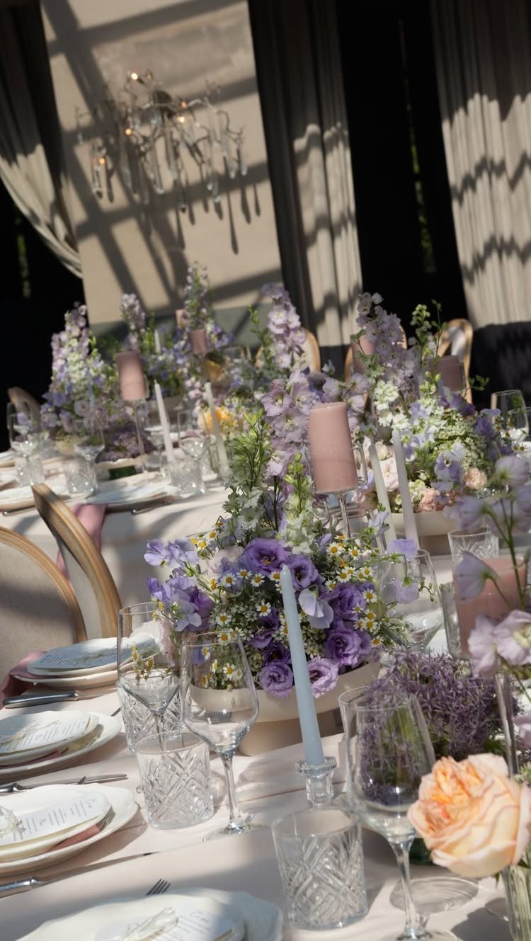
Lavender and ivory is the calmest palette here, and it asks very little of you. Ivory linens do the quiet work, while lavender flowers and purple candles bring in the color at table height.
Keep the purple to two or three touches per table. A deeper candle beside paler flowers gives the eye some range without adding another hue.
Crystal glassware and white plates suit it well, and I would stop there. This palette gets its elegance from restraint.
10. Classic Blue and White
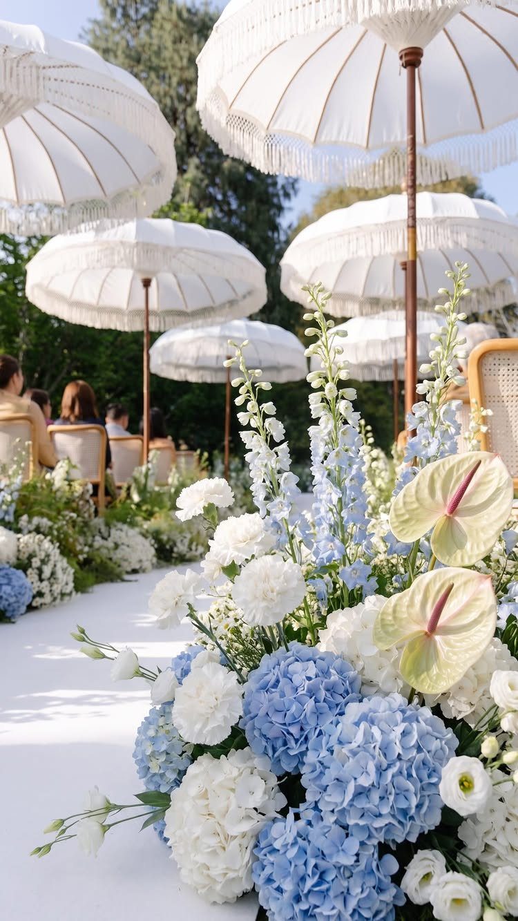
Blue and white is the easiest palette to get right, because neither color fights the other. Down an aisle, a repeated mix of blue and white flowers does the job on its own.
White parasols add height and shade, and they keep the white from being only a flower color. I would repeat the same two-color mix at every chair or post so the aisle looks planned rather than scattered.
Choose one blue and stay with it.
11. Mismatched Pastel Palette
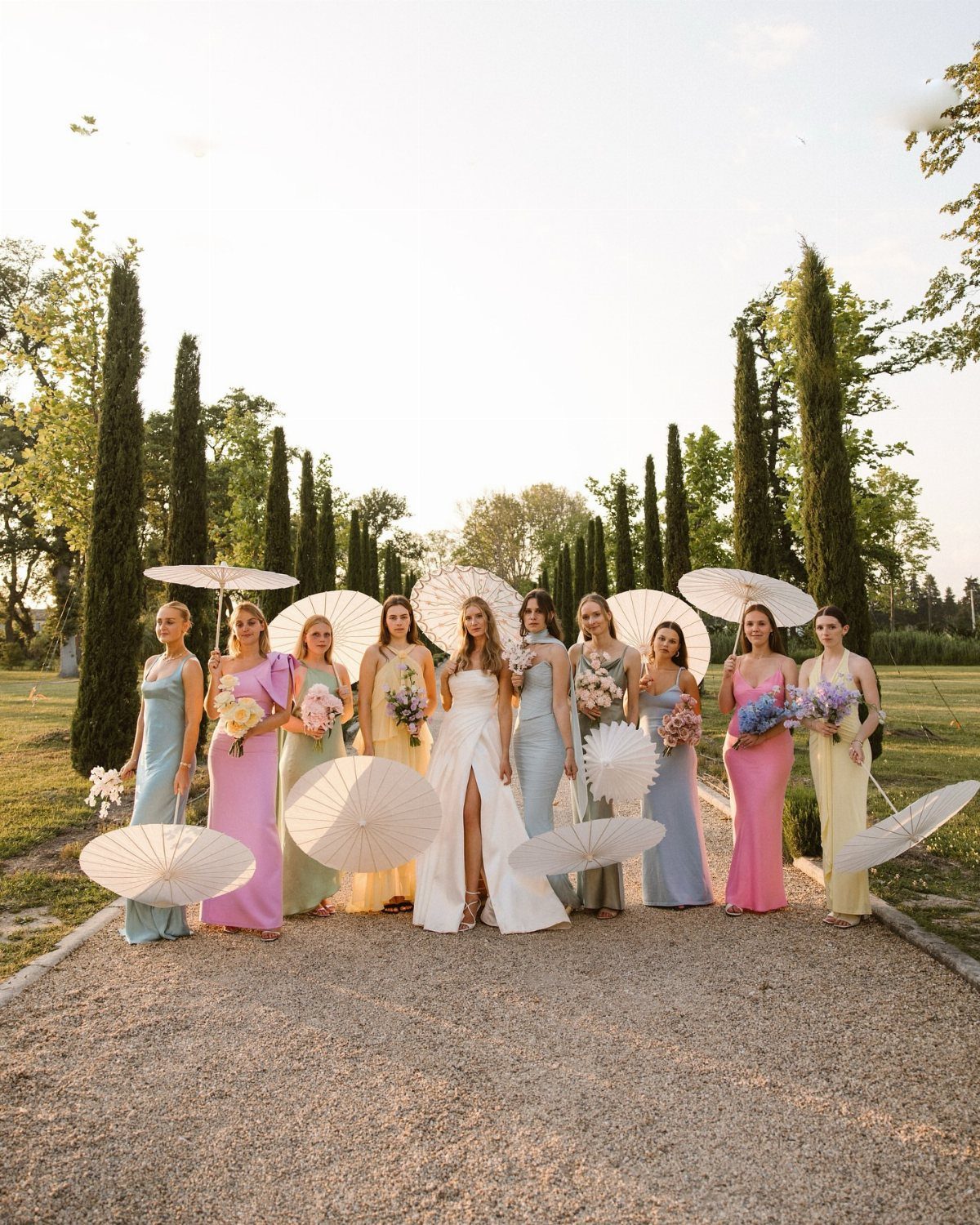
Mismatched pastels let each bridesmaid wear her own color: soft blue, lilac, yellow, sage green, and pink.
Give everyone the same fabric weight and a similar length, so the colors vary but the dresses look like a set. I would pick every shade from one pastel family, with none noticeably deeper than the rest.
It costs less to coordinate than a single matching color, since nobody has to find one exact shade.
12. Sunset Citrus Floral Palette
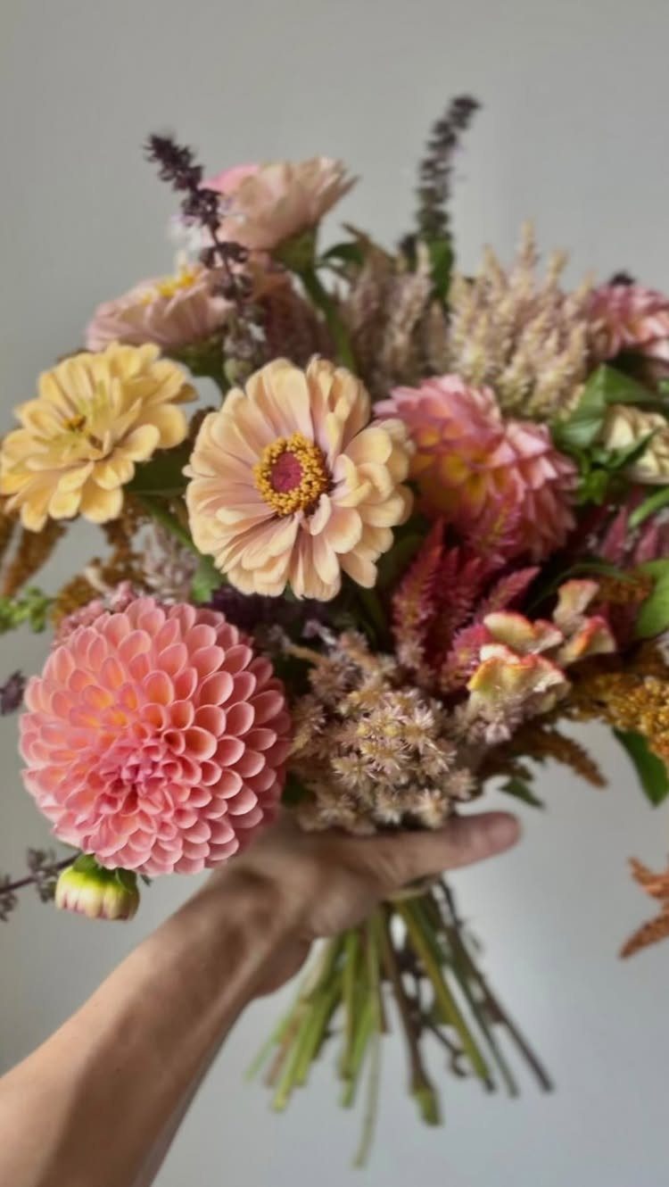
Pink, peach, and yellow zinnias and dahlias make a bouquet that looks like a late-summer garden, and textured greenery stops the warm colors from blurring together. The mix of flower shapes does as much work as the palette.
Keep all 3 colors in each bouquet and avoid blocking them into sections. Mixed through the whole bunch, they read as one soft sunset.
If you want this on the tables too, repeat the same flowers in smaller arrangements.
Choosing a Color Palette
Start with the venue, because it already has a color whether you picked one or not.
Walk the space at the hour you’ll be married and look at the floor, the walls, the wood, and the view. Those fixed colors are the ones your palette has to live with.
A palette that fights the room costs money to cover up. One that borrows from it needs less decor.
Then check the season against your date. Summer light is bright and strong, so ask yourself how each shade looks outdoors at midday and again at dusk.
Mixing Colors
Mixing bold and soft works when the two are not equal partners.
Pick one bold color and let a soft one surround it. Navy against blush and coral beside mint both fit, since each pair sets a deep or saturated tone next to a soft, light one.
Give the bold shade the small jobs: napkins, candles, a ribbon, a single row of flowers. Let the soft shade take linens, backdrops, and bridesmaid dresses.
If you can’t decide whether the bold color is too much, remove half of it. Added back in small doses, it usually looks better than it did all at once.
Seasonal Inspiration
Before you lock in a palette, call the person doing your flowers and get a list of what is actually blooming on your date.
A color you love in a flower that is out of season will cost more and may arrive in a weaker shade.
Bring two or three palette options rather than one fixed list. A florist can then steer you toward the blooms that are fresh and affordable, and you keep the color story either way.
Let the weather guide the decor too. Heat and bright sun favor lighter fabrics and flowers that hold up outdoors.
Frequently Asked Questions
What are the trendy summer wedding colors?
Butter yellow, coral, blush, and several shades of blue are the colors showing up most, and bold saturated shades paired with softer neutrals like champagne or gray are a strong direction.
Lemon can read loud against linen, while butter yellow has a creamy softness that holds a pastel palette together. Pair it with pale lilac or cream if you want a second color.
What are the best color combinations for a wedding?
Pairing navy or dusty blue with white takes almost no color theory, because neither shade competes with the other. Blush and sage green, navy and yellow, and dusty blue with burgundy also work well.
Most good pairings put one bold or deep shade next to a soft one, with the bold color kept to small touches like napkins and candles.
What color should you wear to a summer wedding?
Soft pastels such as butter yellow, lilac, sage green, blush, and light blue suit bridesmaids in summer light.
They can be mixed in one party if each dress uses a similar fabric weight and length and every shade comes from the same pastel family.
Matching the weight and length keeps the group looking like a set even when the colors differ.